From web designers to marketers, customers to CEOs, everyone has an opinion on web design principles.
That's what makes the web so diverse and interesting!
But a good design strategy can't rely solely on personal opinions while hoping for the best. Sure, your website will be creative, but will it be effective?
Today we'll show you how your website can be both, using the underlying web design principles.
This article isn't a collection of our personal design preferences or trendy techniques. It's a stripped-back view of the core goals of great web design and how to achieve them.
And you also get to learn from Bogdan Pop, our Design Lead at Thrive Themes.
What Are The Goals of Great Web Design?
It's OK to be creative when designing your site. It's an expression of you and your brand. Go ahead and make something beautiful!
Considering the fact that your website (or homepage) is responsible for your visitors’ first impression of your business... you’ll want to make sure you have the best visual design possible.
But every design choice needs to be underpinned by solid principles.
And web design principles need to be tied to real goals.
So before we share any real advice, we need to define these goals.
What are the fundamental goals of a well-designed website?
To quickly guide website visitors to an intended result.
To communicate your brand, personality, and trustworthiness with the most important elements
To suggest the level of quality customers can expect from your products.
To welcome your target audience, and discourage those who are not a good fit.
Each and every design principle needs to be tied to these aims.
Otherwise, they are just personal design choices
13 Key Principles for Designing an Impressive Website Look
This section breaks down the key principles of good website design, so you can easily implement them on your on site. Let’s dive in.
1. First Things First: Use the Right Tools
The outcome of your website’s appearance and functionality heavily depends on the tools you use to build and design it.
With the wrong tools, you’ll struggle to create an effective web design and a clear path to conversion.
But, when you equip yourself with the right web design tools, you’re so much closer to creating something impressive – a website that doesn’t just look good but feels right to every visitor, turning casual browsers into loyal customers.
And nothing says “building with the right tools” like using Thrive Suite to create your business website.
Thrive Suite stands the all-in-one toolkit you need to create a memorable (and profitable) online presence and generate revenue for your business.
With these tools, the design process is a breeze.
This WordPress plugin bundle offers a comprehensive range of tools tailored for building and optimizing websites that aim not just to attract but to engage and convert visitors.
From advanced drag-and-drop functionality that allow for creating beautiful, custom pages without the need for coding, to powerful conversion-focused plugins designed to boost your site's performance, it provides everything you need to create a website that thrives.
With its suite of conversion-focused tools, creating compelling calls-to-action (CTAs), conducting insightful A/B tests, and generating leads become second nature.
It's about making sure your website doesn't just gather clicks, but generates leads and sales. Plus, Thrive Suite's ability to smoothly integrate with various platforms means you can easily connect with your audience across email, social media, and beyond, all from one central hub.
Think of Thrive Suite as your partner in elevating your online presence. It offers a perfect blend of functionality and flair, ensuring your website not only captures attention but drives results.
2. Focus on Your Users
A core website design principle is to keep your users at the heart of every decision.
Your site isn’t just about aesthetics. You’re creating a space for users with a need to find the solutions to their problems.
So your platform needs to be an intuitive, accessible, and engaging space. “Designing for your users” isn’t complicated, either. It boils down to building with empathy – putting yourself in your target audience’s shoes.
Connect with their pain points, show them why you are the person to help them, and outline the benefits of your solution, and guide them to opt in for the offer.
Empathy is one of the best tools to use in design. It’s almost a cliché to say that design should be user-centered, but that’s the proven reality. If you tend to people’s needs they will be interested. If you make your design/website about your target visitor’s needs, pain points, and gains, they will engage with it. – Bogdan Pop, Design Team Lead @ Thrive Themes
3. Keep Your Design Simple
Simple is always better.
Your design doesn’t necessarily have to be minimalist or consist of one or two colors.
Instead, simplicity is focuses on stripping away the unnecessary, and focusing on the important details; creating a user-friendly experience.
Remove long-winded paragraphs that don’t serve your sales pitch. Avoid adding unnecessary animations that will distract the users or interrupt their scrolling.
Choose clarity over clutter and make sure it's easy for your visitors to find what they're looking for.
4. Create a Clear Visual Hierarchy
“Visual hierarchy” simply refers to how to arrange design elements on your web pages to show which are most important.
It's like using bigger or bolder fonts for headlines so they stand out more than the smaller text beneath them, helping people see the most important information first.
Visual Guidance and Hierarchy help guide the visitor’s attention and minimize confusion.
Elements that are clearly marked as interactive also contribute to this. A button that feels like a button will actually be pressed more often.
If it doesn’t look like something clickable, or it doesn’t react when you move your mouse over it, it will either be missed by the visitor or assumed to be broken. – Bogdan Pop, Design Lead @ Thrive Themes
The easiest way to do this, especially if web design isn’t your strength, is through using templates that have created a clear visual hierarchy for you. That way you’ll know where to put your content without a worry.
Our professional page templates are designed with usability principles baked in.
Just choose a great starting layout from Thrive Theme Builder and customize it to fit your brand and personality. Want to try a different page flow? What used to take days of custom coding now takes just minutes of drag and dropping.
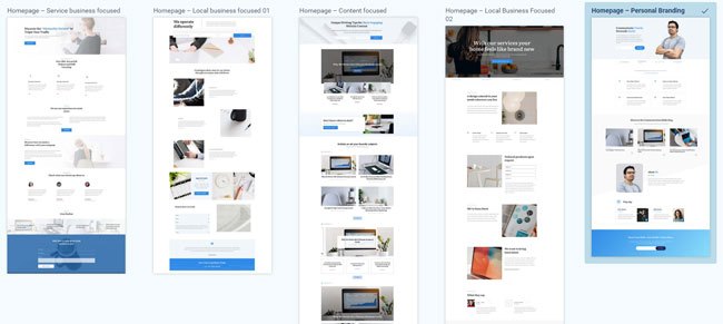
If you’re a Thrive Suite user, you can enjoy the benefits of designing with conversion-focused templates that were built by design professionals. All the hard work’s already done for you, you just need to add your text and images, and change the color scheme to match your brand’s.
5. Maintain Consistency in Your Design
Consistency focuses on ensuring your design is uniform – so your audience can easily recognize your brand when they land on your website.
The most basic things you need to do to achieve consistent branding are all about repetition:
A brand's identity consists of some key components that form a recognizable mood. The key components are the brand’s color, typography, visual style and communication tone. So, to represent a brand properly, the website will need to consistently use those key components across its content.
– Bogdan Pop, Design Lead @ Thrive Themes
Thrive Suite users have the upper hand here because they have access to Thrive Theme Builder and Thrive Architect.
In Thrive Theme Builder, you get to set up a consistent theme design (complete with a sitewide color scheme and typography). These changes are carried over to any Thrive Architect page template you load, allowing you to dive in and create consistent landing pages that reflect your brand.
6. Make Website Navigation Clear and Straightforward
Straightforward, seamless navigation is a core part of good web design.
A well-structured navigation system helps your visitors find what they’re looking for quickly and without hassle.

Key elements of navigation ease include:
A clear, consistent main navigation menu (usually a dropdown menu) that serves as the roadmap for your website
Logical, well-thought-out page organization that creates a natural, intuitive flow
Search bar accessibility (in the header, footer, and/or sidebar of the website)
Well-organized content that can be navigated intuitively
7. Ensure Your Site Design is Responsive
In a world where our phones and tablets have almost become an extension of ourselves, having a mobile-friendly website is non-negotiable.
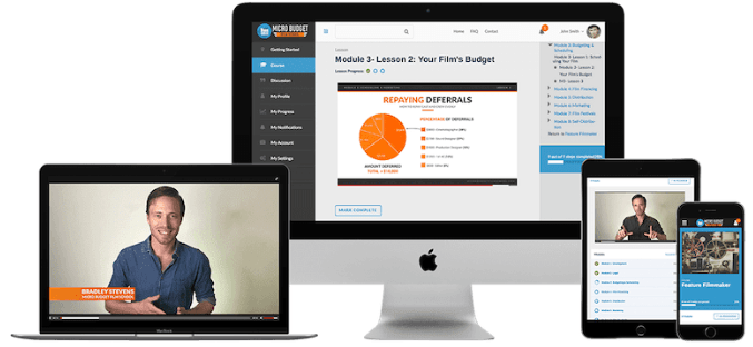
Websites need to work simulaneously across laptops, desktop PCs, tablets and smartphones.
When a visitor accesses your site through their mobile device, your site’s content and layout should adjust automatically, allowing for easy navigation and an enjoyable experience.
If you’re using Thrive Architect, you can optimize your pages and create a mobile version of your website in seconds.
Thrive Architect features a built-in “Responsive Design” feature that lets you manage the display of certain elements on the Desktop, Tablet, or Smartphone interfaces
8. Optimize Your Site for Speed
Websites that load quickly meet user expectations for efficiency and immediacy.
Slow-loading pages can lead to frustration and high bounce rates, as users are likely to leave a site that doesn’t load promptly.
To avoid a slow-loading website, you should:
Optimize your images and videos
Ensure none of your plugins are outdated
Use a theme that is built with clean code and is updated regularly
Install a site speed plugin (or tools found in Google Search Console) for additional assistance
Thrive Theme Builder also includes a Website Speed Optimization tool to ensure your website loads fast.
This feature is automatically activated on your website, so you don't need to do anything here.
Our site performance optimization tools are simple to understand and straightforward to use, so you can complete this setup in less than a few minutes.
9. Choose Your Color Scheme Wisely
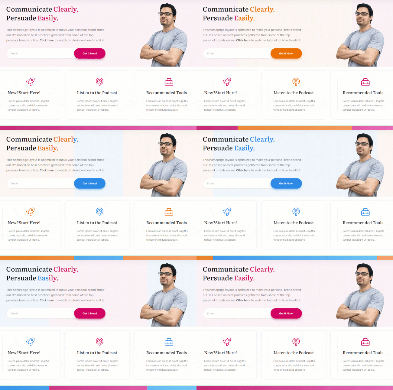
Choosing the right color scheme is crucial for your website because colors do more than just make things look nice. They can affect how people feel and act on your site. Pick colors that match what your brand stands for and make sure they work well together to make your site easy to read and use. Your colors should help highlight important parts and guide visitors around your site.
How can Thrive Theme Builder help?
Ensuring consistency across your WordPress theme is a core feature of Thrive Theme Builder.
Simply select colors that match your brand, and watch your website instantly update every element. We call this Smart Color Technology because, well it's pretty darn smart!
10. Use Readable Typography
If you've gone to the effort of publishing amazing content, it's time to consider how typography affects readability.
Every heading, sentence, word and link will be transformed – positively or negatively – by your choice of font and typeface.
Font Typefaces
Don't mix font different typefaces or sizes across similar elements.

Avoid heavily cursive or serif fonts, except for stylised headings and short text elements. They are more difficult to read on screens and make a page feel needlessly busy:
Imagine reading this entire article in this font!
Design headings for structured content
HTML headings (H1, H2 etc.) are created to provide hierarchy information to search engines and screen readers, as well as visual separation to visitors. This is key for SEO.
Avoid using HTML headings for global, non-content elements (navigation, breadcrumbs, widgets). Better schemas are available for these while leaving HTML headings for the main page content.
Inline formatting
Use inline text formatting sparingly (like bold, italics and highlighting). Done right, they emphasize critical information like features and benefits. But remember, when everything is emphasized, nothing is!
Screen Sizes
Test your typography across different devices: full screen, tablet and mobiles. Font size, letter spacing, line height and color can look surprisingly different on smaller screens.
Beautiful fonts updated in real time across every page on your site. Use our powerful typography editor to manage your global fonts and styles. Only available in Thrive Theme Builder!
11. Include Visual Elements that Support Your Brand Message
Break up text with high-quality images, videos, and infographics.
Multimedia elements can make your content more engaging and shareable, offering a richer user experience.
Plus, they can help explain complex topics in a more digestible format.
If you’re building your business on a budget, consider creating your own website images with affordable tools.
Always resize and optimize your images to avoid hampering your site’s load speed.
On Web Design and SEO...
Typically, a clear and efficient design will also perform better for SEO.
The reason is simple: search engine algorithms are built in a way that should reflect the average human’s necessities when interacting with a website.If your design is clear, responsive, and fast to load – both humans and robots will be more drawn to it.
Some more subtle details help as well, like contrast. If you play too much with soft shades of colors or thin texts, SEO will be impacted, and other websites with more readable content and buttons will get a higher ranking.
– Bogdan Pop, Design Lead @ Thrive Themes
12. Use White Spacing Strategically
White space (negative space) is a calming buffer of nothing that frames your content.
Sounds very zen, doesn't it?
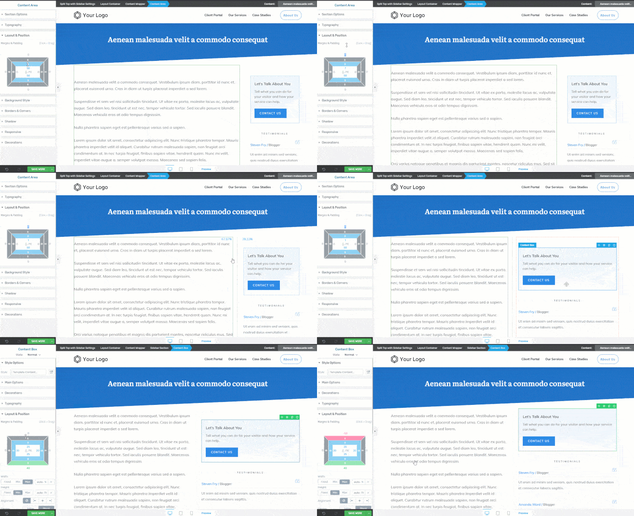
Don't feel you have to pack every web page with information-dense elements. Use margins and padding to help visitors feel less overwhelmed and showcase your most important content.
Obvious caveat: White space isn't necessarily white. If your background color is light blue, then so will your white space!
You'll find pixel-perfect whitespace in all our templates, straight out of the box.
However, feel free to tweak your own margins and paddings to match your brand and personality. Of course, as with everything in Thrive Theme Builder, your changes will show instantly on all similar WordPress pages that use the same template.
13. Limit Your User’s Options (Hicks Law)
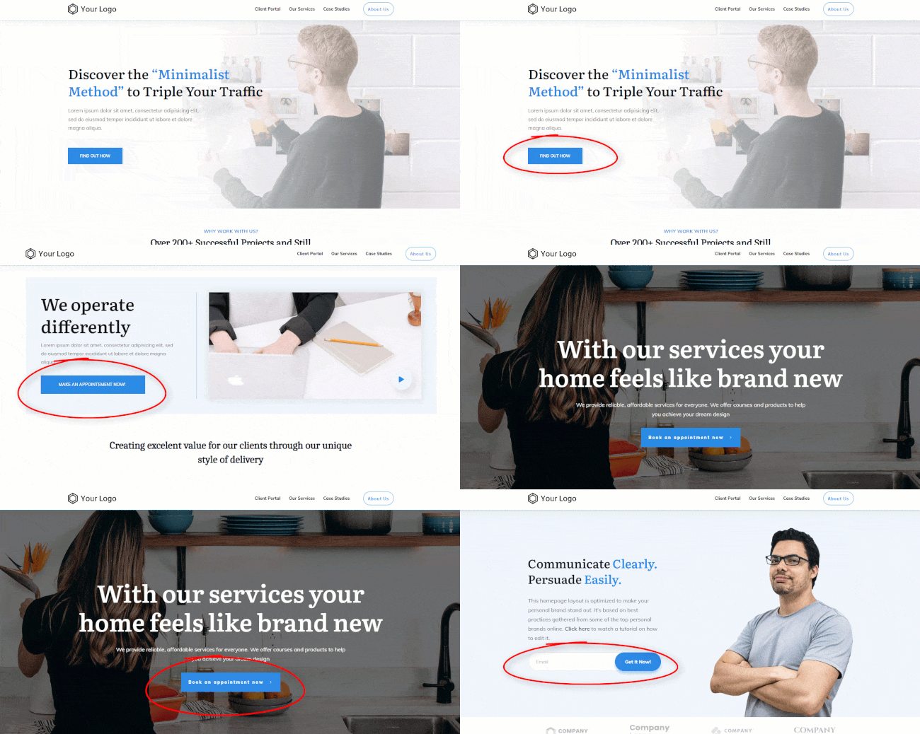
Hick’s Law suggests that the more choices you give someone, the longer it takes for them to decide.
So, when designing your website, keep choices to a minimum. This could mean having fewer menu items, simplifying forms, or offering a streamlined checkout process.
The goal is to make navigating your site as easy and quick as possible. By reducing the number of decisions users have to make, you help them find what they need faster and improve their overall experience on your site.
Make your visitor's next step a no-brainer.
Thrive Suite offers custom-made templates for the most common types of business and brands: services, local business, content publishers, and personal branding.
Each template is designed to help your audience find what is important... both to them and your business.
Next Steps: Start Building Your WordPress Website
As you read through all the must have features your website should have, you may have felt a bit overwhelmed. If you’re new to building websites and don’t have a lot of experience, you might be worried about finding a way to include most of these features without needing to learn complex code.
But you don’t need to fret - at all.
There are a variety of high-quality no code tools designed to help you build a website without needing to take a crash course in HTML & CSS.
Here are a few resources to help you understand how to build an impressive WordPress website, without needing to code:
Best Web Design Principles: Turn This Tutorial into Action
You can build a professional-looking website that will impress your potential customers and turn them into paying customers – all by yourself! And if you’re building a website on WordPress, you have thousands of plugins to choose from.
However – you’ll need to make sure you select the right bundle of plugins to ensure your website runs smoothly.
To do that, you have two options:
1. Buy an array of plugins from different stores & developers...and risk them clashing and even crashing your website…
2. Purchase Thrive Suite, the all-in-one plugin toolkit you need to create a stunning, engaging website that generates conversions.
When you purchase Thrive Suite -- at a steal, might we add -- you get access to 9 powerful plugins that turn your site structure into an engaging website your potential customers will love.


