A landing page is the front door to your sales or marketing funnels.
This is where your website visitors are introduced to your business, products and services, and encouraged to learn more, sign up or make a purchase.
But, to get your visitors to move past your landing page, and into your funnel, you need to give them a compelling reason to do so.
This post covers all the information you need to understand what a landing page is, the different types of landing pages you can build, and the different design elements required to make a landing page that converts.
Ready to learn how to build great landing pages to boost your conversion rates and grow your business?
Keep reading…
More...
What Is a Landing Page?
A landing page is a standalone page, often separate from any other page on your website, with a single purpose: to turn your visitors into new leads or new customers.
Think of a landing page as a bridge between where your audience currently is (curious about your business and products) and where you want them to be (signed up & paid up for your offer).
Essentially, a landing page is a follow-up to a promise you’ve made to your audience — through a blog post, email, social share, or ad — and this is where they come to learn more and take action.
For example:
Landing pages are beneficial to your business because they can help create an amazing first impression for your business, boost your conversion rates, and grow your mailing lists.
Examples of what you can offer on your landing page, include:
Landing Page vs Homepage: What’s the Difference?
Homepages and landing pages differ when it comes to the goal they’re trying to achieve, the traffic directed towards them, and the navigation options they offer to visitors.
1. Goal
Your homepage can be considered the “front door” of your website. The purpose of your website’s homepage is to:
- 1Introduce your visitors to your business
- 2Explain your products and services
- 3Prove why your visitors can trust you to solve their problems
Consider Semrush’s homepage:
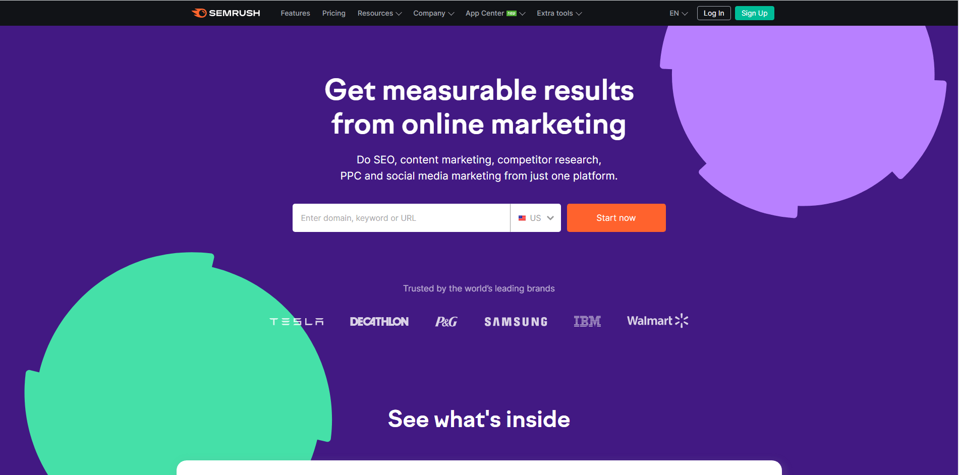
Semrush’s homepage.
The moment you land on their website you learn about the services they offer, how they can help your business, and you even get a chance to test drive one of their products – their keyword researcher.
If you scroll down the homepage, you’ll find more information on the products they offer, testimonials from some of their customers, and social proof to show you why you can trust their business.
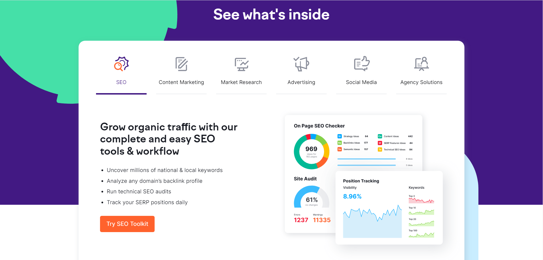
Semrush’s homepage includes details on all the products they offer.
A landing page, on the other hand, is focused on getting your visitors to take a specific action.
This could look like getting them to:
Let’s look at an example from one of Semrush’s landing pages:
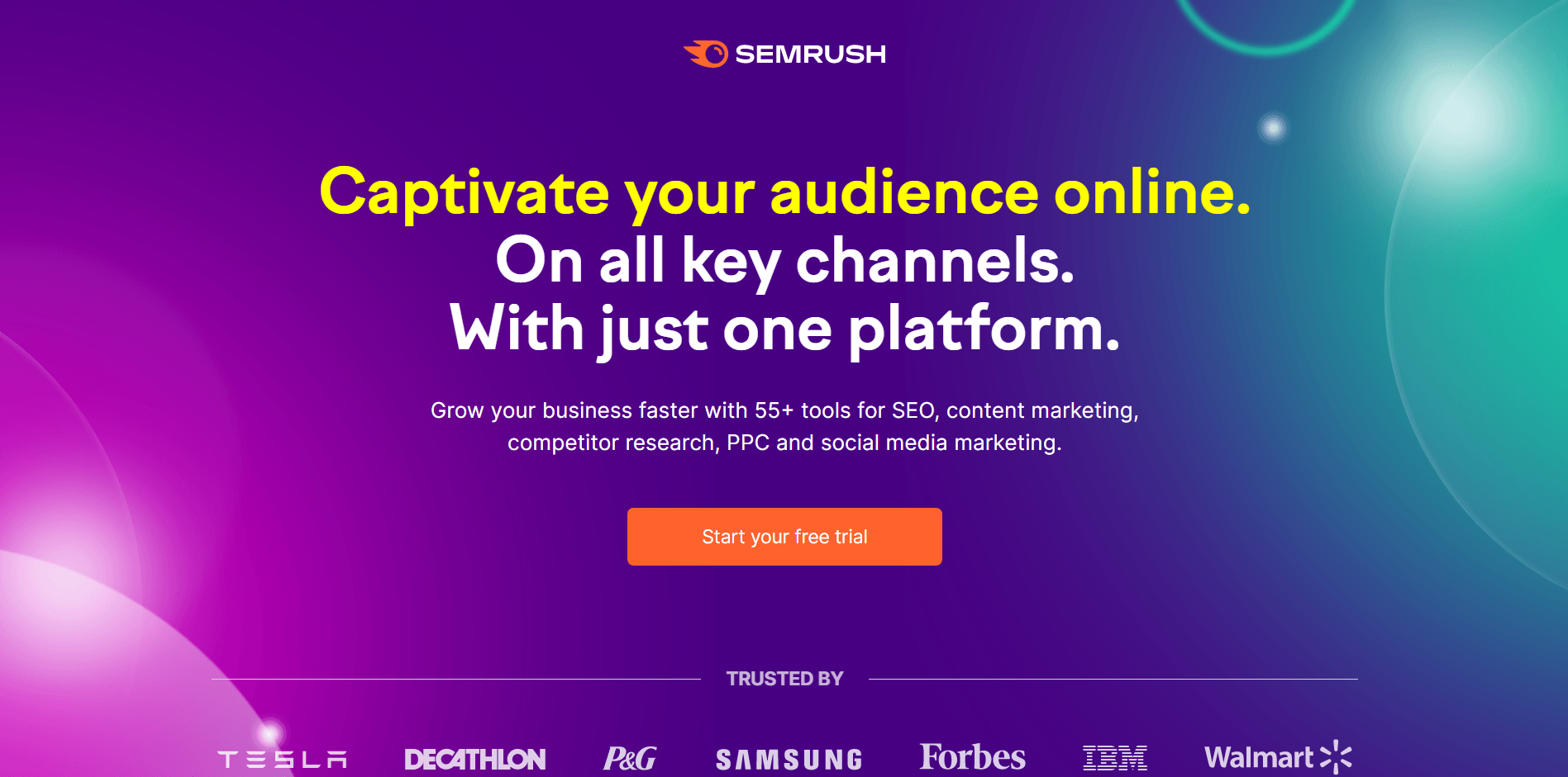
One of Semrush’s standalone landing pages.
The goal of this page is to get visitors to start a free trial of their software. When a landing page focuses on one goal, this makes it easier to get visitors to convert.
2. Traffic
If you search for “seo tool” on Google, you’ll find a few paid ads at the top of the search results page.
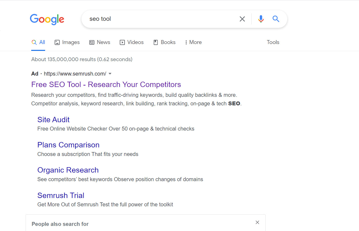
Search engine results for “SEO tool”.
When you click on the first result — Semrush in this instance — you’re directed to a landing page:

Semrush used their paid ad to direct traffic to one of their single-focused landing pages.
Semrush has to pay to get the top ad space on the search engine results page — which means they have to get a worthwhile return on their ad spend in order to be profitable.
The goal of running paid ads is to get as many conversions as possible — which is why it’s advisable to direct paid traffic to a single-focused landing page, as opposed to a homepage.
A homepage usually gets traffic from unpaid sources – content shares on social media, organic traffic through search, etc. Since a homepage has multiple areas of focus, it’s not wise to direct paid traffic there as there is a higher chance of your visitors dropping off without taking action.
3. Navigation
If you take a close look at some of the landing pages examples I’ve shared, you’ll notice that they don’t have a header at the top. This is deliberate.
Since a landing page is designed to achieve a single business goal, you’ll find that many won’t have top bar navigation to prevent visitors from leaving the page.
Homepages, on the other hand, are designed to guide visitors to other parts of a website so they need to have a header — and even a sidebar — for navigation.Use Thrive Architect to Build a Conversion Focused Header
Did you know you can use Thrive Architect to optimize your headers and create landing page designs that convert?
Watch this video to learn how to create a conversion focused header that keeps your offer at the front of your visitors’ minds:
Types of Landing Pages
Each type of landing page has its own purpose. In this section, you’ll discover the most common types of landing page you’ll come across and what they are used for:
Squeeze Pages
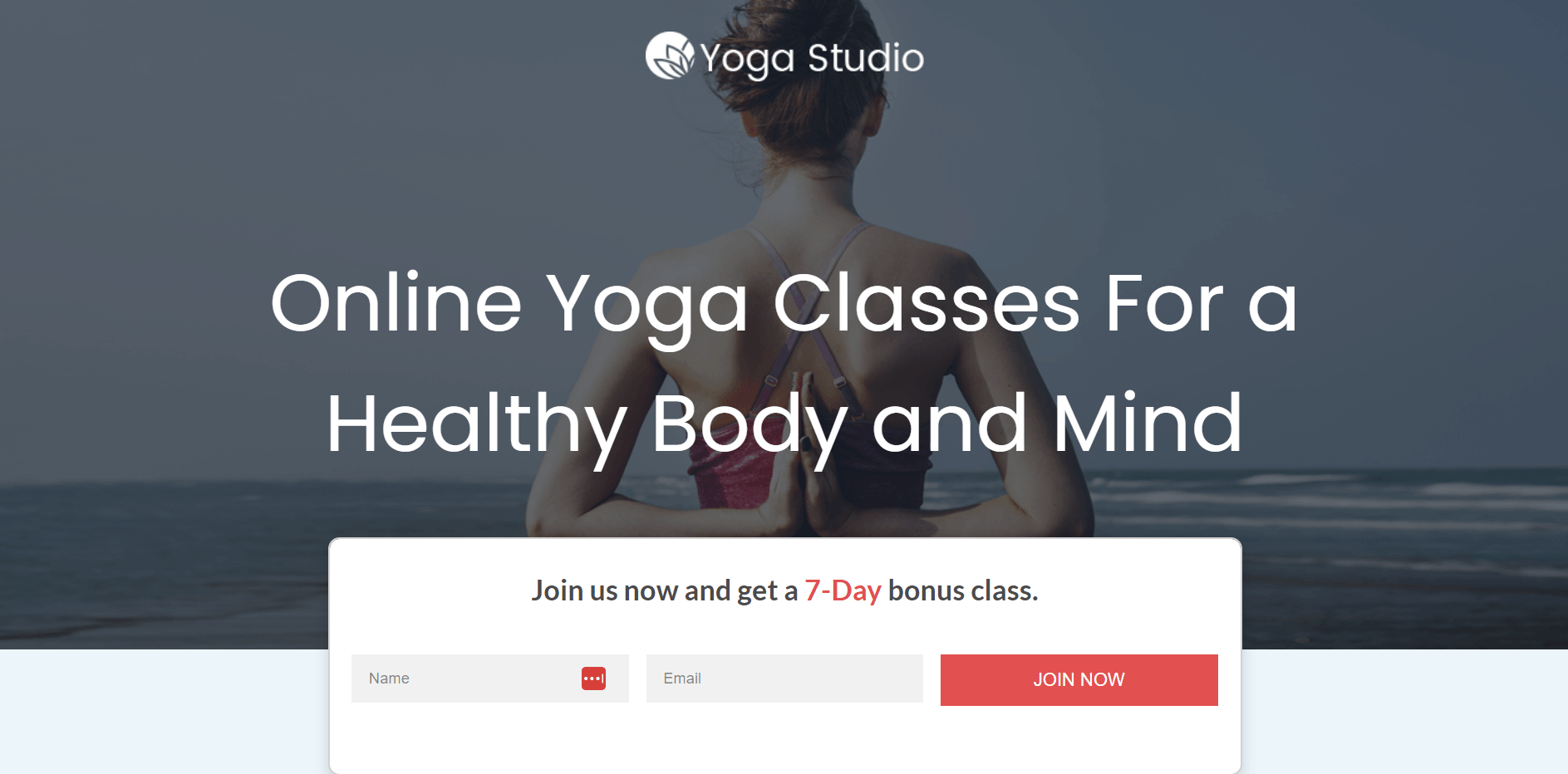
Squeeze pages have one goal: collect visitors’ email addresses quickly.
A squeeze page is a type of landing page that focuses on collecting email addresses from website visitors. You can encourage visitors to share this information by offering them a valuable, irresistible offer in return.
Your offer can be an ebook, online course, gated content, whitepaper, etc.
Squeeze pages can play an important role in your marketing strategy because once you collect your visitors’ email addresses, you have the opportunity to connect and build a relationship with them away from your website, and provide product information and special offers (coupon codes, sales, freebies, etc.)
But, a successful squeeze page doesn’t just ask for your visitor’s email addresses. Squeeze pages should also make it clear how your offer can solve a problem your visitor is facing.
So, if you’re a nutritionist offering a free recipe ebook, focus on explaining the health benefits your visitors will experience after reading your book. Give them a reason to want to give you their information.
Splash Page
Are splash pages still in? You may be wondering.
For some businesses, yes – and they’re working.
Where squeeze pages, and other types of landing pages, focus on getting visitors to opt in or convert, splash pages serve a different purpose.
Splash pages can be used to get visitors to fill in certain information before they view your website.
Patron, for example, uses a splash page to restrict content from viewers under the age of 18.
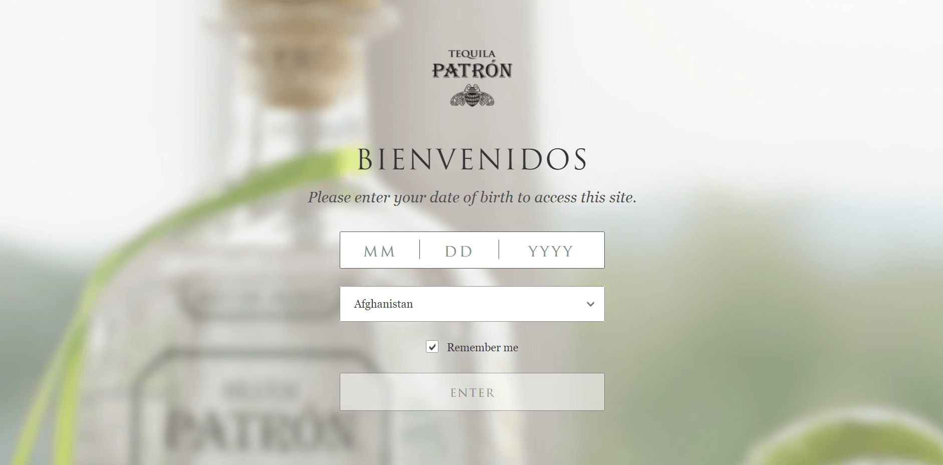
Patron uses a splash page to gate their age restricted content.
Once you’ve entered your date of birth, and confirmed that you are over the age of 18, you’ll be granted access to the rest of the website.
You can also use a splash page to make an announcement or showcase specific content. Zara, for example, uses their splash page to display items from their latest collections.

Zara uses their splash pages for artistic purposes — to showcase their collection.
Referral Page
A referral page is a landing page that persuades visitors to take action by offering a reward or compelling incentive. This is usually in the form of giving away a free item or a discount when they refer your product or service to friends or family.
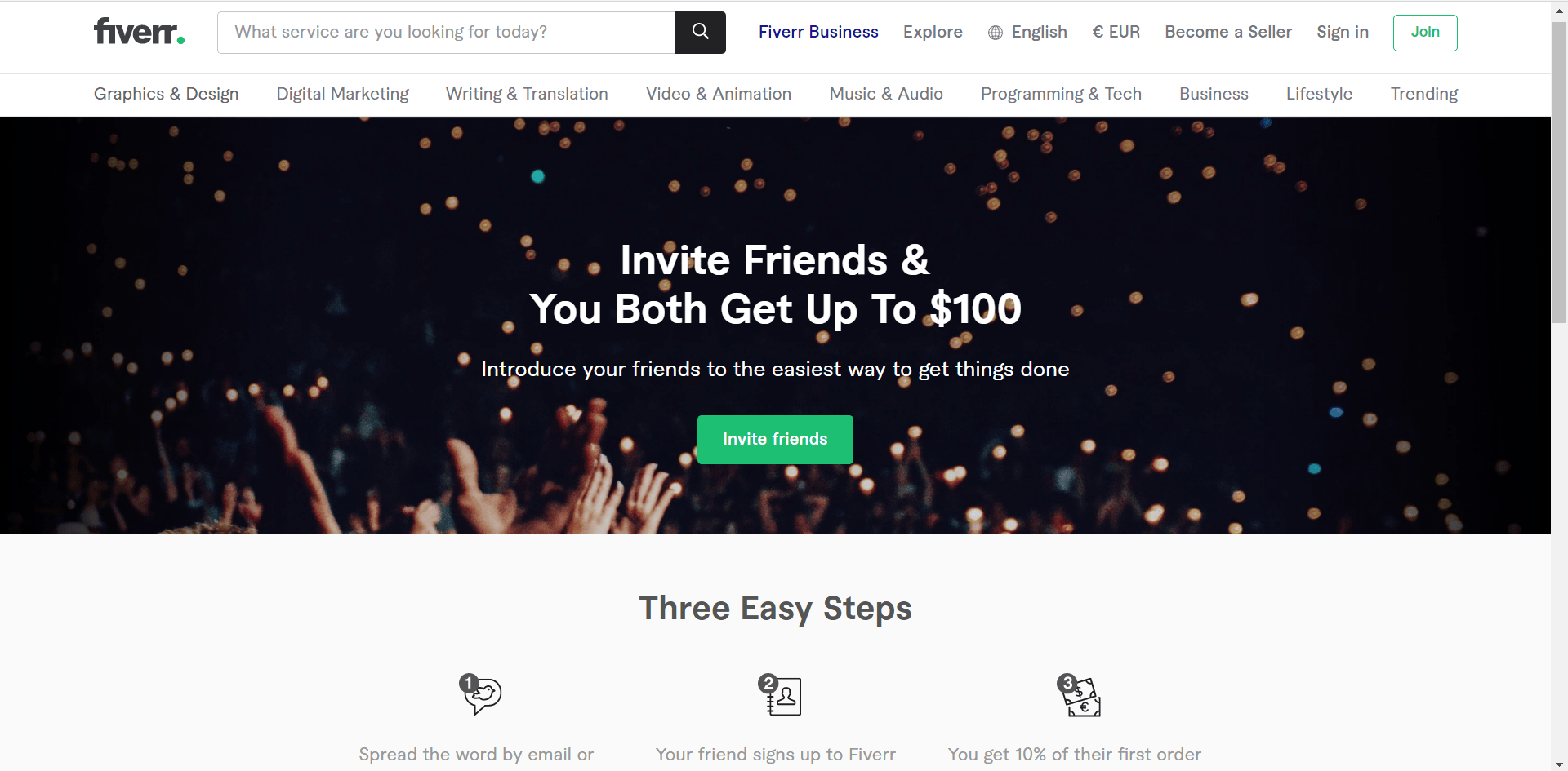
Fiverr’s referral page encourages its customers to invite their friends in exchange for up to $100.
The goal of a referral page is simple: Get your current customers to bring in more customers from their immediate networks.
This can be a win-win situation for everyone involved because your current customers get rewarded for referring them to your business, and you get new customers who are already interested in your business.
Lead Capture Page
A lead capture, or lead generation, page is similar to a squeeze page but typically collects more information from visitors – e.g. name, business name, email address, job title, phone number, industry, etc.
The information you choose to collect on this page depends on your goals for this specific landing page — and where your visitor is in your funnel.
For example, this lead capture landing page from ConvertKit offers a free webinar in exchange for their visitors’ information.
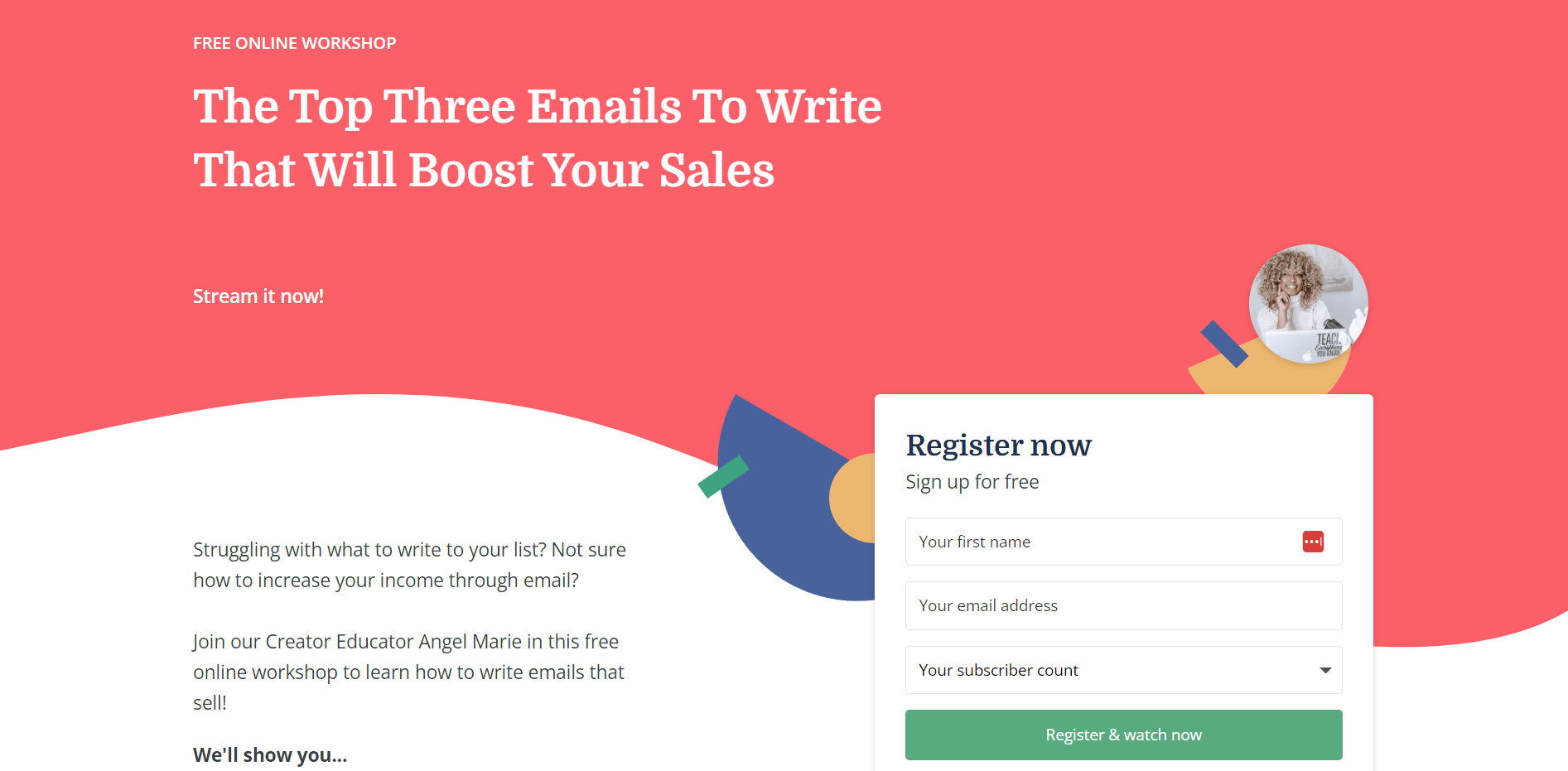
ConvertKit offers a free webinar in exchange for their visitors’ email addresses.
But instead of just asking for the name or email address, they’re also asking visitors to specify the number of subscribers they have. This is a great way to segment their mailing list and send emails to the right audience.
For example, if you create a guide on how to grow your subscribers, you can send it to the “0 - I’m just getting started” segment of your mailing list, since that resource will be more beneficial for them than the “25,000+” segment.
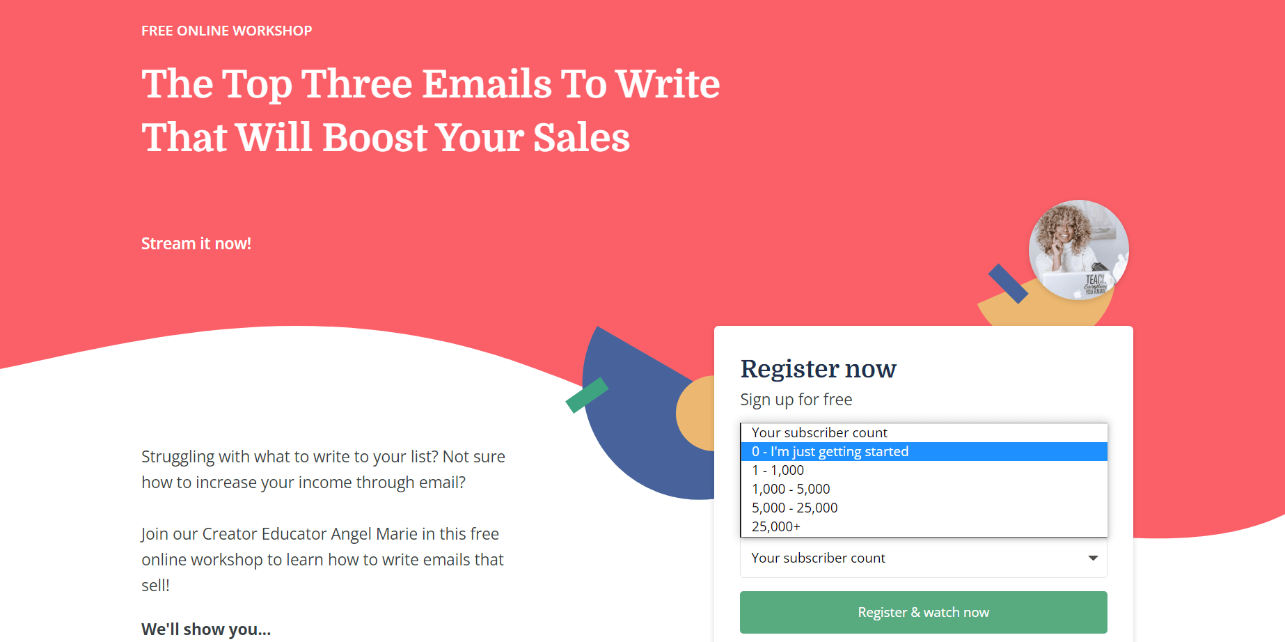
You can also use lead capture forms to segment your mailing list.
Long Form Sales Page
Long form sales pages have one goal: To get your visitors to buy.
This page is the very definition of “leave no stone unturned” because this is where you must answer every question your potential customer has — and address any barriers that could stop them from making a purchase.
Take a look at our Thrive Architect sales page for example: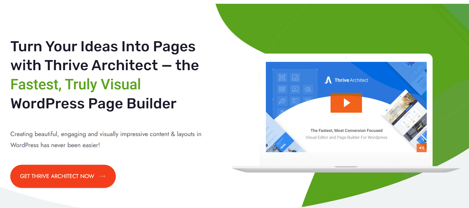
Hero section for the Thrive Architect sales page.
The moment someone lands on this page, they get a clear idea of what this product does: Helps you to build attractive, conversion-focused web pages in rapid time.
The hero section also includes an informative video to support our claim. As you scroll through the page you’ll find:
There are also several CTA buttons placed on different parts of the sales page, so visitors can take action when they’re ready to purchase.
With this type of landing page, every section counts. When you build your own sales pages, make sure to keep your writing clear, direct, and focused on showing your visitors how their lives will change after purchasing your product or service.
Paid Advertising Page
Your paid ads should direct your visitors to a specific landing page where they can opt in and provide you with their email addresses — and other personal information.
Sending your paid traffic to other pages like a pricing page, might not be as effective because these visitors aren’t always ready to buy.
Take a look at this Facebook ad from BetterHelp:

Facebook ad for BetterHelp.
If you click the “Learn More” button, you’re taken to a landing page that contains a detailed questionnaire. The goal of this questionnaire is to collect your personal information so you can be matched with the right therapist.
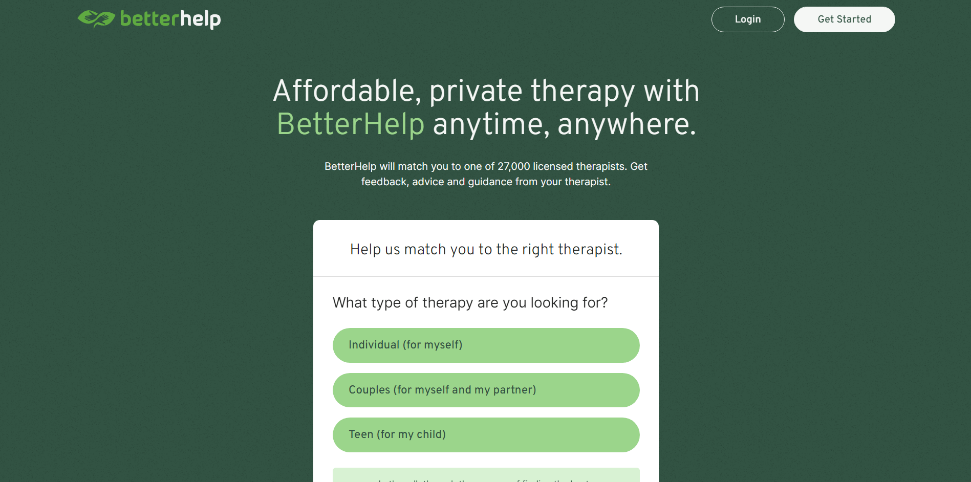
BetterHelp uses their social media ads to direct traffic to specific landing pages.
Once you’ve completed the questionnaire, you’ll be required to create an account and continue with the onboarding process.
Directing your paid traffic to a landing page with one specific goal can increase your conversion rate and give you a much better return on ad spend (ROAS).
404 Page
Although your website's 404 page isn't traditionally a landing page, it can still help you grow your email list and conversions using these tips.
Use your 404 page to redirect visitors to another part of your website. Take a look at the 404 page from Kwik, one of our smart landing page sets:
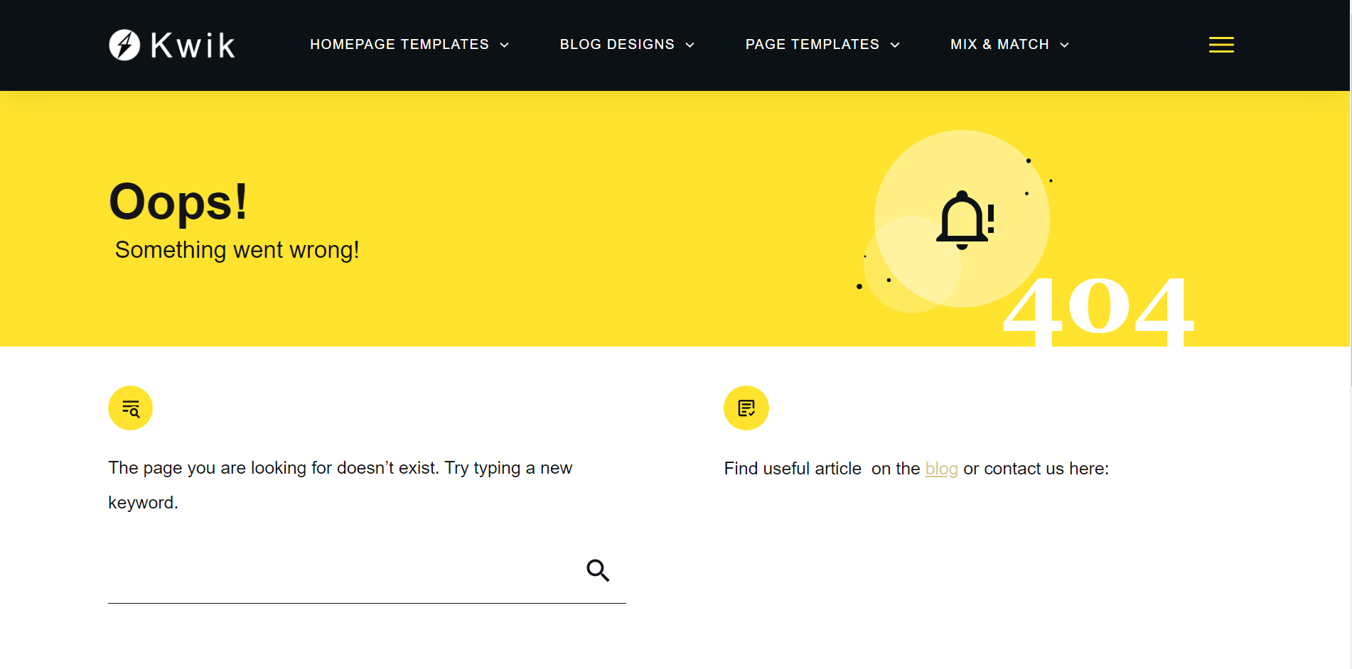
Use your 404 page to direct visitors to other important pages on your site.
The page gives visitors a chance to search for a new page using the search bar provided. You can also use this page to direct your visitors to your blog, contact page, or even a product page — the choice is yours.
About Page
Your “About” page can be a great place to generate conversions.
Take a look at this “About” page from online fitness coach, Lauren Simpson. She’s added a clear CTA button visitors can click to learn more about the methods she used to transform her body.
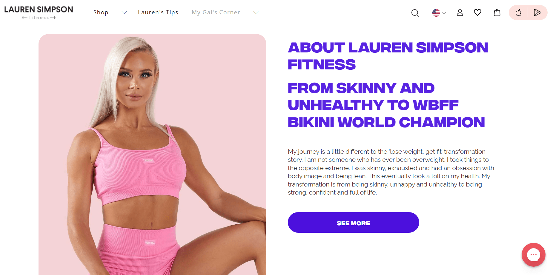
Top section of Lauren Simpson’s about page.
This button directs you to another landing page where you can see before-and-after transformations of her previous clients.
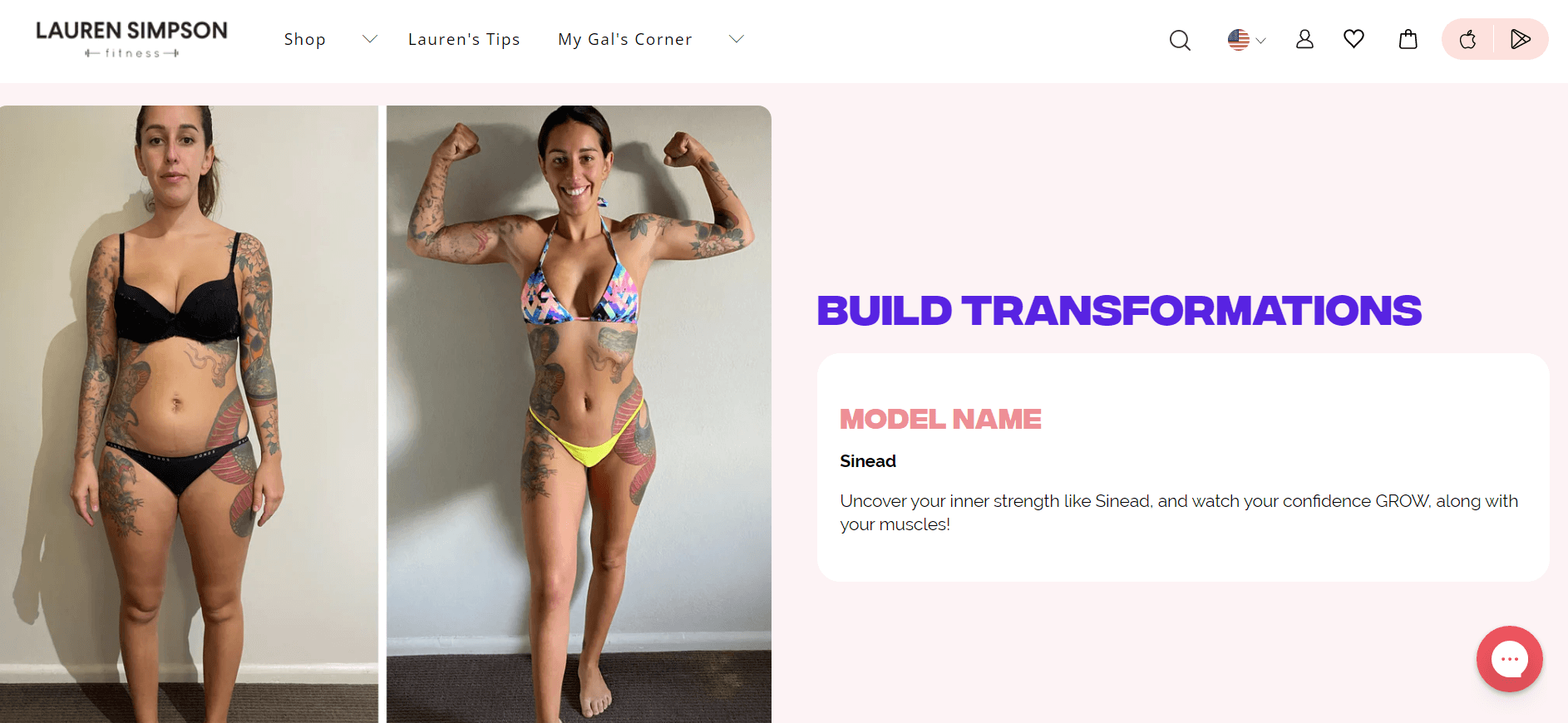
This site uses their About page to direct visitors to a testimonial page.
And when you get to the bottom of this page, you’ll find a call to action to join her community and achieve similar results.
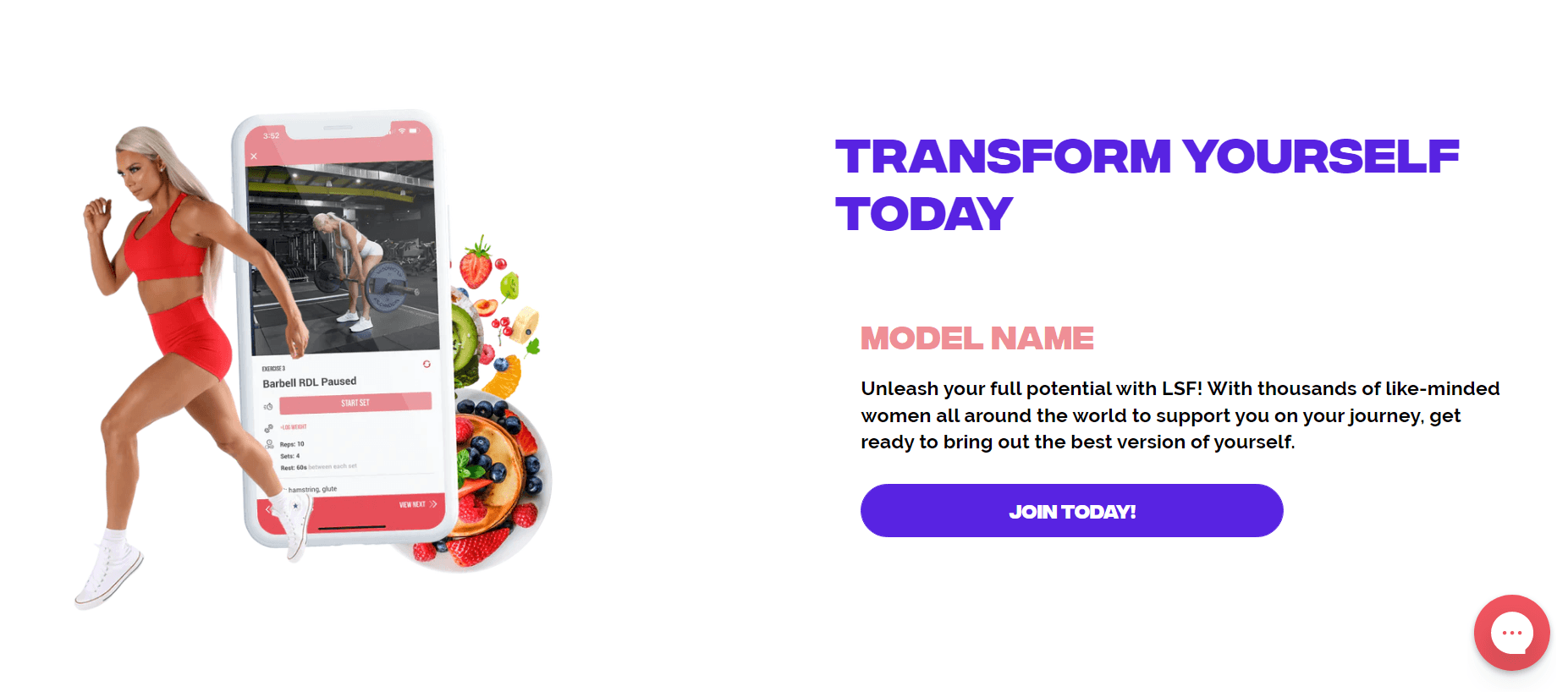
Once you reach the bottom of the page, you’ll find a CTA to join one of Lauren Simpson’s programs.
And where did this all start? On her About page. Don’t make the mistake of filling your About page with blocks of text that offer no value.
Coming Soon Page
Did you know that you don’t need to have a fully built website to start collecting leads? You can use a “Coming Soon” page to build anticipation for your new website, promote upcoming products and services, and collect your visitors’ email addresses.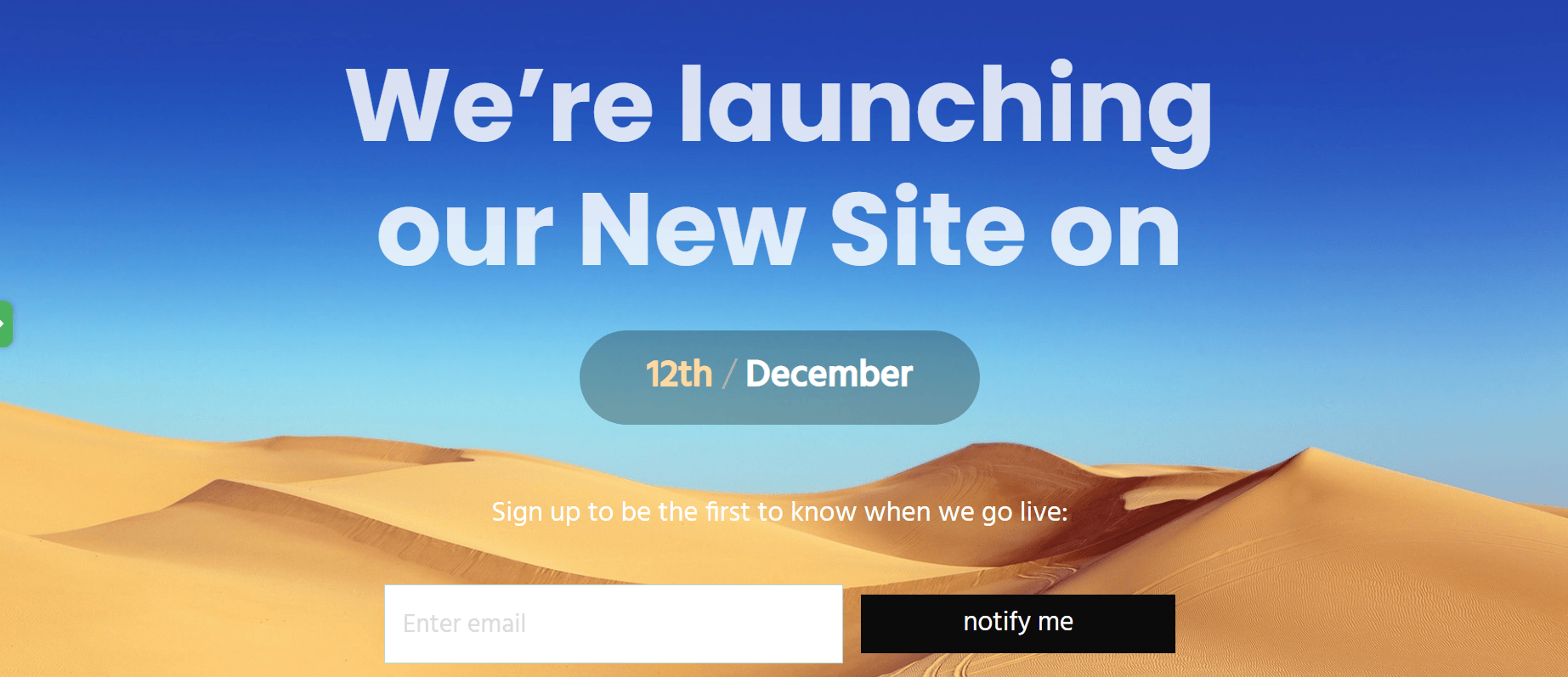
An example of a “Coming Soon” page template in Thrive Architect.
If you’re a Thrive Architect user, you have access to multiple, fully customizable “Coming Soon” templates you can use on your website.
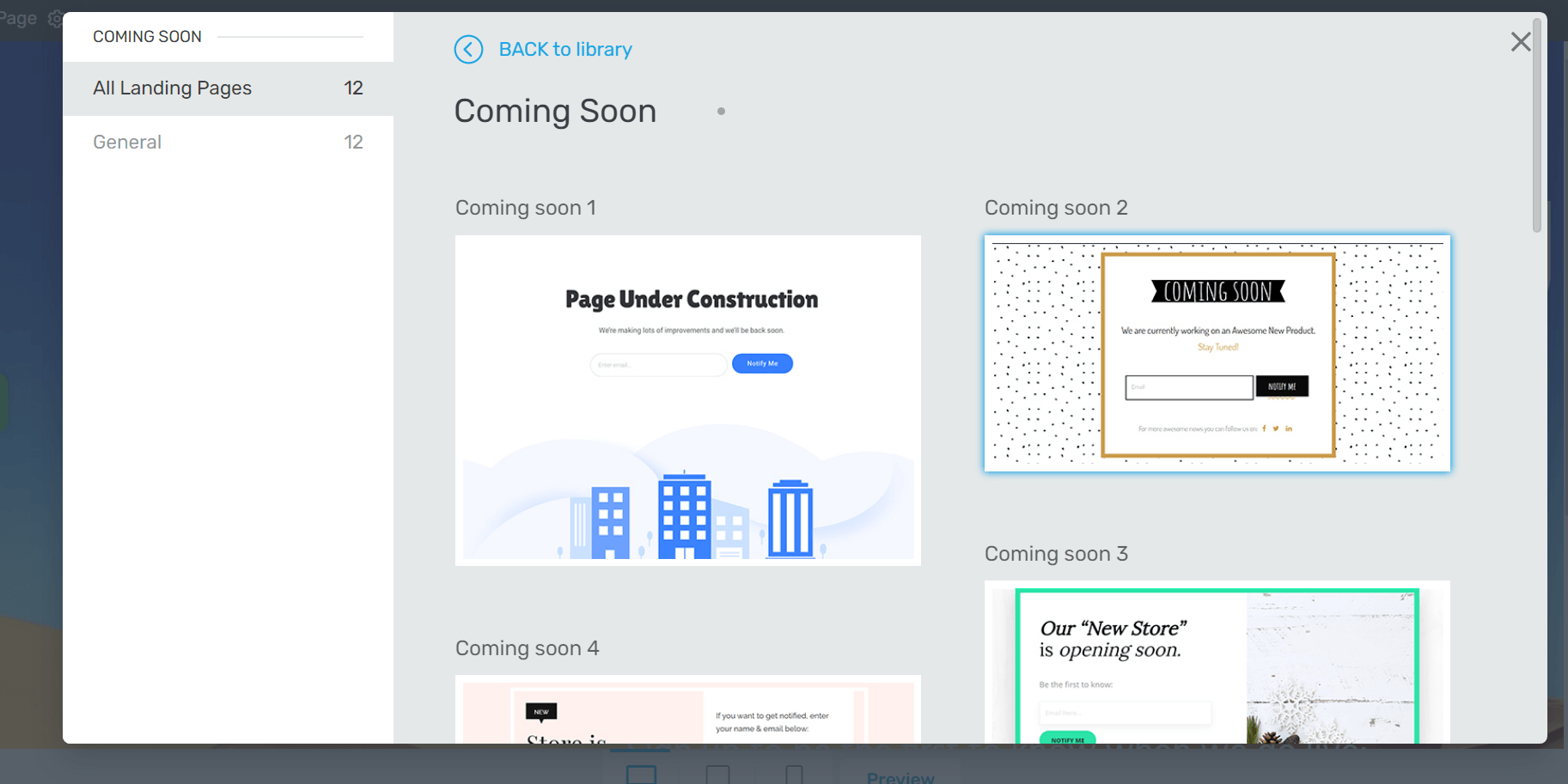
Gallery of “Coming Soon” page templates in Thrive Architect.
These templates are designed to help you get started fast. Watch the video below to learn how to set up your lead generating “Coming Soon” page in less than five minutes.
How to Choose the Right Landing Page
Knowing which landing pages to use — and when — boils down to asking these questions:
Once you have a clear picture of your page’s goals, you need to decide whether this should be a short or long form landing page.
Squeeze, splash, and referral pages are examples of short form pages. They provide “small” offers for a quick action in return. These offers don’t require a lot of detail, hence the need to keep them short.
Long form landing pages work best for sales and click through pages where you really have to communicate the value of your products or services to get your visitors to buy or sign up.
It helps to study your competitors’ strategies as well, to identify what’s working for them and what they need to improve on. You can use that information to shape your landing pages and the strategies you’ll use to drive traffic to these pages.
What Makes a Good Landing Page?
To increase the chances of getting your website visitors to convert, make sure to include the following elements in your landing pages:
1. A Benefit Driven Headline
When a visitor lands on your landing page, the main question on their mind is, “What’s in it for me?”
What can you offer them that they can’t find anywhere else?
Your headlines should be one of the first things to answer that question.
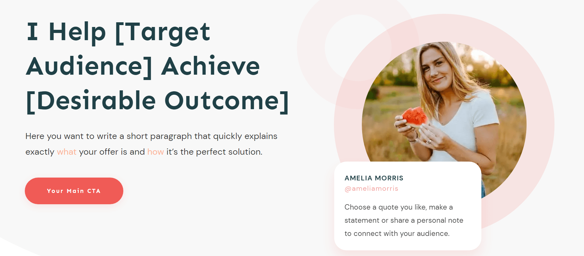
Hero section from Ommi, one of Thrive Architect’s smart landing page template sets.
The best way to win your audience over is to clearly communicate how your products will make their lives better. Remember, people visit your page because they have a problem they want to solve.
So you need to tell them right away how your valuable offer (ebook, online course, webinar, etc.) will help them achieve the results they’re looking for.
In addition to your headlines, the benefits of your offer should be clearly communicated on your landing pages - as well as the features they can expect to see.
Highlighting the features of your product is important because it gives your audience a clear idea of what to expect when they sign up or make a purchase - but your headline isn’t the place to do that.
Instead, you should try to speak about your product’s features in a later section of your landing page.
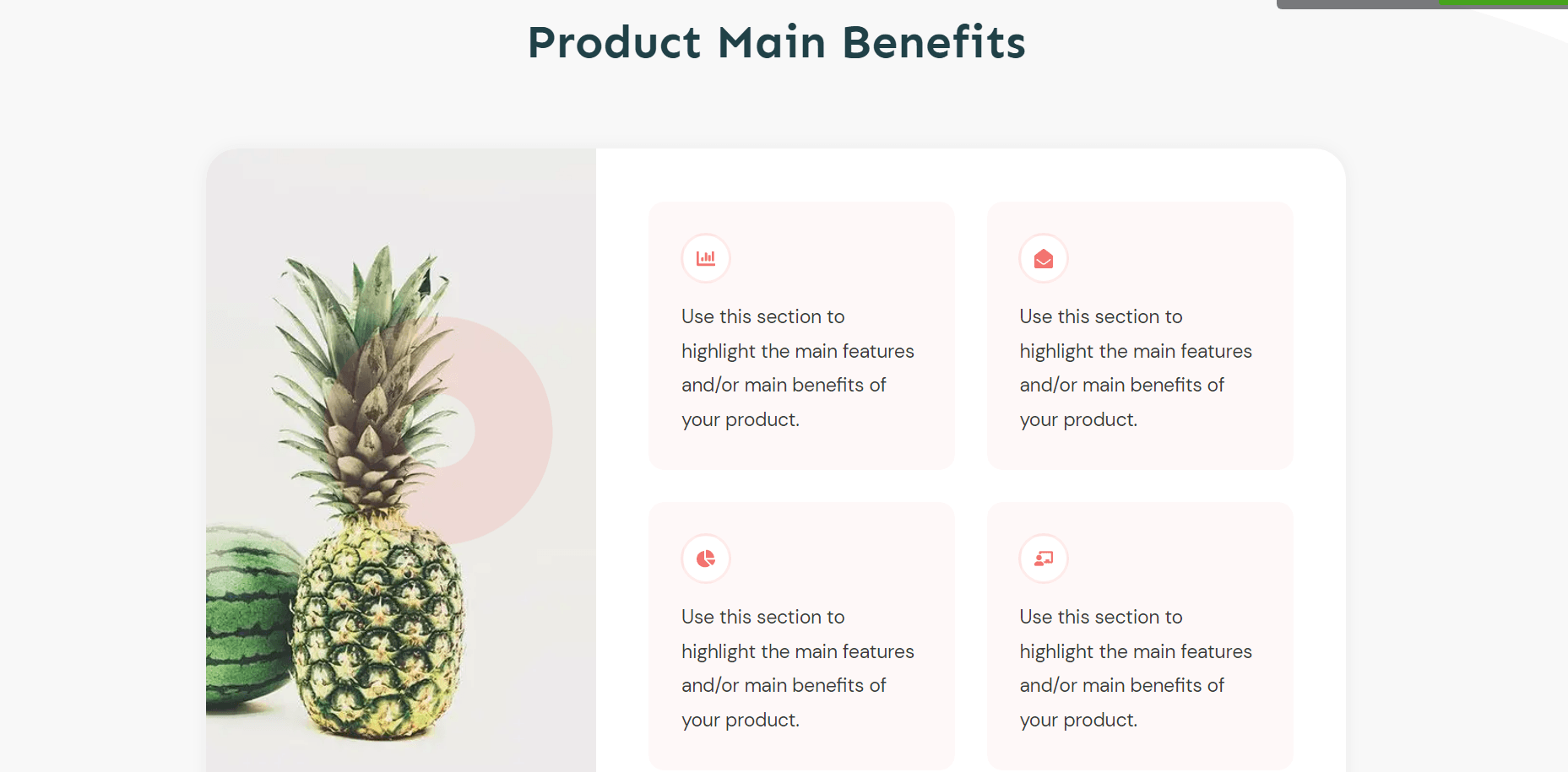
Some landing page templates in our Thrive Architect smart landing page template sets provide areas for you to clearly list your products’ main benefits.
2. Relevant, Eye Catching Images
Your image assets need to be high quality and relevant to your business. If your landing page is about fitness training for women, for example, then your image should be relevant to a female audience.
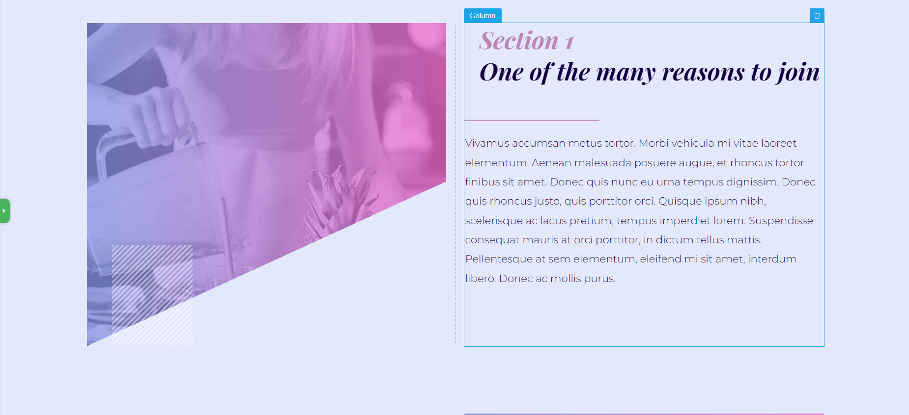
Use relevant images in your landing page to connect with your audience.
3. A Personal Connection or Humanizing Element
To get your visitors to buy from your business they need to trust you.
…and it’s pretty hard to win your visitors’ trust if they can’t tell who they’re buying from.
“Faceless” companies often seem suspicious because they give the impression that they don’t want to be transparent. How will your visitors know that your business is legitimate? What stops them from thinking, “What if this is a scam?”
Including elements like a bio and a photo of yourself, as the owner of the business, can drive up trust significantly. It makes it easier for your audience to trust you because they feel like they’re actually interacting with a person.
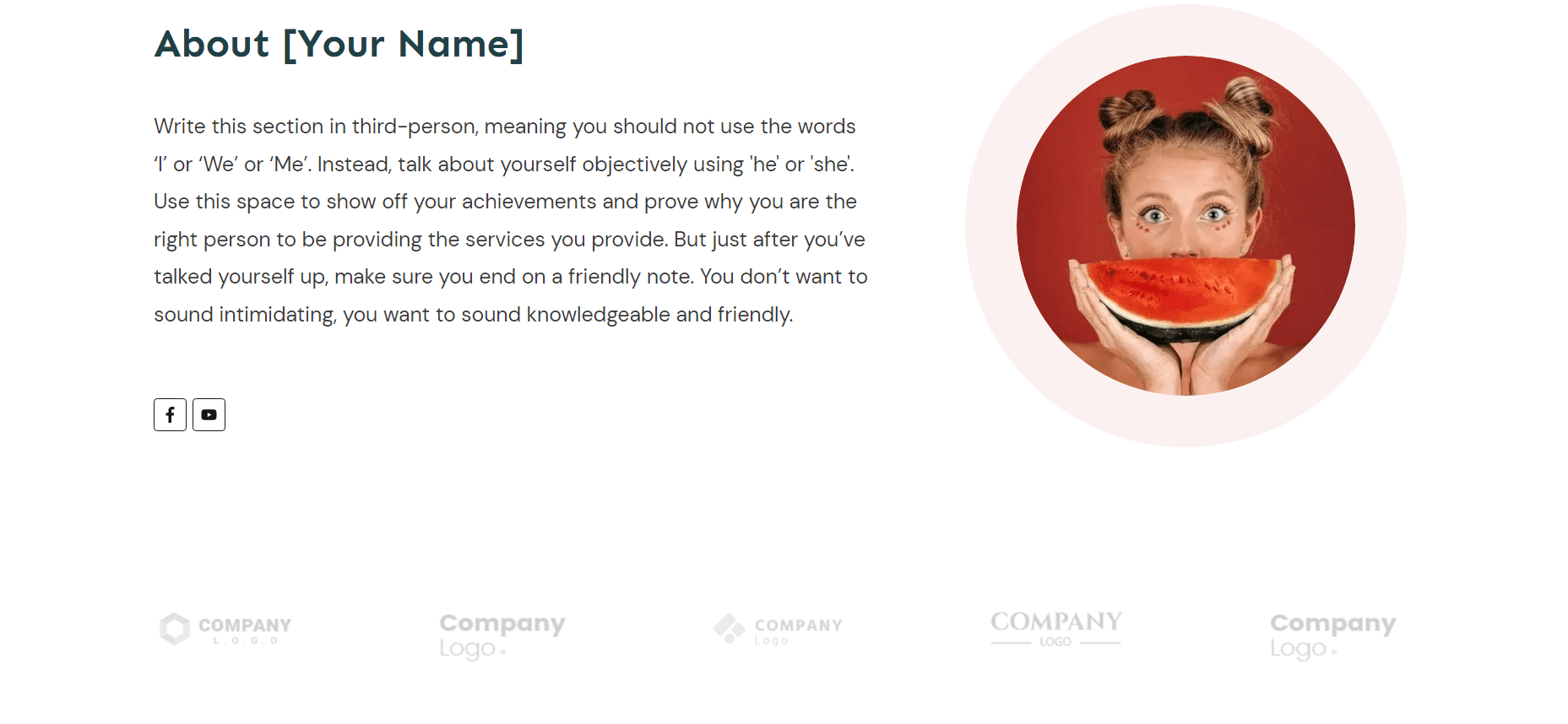
About us section from Ommi, a Thrive Architect smart landing page template set.
Adding a simple “About” section to your landing page, with a photo and a clear bio, can make a big difference in getting your visitors to convert.

About us section from Shapeshift, a Thrive Architect smart landing page template set.
In most of our landing page templates, an “About” section is included, to help you fill in the information quickly.
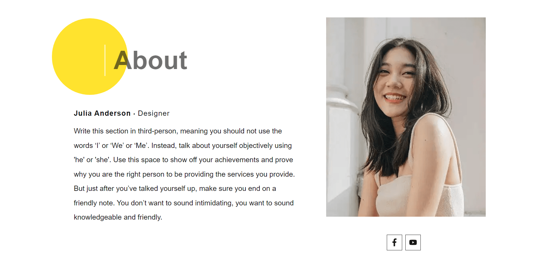
About us section from Kwik, a Thrive Architect smart landing page template set.
4. Testimonials
Testimonials are a great way to show new visitors that you offer high-quality products & services, and that your brand can be trusted to deliver.
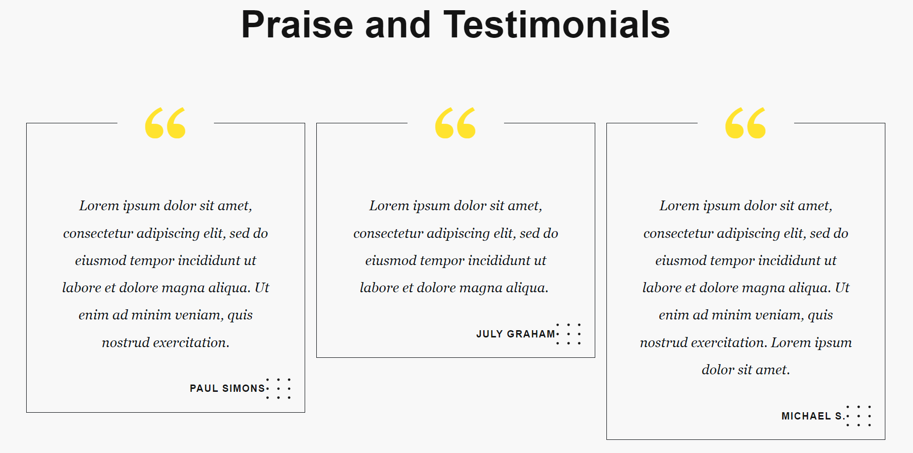
Use testimonials to show your visitors they can trust your business.
With a few solid testimonial on your landing page, you can easily:
5. An Easy-To-Spot Opt-In Button
Buttons may be small but they play a big role in getting your website visitors to convert.
High-converting landing pages have opt-in buttons that are in plain view and fairly high contrast to the background of the landing page so they are easy to spot.

Use clear, direct text and a bold color to make your CTA buttons hard to miss.
The messaging on these buttons should be enticing; encouraging your audience to click and access your offer immediately.
6. Optimized for Mobile
There are over 6.4 billion smartphone users worldwide, and the average adult spends up to 3 hours on their phone daily.
This statistic alone is enough reason for you to take mobile optimization seriously. One of the biggest mistakes businesses make is assuming that their webpages are automatically optimized for mobiles - but this isn’t the case.
A number of core elements on landing pages, responsible for aiding conversions, can become almost unreadable on smaller screens. So, while your page may look great on a desktop screen, it can look awkward and hard to navigate on a phone or tablet screen.
That’s why it’s important for you to view your landing pages on different screens and make sure that every element is in place.
TIP: To learn more about best practices for landing pages that convert, watch this video:
7. Frequent Split Testing
The first version of your landing page will not be the best version.
That’s why it’s important to test your pages frequently, to identify what’s working well and what needs to be improved.
Think of it this way:
More A/B testing
=
More insight into page designs that convert
=
More subscribers and sales
So, the more you test, the closer you are to creating consistent growth for your business.
When you build your pages with Thrive Architect, you also get access to Thrive Optimize to perform simple, fast and highly effective A/B tests directly on your WordPress website.
And if you’ve never run an A/B test before, now would be the perfect time to start.
Create Conversion Focused Landing Pages with Thrive Architect
If you aren’t a designer or a kickass coder, building conversion focused landing pages for your business can be a challenge.
…that’s why you need Thrive Architect, our visual WordPress page builder.
This tool is built to help you create stunning, engaging pages in minutes, so you can spend more time focusing on your business.
On top of that, Thrive Architect gives you access to 70+ Smart Landing Page Template Sets and 800+ professionally designed Block templates too!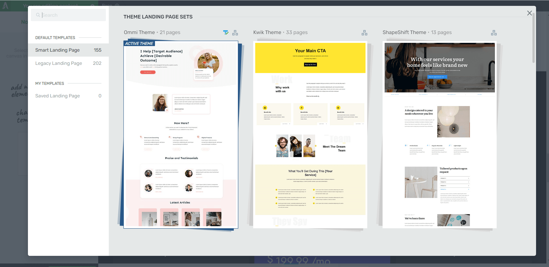
Use our smart landing page sets to setup your landing pages in rapid time.
Creating conversion focused landing pages just became much easier.
Click here to learn more about Thrive Architect and how you can use it to take your website to the next level.


Is the https://staging.thrivethemes.com/ homepage the landing page?
And is the Thrive home page A/B Test according to Goal as Visit Goal Page to Thrive Suite?
Hey there!
For your first question, no. Our homepage has elements of a landing page (CTA buttons, testimonials, relevant images) but it serves to introduce our visitors to our products — which then leads them to different landing pages (for Thrive Suite, Thrive Architect, Thrive Quiz Builder, etc.). An example of one of our landing pages would be: https://staging.thrivethemes.com/architect/
Regarding your second question, an A/B test would work better for a landing page that is focused on a single goal (e.g. getting visitors to start a free trial, opt in to a form, or buy a product), so you can see which page helps achieve that goal more.
Thank you many