The rise of hero-image landing page design has certainly grown in popularity over the past few years — especially for personal brands.
That’s because a big, beautiful, screen-width image helps to instantly convey important qualities about your business like its authenticity, integrity and trustworthiness.
But if you display an engaging hero-image on your site’s key landing pages (e.g. your homepage or lead generation pages), is your header doing its part to be a conversion focused sidekick?
Too often, fixed headers don’t perform like they should to keep visitors engaged, oriented on your site, and focused on your most important conversion goal.
This post will help you fix that by showing how to create headers with Thrive Theme Builder and Thrive Architect that are “sticky” and can transition to a completely different design that’s optimized for scrolling.
Ready to learn how your header designs can finally become the loyal sidekick your hero landing pages have always needed? Keep reading...
More...
Header Design Basics
Let’s begin by touching on the basic design elements that usually comprise a header.
When you think about headers for websites, there’s at least two standard elements every respectable design incorporates:
A Logo (either image or text-based) and a Main Navigation Menu.
In fact, here's a basic example to help illustrate that point clearly:

Example of a very simple, but complete header design. It includes a Logo (text based) and a Navigation Menu.
Without these two elements, a header just isn’t really a header, right?
But as landing pages have evolved over the years, so too should headers. After all, your header can do so much more for your website.
These days, headers also display important elements like:
- Call-To-Action Buttons
- Contact Info (e.g. phone numbers, physical addresses, email addresses)
- Social Sharing Buttons
- Search Bars
- Checkout Buttons (for eCommerce sites)
- Login / Logout Buttons
- Visitor Notifications (e.g. seasonal sales, expiring offers, event information)
- Alternate Language Links
- Sitemap Links
But even though you can burden your header with all sorts of functionality, know that every element you add can ultimately distract from the main conversion goal of the page or post it loads on. If your aim is building a conversion focused site – always keep this concept in mind!
Make a habit of assigning primary conversion goals to each post and page of your site. Then make sure the header design for that post or page doesn’t distract from that goal. In some cases, you should hide your header completely (e.g. on sales pages) to keep the reader focused on that singular conversion goal.
Sticky Headers & Where You Should Use Them
As websites have transitioned from publishing shorter to longer form content — and online visitors have become more accustomed to scrolling — header designs must evolve to support such trends.
One emerging header design trend is the Sticky Header.
Fixed Headers are… well… fixed. They are displayed at the top of a page when it loads and disappear as visitors scroll.
Alternatively, Sticky Headers keep a site’s core navigation & central call-to-action pegged to the top of the screen, even as visitors scroll down your page.
If you need a rule of thumb to help you choose between using a Fixed or Sticky Header design, first consider the length of your landing page. If it’s short (less than 2 screen-lengths) a Fixed Header is probably appropriate.
But once scrolling exceeds 2 screen-lengths, consider using a Sticky Header instead.
Now what about adding the transition feature to it?
You should consider doing that when crafting a header for your hero image landing pages.
And lucky for you, this post is going to show you how to build 3 progressively advanced Sticky Transition Header designs to go with your long form hero landing pages. But first, let’s understand how you should work with headers in the Thrive visual editor…
Sitewide Theme Headers vs Standalone Landing Page Headers:
When it comes to designing and deploying headers on your WordPress site, the combination of Thrive Theme Builder (a fully customizable WordPress theme) and Thrive Architect (a landing page & content building plugin) give you TOTAL control.
But with great power comes increased complexity, so let’s quickly discuss how to wield all that header customization power correctly. Once you understand this, you’ll be able to accomplish any header-related design goal needed on your website.
Using the Outside-In Principle, let’s first talk about Thrive Theme Builder and how to edit, replace and unlink header designs at your theme level (i.e. sitewide).
Modifying Sitewide Headers in Thrive Theme Builder
If you install and activate Thrive Theme Builder as your WordPress theme, you’ll be prompted to select a header template as your design starting point when working through the its Setup Wizard:
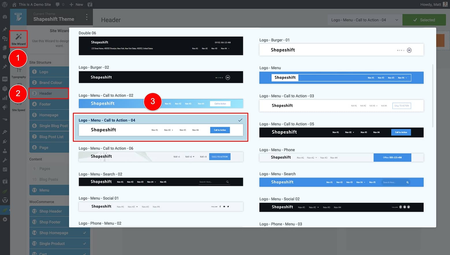
Select a header template to act as your sitewide header design starting point when working through the Site Setup Wizard in Thrive Theme Builder.
The header template you select at this stage will then become your default, sitewide header design.
From there, you’ll need to modify this default template to suit your specific website.
The best way to accomplish that is to enter the Templates area of your Thrive Theme Builder dashboard and edit one of your Core Templates (like your “Default Post” template).
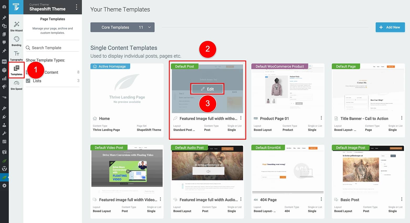
In the Templates tab of the Thrive Theme Builder dashboard, select a theme template to edit and open the Thrive visual editor by clicking the "Edit" button that appears when you hover over the theme templates thumbnail.
Once the Thrive visual editor loads, you’ll know you’re working inside Thrive Theme Builder as color in the upper lefthand corner is blue, and there’s a Thrive Theme Builder icon in the upper righthand corner.
Now notice that your default header you selected in the Site Setup Wizard is already applied and loaded.
But before modifying it, you’ll need to make an important choice...
In the Thrive visual editor, click on the theme page template breadcrumb, open the Header Options tab in the left sidebar, and then click on the header area of the page sections diagram:
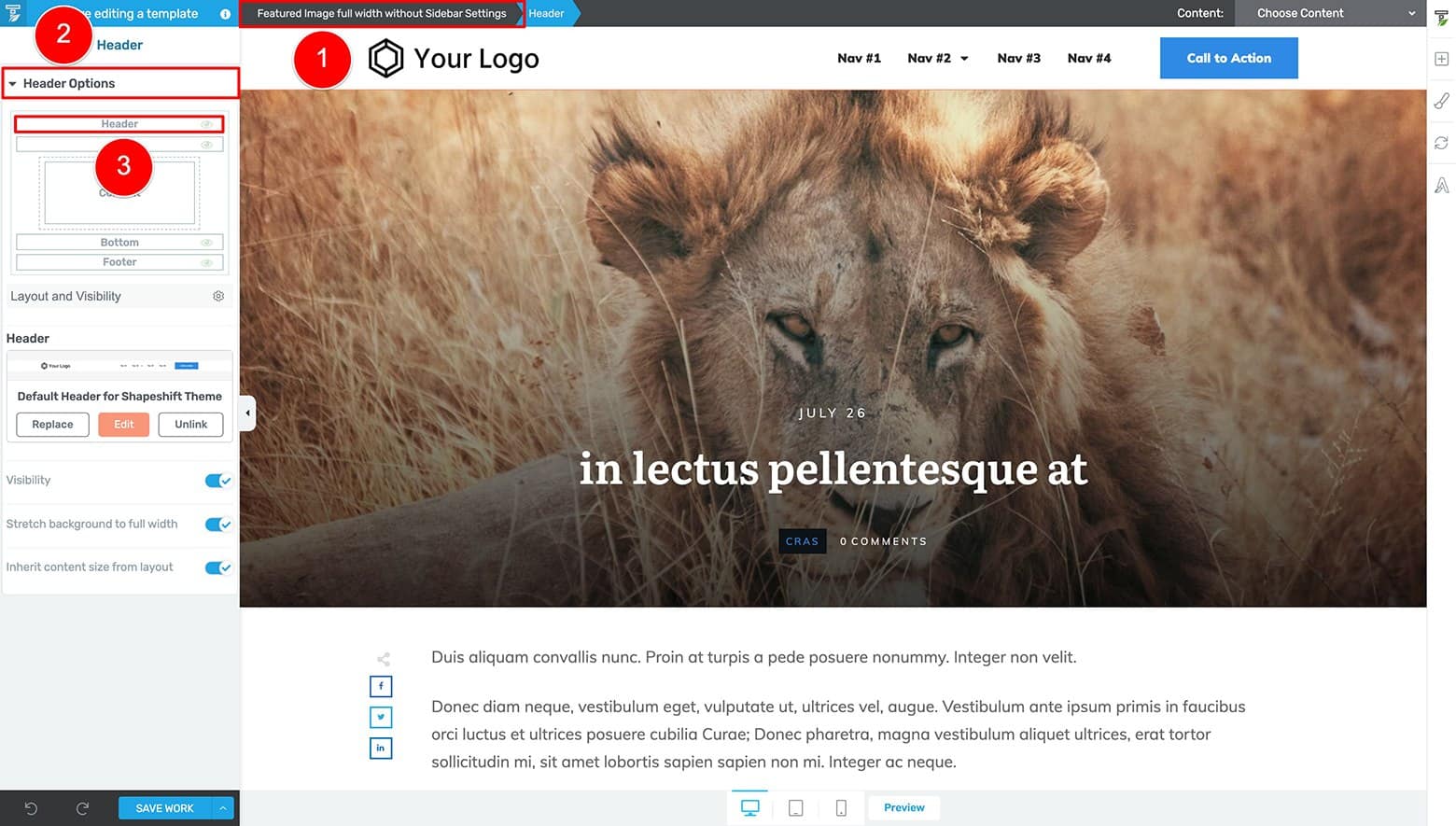
To access the Header "Replace", "Edit", and "Unlink" options in the Thrive Theme Builder visual editor, highlight the page template breadcrumb, open the Header Options tab in the left sidebar, and then click on the header area of the page sections diagram.
You should now see 3 options appear under the Header sub-tab asking how you’d like to customize your header. The choice you select determines how your header changes will apply either locally or sitewide:
- Replace: allows you to choose from the list of available header template designs (including your saved header designs you previously customized) and load your selection in place of the current header.
Choosing the Replace option only affects the THEME PAGE TEMPLATE YOU ARE CURRENTLY WORKING ON. The rest of your site will remain unaffected. - Edit: allows you to edit the current header, but applies any changes made SITEWIDE.
In other words, wherever else this particular header is programmed to display on your site (either on Thrive Architect landing pages or Thrive Theme Builder controlled theme page templates) the changes will be applied instantly across every instance of this particular header design.
- Unlink: unlinks the current header from its sitewide group and forces you to save it under a new custom header name.
Once you unlink and save the header as a new design, any changes made will only apply to the header name just created.
If you’re just getting started building a new Thrive Theme Builder website, we recommend choosing the “Edit” option so you can modify your default header. The changes you make will then apply across all your default theme page templates automatically.
From that point on, you can create new header designs as needed and apply them on case-by-case basises to standalone Thrive Architect landing pages or specific Thrive Theme Builder controlled theme page templates.
Modifying Standalone Headers in Thrive Architect
When it comes to creating, adding, removing or replacing headers on your landing pages, things are even simpler.
Open a landing page with Thrive Architect (like your Homepage if it’s set up as a standalone landing page).
You’ll know you’re working inside Thrive Architect’s visual editor as the color in the upper lefthand corner is green, and there’s a Thrive Architect icon in the upper righthand corner.
Next, highlight the Header breadcrumb and open the Main Options tab in the left sidebar to see 2 options for customizing your headers:
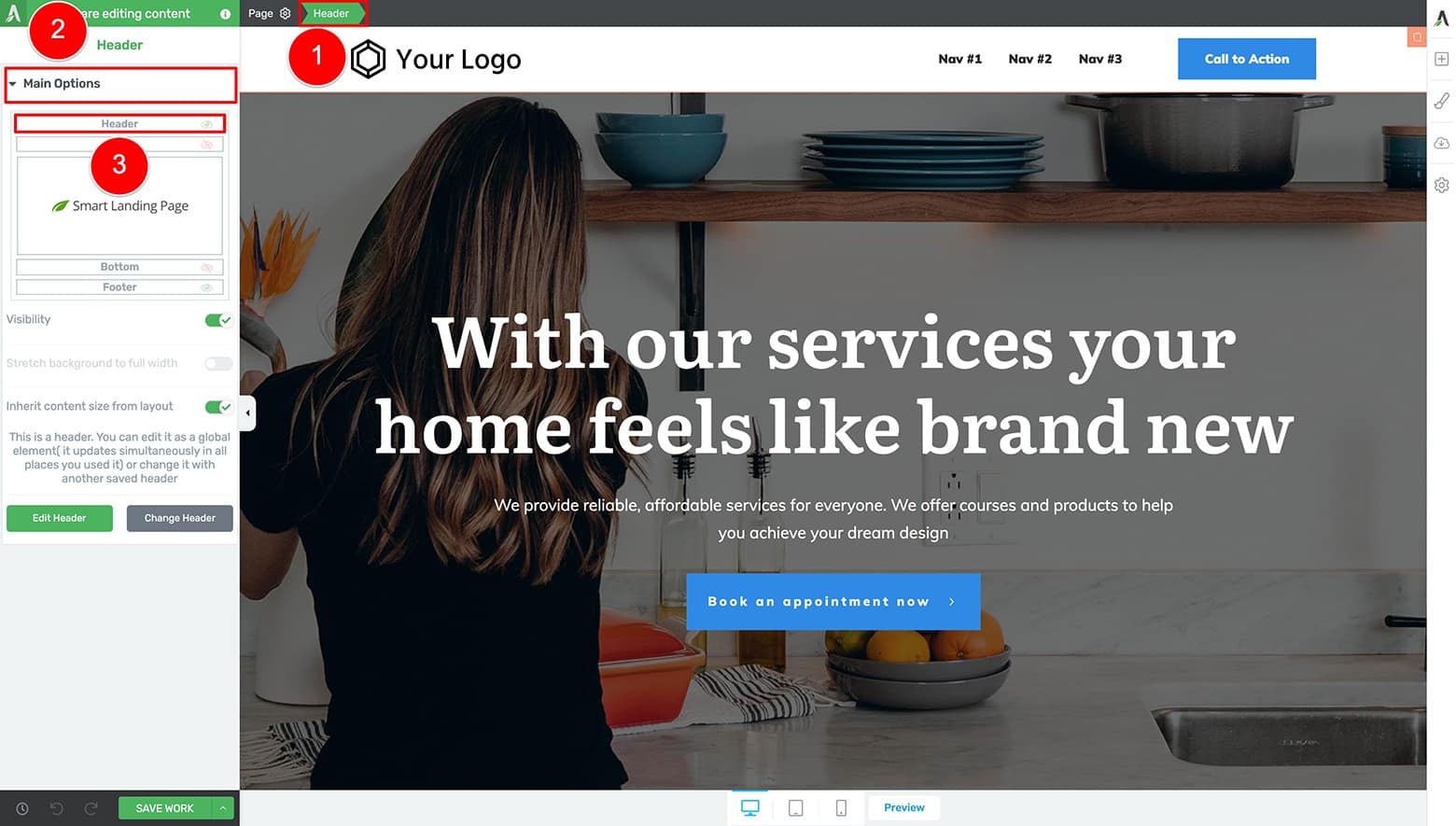
To access the "Edit Header" and "Change Header" options in Thrive Architect's visual editor, highlight the page template breadcrumb, open the Main Options tab in the left sidebar, and then click on the header area of the page sections diagram.
- Edit Header: allows you to edit the current header.
Any customizations you make to this particular header design will instantly apply to all other instances of this design (just like when choosing the “Edit” option for your headers in the Thrive Theme Builder visual editor). - Change Header: allows you to choose from the list of available header template designs (including your saved header designs you previously customized) and load your selection in place of the current header.
This option works just like the “Replace” option when modifying headers in the Thrive Theme Builder visual editor. - Note: there is no “Unlink” option when editing headers in Thrive Architect’s visual editor.
If you want your standalone landing page to display the sitewide header design, just choose the “Change Header” option and select it from the list of saved header options available.
If you’d like to show a unique header design for a given landing page, choose the “Change Header” option, select one of the starter header templates, and save it under a new name. From there, you can proceed by clicking the “Edit Header” button to customize it without applying any sitewide changes.
Finally, if you need to hide your header altogether (e.g. on sales page where you don’t want to distract visitors from the sales goal), just click the eyeball on the header diagram under the Main Options tab to make it disappear:
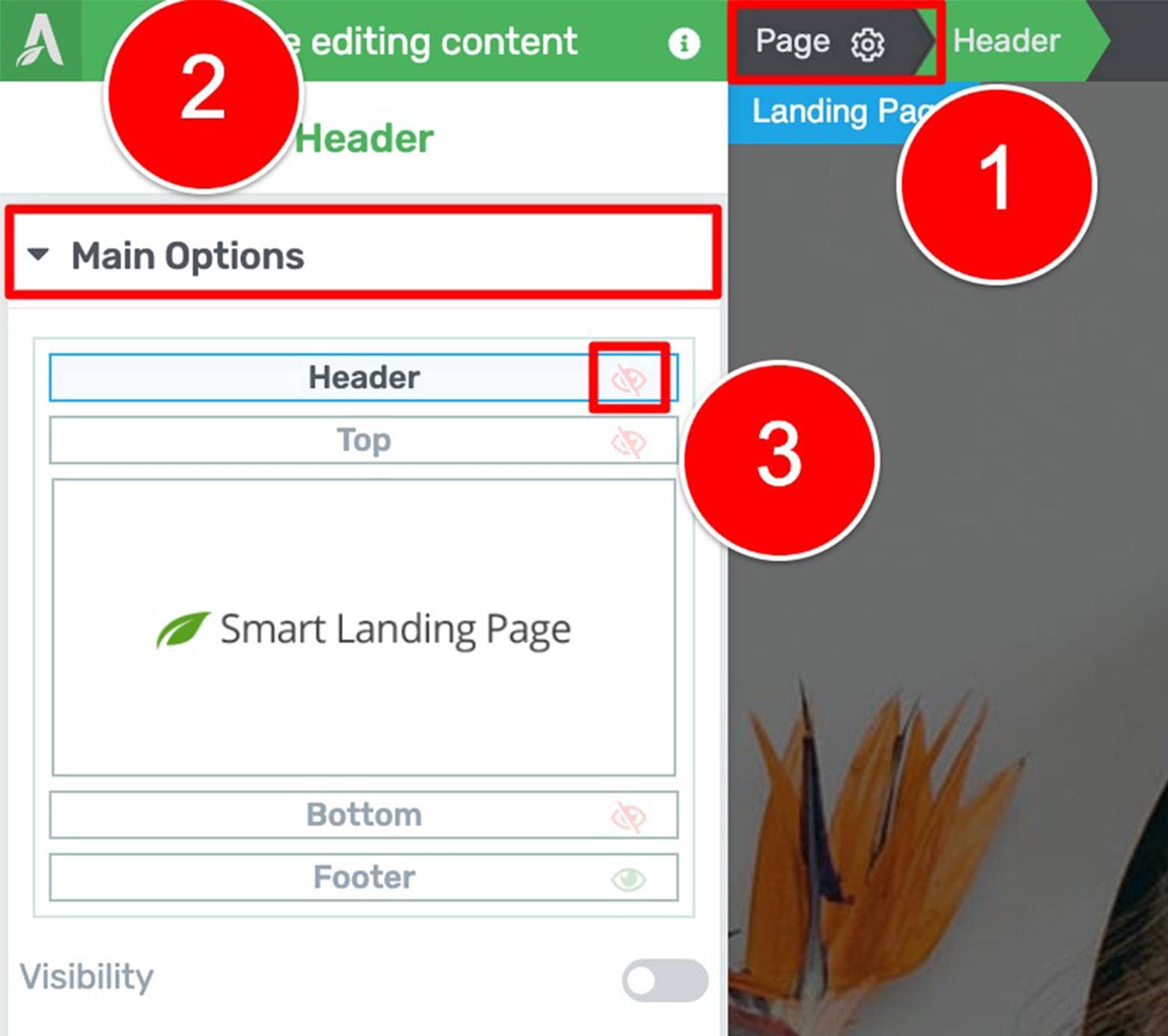
To hide your header on select landing page designs inside Thrive Architect's visual editor, highlight the Page template breadcrumb, click on the Main Options tab, and then click on the eyeball icon inside the Header section of the page sections diagram.
Okay, so now that you know how headers work between Thrive Theme Builder and Thrive Architect, let’s jump in to designing some Sticky Transition Headers for your hero pages...
Example 1: Simple Sticky Transition Header Design
This simple design was inspired by Studios.com:

The Studios.com homepage is a good example of a Simple Sticky Transition Header design. We'll use it as inspiration to create something similar with the Thrive visual editor.
Why do we describe their header design as Simple, Sticky, and using a Transition?
Well, it’s simple because it only displays (on page load) a white text logo and white navigation text over a transparent header background.
Notice that the transparent header background (on page load) blends seamlessly with the background. It just looks like part of the image, right?
Moving on, we describe the header as sticky because the header remains stuck to the top of the page as visitors scroll.
Finally, you can say the header transitions because the design completely changes once scrolling begins.
If this particular design is a good fit for your site, here’s how you can build something similar using the Thrive visual editor...
How To Build It with Thrive Themes
To make things easy, let’s assume you’re building this header design for your homepage. The “Homepage – Local Business” template available with Thrive Theme Builder’s ShapeShift companion theme is just the type of design you should build a Sticky Transition Header for:
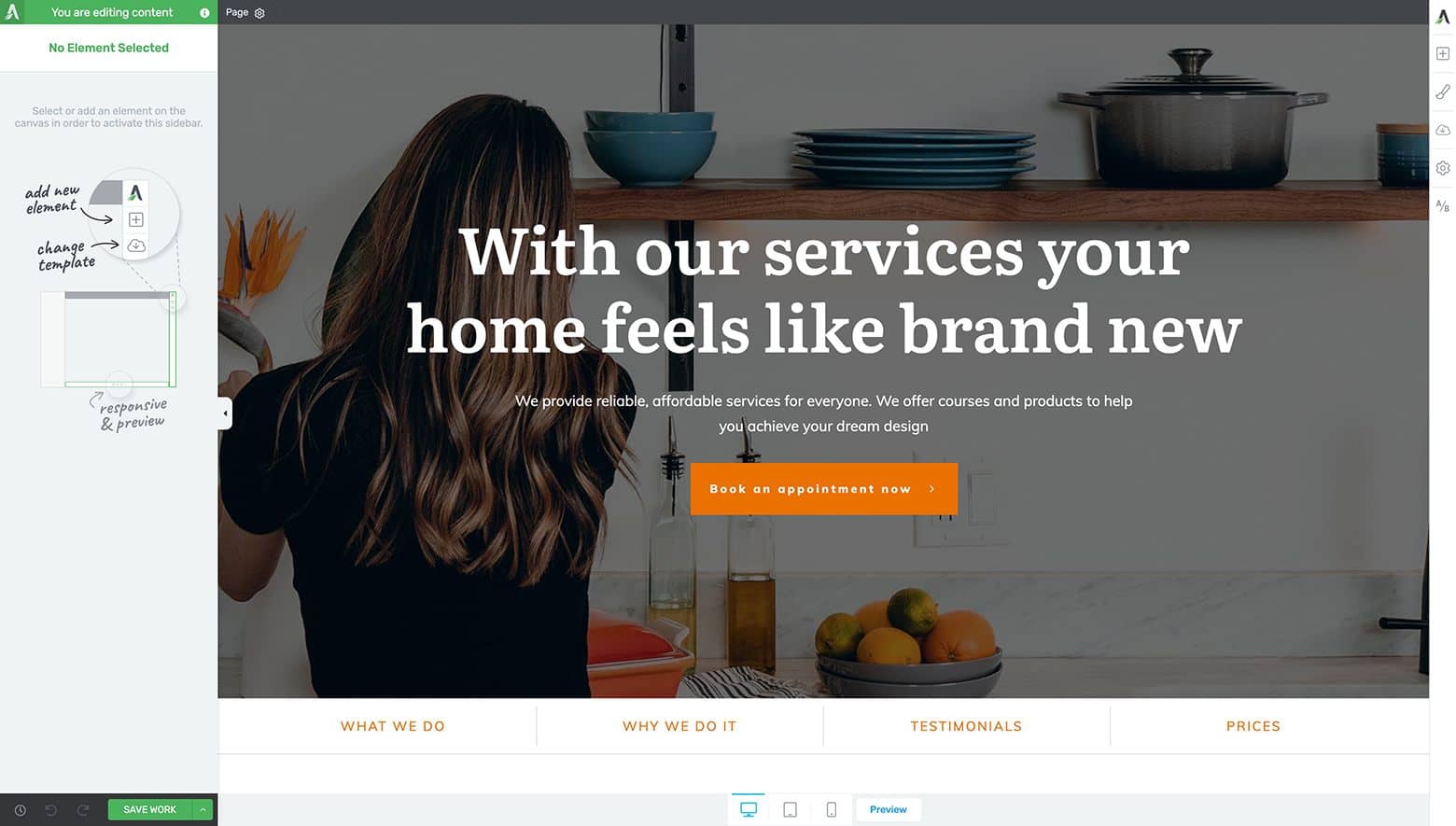
The “Homepage – Local Business” Smart Landing Page Template available with the ShapeShift Companion Theme for Thrive Theme Builder.
If your default header is already loaded, either “Edit” or “Replace” it as needed to get started. It’s best to select one of the header templates that looks pretty similar to the Studios.com example design.
If no header is currently visible, you can add a header to the page by:
- Clicking on the “Page” breadcrumb at the top of the Thrive visual editor
- Clicking on the “Header” diagram in the left sidebar
- Clicking on the “Change Header” button
- And selecting one of the Header designs in the lightbox appears templates from the “Create New Header” tab in the lightbox that appears.
The “Basic Light” Header template option is a good one to choose if you want to follow along:

To select a simple header template design to follow along with this example, highlight the Page breadcrumb, open the Main Options tab, and click on the Header section of the Page Sections diagram. In the lightbox that appears, scroll down to select the "Basic Light" header template.
You’ll then be prompted by a lightbox to give your new custom header a name. Once saved, you’ll be able to find this design in the Saved Headers tab of the “Choose a Header” lightbox within both Thrive Architect and Thrive Theme Builder:
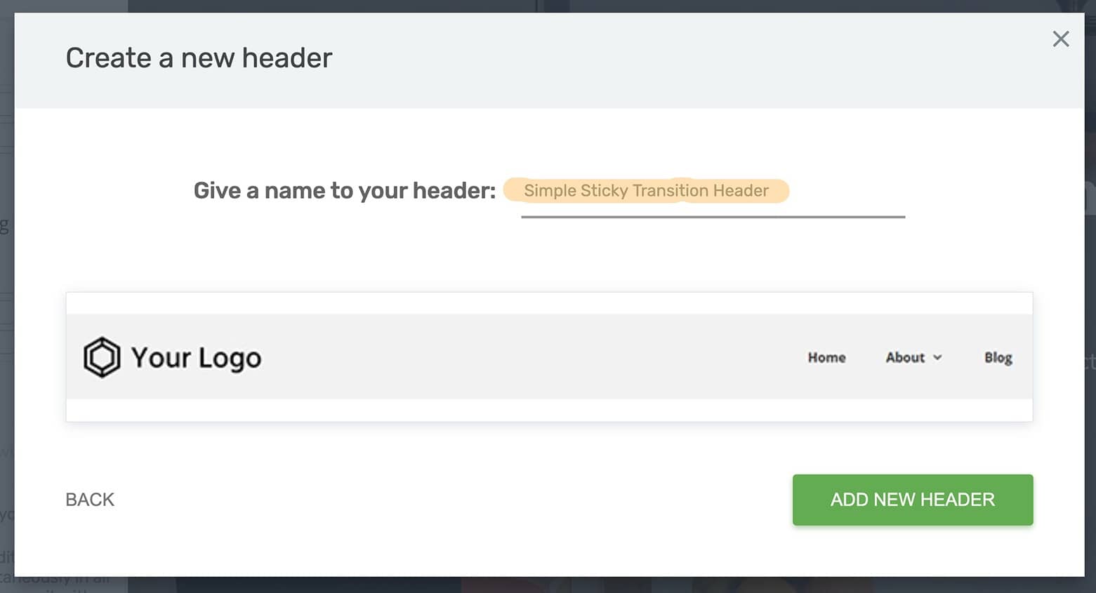
When prompted, give your header selection a name and click the "Add New Header" button to continue.
With your landing page and header templates in place, it’s finally time to start building your Simple Sticky Transition Header design.
How To Craft the “On Load” Header State
Begin by highlighting the “Header” breadcrumb followed by clicking on the “Edit Header” button in the left sidebar:
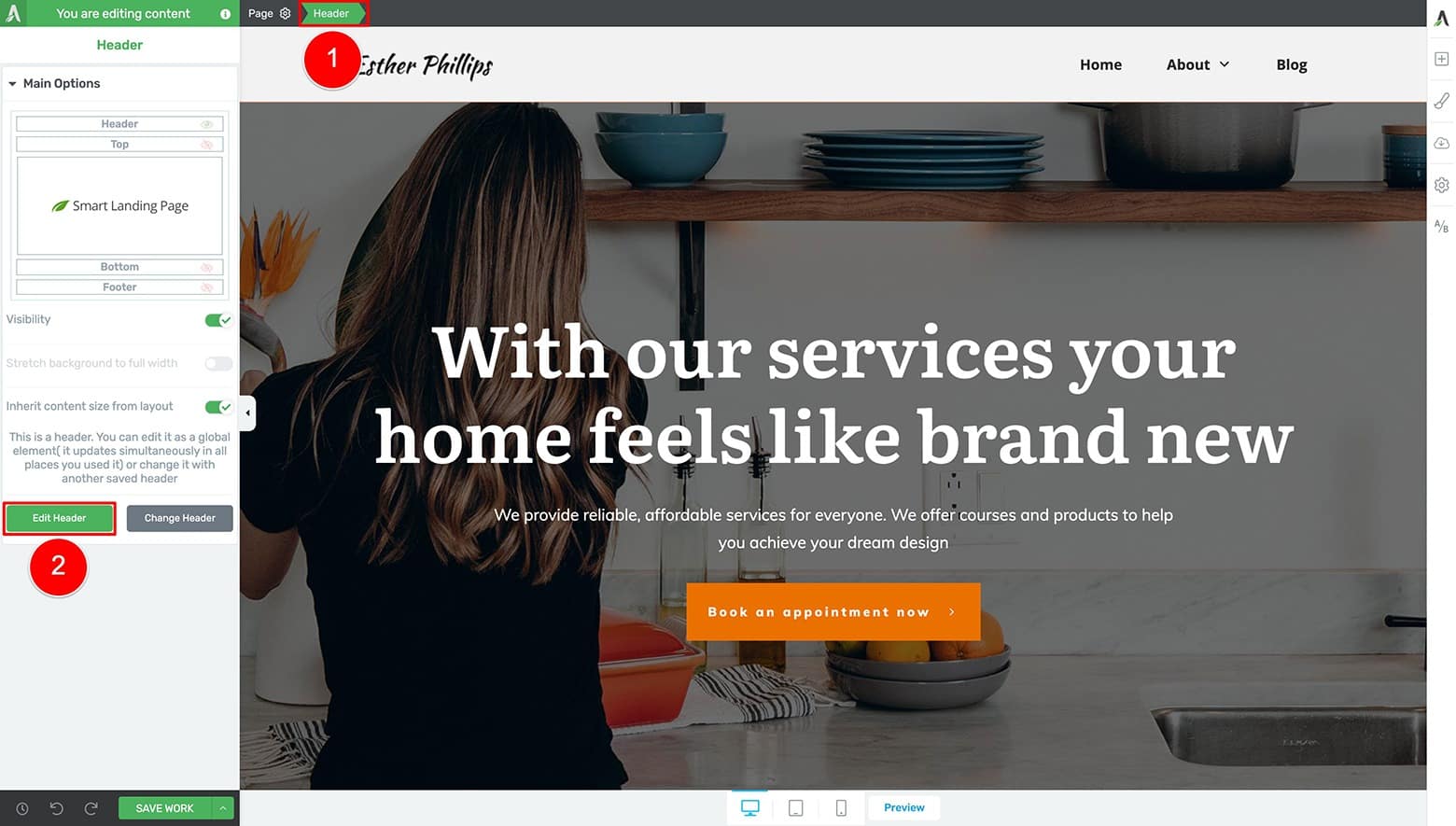
To begin editing your header in Thrive Architect's visual editor, highlight the Page breadcrumb, open the Main Options tab in the left sidebar, and click on the "Edit Header" button.
Next, navigate to the Header Options tab in the left sidebar and change the “Header Options” selection to Over Content:

To make your header overlay your hero image, navigate to the Header Options tab in the left sidebar and change the “Header Options” selection to Over Content.
This will make your header lay on top of the Hero Image rather than forcing the Hero Image to display at the bottom of the header.
Next, click on the Background Style tab and delete the header’s background color to make it transparent:
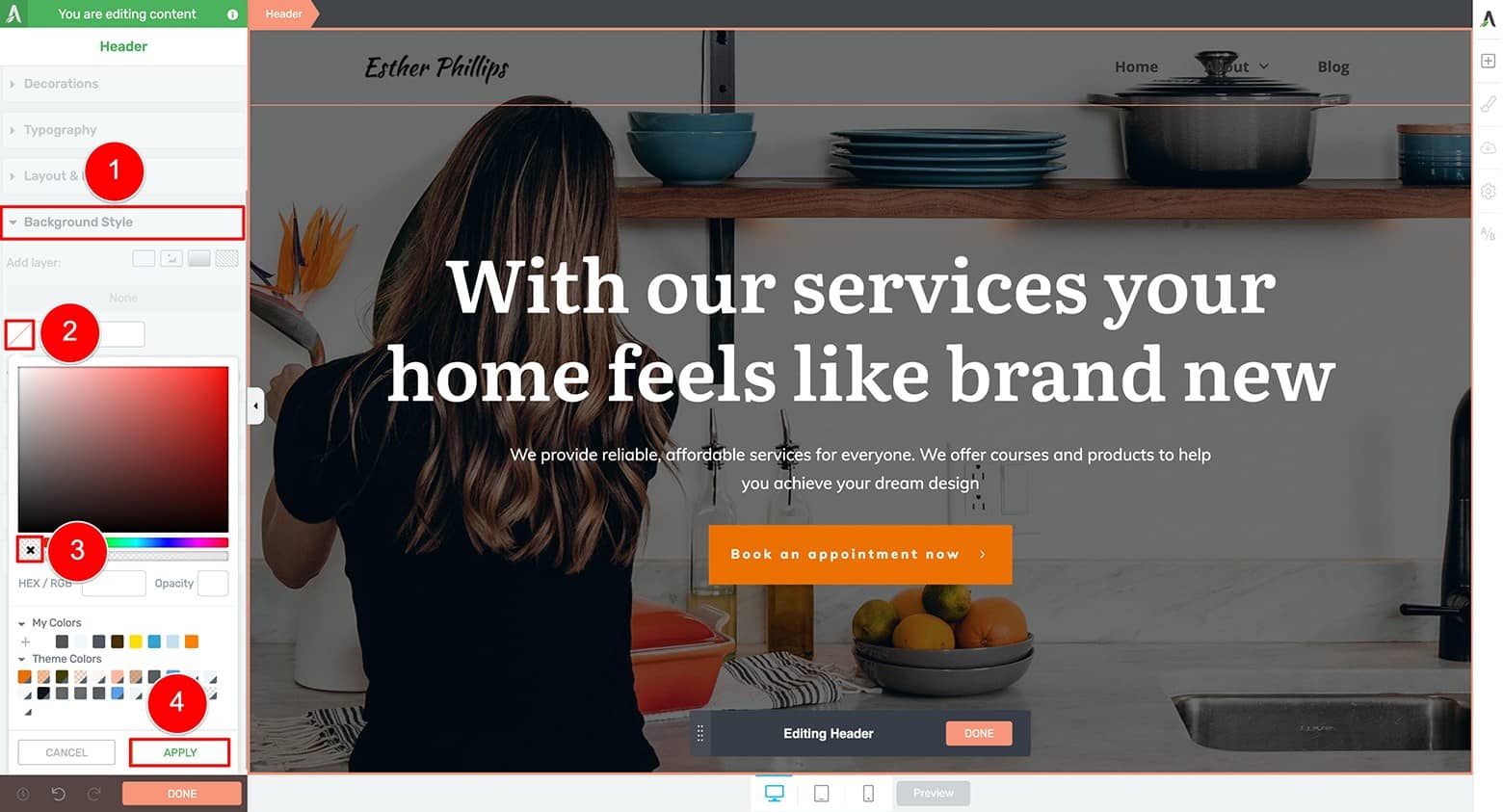
Click on the Background Style tab and delete the header’s background color to make it transparent.
Now it’s time to modify the design elements within your header (namely your logo and navigation menu) so they’ll stand out with high contrast on the hero image. On a dark background like this one (which uses a semi-transparent overlay on top of the hero image), selecting your white logo (or equivalent) and setting the navigation text to white (or a light color) is a clever choice.
To switch your logo design from light to dark, highlight the Logo element in the header area, open the Logo Options tab in the left sidebar, and then select the “Light” logo design setting:
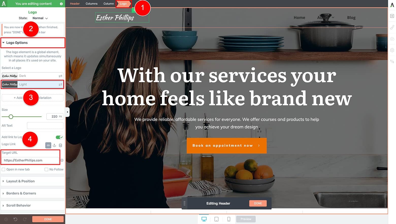
To switch your logo design from light to dark, highlight the Logo element in the header area, open the Logo Options tab in the left sidebar, and then select the “Light” logo design setting.
Don't forget to apply a Target URL address for the Logo element too!
Setting a "Light" and "Dark" logo design in Thrive Theme Builder
It’s useful to set both a “Light” and “Dark” version of your logo in the Thrive Theme Builder dashboard. This helps the Thrive Smart Color algorithm automatically apply the logo with the highest visual contrast when you load any of our Thrive Smart Template designs.
You can also set additional logo variations too! See Example 2 below to see how you can use additional logos to create more advanced header designs.
Now you’ll need to modify your Custom Menu element text from black to white by highlighting one of its Menu Items breadcrumbs, opening the Typography tab in the left sidebar, and changing the font color to white:
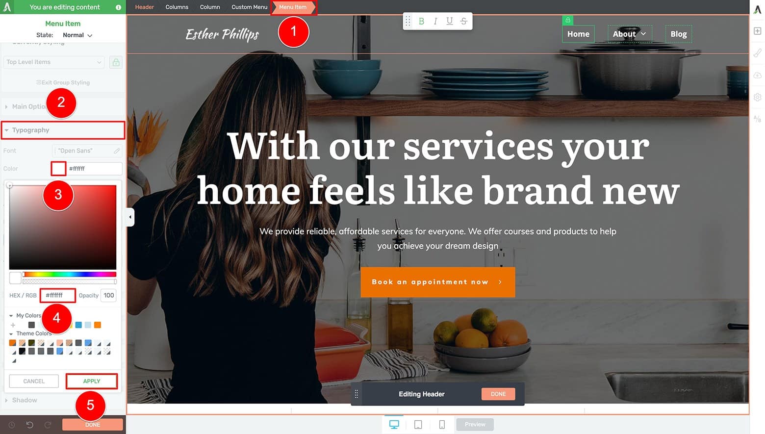
To modify your Custom Menu element text from black to white, highlight one of its Menu Item breadcrumbs, open the Typography tab in the left sidebar, and change the font color to white.
Because the Menu Items are grouped, applying a design change to one item instantly applies them to the others!
And if you need to add, delete or modify Menu Items, just highlight the Custom Menu breadcrumb, open the Main Options tab in the left sidebar, and customize your items as needed under the Menu Items sub-tab:

If you need to add, delete or modify Menu Items, just highlight the Custom Menu breadcrumb, open the Main Options tab in the left sidebar, and customize your items as needed under the Menu Items sub-tab.
Alternatively, if you have a defined menu saved inside your WordPress dashboard (open the Appearance tab followed by the Menu tab in your WordPress backend to set one up), then you can use your saved WordPress Menu here instead — saving you several Menu Item customization clicks.
To use a saved WordPress Menu in your headers, highlight the Custom Menu element, open the Main Options tab, and select the name of your WordPress Menu from the "Menu Options" setting (or select Custom to setup a Custom Menu instead):
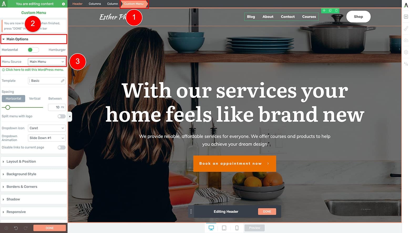
To use a saved WordPress Menu in your headers, highlight the Custom Menu element, open the Main Options tab, and select the name of your WordPress Menu from the "Menu Options" setting (or select Custom to setup a Custom Menu instead). In this example, the saved WordPress Menu's name is 'Main Menu'.
Looking good! It’s now time to ensure your header looks great on smaller screen sizes.
Start this optimization process by clicking on the Tablet icon at the bottom of your Thrive visual editor.
Next, highlight the Custom Menu element and open its Main Options tab in the left sidebar.
From there, click on the “Icon Color” option and change the default color to white (so the hamburger icon shows itself in bright contrast on top of your hero image background):
Start mobile optimizing your header design for tablet by clicking on the Tablet icon at the bottom of your Thrive visual editor. Next, highlight the Custom Menu element and open its Main Options tab in the left sidebar. From there, click on the “Icon Color” option and change the default color to white (so the hamburger icon shows itself in bright contrast on top of your hero image background).
Now make sure the text color of your Tablet Menu Items are correct when visitors toggle open your hamburger menu icon.
Do this by toggling the “Menu State” to Open:
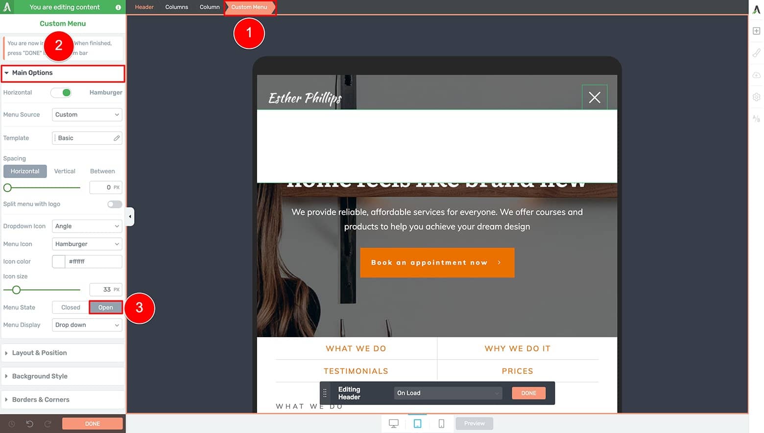
To make sure the text color of your Tablet Menu Items are correct when visitors toggle open you hamburger menu icon, set your “Menu State” to Open so you can inspect what the Drop down menu looks like.
If the Open Menu shows white text on a white background (like you see above), then you’ll need to change the Custom Menu font color to black. Highlight one of the Menu Item breadcrumbs, open the Typography tab in the left sidebar, and switch the “Color” option from white to black:
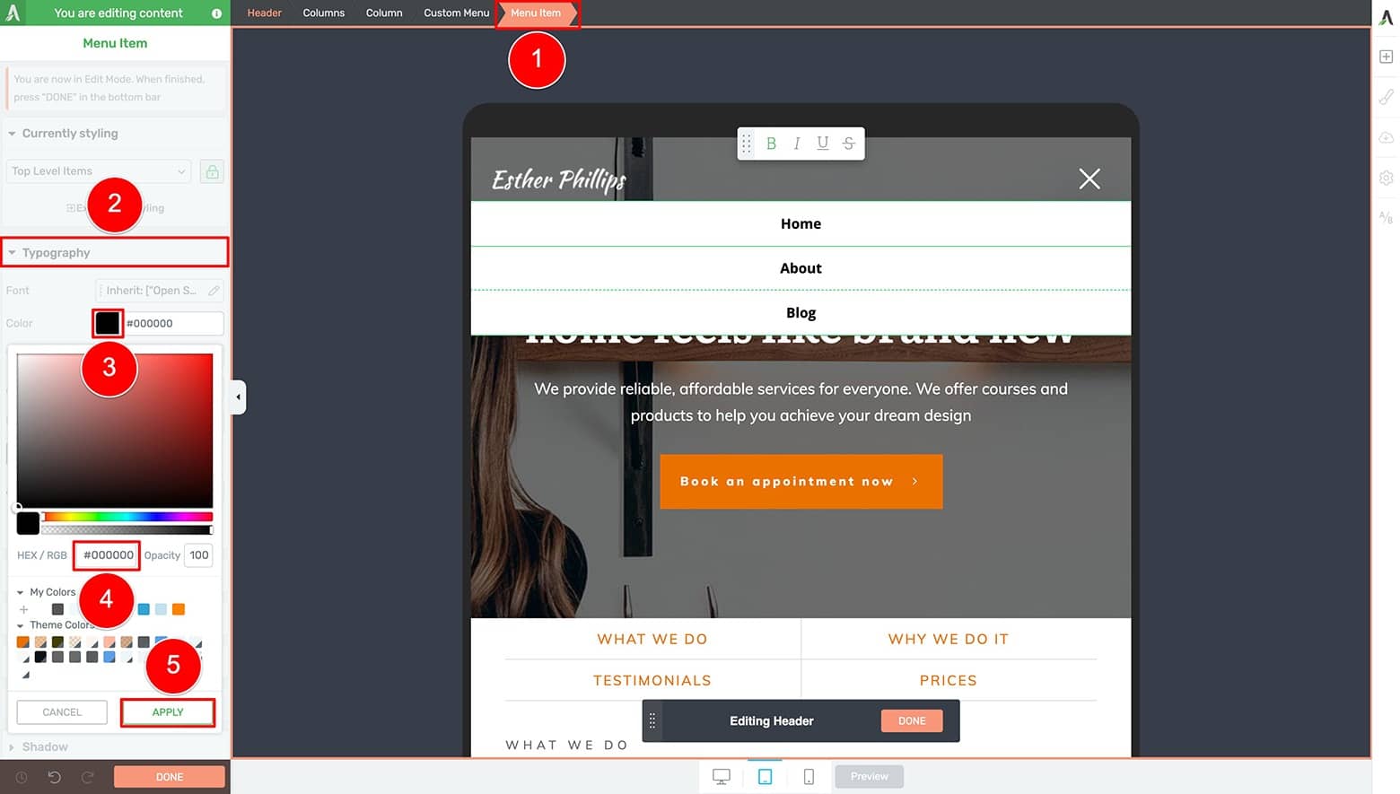
To change the Custom Menu font color to black, highlight one of the Menu Item breadcrumbs, open the Typography tab in the left sidebar, and switch the “Color” option from white to black.
Finally, click on the Mobile icon at the bottom of the Thrive visual editor to make sure the design looks good on smartphones too.
Because the customizations you make on Tablet cascade down to Mobile (but not up to Desktop!), there should be no further design changes needed for the page load state of this header:

Click on the Mobile icon at the bottom of the Thrive visual editor to make sure your header design looks good on smartphones too.
Halfway done! Now it’s time to make your header ready to scroll…
How To Craft the “On Scroll” Header State
To do that, go back to Desktop editing mode and open the Scroll Behavior tab in the left side bar.
Set the “Behavior on Scroll” option to Sticky and then toggle the “Switch on scroll” feature to ON.
Next, set the vertical pixel distance you want your visitors to scroll before the header design transition occurs (change the “Switch After” pixel setting to something between 100 and 500 pixels).
Now, look for the floating “Editing Header” bar at the bottom center of the Thrive visual editor and switch the design state to “On Scroll”:
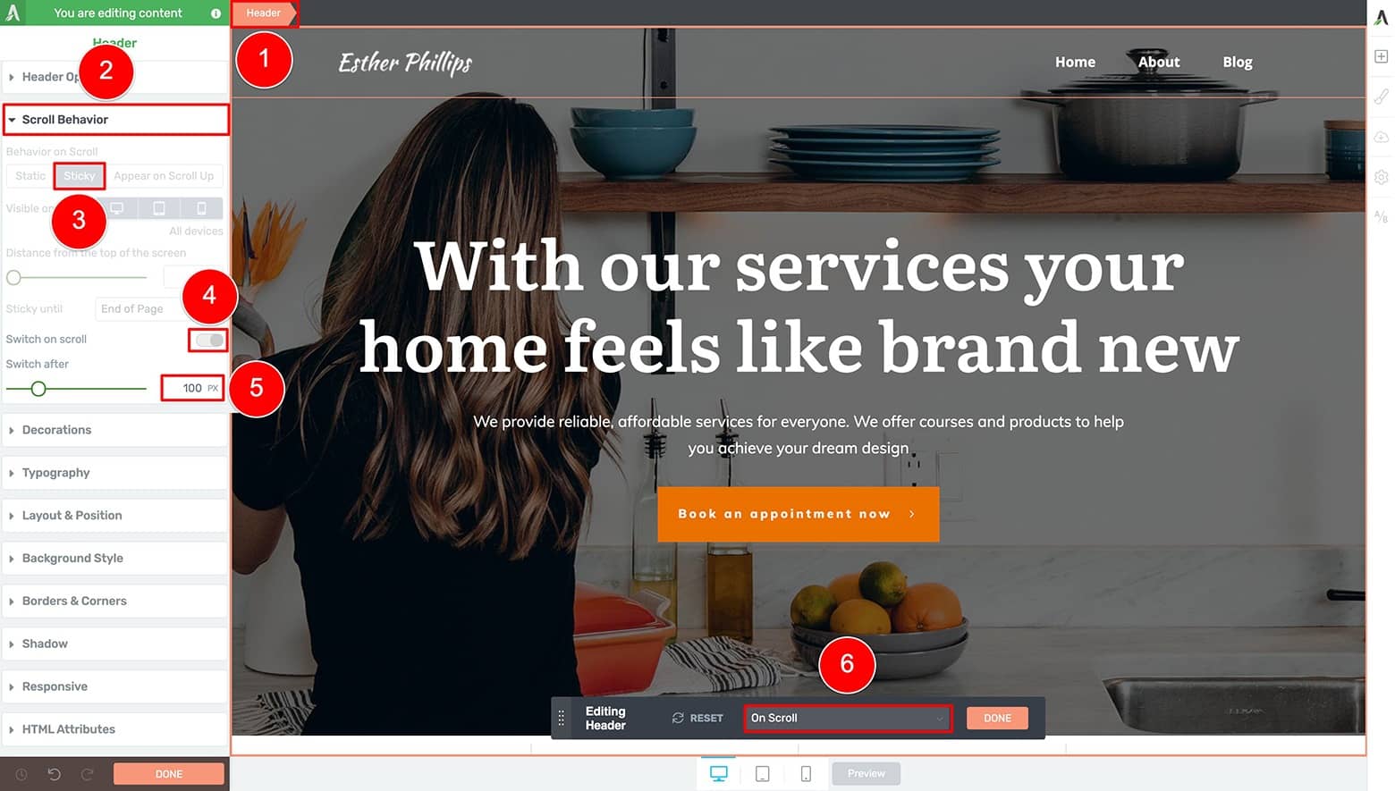
To switch to editing the "On Scroll" state of your header design, first open the Scroll Behavior tab in the left side bar. Set the “Behavior on Scroll” option to Sticky and then toggle the “Switch on scroll” feature to ON. Next, set the vertical pixel distance you want your visitors to scroll before the header design transition occurs (change the “Switch After” pixel setting to something between 100 and 500 pixels). Now, look for the floating “Editing Header” bar at the bottom center of the Thrive visual editor and switch the design state to “On Scroll”
This action takes the customized “On Load” state of your header and duplicates it to become the design starting point for the “On Scroll” state.
Once the “On Scroll” state is active, you can begin to create the version of your header that will display once visitors start scrolling down the page.
Complete the following “On Scroll” state steps to get your Simple Sticky Transition Header ready to publish:
- Set the Header element background color to white (highlight the Header element >> open the Background Style tab in the left sidebar)
- Switch the Logo element to the “Dark” variation (highlight the Logo element >> open the Logo Options tab in the left sidebar)
- Change the “Color” setting of the Custom Menu element Menu Items to black. Remember that Menu Items are grouped so changing the styling of one item changes them all! (highlight one of the Custom Menu element Menu Items >> open the Typography tab in the left sidebar)
- Switch to Tablet editing mode and change the hamburger “Icon Color” setting from white to black (click the Tablet icon >> highlight the Custom Menu element >> open the Main Options tab in the left sidebar)
- Check that the Custom Menu text is black on a white Custom Menu background (highlight the Custom Menu element >> open the Main Options tab in the left sidebar >> toggle the “Menu State” option to Open)
- Switch to Mobile editing mode and make sure the Custom Menu and Menu Item settings are correct. Remember that Tablet changes cascade down to Mobile, but not up to Desktop (click the Mobile icon >> highlight the Custom Menu element >> open the Main Options tab in the left sidebar >> toggle the “Menu State” option to Open)
- Find the floating “Editing Header” bar at the bottom center of the Thrive visual editor and click the peach “Done” button
- Save all of your header design customizations by clicking the “Save Work” button in the bottom left corner of your Thrive visual editor
Congratulations… your first Sticky Transition Header design is complete!
Now when you preview your work, you’ll see a transparent, mobile optimized header load on top of your hero image landing page. It will stay stuck to the top of the screen on scroll as well as transition to the scroll state design after your vertical pixel distance setting is crossed:

Your Simple Sticky Transition Header design should look something like this if you followed the instructions above to build this example on your own site.
Awesome work my friend!
Now that you know the basics of how to create Sticky Transition Headers for your theme page templates, let’s take a look at how you can take things to the next level...
Example 2: Add a Call-To-Action to Your Sticky Transition Header Design
Our second Sticky Transition Header example comes from Magic Leap:

The Magic Leap homepage is a good example of a Call to Action Sticky Transition Header design. We'll use it as inspiration to create something similar with the Thrive visual editor.
Notice this Sticky Transition Header design is similar to the previous example, but deploys 2 impressive design upgrades:
- The logo transition switches from a “Light” version to a red logo variation (instead of to the inverse “Dark” logo variation)
- And the header has a Call-to-Action “Shop” button that transitions from white to red (the same color as the logo variation)
Here’s how to build something similar using the Thrive visual editor…
How To Build It with Thrive Themes
We’ll begin again by using the same ShapeShift theme “Homepage – Local Business” landing page template:

The “Homepage – Local Business” Smart Landing Page Template available with the ShapeShift Companion Theme for Thrive Theme Builder.
But this time, let’s select one of the Header templates that uses a Call-to-Action button in its design. For this example, select the “Logo - Menu - Call to Action - 04” header template:

To create your own Call to Action Sticky Transition Header design, select one of the Header templates that uses a Call to Action button in its design. We use the “Logo - Menu - Call to Action - 04” header template for this example.
Name your new header design something like “CTA Sticky Transition Header” when prompted.
Now, your starting point for design customization should look like this:
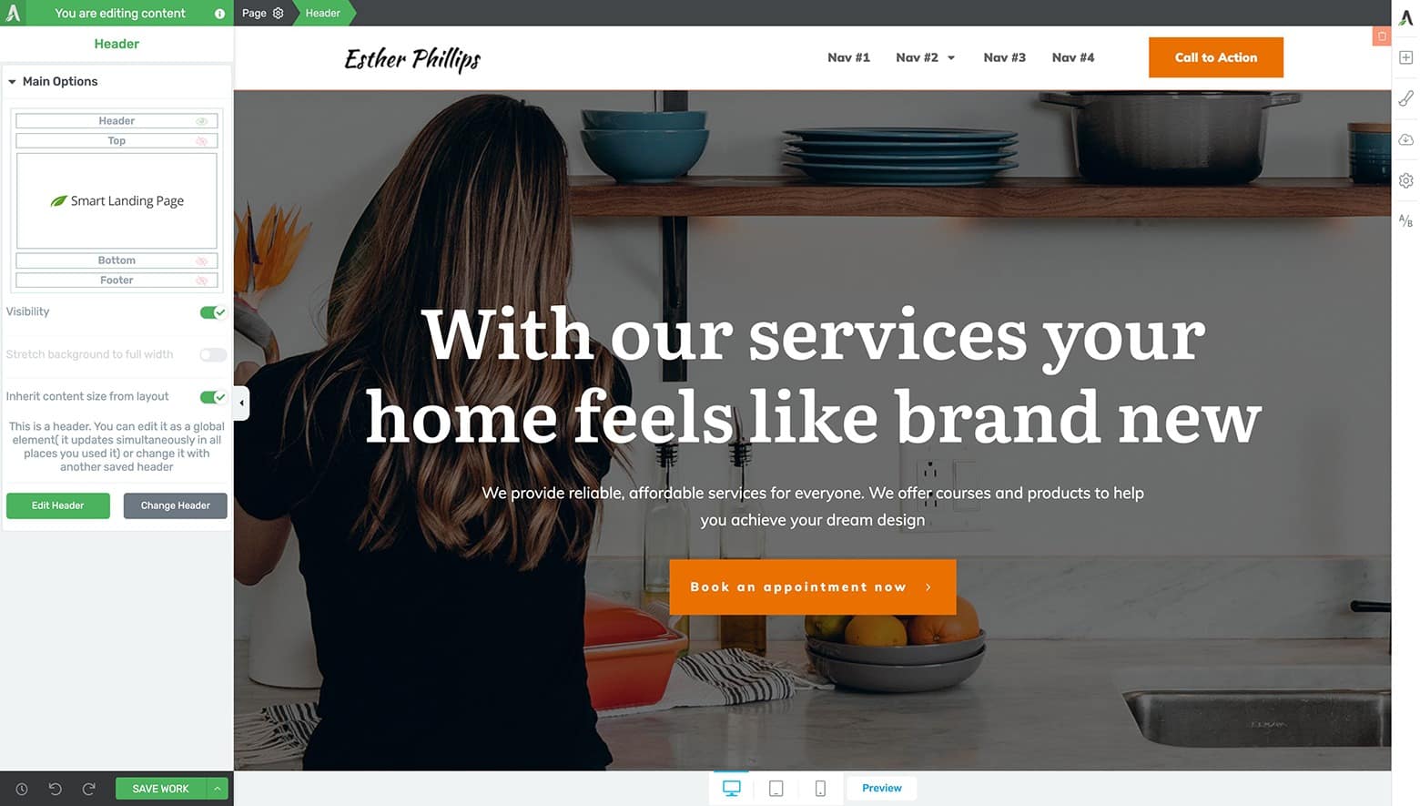
Your starting point for customizing your Call to Action Sticky Transition Header should look something like this.
Notice that the Header templates in the Thrive visual editor use our Smart Color Technology and therefore automatically adopt the brand color you set inside theThrive Theme Builder dashboard (if installed and activated on your site).
How To Craft the “On Load” Header State
Start by customizing the “On Load” state of your new CTA Sticky Transition Header design – just like you did in the previous example to make it blend with the Hero Image background:
- Change the “Header Position” setting to Over Content (highlight the Header element >> open the Header Options tab in the left sidebar)
- Make the Header background transparent (highlight the Header element >> open the Background Style tab in the left sidebar)
- Switch the active Logo element variation from “Dark” to “Light” (highlight the Logo element >> open the Logo Options tab in the left sidebar)
- Assign the Logo element a Target URL address (highlight the Logo element >> open the Logo Options tab in the left sidebar)
- Change the Custom Menu text color to white (highlight one of the Menu Items of the Custom Menu element >> open the Typography tab in the left sidebar)
- Change the Custom Menu text styling as desired (highlight one of the Menu Items of the Custom Menu element >> open the Typography tab in the left sidebar)
- If you're using a Custom Menu in your header (instead of a saved WordPress Menu), customize each Menu Item to display the appropriate inline text and assign them Target URLs (highlight the Custom Menu element >> open the Main Options tab in the left sidebar >> open the Menu Items sub-tab)
After completing all of these steps, you should arrive at a partially completed header design that looks similar to this:

After completing the above 7 steps, you should have at a partially completed header design that looks similar to this.
Now you can modify the Call to Action Button element to match the Magic Leap example.
Do this by completing the following steps:
Change the Button element “Master Color” to white (highlight the Button element >> open the Main Options tab in the left sidebar)
Change the Button element’s Inline Text “Color” setting to black or dark grey. Customize the text styling as desired (highlight the Button element >> open the Typography tab in the left sidebar)
Set the corners of the Button element to 90 pixels to make it look rounded (highlight the Button element >> open the Borders & Corners tab in the left sidebar)
Change the Inline Text of the Button element (double-click on the Button element text).
Your header design should now look something like this:

After completing the above 4 steps to modify the CTA Button element, your header design should now look something like this.
Once again, you’ll need to do a few quick mobile optimizations in both the Tablet and Mobile editing modes to make sure your new header design looks great on smaller screen sizes.
Do this by completing the following steps:
Enter the Tablet editor mode and change the “Icon Color” setting from black to white (highlight the Custom Menu element >> open the Main Options tab in the left sidebar)
Change the text “Color” of the Menu Items from white to black (highlight one of the Custom Menu element Menu Items >> open the Typography tab in the left sidebar)
Optionally, you can also change the Custom Menu element padding from 40 pixels per side to 10 pixels per side to tighten how the Menu Items appear in the dropdown box (highlight the Custom Menu element >> open the Layout & Position tab in the left sidebar)
Enter the Mobile editor mode and toggle off the “Wrap columns” option (highlight the parent Columns element of the header >> open the Main Options tab in the left sidebar)
Make sure the CTA Button element margins are set to 0 pixels per side (highlight the Button element >> open the Layout & Positions tab in the left sidebar)
Great job! The “On Load” state of your CTA Sticky Transition Header is complete and mobile optimized.
Now it’s time to customize this design for scrolling...
How To Craft the “On Scroll” Header State
Remember how to get started with that? If not, here’s a refresher:
Make sure you’re still in the Header edit mode
Open the Scroll Behavior tab in the left side bar
Set the “Behavior on Scroll” option to Sticky
Toggle the “Switch on scroll” feature to ON
Set your desired “Switch After” vertical pixel distance
Look for the floating “Editing Header” bar at the bottom center of the Thrive visual editor and switch the design state to “On Scroll”
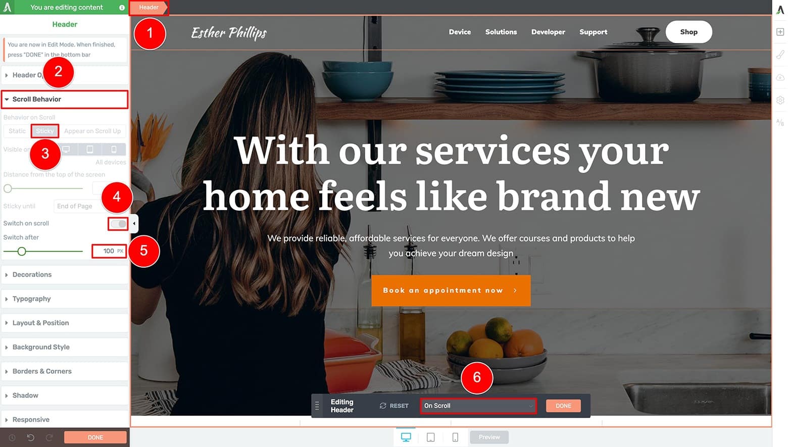
Switch to the "On Scroll" edit mode inside the header editor of the Thrive visual editor.
Once again, the customized “On Load” state of your header gets duplicated to become your “On Scroll” state. From here, you can start customizing the version of your header that will be shown to visitors as they scroll down the page.
To get your “On Scroll” state looking like the Magic Leap example, here’s what to do...
First, open the Header element’s Background Style tab in the left sidebar and set the color to white (just like you did in the previous example).
Next, highlight the Logo element and open the Logo Options tab in the left sidebar.
Add a new logo variation by clicking on the “+ Add New Logo Variation” option. Upload the alternate logo image to your WordPress media and make sure your new logo variation matches the brand color that you set in the Thrive Theme Builder dashboard:
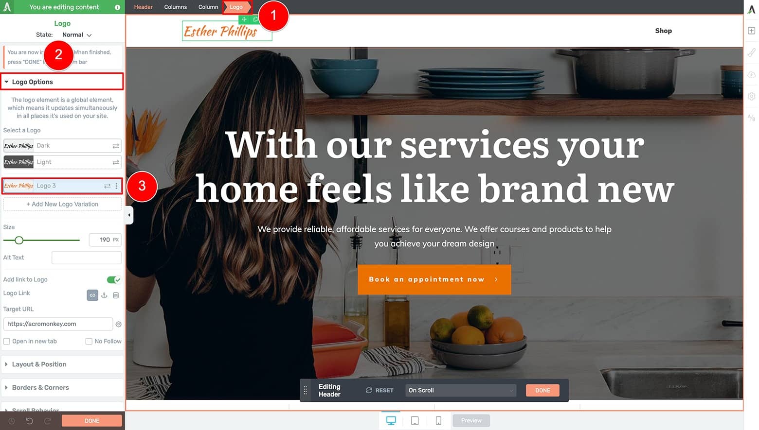
Add a new logo variation by clicking on the “+ Add New Logo Variation” option. Upload the alternate logo image to your WordPress media and make sure your new logo variation matches the brand color that you set in the Thrive Theme Builder dashboard.
What’s next?
Well now it’s time to modify the Custom Menu text and CTA Button color for scroll:
Change the Menu Items of your Custom Menu element to black (highlight one of the Menu Item elements >> open the Typography tab in the left sidebar)
Change the Button color to your brand color (highlight Button element >> open the Main Options tab in the left sidebar)
Change the Button text color to white (highlight Inline Text of the Button element >> open the Main Options tab in the left sidebar)
After completing these changes, your header should now look similar to this:

After completing the above 3 steps, your CTA Sticky Transition Header design should now look something close to this.
Finally, you just need to optimize the “On Scroll” state for Tablet and Mobile:
Enter the Tablet editor and change the “Icon Color” setting to your brand color (click on the Tablet icon >> highlight the Custom Menu element >> open the Main Options tab in the left sidebar)
Toggle the “Menu State” to Open and check that your Custom Menu text is black on a white Custom Menu background (highlight the Custom Menu element >> open the Main Options tab in the left sidebar)
Enter the Mobile editor and ensure that the Custom Menu and Menu Item settings look right. Remember that Tablet changes cascade down to Mobile, but not up to Desktop! (Click the Mobile icon >> highlight the Custom Menu element >> open the Main Options tab in the left sidebar >> toggle the “Menu State” to Open)
Find the floating “Editing Header” bar at the bottom center of the Thrive visual editor and click the peach “Done” button.
Save all of your Header design customizations by clicking the “Save Work” button in the bottom left corner of your Thrive visual editor.
When you preview your work, you’ll see a gorgeous looking Call to Action Sticky Transition Header — custom designed for your hero image landing page:

Your Call to Action Sticky Transition Header design should look something like this if you followed the instructions above to build this example on your own site.
Wow...
You’ve got some really cool looking Sticky Transition Header designs built now to accompany your heroic landing pages!
Want to see one last, even more advanced example? This last one is perfect for local and service based businesses that rely on getting customers on the phone to make a sale...
Example 3: The “Call Me” Sticky Transition Header Design
Let’s take our previous example and crank it up a notch.
Instead of simply transitioning between different logos, text and button colors, what if you try to keep your main conversion goal front-and-center on scroll?
In other words, your “On Load” header state will show the standard Logo, Navigation
Menu and CTA Button elements. We’ll even add a new element to showcase your phone number:
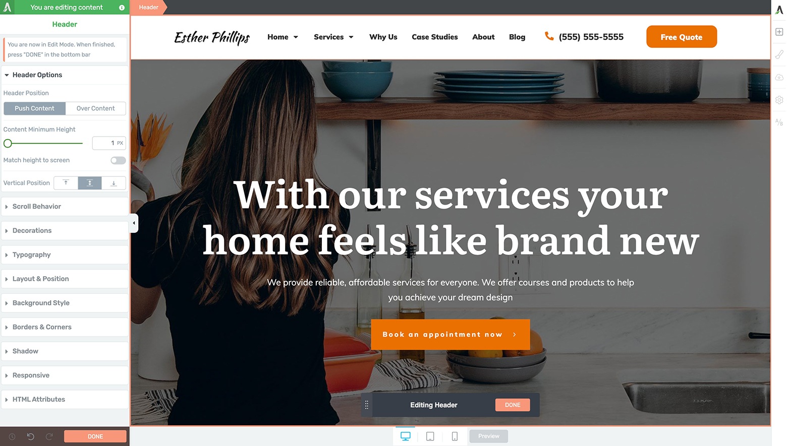
Let's kick things up a notch and build a "Call Me" Sticky Transition Header design. We'll use it as inspiration to create something similar with the Thrive visual editor. It's perfect for local and service based businesses that rely on getting customers on the phone to make a sale.
… but with your “On Scroll” state, we’ll switch things up and display just your Logo, a Line of Benefit Focused Copy, and “Call Me” CTA Button:
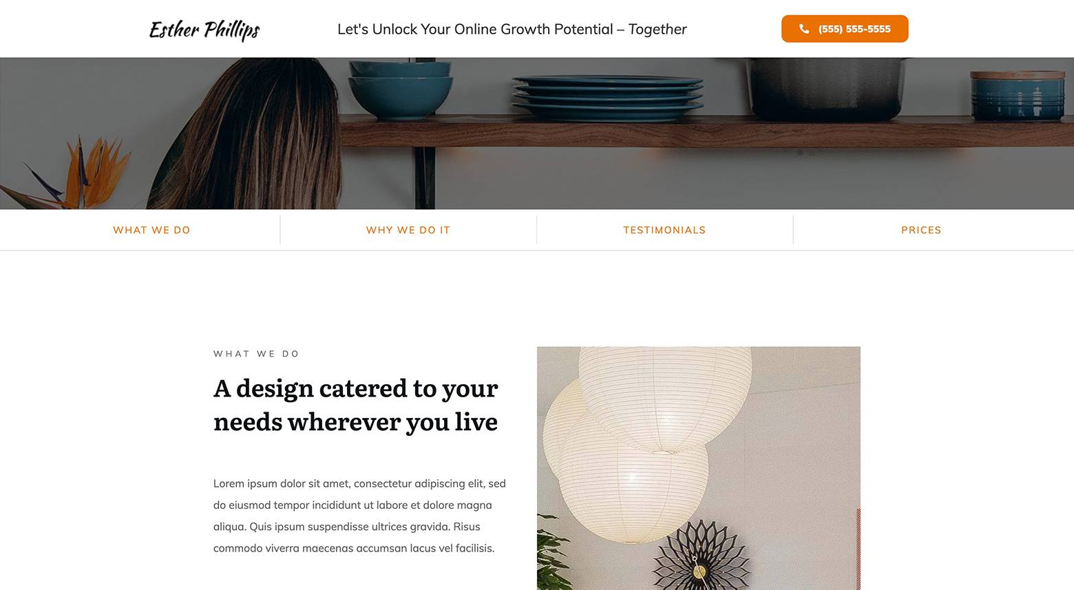
With the "On Scroll" state over your header, we'll change things to be very conversion optimized by eliminating the Navigation Menu and show just a Logo, a Line of Benefit Focused Copy, and “Call Me” CTA Button instead.
If you’re a service based business that relies on making sales one-by-one over the phone, then this Sticky Transition Header design is exactly what you’re looking for. 😉
How To Build It with Thrive Themes
To begin, load your hero image landing page just like before. You can use the same Call-to-Action header template design we used previously too:

Get started creating your "Call Me" Sticky Transition Header design by first loading up the “Homepage – Local Business” smart landing page template, followed by loading up the “Logo - Menu - Call to Action - 04” header template.
How To Craft the “On Load” Header State
Prep your header like before by setting the “Header Position” option to Over Content (highlight the Header element >> open the Header Options tab in the left sidebar).
This particular design also showcases a Contact Number so let’s add that to the “On Load” state now. We recommend using a Styled List element to do this.
Find the Styled List element within the Elements Tray of the right sidebar and drop it between the Custom Menu and Button elements:

To add a Contact Number to your “On Load” header state, use a Styled List element. Find the Styled List element within the Elements Tray of the right sidebar and drop it between the Custom Menu and Button elements.
From there, you’ll need to modify your header design by doing the following:
- Assign your Logo element a Target URL (highlight the Logo element >> open the Logo Options tab in the left sidebar)
- Modify the Custom Menu element’s Menu Item text styling as desired (highlight one of the Menu Items of the Custom Menu element >> open the Typography tab in the left sidebar)
- If you're using a Custom Menu in your heading (instead of a saved WordPress Menu), rename and assign the Target URLs for each of the Custom Menu element’s Menu Items (highlight the Custom Menu element >> open the Main Options tab in the left sidebar >> open the Menu Items sub-tab)
- Delete all but one of the List Elements from the default Styled List element (highlight the Styled List element >> open the Main Options tab in the left sidebar)
- Change the Styled List element margins to 0 pixels on all sides (highlight the Styled List element >> open the Layout & Position tab in the left sidebar)
- Change the remaining List Item’s margins to 0 pixels on all sides (highlight the List Item element >> open the Layout & Position tab in the left sidebar)
- Change the Column widths of the Columns element so each of the design elements fit in a single, horizontal line (hover your cursor over the Column edges >> click & slide to modify the widths)
- Change the Button element’s Inline Text (double-click the Inline Text of the Button element)
- Round the corners of the Button element slightly so it doesn’t look so square (highlight the Button element >> open the Borders & Corners tab in the left sidebar)
- Assign the Button element a Target URL (highlight one of the Button element >> open the Main Options tab in the left sidebar)
You should now find yourself with a header that looks something like this:
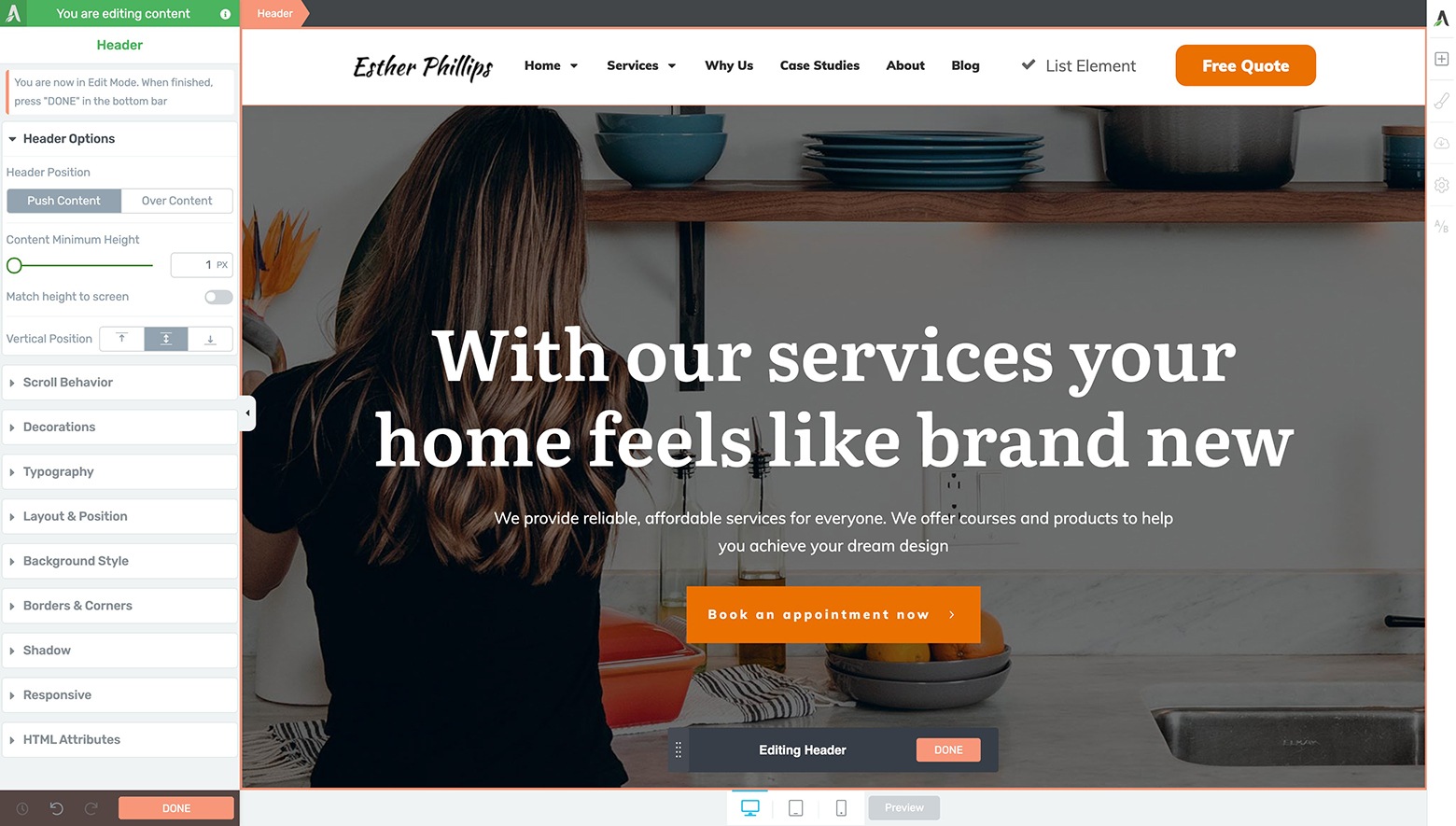
After completing the above 10 steps, your "Call Me" Sticky Transition Header design should now look something close to this.
Now you’ll need to change the remaining Styled List Item to actually look like a Contact Number:
- Change the default check Icon in the Styled List Item from a check to a phone (highlight the Icon of the Styled List Item element >> open the Main Options tab in the left sidebar >> click on the “Change icon” button >> search for and select a new phone icon from within the “Icon Library” lightbox that appears)
- Change the color of the new phone Icon to match your brand color (highlight the Icon of the Styled List Item element >> open the Main Options tab in the left sidebar)
- Change the Inline Text of the Styled List element’s remaining List Item (double-click the Inline Text of the List Item)
- Modify the List Item’s text styling as desired (double-click the Inline Text of the List Item >> open the Main Options tab in the left sidebar)
At this point, it’s time to do a quick optimization run through of the Tablet and Mobile editor modes to make sure the “On Load” state is ready to appear on smaller screen sizes (just like you did in the previous 2 examples).
With that, your “On Load” state of this “Call Me” Sticky Transition Header design is complete:

After completing all the "On Load" state customization and mobile optimization steps, your final "On Load" state of your "Call Me" Sticky Transition Header design should look similar to this.
Finally, it’s time to design that special call to action focused “On Scroll” state for this particular "Call Me" Sticky Transition Header…
How To Craft the “On Scroll” Header State
This means you’ll need to once again enter the Scroll Behavior tab of the left sidebar while the Header element is highlighted. From there:
Switch the “Behavior on Scroll” setting to Sticky.
Toggle the “Switch on scroll” option to ON.
Switch to the “On Scroll” state in the floating “Editing Header” bar at the bottom center of your Thrive visual editor.
Set the “Switch after” setting to something like 500 pixels (so the header transition occurs near the bottom of your hero image above-the-fold area).
You can now customize the “On Scroll” state to match the finished example by doing the following:
Delete the Custom Menu element as well as the Column element it’s held within.
Delete your Styled List element (a.k.a. contact number) and replace it with a Text element that you style to become a benefit focused line of copy.
Change the Inline Text of your Button element to showcase your Contact Phone Number instead.
Make your CTA Button “click to call” (by setting the Button element’s Target URL link to the following format: tel: +1-555-555-5555) … or set the Button element action to open a conversion focused landing page in your sales funnel.
Run through the Tablet and Mobile editors to make sure the “On Scroll” design looks good for smaller screen sizes.
Click the peach “Done” button on the floating “Editing Header” bar and save your work.
When you preview this design, you’ll see a conversion focused “Call Me” Sticky Transition Header design that looks something like this:

Your "Call Me" Sticky Transition Header design should look something like this if you followed the instructions above to build this example on your own site.
Pretty impressive stuff, right?
Use this conversion focused Sticky Transition Header design anytime you want to keep a mission critical conversion goal front-and-center for visitors as they scroll down your landing page.
Ready To Build Your Own Sticky Transition Headers?
So that’s how to build a conversion focused Sticky Header sidekick for your heroic above-the-fold landing page designs.
If your header designs are looking a bit dated, maybe it’s time to update them for 2024. Build and deploy one of these conversion-focused Sticky Transition Header designs for your website now using the power available to you in both Thrive Theme Builder and Thrive Architect.
Have any questions about how to get your Sticky Transition Headers up and running? Leave them for us in the comments section below!


I noticed that now we can’t unsign colors easely. Example: I assign a color to some background and then want to remove it. I have to do several clicks and select the hexacode to finally delete…. There was a remove color “check” before. This is a bit annoying for UX or I’m missing something…
https://share.getcloudapp.com/E0urbBqn
Now the good news 🙂 thrive builder had an awesome comeback. I’m surprised! Congrats to the team!
Hi Antonio,
There actually is (but granted it’s a bit hidden) once you unlinked the color (which you only have to do when using template, theme or global colors) you can click on the actual color square. This brings up an X to delete the color: https://share.getcloudapp.com/2Nuj5wjP
TBH I’m not sure if it’s really that much faster than deleting the hex color though 😉
🙂 I totally missed that. Thanks.
Wow, was this ever helpful… Thanks so much, Matt; it was a great presentation!
Cheers David… glad to hear you found the content so useful!
I have been paying for the full service for several years now and STILL have nothing up because it is too overwhelming and complicated. Here is an idea for you and the Thrive engineering team if you don’t already have someplace I have not yet discovered. I want two things. 1) A button that will spin up the basic site so all I have to do is fill in the content. Of course, I can change elements later after I get something on the web and start to understand all the options. 2) A complete CHECK LIST of all the elements I need to get the blog/website complete. ie. logo, photos, about me, email set up with landing page and confirmation pages….etc.
Hi Thomas,
Building a website and an online business is complicated and we do our very best to make it as simple as possible, but unfortunately there is no magic bullet.
The wizard in Thrive Theme Builder is as close as you can get to a “one button” setup for your site! Click through the steps in the wizard and you WILL have a functional website by the end of the 10 steps.
You can see me build a complete website (including contact page, email opt-in forms and about page) here: https://www.youtube.com/watch?v=Qmc_5ccPlAU&lc=UgxQyWwHtJkheQWme5x4AaABAg&ab_channel=ThriveThemes
Great stuf, remind to update my website for mobile.
Thanks Christiaan! Yup, always important to make sure your designs are fit for mobile too. 😉
Great video. Wouldn’t you want to use the Smart link for the phone number?
Hi Carl,
If you’re referring to the global fields in the Smart Site section, you could definitely use that!
We don’t call them Smart links though, because Smartlinks is a feature in Thrive Leads that allows to hide opt-in forms.
Yes, sorry Hanne I had a brain freeze while I was typing… Smart Site phone global field.
Thank you, Matt, this was a long video, but I liked it and learnt a lot. I can’t wait to use this cool feature on my sites. 🙂
You’re welcome Tibor… good luck getting it your new Sticky Transition Header dialed in!
Awesome (as usual)!
One quick thought…
Since the original header was already white background with black text which is what you wanted for the “on scroll” version, wouldn’t it have been quicker to select the “switch on scroll” checkbox first so it duplicated that for the on scroll version, then go back and just change the “on load” version?
I imagine you didn’t do this because you wanted to show all the options available but…am I right that in this circumstance that would save you from having to make those extra edits switching the background color and text colors back to their originals?
Hi, guys. is there any plan to connect woocommerce with Thrive Apprentice?
Because I think then, it’s everything that I need. and it closes the “payment’s” open loop for a digital product business with Thrive.
I agree with that and yes we do plan to integrate Apprentice with WC – it’s on our roadmap but I can’t give an ETA just yet
This was a great video Matt. Thanks
How do I make a double header a single header on tablet and mobile so that the navigation doesn’t overlap the audio and video post?
Gday Matt , Still waiting on earlier query that is stuck in moderation :
—-
This comment is awaiting moderation
Hi Thrive Team ,
Building a new site on theme builder . Can I add a simple sticky header function to an existing header I’ve modified via Thrive tutorial for Simple Mega Menus – ? Draught mode at the moment https://pauldaviescoaching.com/
Yes you should be able to make that existing header sticky.
My God!!
Why don’t you just offer it as a template? I miss the days you had ready made templates we could use (Focus anyone?!)
Hi Darlene,
Any of our companion themes comes with 100rds of pre-made templates including headers 🙂
Making a header on desktop is great but making the header look good and functional on mobile is not so good.
I like mobile headers to be one column high. I don’t like how the columns stack on top of each other.
Some of the headers take up nearly half the above the fold screen on mobile.
A lot of the features that are shown on the desktop menu need to be move to the off canvas menu area.
We need a lot more freedom to design the off canvas menu area.
So how about you guys spend some time looking at different websites or WordPress themes and check out the mobile menus
This really is an issue when we use the woo commerce headers. So please have a look at some woocommerce themes and see how they layout there mobile menus.
Love your products but this has been an issue for a while, hope you can fix it.
Keep up the great work. Cheers
Hi Adam,
If you want a radically different header on desktop and on mobile, I’d suggest creating 2 separate headers instead of adjusting the desktop header to mobile.
You can easily hide the desktop header on mobile and visa versa.
You can see it in action here on our own site 🙂
You’d also notice that we’re taking advantage of the off-screen menu option to avoid overcrowding the header.
And specifically for e-commerce you have the possibility to use the “mini-cart” in the header to give easy access for customers.
The pre-made headers in the templates use the same version on desktop and mobile because it would become confusing for customers to understand, but on your own website, I highly recommend separating both for more design freedom.
If there’s a specific header you want to re-create but are unsure where to start, feel free to ask in our Facebook group: https://www.facebook.com/groups/383136866154053
Hi, thanks great tutorial. Is it possible to add connect on whatsapp/messenger to the CTA button tel: options – that is more common in Asia?
Hi Catherine,
Yes you can 🙂 You can see how to do this in this tutorial: https://help.thrivethemes.com/en/articles/6126841-how-to-add-a-whatsapp-button-to-your-website