Want to learn how to create an impressive case study template to showcase your customer stories the right way?
Keep on reading because you've come to the right post!
A proven case study template can transform those client success stories from forgotten portfolio pieces into real conversion-generators.
In this tutorial, you'll discover how to build case studies that hook readers from the first sentence and guide them smoothly toward becoming leads.
Skip the trial and error - we'll show you how to create a beautiful, reusable and conversion focused client case study template fast using Thrive Architect.
The Ultimate Case Study Blueprint
What if I told you that you could easily design a high quality case study template like this:

You can build this very same case study template – from scratch – in just a few minutes using nothing but Page Blocks!
All without needing to know how to code?
The answer is simple: using page blocks from Thrive Architect.
What Are Page Blocks?
Thrive Architect's block templates are pre-designed sections you can easily add to your pages with just a click. These templates are made up of various elements like text boxes, images, contact forms, and buttons, all arranged in visually appealing layouts.
You can quickly customize these templates to match your brand, saving you time and effort in designing your website pages from scratch.
This design is not only quick and easy to create with Page Blocks, but it’s also mobile responsive – straight out of the box!
And because all our Page Block templates are also Smart Color enabled, your case study pages will always match your site’s Brand Color no matter how often you change it:
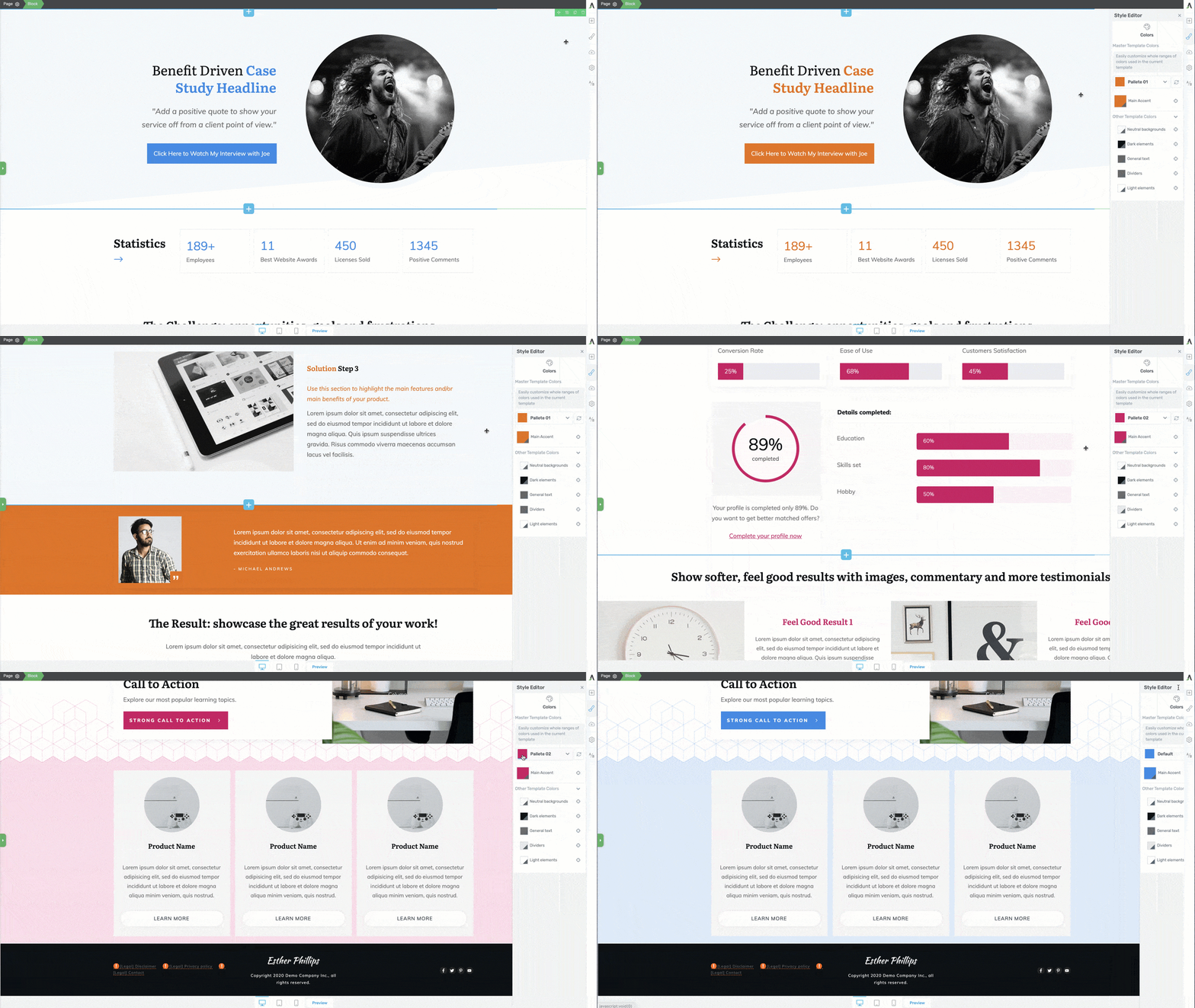
All the Page Block designs are Smart Color enabled, which means no matter what you change your site colors to — your case study pages will always match your brand!
So how ‘bout it? Are you ready to build your own client case study template with Page Blocks using the Ultimate Case Study Blueprint design? Keep scrolling...
How to Create an Amazing Case Study Template for Your Website (with No Code)
This tutorial is super easy and straightforward. By the end of it, you'll have a case study template that looks just as great as ours!
Step One: Download and Install Thrive Architect
If you want to build this amazing case study template, you'll need Thrive Architect, our top landing page builder. It takes the headache out of design work and lets you create stunning case studies (and other landing pages) by simply dragging and dropping. What you see while building is exactly what your visitors will see – no surprises when you hit publish.
When you use this plugin, you get the option to use one of our page templates to build your landing pages -- and these templates are stunning. They're also built with conversion-focus in mind, which means they're designed to get your audience to act.
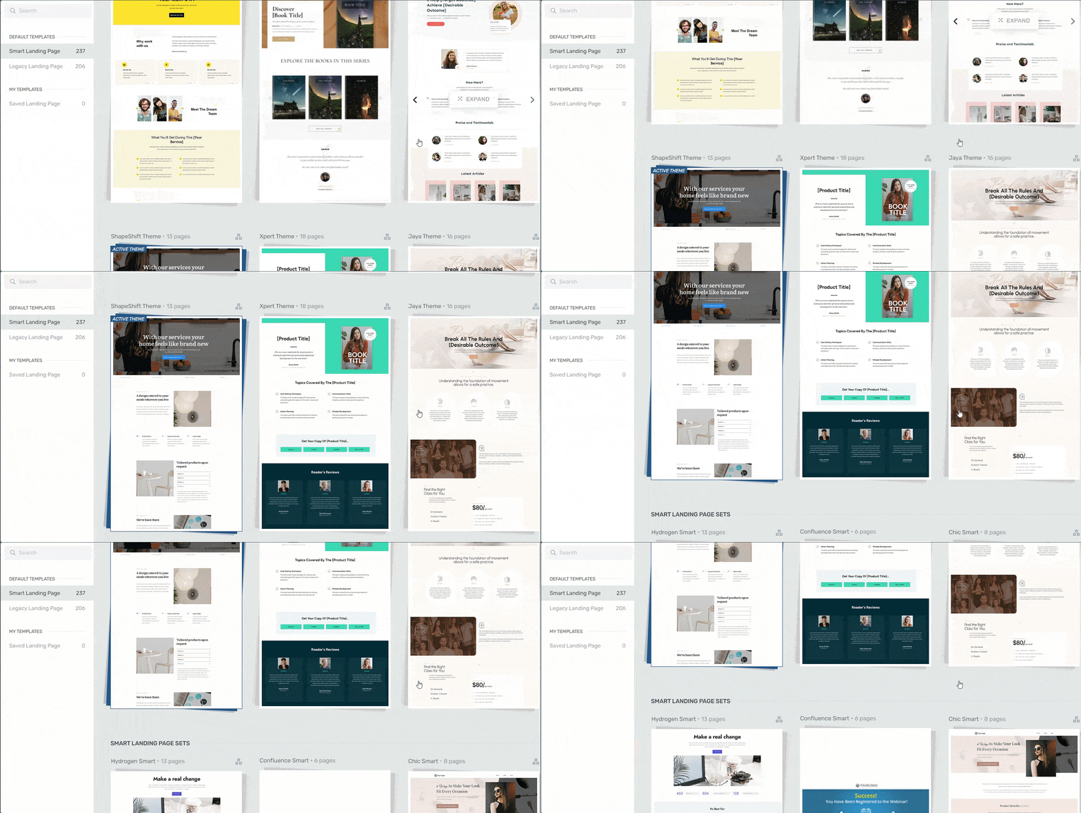
Landing page template sets in Thrive Architect
These templates are just a start. The design magic starts with Thrive Architect's Page Block templates.
They make building so much easier and give you the chance to make your pages uniquely yours.
You also get a library of individual design elements you can easily add to your pages. You can add pricing tables, countdown timers, lead-generation forms, and so many more items to make your pages look and function better.
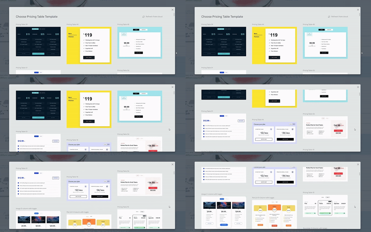
Example of pricing tables in Thrive Architect
The best part? Once you've created a case study template you love, you can save the entire layout as a template (and we'll show you how). Next time you land a big client win, you'll have your case study format ready to go. Just plug in your new content and publish – what used to take days now takes minutes.
Your case studies will look amazing whether someone's reading them on a laptop or checking them out on their phone during their commute. Everything adjusts automatically, so you never have to worry about mobile viewers getting a broken layout.
You have Thrive Architect to thank for that.
Pro tip
If you want to create a template that looks exactly like our Case Study Blueprint, you'll need to purchase Thrive Architect with Thrive Theme Builder, our theme builder plugin.
These two tools work in tandem to help you create a stunning WordPress website and you get access to more Page Block templates in Thrive Architect as a result!
You can learn more about this tool right here.
Step Two: Set Up Your Page in WordPress and Thrive Architect
To get started, open your WordPress dashboard and create a new Page.
Name it something generic like “Case Study Template” (so you can one-click clone it for actual case studies once your template is finished) then save the page as a draft. After that, click the “Launch Thrive Architect” button to open the visual editor.
Select the “Completely Blank Page” option when prompted:
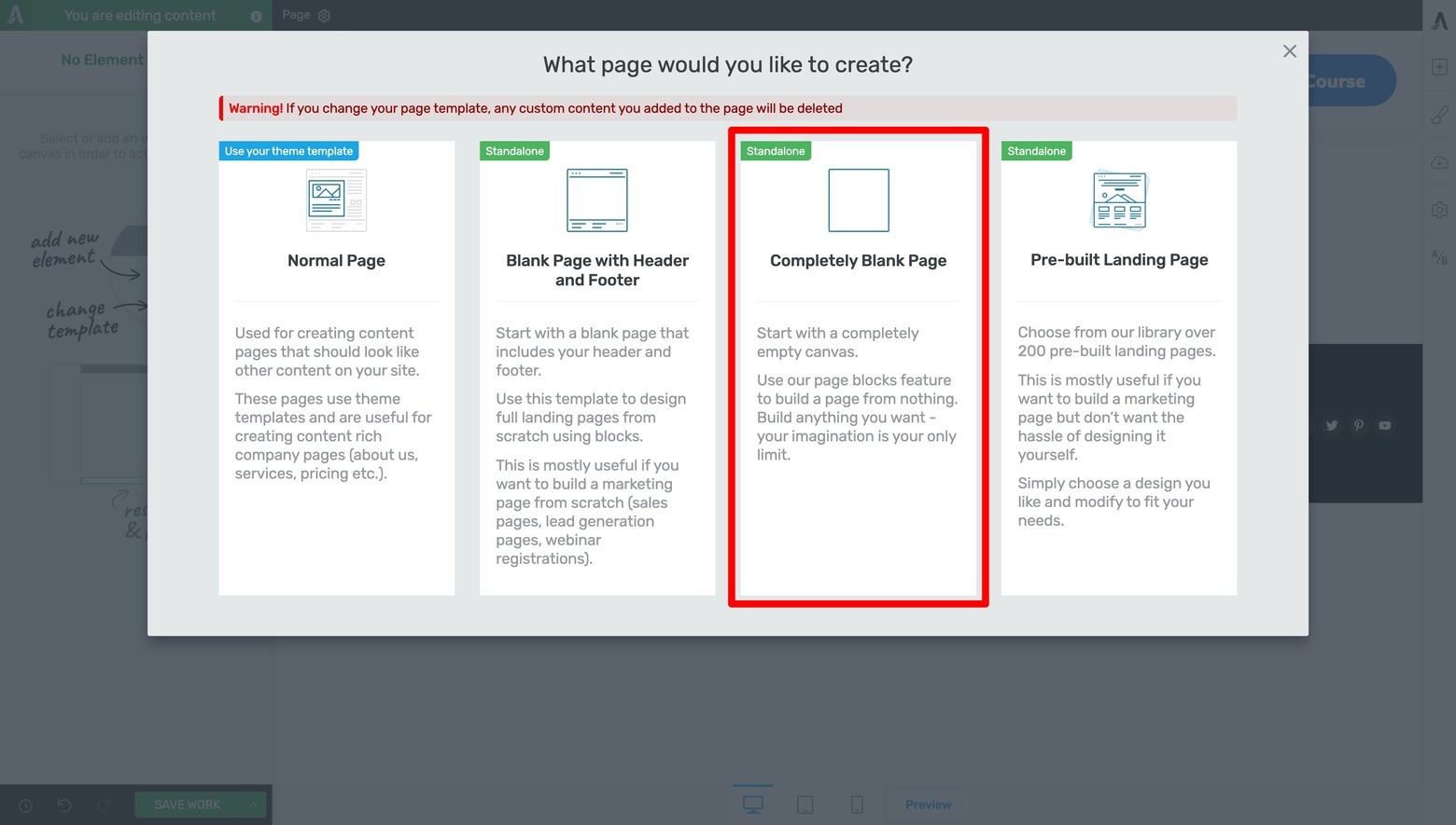
To make your landing pages hyper conversion focused, choose the "Completely Blank Page" option when prompted.
From there, start building your case study template by clicking the “Add A Block” button to open the Page Block Template Library:
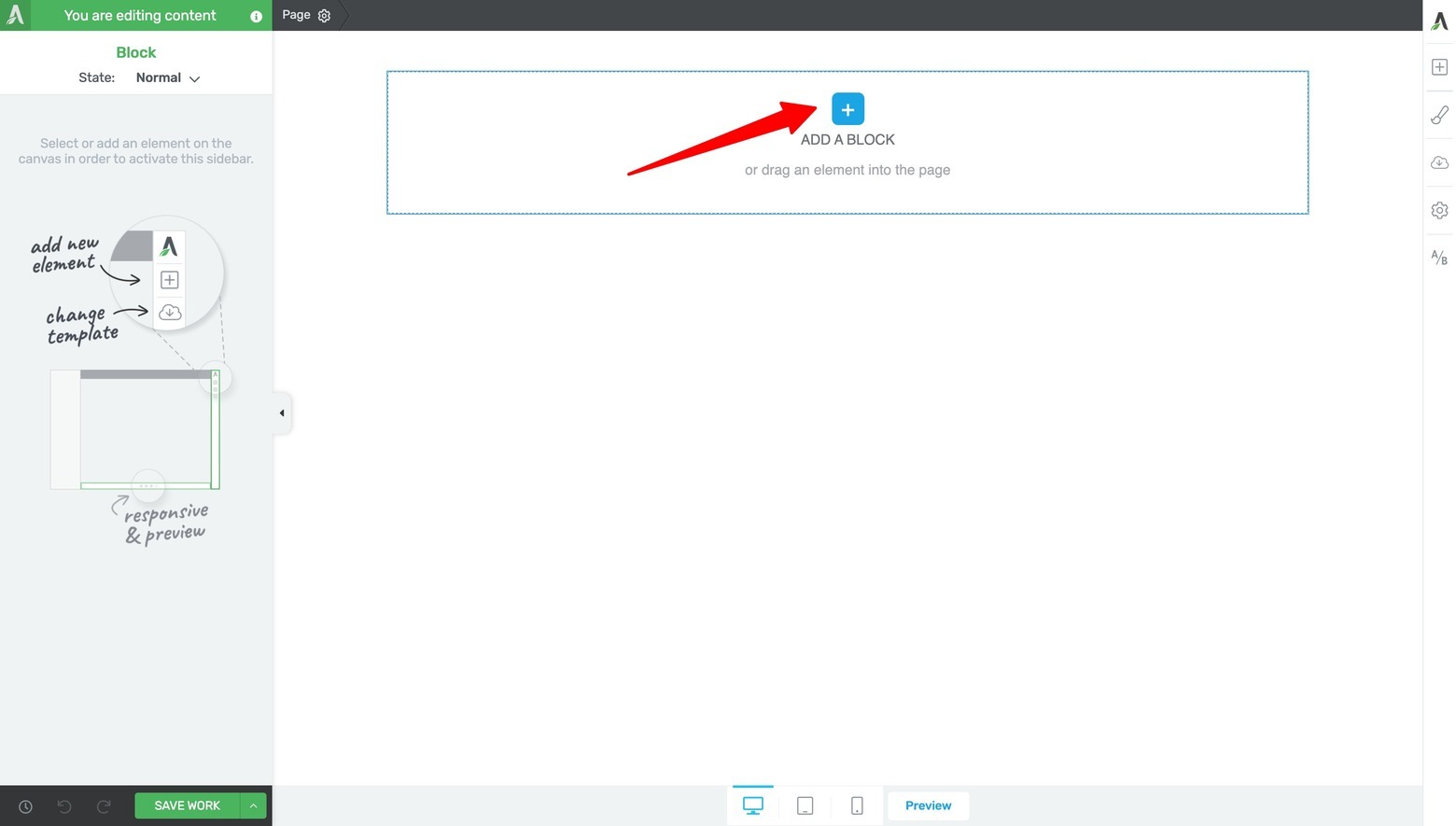
Click the "Add a Block" button on your blank landing page to open the Page Block template library to get started.
Once the Page Block Template Library appears on screen, it’s time to select your...
Step Three: Design Your Hero Area Section
Your hero section sets the tone for your case study and gives readers an immediate snapshot of what they'll learn.
As per the Case Study Blueprint design, this template begins with an above-the-fold Hero Area that includes a:
- Benefit driven headline
- Positive and engaging quote about your business from the client
- And an authentic, eye-catching image of your client or their business
Using Thrive Architect's drag-and-drop editor, you can position these elements for maximum impact without overwhelming your visitors.
To find the right Page Block design, filter for the “Hero Area” templates in the library’s left sidebar and select one of the options that includes these elements:
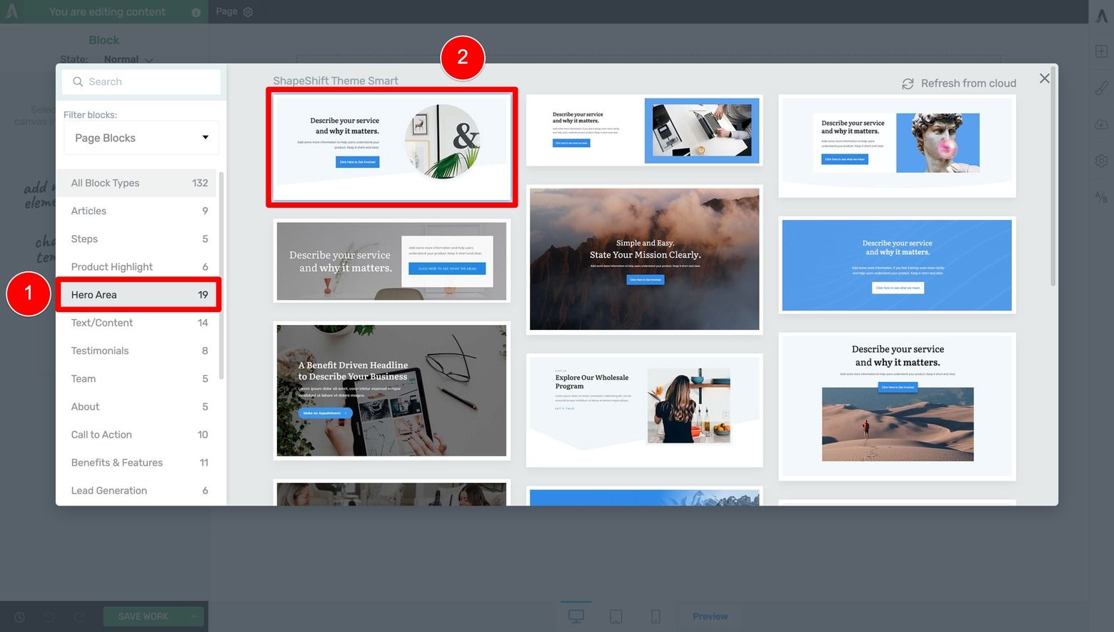
Filter for and choose a "Hero Area" design.
Once the Page Block design loads, you can swap out demo images for photos of a client (or their business) and replace the demo text with more instructional style copy (to help prompt yourself to write good copy when crafting an actual case study):
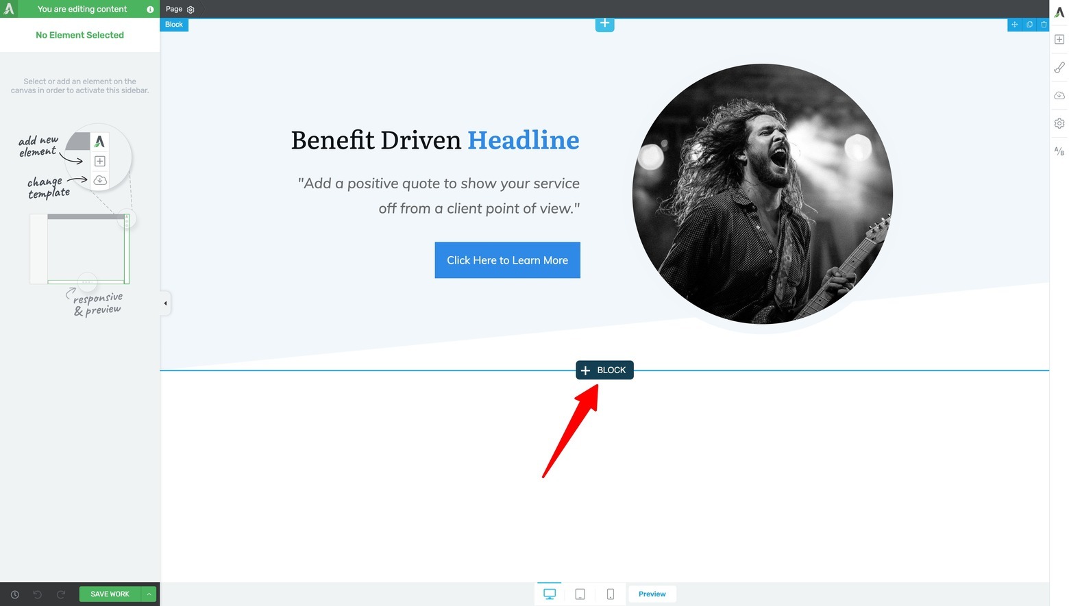
Swap out the Page Block demo content with your own images and instructional copy, then click on the "+ Block" to add the next section.
From here you can continue on to building the next section by clicking either the “+ BLOCK” button at the bottom of the existing Page Block (shown above) or by dragging & dropping the Block element into the editor window (shown below):
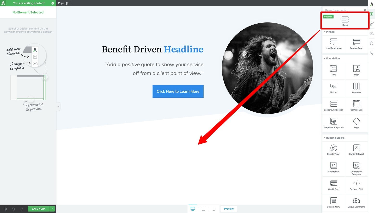
You can also add Page Blocks and access the template library by dragging & dropping the Block element onto the visual editor window from the right sidebar.
Step Four: Add an Impressive Stats Section for Social Proof
The next thing to add to your case study template is an Impressive Stats section.
A well-placed stats section reinforces your case study's credibility by highlighting the measurable impact of your work.
If you filter for “Statistics” templates in the Page Blocks library, there’s a design available that was made for exactly that purpose:
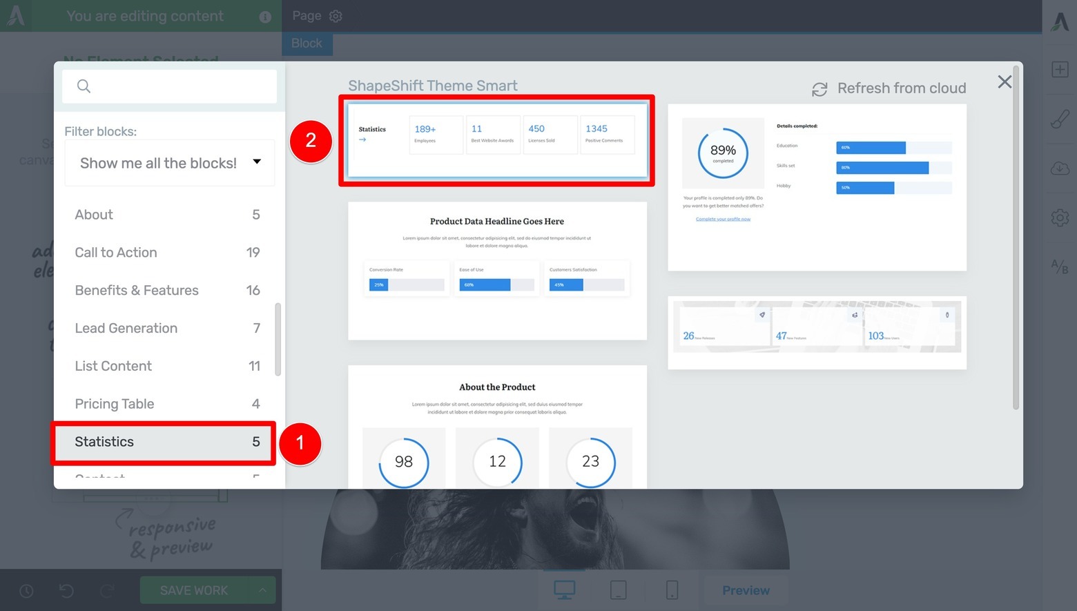
Filter for and choose a "Statistics" design for your Impressive Stats section.
Once loaded, just update the demo text as needed to give yourself the necessary instructional prompts for future case studies:
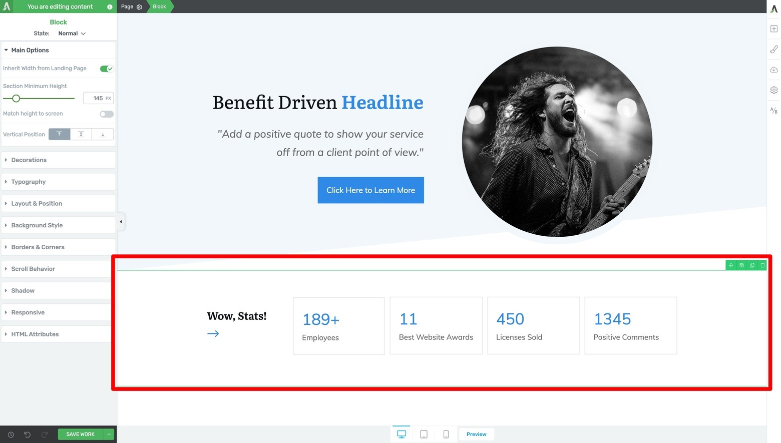
Swap out the demo text with your own instructional copy and data descriptors.
Step Five: Build the Challenge Section
This section helps readers connect with your case study by showing you truly understand the problems they're facing. Paint a clear picture of your client's situation before they worked with you.
Next, you need to add a Challenge section. Do this by filtering for “Text/Content” Page Block designs and selecting the one you feel will help you best showcase a client’s problems, goals & frustrations:
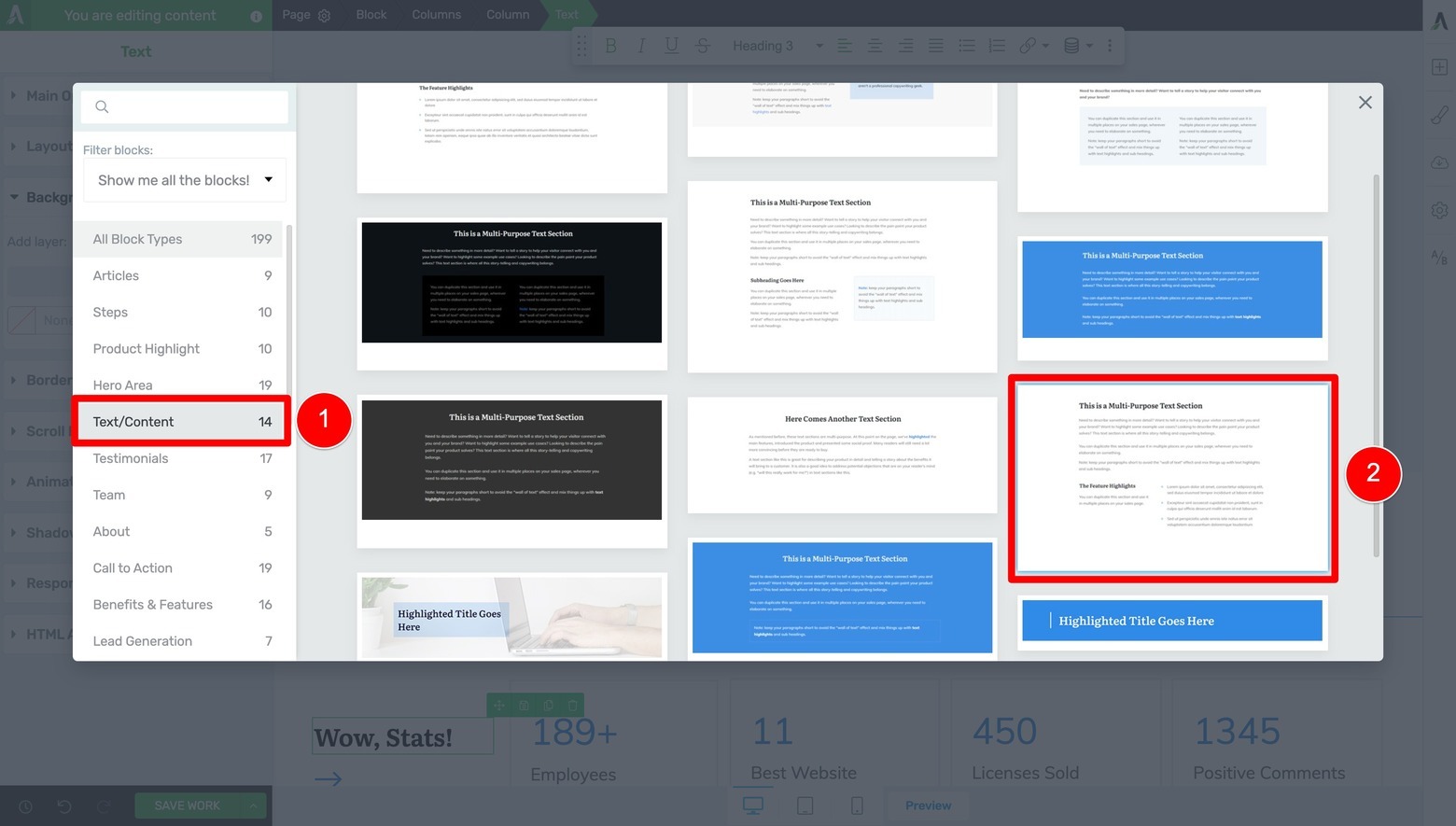
Filter for and choose a "Text/Content" design for your Challenge section.
Once you replace the demo text with instructional copy, it should look something like this:
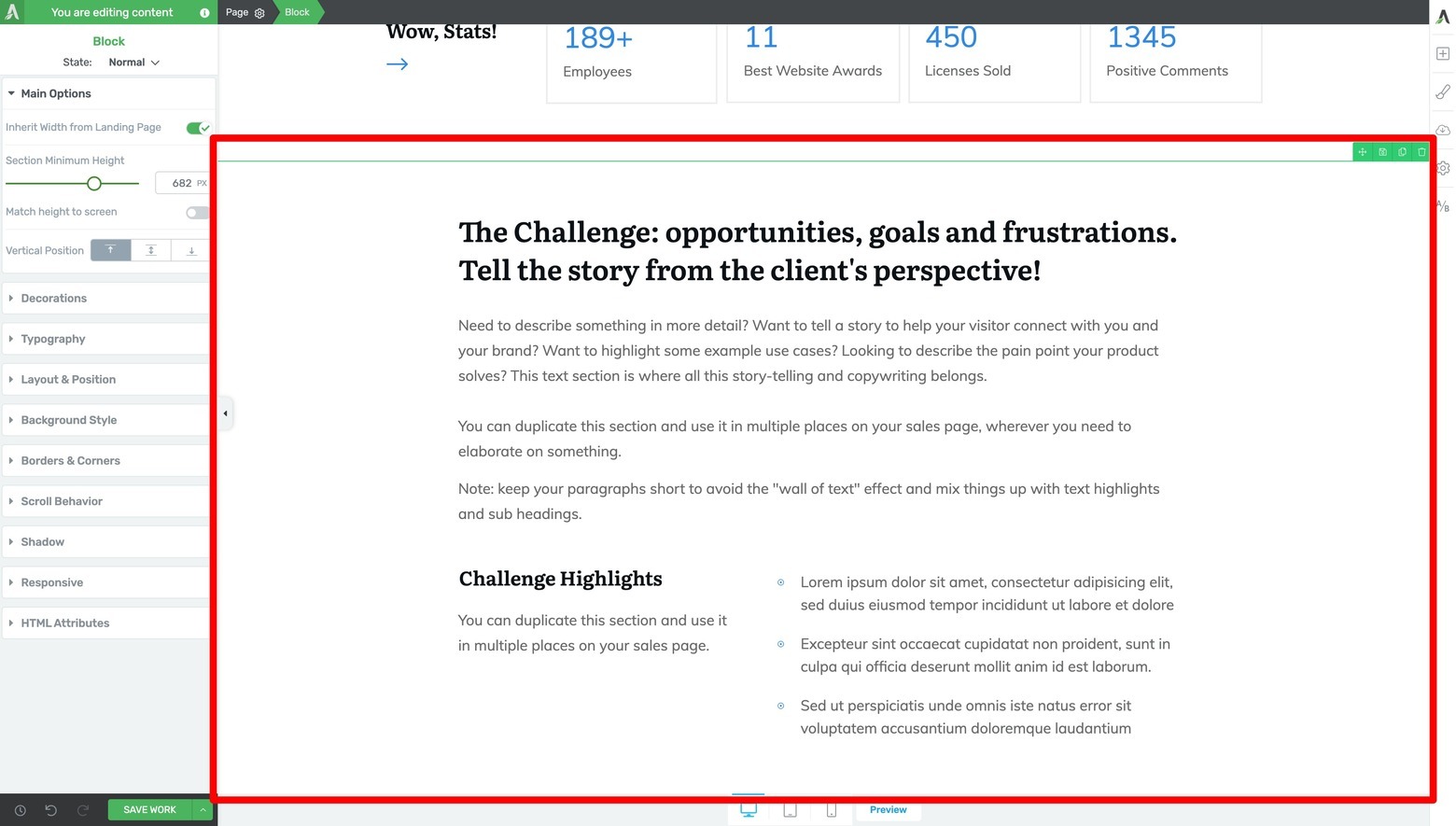
Swap out the demo text with your own Challenge section instructional copy.
Stay focused on problems your target audience will recognize – like "Manual processes eating up 15 hours per week" or "Cart abandonment rate at 82%." Write this section from your client's perspective, using direct quotes when possible to add authenticity. Keep each challenge description brief but detailed enough to show the real impact on their business.
Step Six: Create Your Solution Section
Here's where you show your expertise in action. Break down your solution into clear, digestible parts using Thrive Architect Illustrated List template.
Start with a brief overview of your approach, then detail the specific steps you took to solve your client's challenges. For example: "We implemented a three-part strategy focusing on email automation, checkout optimization, and customer feedback loops."
If you don’t find the design you’re looking for, click the “Filter blocks” dropdown menu (underneath the search bar of the template library’s left sidebar) and select the “Show me all the blocks!” option. This setting will make sure both your Theme Page Blocks AND the Thrive Architect Content Block templates are available to choose from.
But this only works if you're using Thrive Theme Builder as your WordPress theme.
Filter for the “Illustrated List” designs again and select the one you like best:
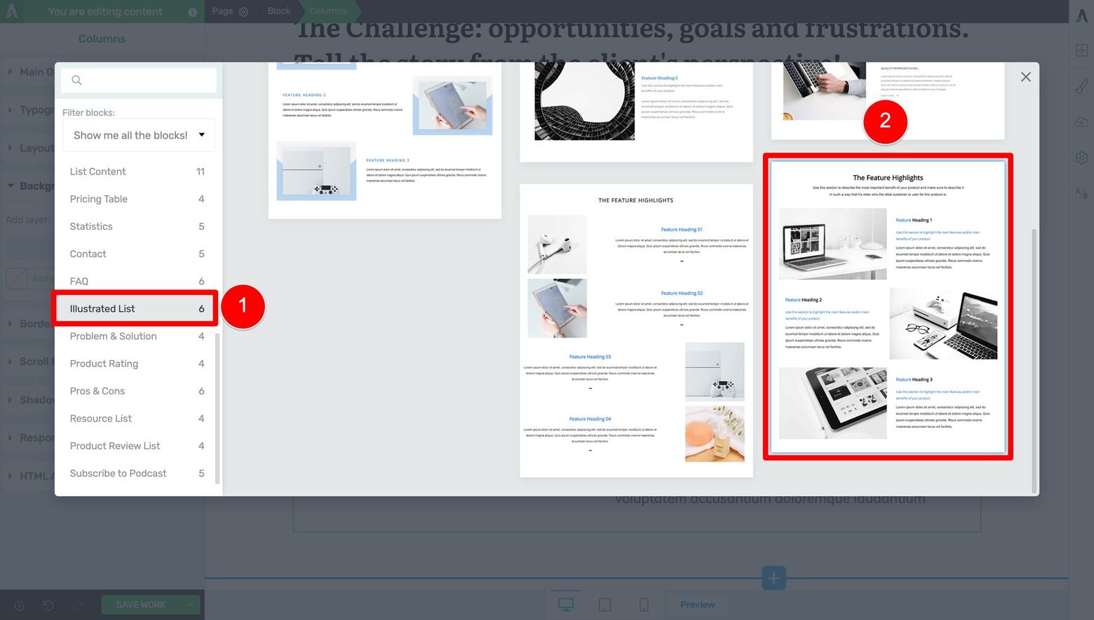
Filter for and choose an "Illustrated List" design for your Challenge section.
Once the Page Block design loads, create an attention-grabbing pattern interrupt by changing the Block element’s default white background color to one of the light accent colors from your Thrive Theme Builder brand color palette. This change of background color will visually signal to readers that they’ve entered a new landing page section and help keep them reading:
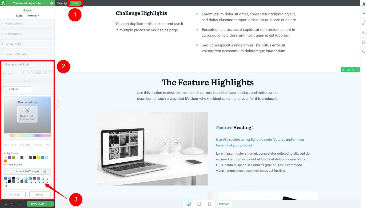
Change the Solution section's background color to one of your light brand accent colors to create an attention grabbing visual pattern interrupt.
And once you replace the demo text with more relevant instructional copy, your Solutions section should look similar to this:
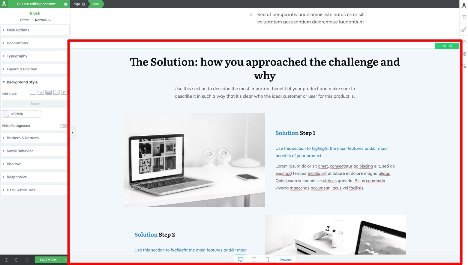
Swap out the demo text and images with your own Solution section instructional content.
Step Seven: Client Testimonial Section
Now, it’s time to add a small Client Testimonial section. A powerful testimonial adds credibility to your case study by letting your client tell the story in their own words.
If you’ve been following along so far, you know the drill…
Add another Page Block to your landing page, filter for Testimonial templates and select one that looks similar to the Case Study Blueprint:
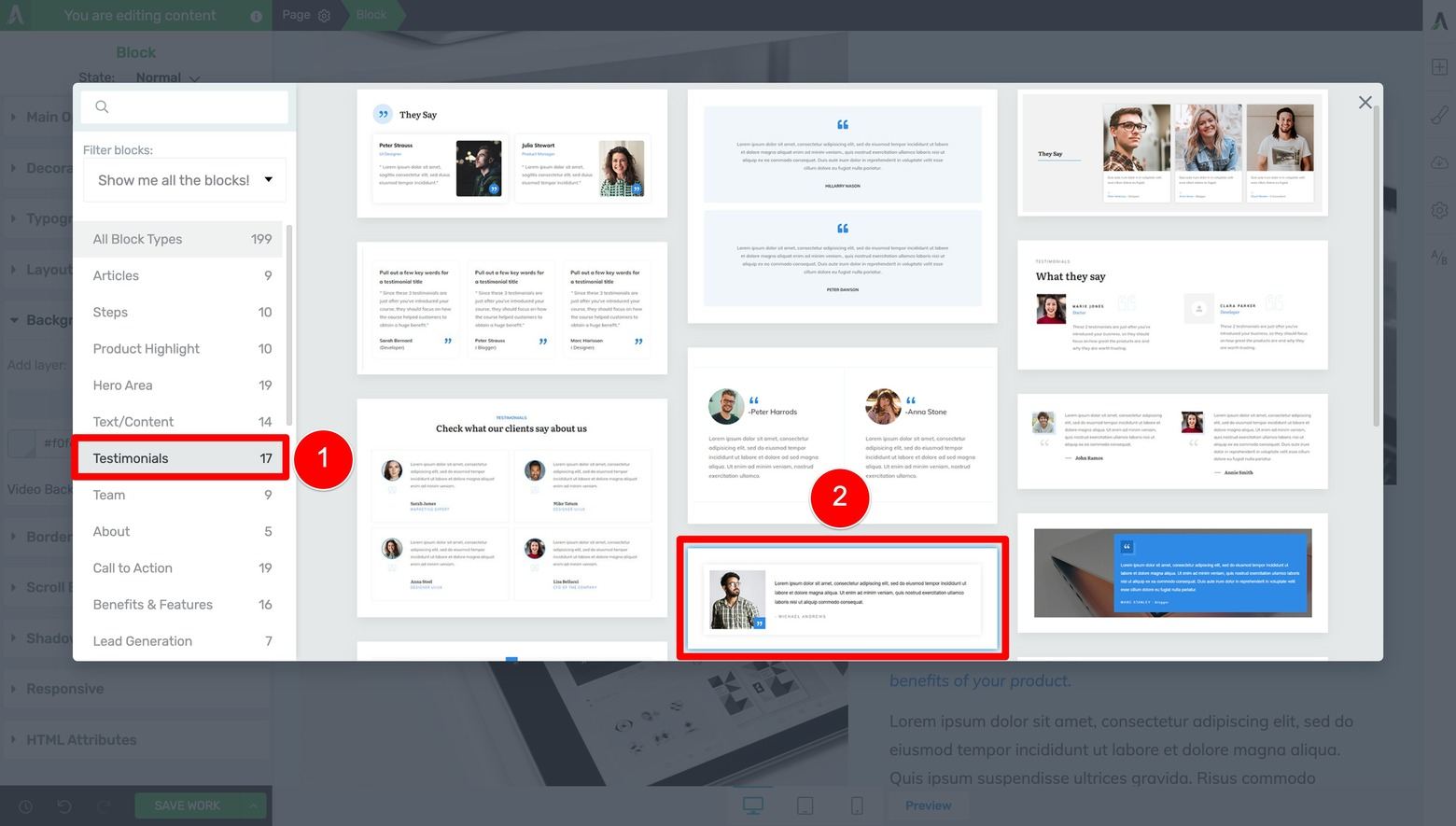
Filter for and choose a "Testimonials" design for your Client Testimonial section.
Again, you can change the Page Block template’s default white background color here with your Thrive Theme Builder brand color… this will really make your testimonials POP.
Just be aware that the default grey text color on this template won’t look very readable with certain dark brand colors — so you may need to change the text color to white if this happens.
But instead of changing each individual Text element’s font color, you should follow the Outside-In Principle and highlight the largest container (in this case the Block element), open the Typography tab in the left sidebar, and then change the font color to white there instead.
By doing it this way, all the Text elements within that particular Page Block will update together automatically:
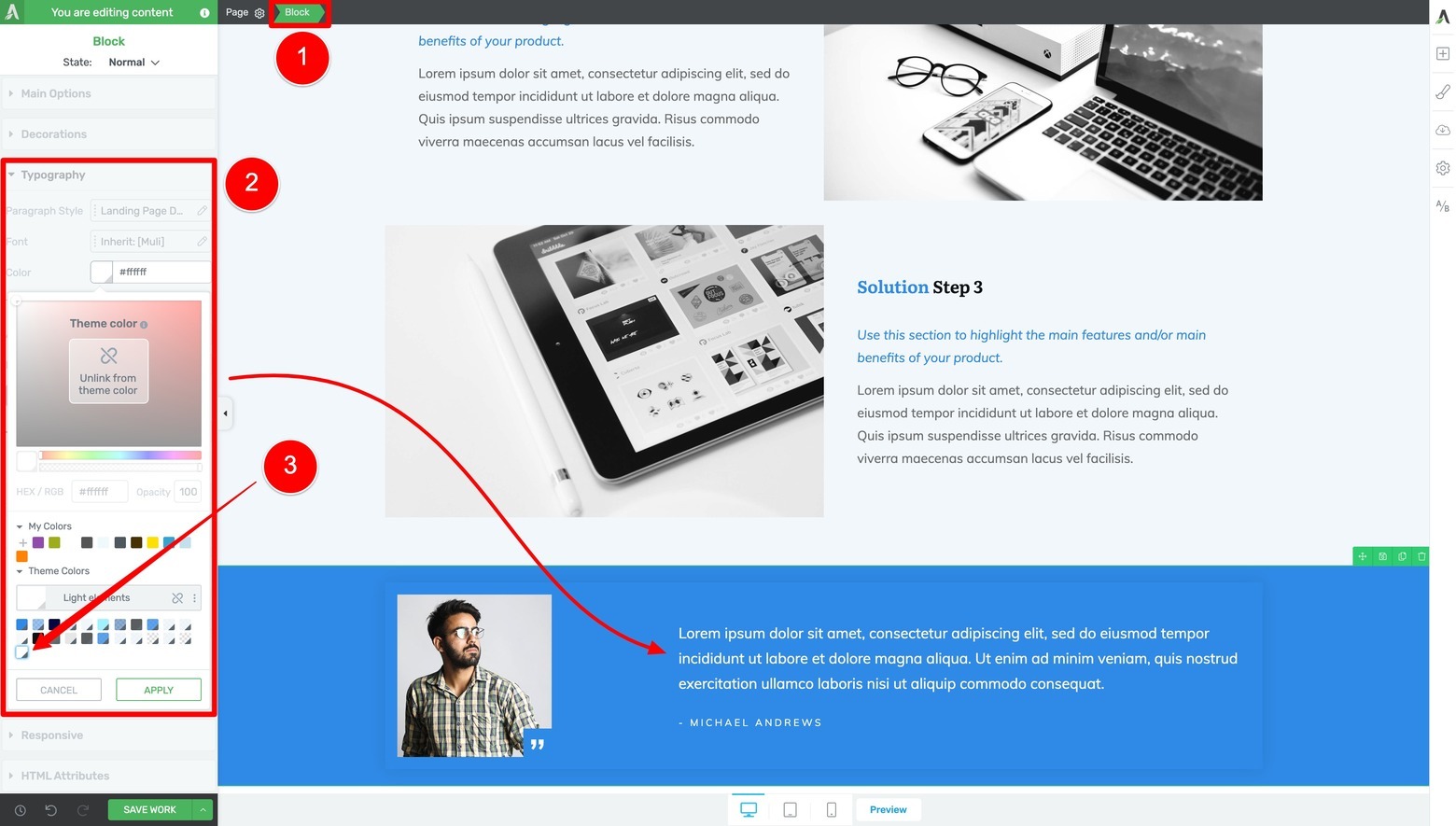
Change the Testimonial Page Block design's background to your brand color. Then follow the Outside-In Principle and change the Block element's Typography color to your brand white (instead of changing each individual Text element's font color).
Pro tip
Sometimes, asking for testimonials can be a challenge. If you want to learn how to request for reviews or feedback from your customers, check out this detailed guide.
Step Eight: Add The Results Section to Your Page
This section transforms your case study from a story into proof.
Here’s the place to show off impressive client results with graphs and charts by using some of the Page Block “Statistics” templates available. Filter for them in the Page Blocks library and select one of the options with a Heading element:
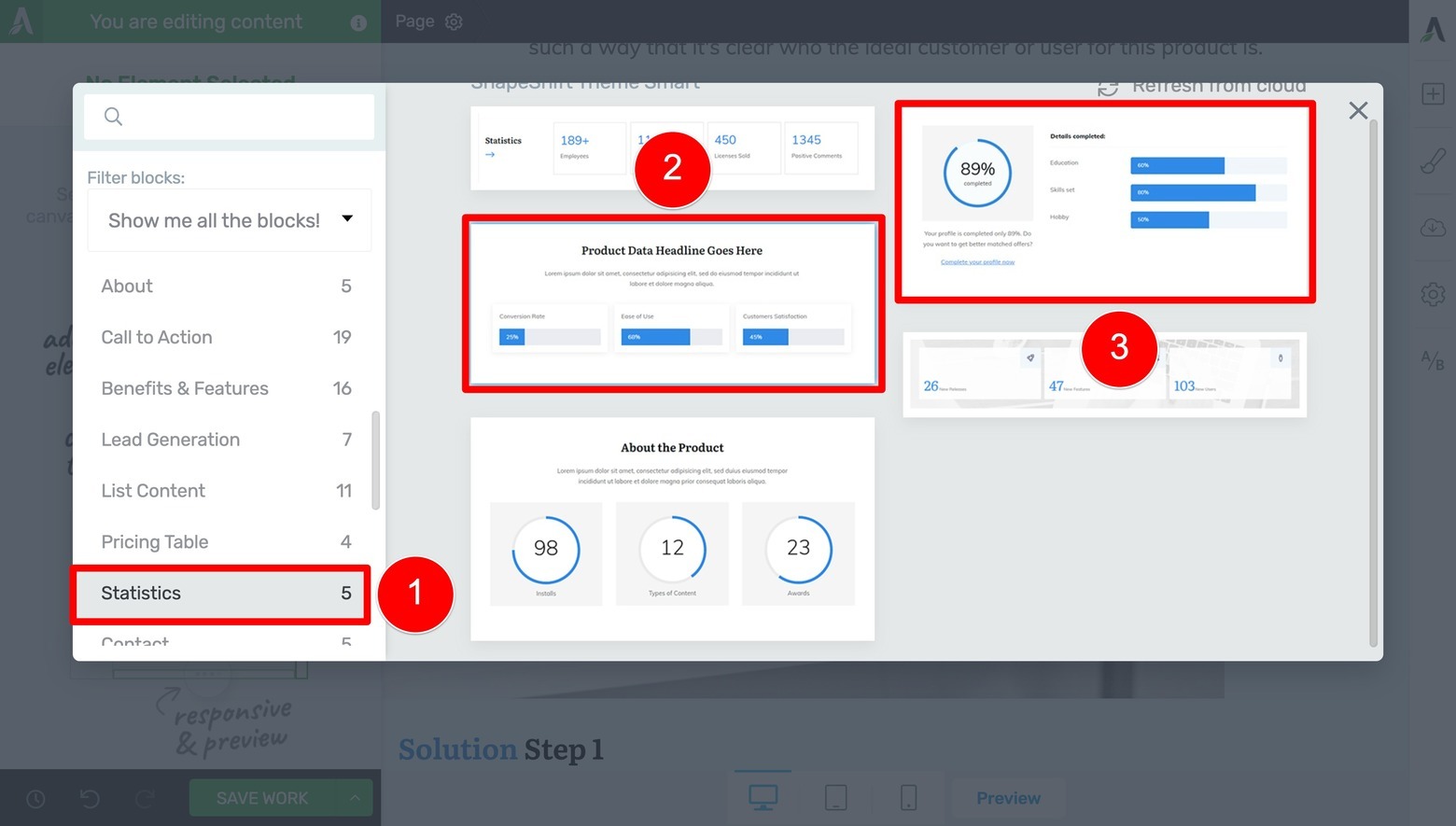
Filter for and choose one or two "Statistics" designs for your Results section.
Then, if you still need to include even more graphs or charts to your Results section, add another “Statistics” template to the page and then drag and drop them into the first “Statistics” Page Block you chose. Just delete the empty Page Block this step leaves behind.
After replacing the demo text with your instructional copy, your Results section could look something like this:
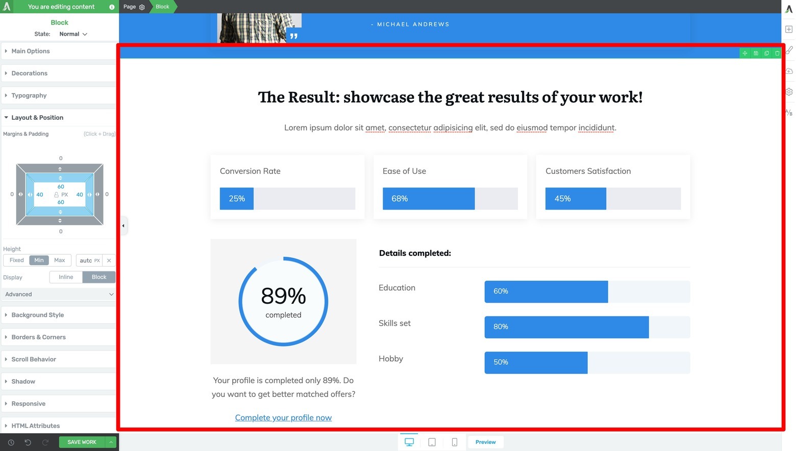
Swap out the demo text and graph/chart data with your own Results section instructional content.
Step Nine: Feel Good Results Section
The Case Study Blueprint recommends creating a “Softer, Feel Good Results” section that follows your charts and graphs.
You’ll find some interesting Page Block options to fit this purpose by filtering for the “Illustrated List” designs once again:
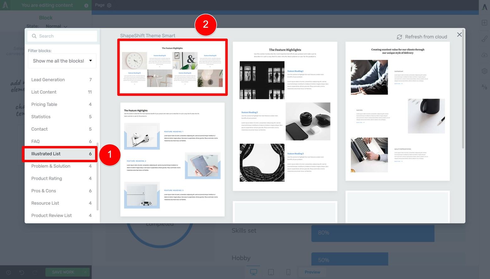
Filter for and choose an "Illustrated List" design for your Feel Good Results section.
After you update the demo text with instructional copy, you should have a neat image-commentary section you can now use whenever you need to show off some feel good results to help better connect with your prospective clients:
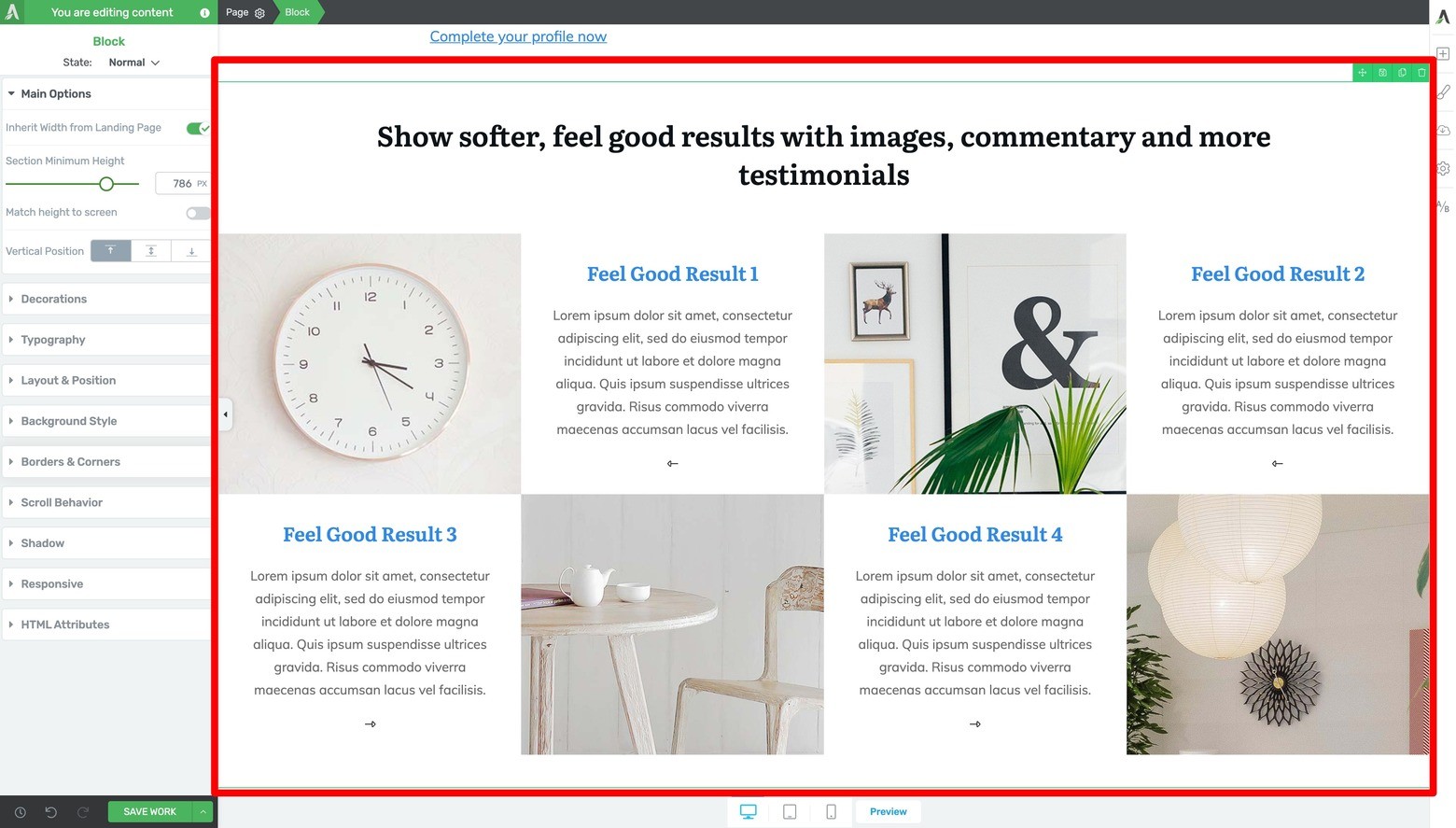
Swap out the demo text and images with your own Feel Good Results section instructional content.
Step Ten: Client Video Testimonial Section
As per the Case Study Blueprint’s design recommendations, you should do your best to acquire happy client video testimonials.
If you’re able to get such client testimonials, use one of the video “Call to Action” Page Block designs to create this next section:
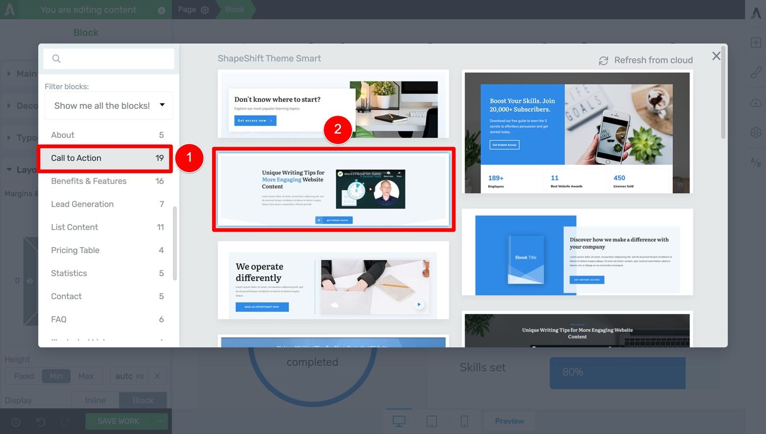
Filter for and choose a "Call to Action" design for your Client Video Testimonial section.
From there, you can templatize the text and swap out the demo video for one of your own.
Also, because the Case Study Blueprint recommends creating a dedicated Call to Action section after the video section, delete any default Call to Action buttons included in the template you chose:
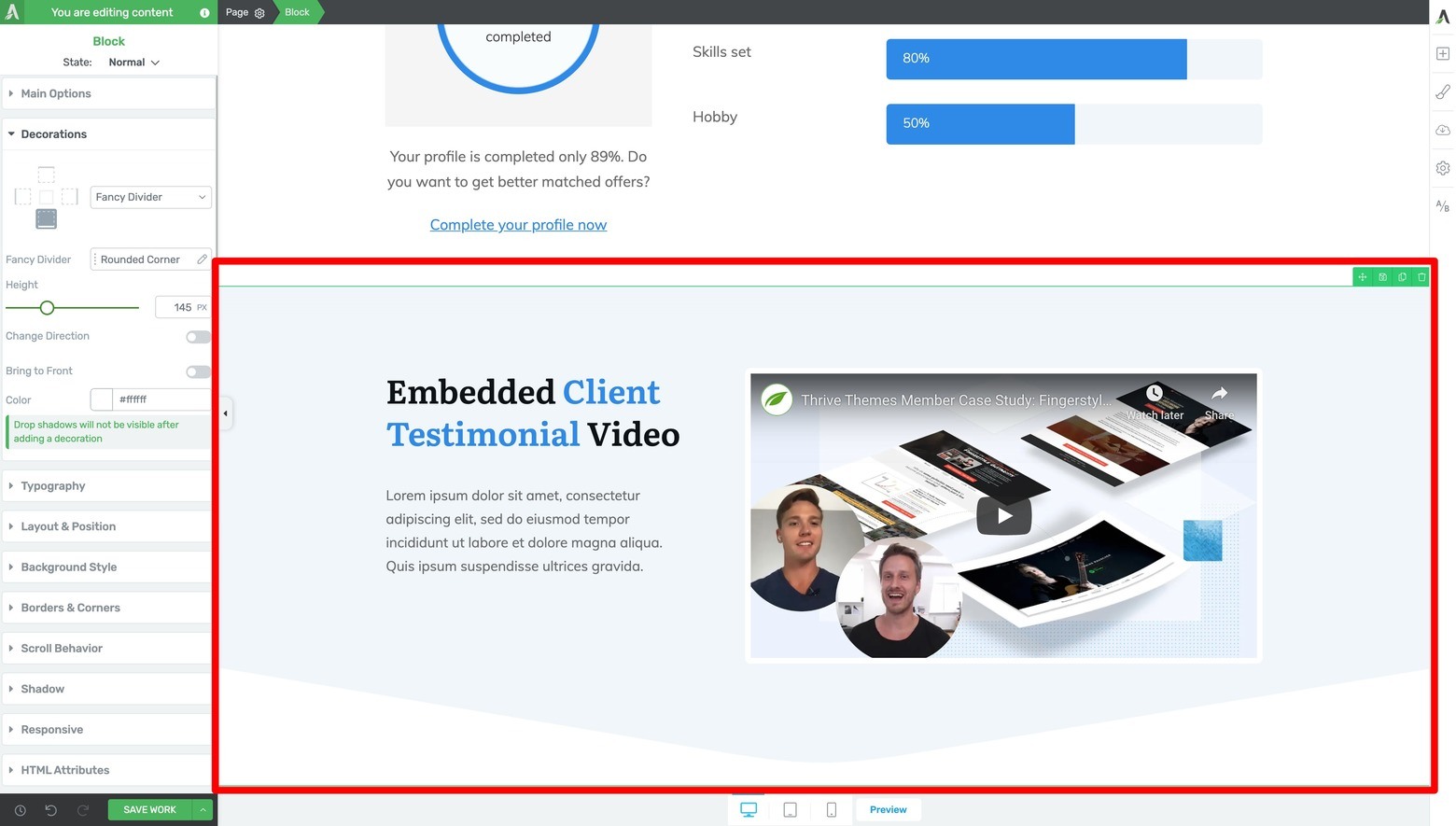
Swap out the demo text and video link with your own Client Video Testimonial section instructional content.
And don’t forget to scroll back up to your Hero Area section at this point so you can assign a smooth scrolling jumplink to the Button element there. Doing so will send visitors down to the testimonial video upon clicking:
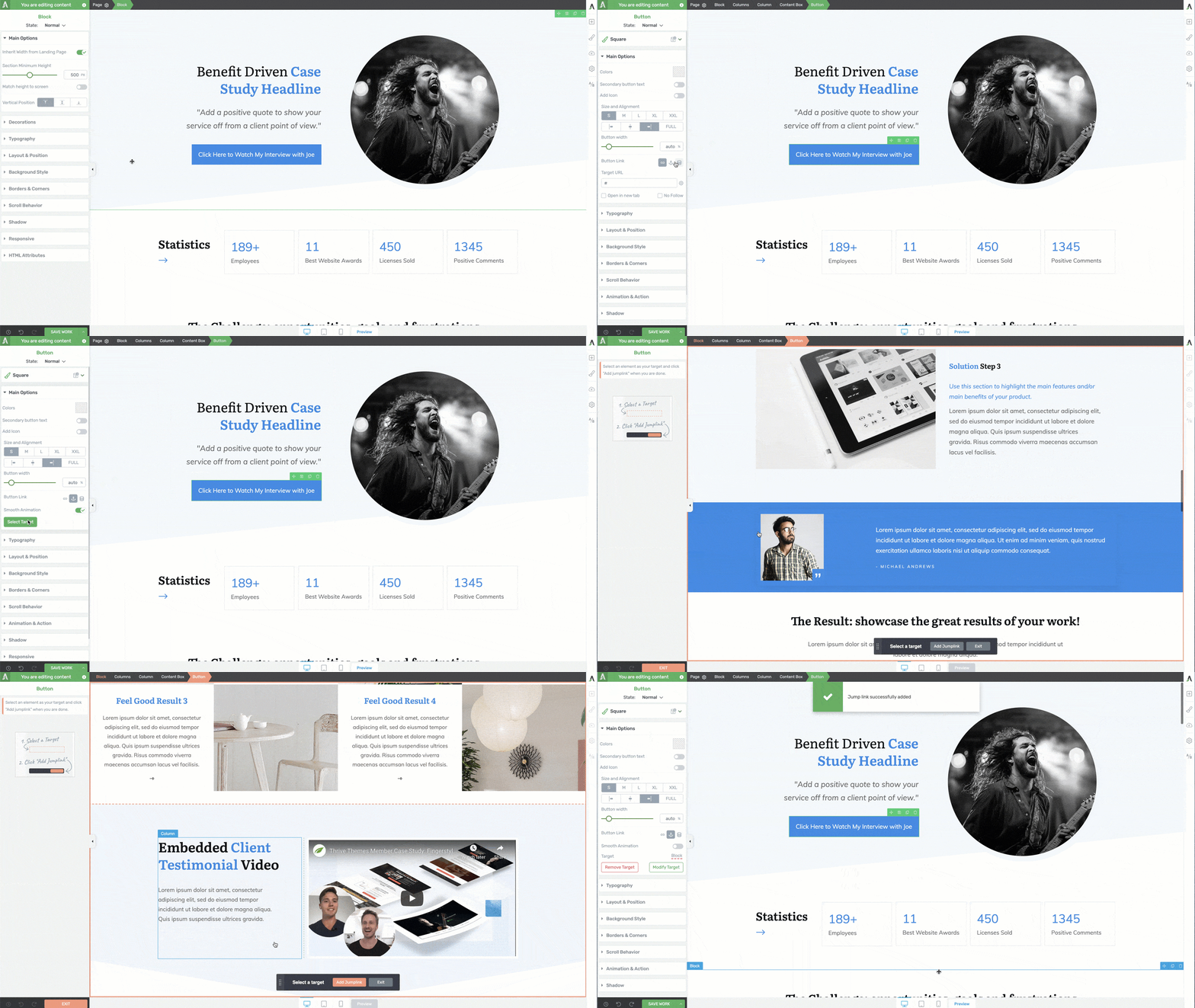
Add a jumplink from the Hero Area CTA Button to the Client Video Testimonial Block element.
Step Eleven: Call to Action Section
The most important part of any conversion focused landing page is its Call to Action section.
That’s why it’s no surprise that the Case Study Blueprint features a prominent Call to Action section immediately after the Client Video Testimonial section.
As you might expect, you can add a Call to Action Page Block design by filtering for the “Call to Action” templates and selecting the one that suits your needs best:
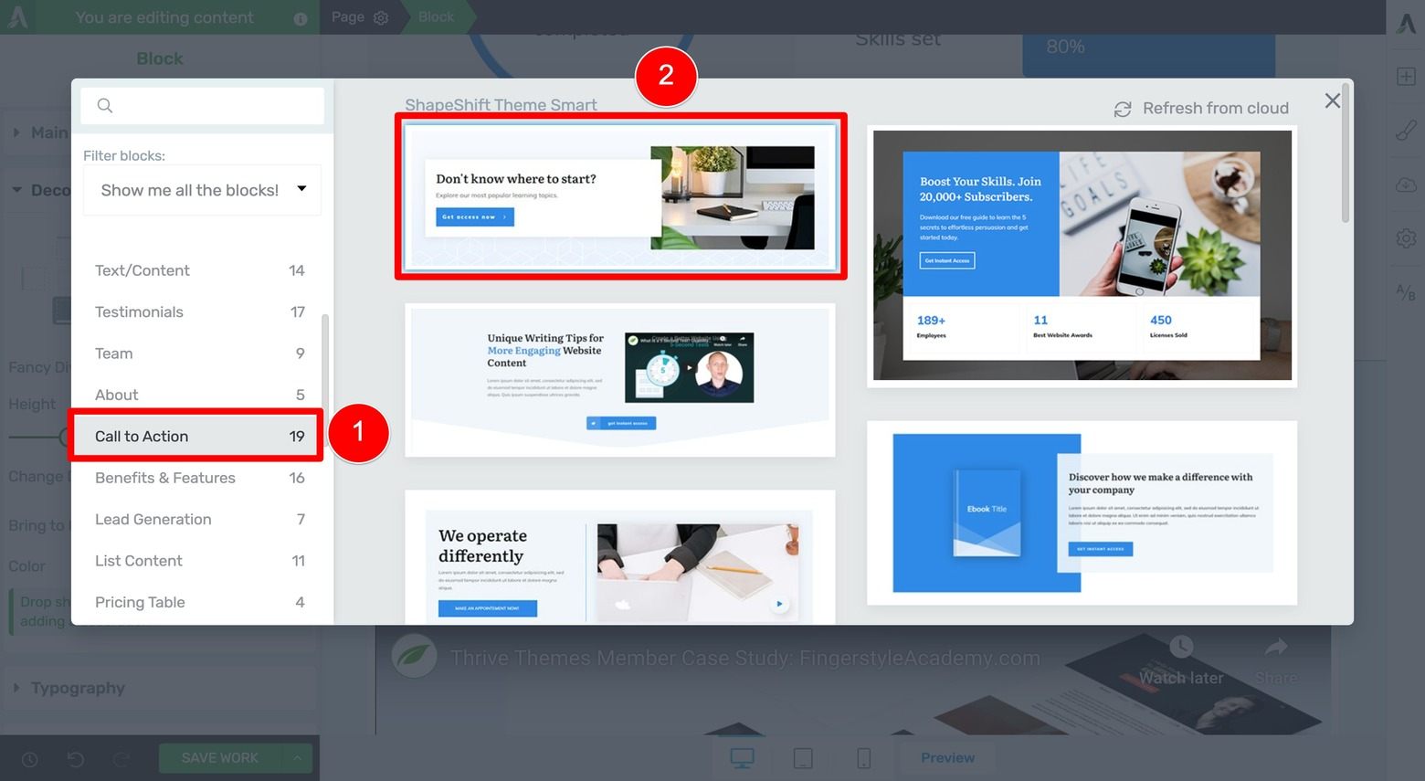
Filter for and choose a "Call to Action" design for your Call to Action section.
Now, if the default background color of a Page Block you select ever conflicts with the Page Block design above it (e.g. the Fancy Divider of the Video Testimonial section doesn’t transition well into the background color of the new Page Block below it), don’t worry because it’s easy to fix that color clash.
In this example, you can just change the background color of the new Call to Action section to white, and then open its Decorations tab so you can modify the color of its bottom Fancy Divider design to one of your brand color palette’s accent colors (shown below):
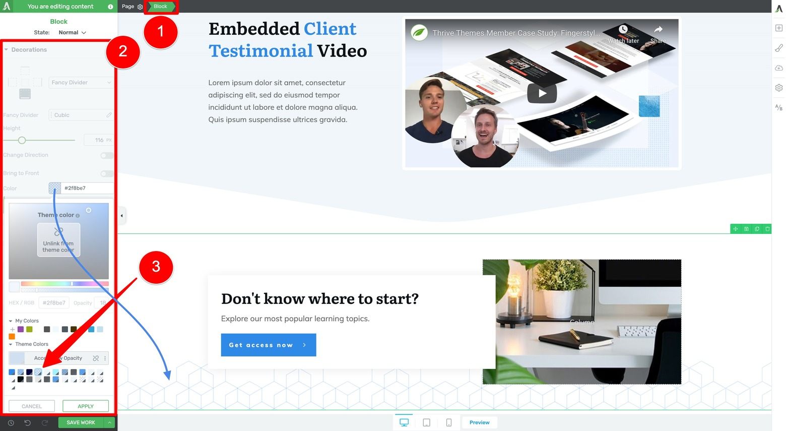
To make your Client Testimonial Video Section and Call to Action Section designs blend seamlessly, change the Call to Action section's background color to your brand white, and change its fancy divider color to one of your brand accent colors.
These customizations make sure that the Testimonial Video section and Call to Action section beneath it blend together naturally while preserving their Fancy Divider design flourishes.
Also, you may need to increase the pixel height of your Call to Action section’s Fancy Divider (shown in the sidebar below) so it can blend seamlessly into the next landing page section too.
After making all these customizations and replacing the demo text with instructive copy once again, you should get a good looking result like this:
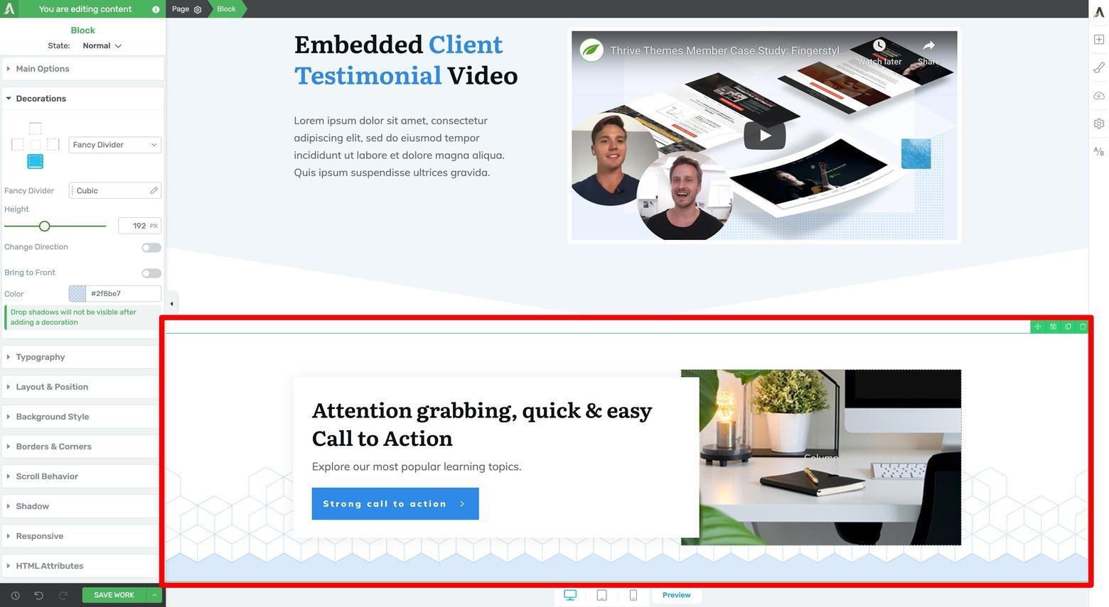
Swap out the demo text and image(s) with your own Call to Action section instructional content.
Optional: Related Products or Services Section
If it makes sense for your business, the Case Study Blueprint recommends adding a Related Products or Services section beneath your Call to Action. The best Page Block templates for this purpose are the “Product Highlight” designs. Filter for them in the Page Block Template Library and select the one you like best:
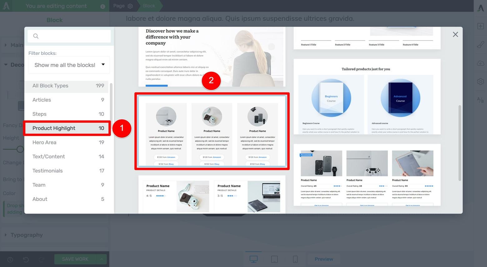
Filter for and choose a "Product Highlight" design for your Related Product or Services section.
Then, make any design customizations you need to (most likely the Block element’s background color and the Button element's hover styling).
To do this, change the Block element’s background color to match the color of the Fancy Divider design above it (again, so they blend together seamlessly) followed by changing the hover styling for one of the Button elements in your related products/service Content Box (shown below):
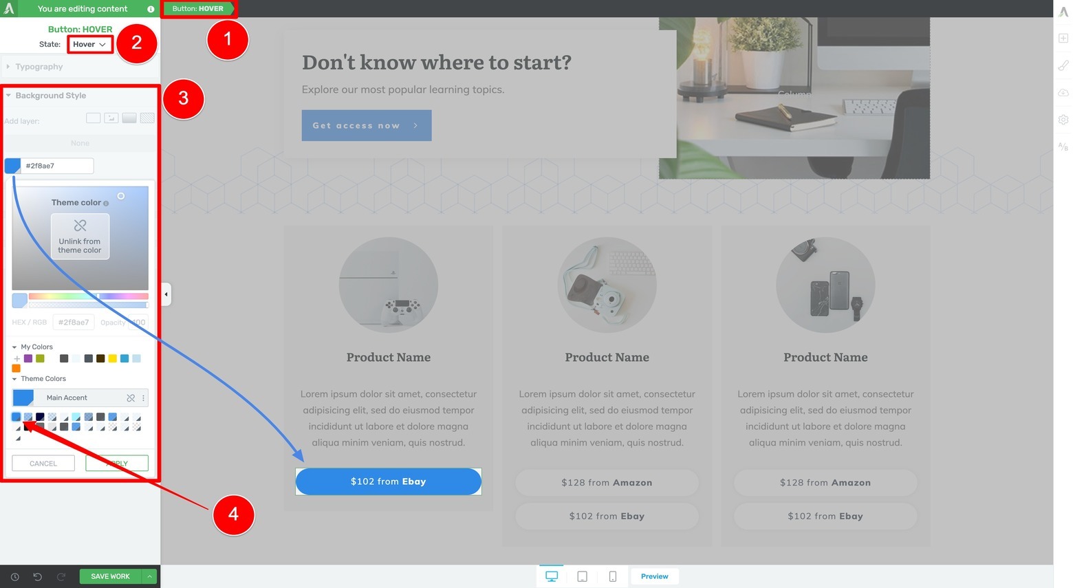
Change the hover effect of your Related Product or Service section content boxes to your brand color.
After making these customizations, you can delete the other default related product/service Content Boxes, clone the one you already customized, and then drag & drop the clones into the empty Column elements.
You should end up with a final design for your Related Products or Services section that looks like this:
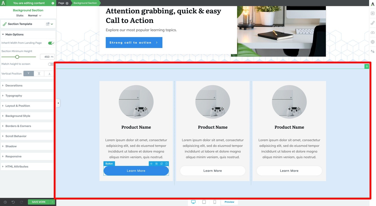
Swap out the demo text and images with your own Related Product or Services section instructional content.
Optional: Minimal Footer
To finish off your case study template, simply add a footer to the bottom of your landing page. You can do this by highlighting the Page element in the breadcrumbs and then click on the eyeball icon within the Footer box in the left sidebar:
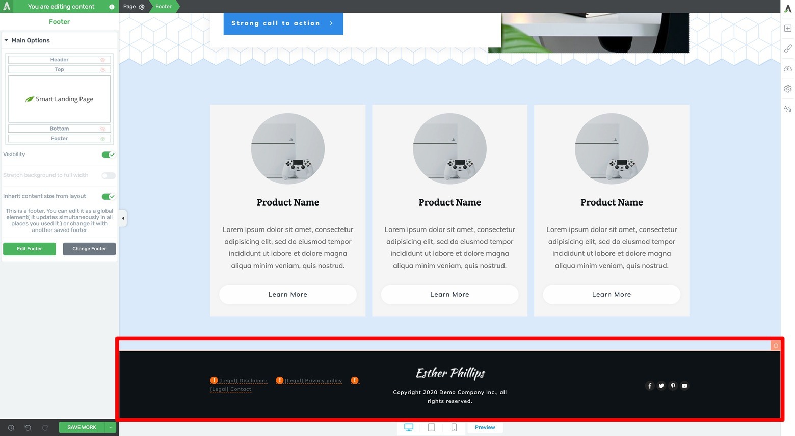
Highlight the Page breadcrumb and activate your default Footer by clicking on the Footer eyeball icon in the Main Options tab of the left sidebar.
With that, your case study template is locked & loaded for desktop!
You only need to double check that the design you just put together displays properly for tablet and mobile devices by making small tweaks where necessary. Remember that Page Blocks are mobile responsive by default so only a few design modifications to tablet and mobile should be required.
You can do this tablet and mobile design quality control step by first clicking on the Tablet icon (at the bottom of the visual editor window), scrolling through the tablet mode to make any necessary adjustments, and then doing the same thing for mobile (by clicking on the mobile icon).
Save your work and you now have a fully functional landing page template ready to reuse over and over again for your upcoming case studies!
How To Clone Your Template for Actual Client Case Studies
When you’re ready to create an actual client case study, you just need to one-click clone the template you just built.
To do this, simply open the Pages tab in your WordPress dashboard and locate your “Case Study Template” page.
Hover your cursor over the page to see a set of options appear under its title. Click on the “Clone” option to create a copy of your template:
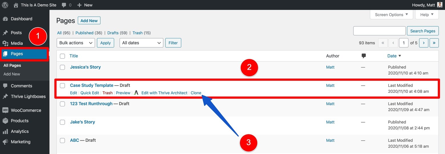
To clone your completed Case Study Template, open the Pages tab of the WordPress dashboard, hover over the template name, and click the "Clone" option when it appears.
Now rename the clone to fit the client you’ll be featuring. From there, just open the Thrive visual editor and start replacing each section’s demo images and instructional text with appropriate content about your client.
Once that’s complete, just save your work, update the page’s backend information (e.g. the featured image, permalink, etc.) and publish your new case study!
Dynamically Display Your Published Case Studies with the Post List Element
If you end up publishing several client case studies on your website, consider showcasing them on either your homepage or a “Success Stories” silo page (maybe both!) where prospective clients are more likely to find them.
Luckily, the Post List element makes the task of dynamically displaying your latest case study pages super easy. Simply add a Post List element to a section of your homepage or use one of Thrive Theme Builder’s many silo page templates (that all prominently feature Post List elements in their designs) to create a search engine friendly “Success Stories” page in a matter of minutes.
Just use the Post List element’s advanced filtering rules to dynamically display your client case studies by clicking on the “Filter Posts” button inside the Post List tab of the left sidebar:
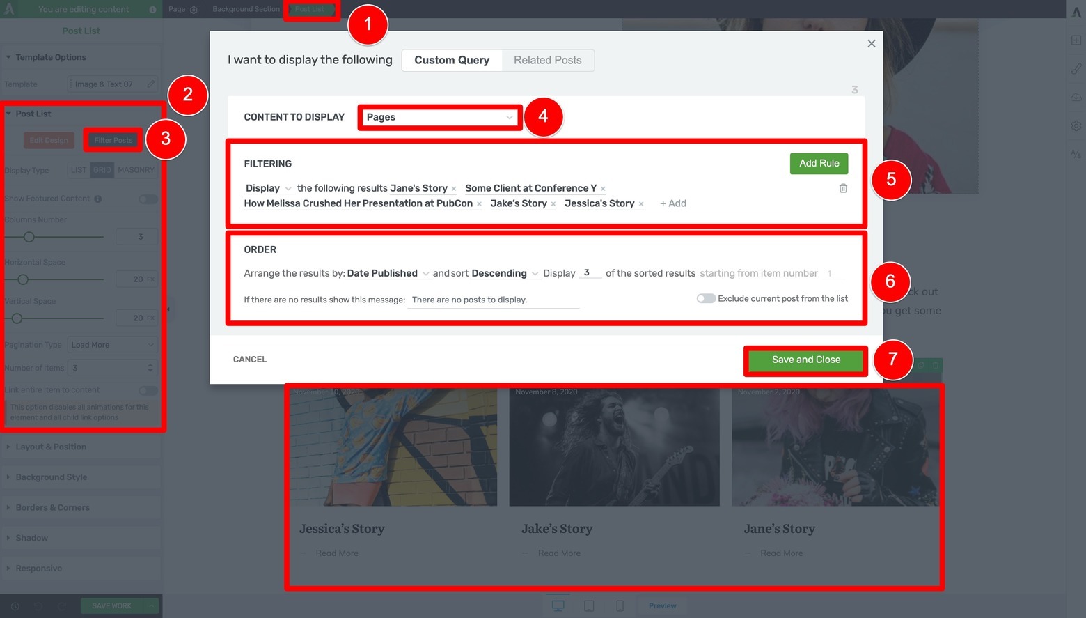
Program your Post List element to dynamically display all of your published Client Case Study articles from newest to oldest in descending order.
Once you’ve programed your Post List element to display all of your case study pages (we recommend from newest to oldest in descending sort order), save & preview your work to see how they’ll now dynamically display based on the display rules you established:
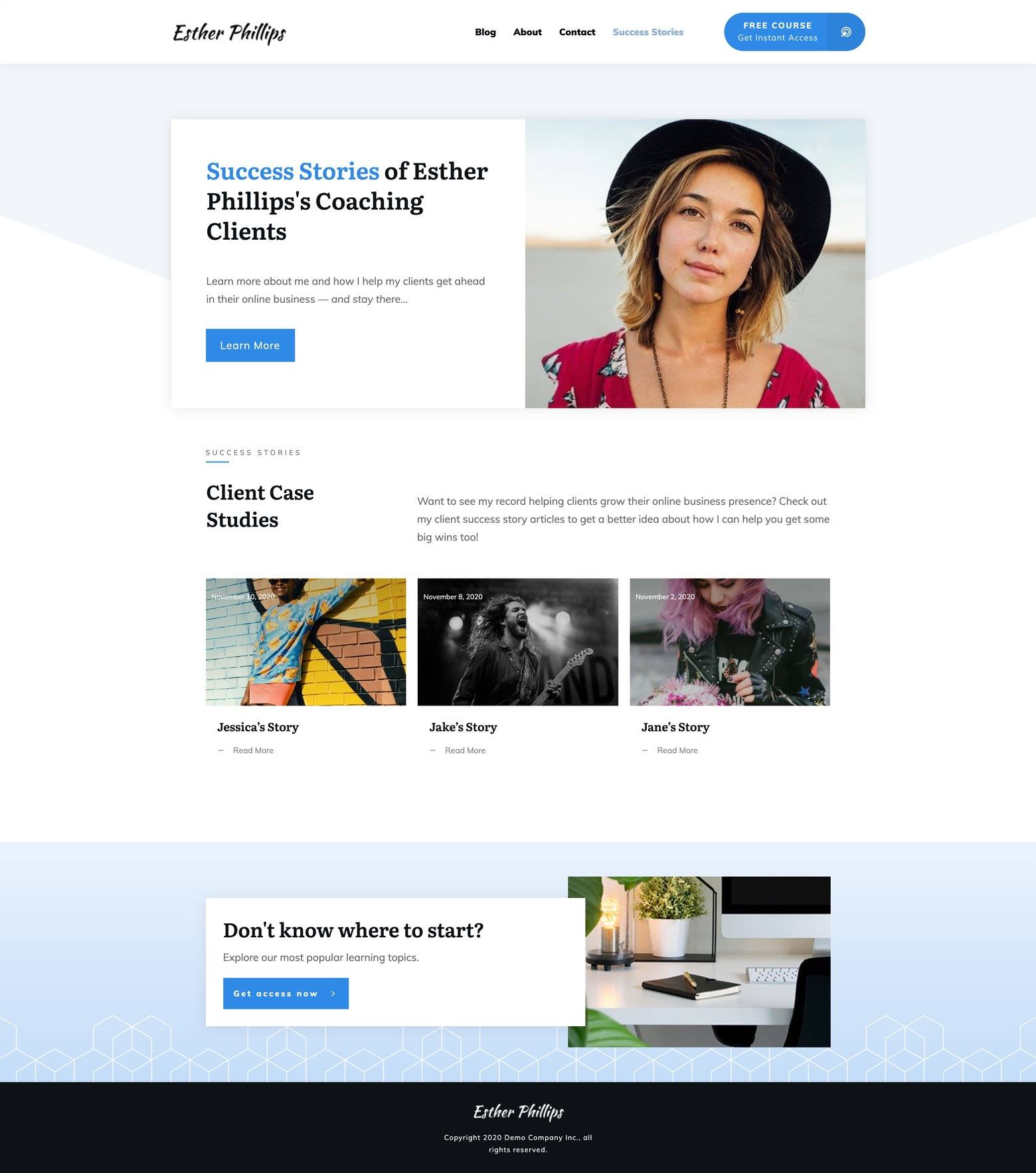
Use a Post List element on either your "Success Stories" silo page or your homepage (or both!) to make them easier for prospective clients to find.
Time to Make Your Case (Study)
Yes it’s true… Page Blocks really do make it that easy to build a conversion focused client case study template — in just a couple of clicks.
They even give you the added bonus of being mobile responsive and smart color enabled straight out of the box!
So are you ready to start publishing new client winning case studies using the Page Block designs showcased in this post? Make sure to get your copies of Thrive Theme Builder and Thrive Architect.
… and leave us any questions about or design ideas you have for new design ideas in the comments section below!



Pages or posts – which is better to use to create case-studies and why? I’m wondering because in the video you need to add every single page to the displayed list. If we used a blog post with a category, this would just require filtering that category. If this category was “portfolio” then that would create a “website.com/portfolio” being just an archive with auto-updating list/grid of your case-studies.
Hi Matthew, indeed this is an issue if you want to make your Client Case Studies using WordPress pages.
If you’d rather create them as WordPress Posts (to assign them a “Case Study” category for use in the Post List element programming), but still achieve that landing page look and feel, I recommend creating a “Case Study” post theme template in Thrive Theme Builder that is full width and only displays the footer (delete or hide all other elements and remove all residual margins and paddings).
From there, you can follow the same steps I show in the video to create a case study “post” template using the same Page Block designs (just drag & drop the Block element into the editor window to open the Page Block template library), and then clone that Post template any time you need to make a case study.
Hope that helps!
I’m doing this exactly as you described on one of my pages right now. After watching your video I am just wondering – do you see any flaws of using posts instead of pages? Maybe some advantages of one over the other?
Hello Matt. Nice post.
Is it possible to built the template in Thrive Builder to have it as a real template and not with Thrive Architect as a stand alone page?
Regards,
Víctor
Hi Victor, you can not because whatever elements you use to build a theme template with in Thrive Theme Builder’s visual editor remain “fixed” so to speak.
That is to say, if you tried to build a reusable case study template like I showed in this video as a Theme Builder theme template, although you could technically build it, you wouldn’t be able to make any of the designs you created unique to the different pages you applied that theme template to… you would only be able to add content inside the Content Area of that theme template. This would then defeat the purpose of having a reusable case study template like I showed in this video.
To build this particular case study template design however, you do need Thrive Theme Builder installed & activated to have access to all but one of the Page Blocks I used in the video.
Great video and article, thanks so much! I was wondering: Is there a particular reason for placing the video testimonial towards the bottom using a button link at the top? Why not just place the video inside the hero section? Thank you!
Great blog post (as usual)!
Is there any chance you could build a Case Study Template that we can import (like the landing page templates)?
That way we have most of this done already and can just make minor adjustments for our specific template preferences?