I'm sure you know those little yellow, red, blue and black building blocks... You've surely played with them as a child. But you've probably never managed to create something like the picture below.

By Nathan Sawaya, The Brick Artist
Even though you "know" the blocks, you don't fully understand how they can form these complex statues but Nathan, the artist, can look at an existing statue and immediately see how he would build it with LEGO.
The same can be said about landing pages. You might have seen the different elements in the Thrive Content Builder sidebar but as long as you do not really understand how these elements work, you'll struggle to create landing pages that look exactly the way you want on desktop AND mobile.
The good news is that most of the elements and settings are easy to apprehend. There are only 3 elements and 3 settings that need some explaining in order to use them to their full potential and unlock any landing page layout. After watching this video you'll be able to look at any landing page and "see" how to build it yourself.
More...
Update
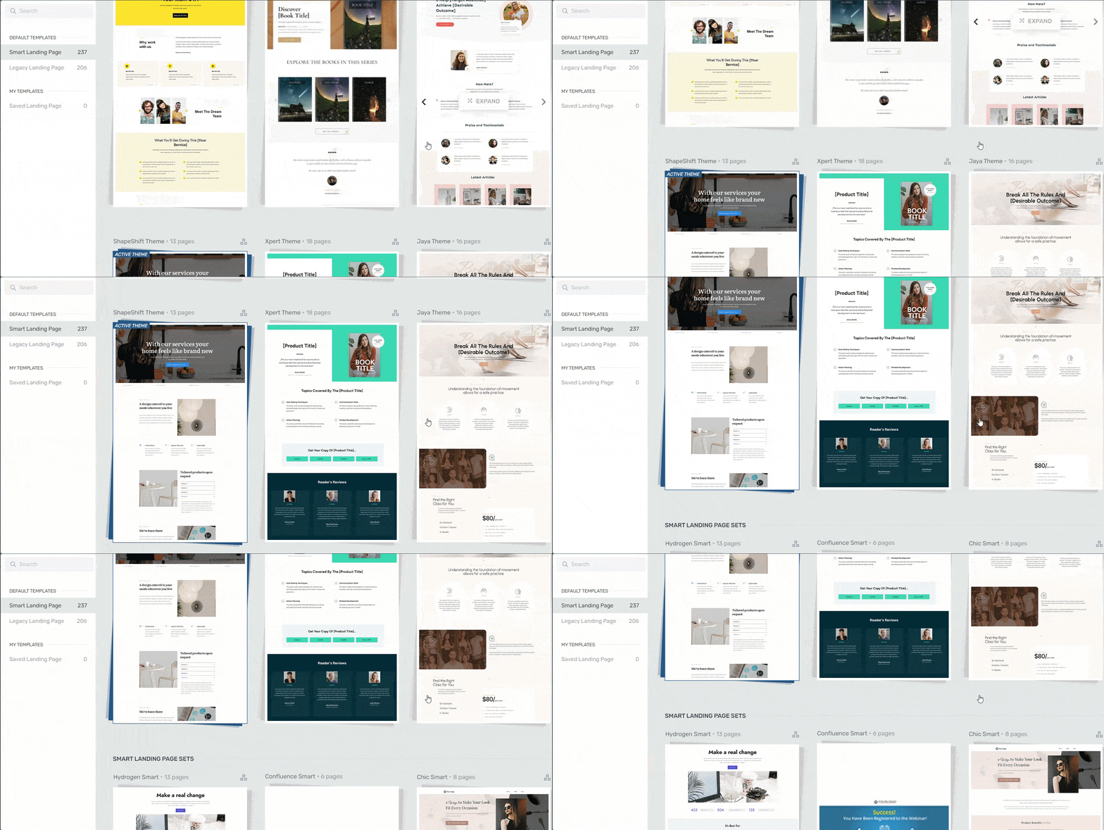
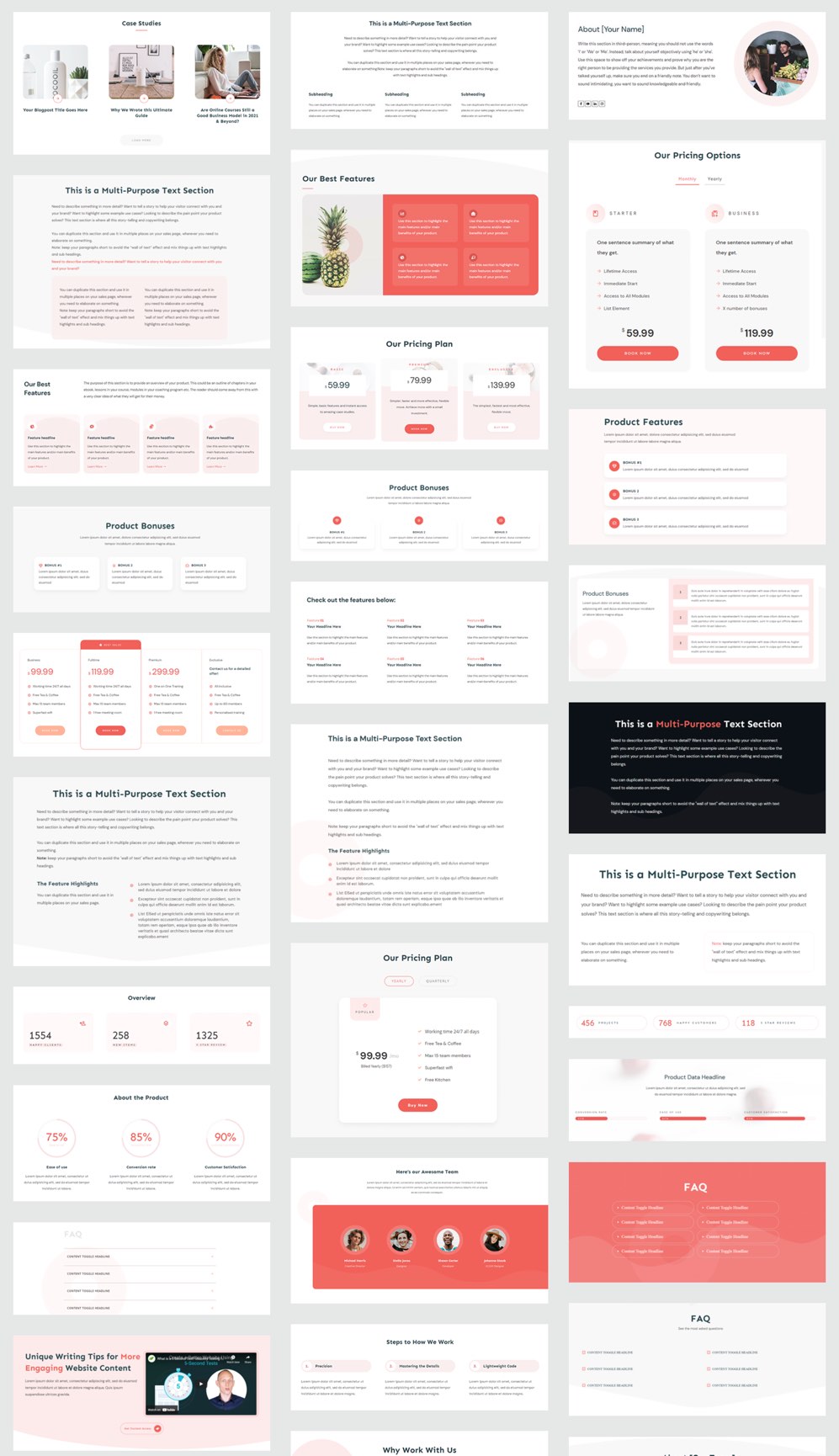
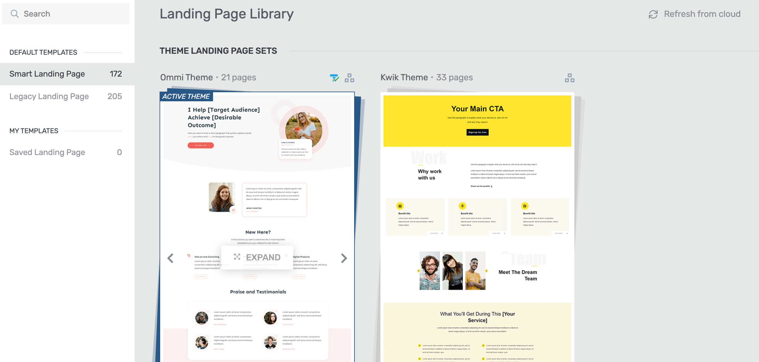
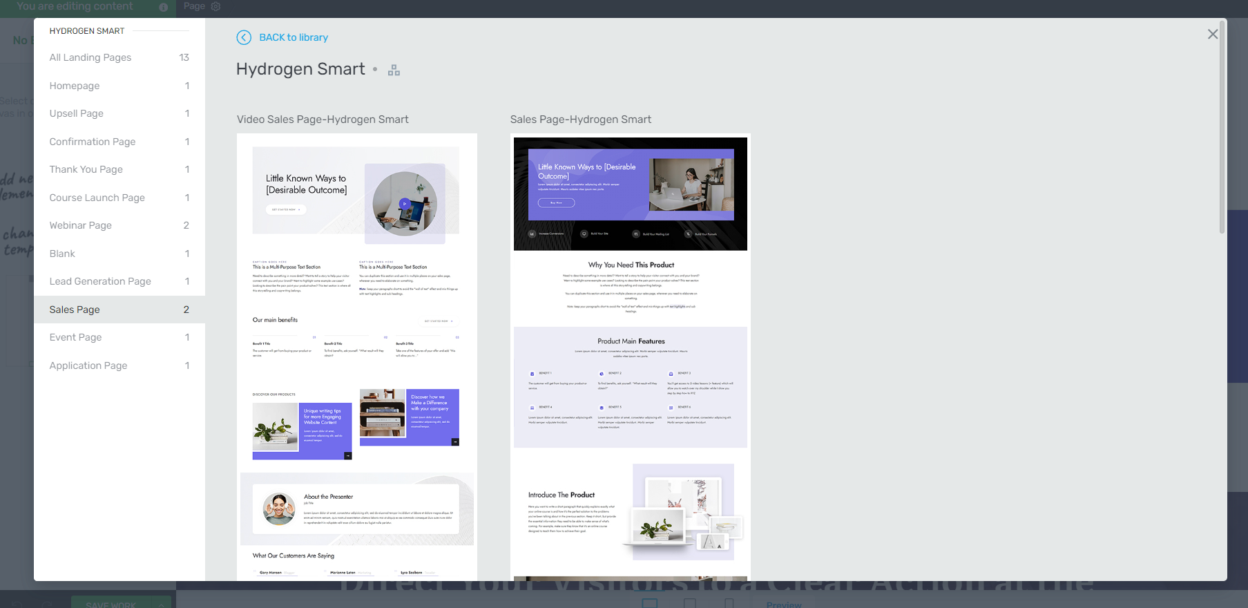
Thrive Content Builder and Thrive Landing pages have been replaced by Thrive Architect, which now has 268 pre-designed page templates and you can preview them all in our landing pages gallery.
Element 1: Page Section (0:47 min)

Learn how to create this exact landing page here
On any landing page, you can change the background color of the full page by going into the landing page settings and change the color or add a background image. This is fine if you're building a simple image background landing page like this one.
If you want a landing page with different background colors and images, you'll need to use page sections.
A page section allows you to have full control over the background of only that section.
As you can see on the image above, page sections allow you to switch colors and also to add background images. To make sure your content stays readable when using a background image, check out this tutorial on how to create the perfect background image for your WordPress website.
Element 2: Content Container (3:05 min)

A content container allows you to adjust the width of any element inside the container
Each time you want to restrain the width of your content, you need to use a content container.
This element can be used inside a page section or any other element such as content boxes, column layouts etc. and you can add any element inside a content container to limit the width.
The reason why you want to use a content container to change the width of your elements is to keep them mobile responsive.
Element 3: Content Box (5:28 min)

Look at this nice, white content box... You can learn how to make this exact one here
Content boxes allow you to change the background and border of only the box (rather than the whole page or the complete section) and because you can add elements inside a content box you can do more very cool stuff with them!
You would typically use them to create an attention grabbing element on your landing page.
Setting 1: Margins (6:43 min)

Margins are applied on the outer border of an element
When you add margins, you add spacing on the outer border of the element.
Margins are very helpful to:
- Align a title on a background image
- Create visual grouping by adding or removing white space in between elements such as text elements, images etc.
Setting 2: Paddings (8:32 min)

Padding allows you to add spacing on the inner border of an element
When you add paddings, you add spacing to the inner borders of an element.
Adding or removing paddings will be most useful when you're using an element that is most likely to contain another element, such as a column layout, a content box, buttons etc.
How About Mobile?

One thing to keep in mind is that margins and paddings are fix. They will apply even on smaller screens, this is why we suggest you only use margins and paddings for vertical spacing (top and bottom) and always use a content container to restrain the width of an element.
4 Steps For Mobile Responsive Landing Pages
- Check the mobile view
- Upload images in the optimal size
- Use margins and paddings with care
- Use column layouts for element alignments
Setting 3: Line Height (10:56 min)
If you want to change the spacing in between the lines of text within the same paragraph, you'll have to adjust the line height.
You'll typically use this for titles or to style a specific text element to make it stand out.
If you want to add spacing in between text elements, you'll use margins or paddings.
I Would Like to Know...
What do you find most difficult when building landing pages? Let me know in the comments below!
The most difficult thing by building landing pages it’s to figure out how to use all this elements. I did it by playing around with the Content Builder but now the concepts are even more clear for me.
Thanks for this content!
Happy this helped you clarify things Eugenio and playing around is still the best way to discover all the options 🙂
Hi
Hanne
It’s Great, You good to say, but need a complete example a build landing pages, hope I will see you soon, Thanks again!!
Hi Marina,
We regularly build complete landing pages from scratch! You can find all of those tutorials here.
I will be working these instructions to improve my website. It is valuable information on how to setup landing pages the correct way. I will be able to use the content Builder with confidence after I practice using the process.
Glad to hear Elizabeth!
WOW great stuff 🙂 Thanks
I’m glad you liked this Sherwood!
This is great, thanks, Hanne!
I have a question if you have time… I’ve been using ‘ThriveThemes Content Builder’ for awhile now and I’ve built all kinds of pages (whoo-woo!)…
My question is, how would you suggest I categorize/organize all my pages? Do you guys use a simple WordPress “plugin” for this? I’m currently using the ‘parents’ strategy to organize my pages, which is a little cumbersome…
If you have any suggestions how we could better do this, that would be AWESOME! Especially with naming and organizing sales funnels.
Thanks for all you guys do for us!
Joshua 🙂
Hi Joshua, great to hear you’re building so many pages 🙂
We actually also use parents pages to organize pages. Or you can have a naming convention to easily find your pages (eg. RLP for the Rapid Landing Pages Course).
I’m not aware of a plugin that would help do this.
Hi Joshua,
It does get complicated with having several funnels! I have 4 and even with “only” 4 funnels, it can get “messy.”
However, if it helps, some things are just not best handled within the WordPress Dashboard.
I have planned out all of my funnels in a very simple Excel sheet, listing the funnel name/description, my lead magnet, my offer (content upgrade) and landing page(s).
However, before doing that, I brainstormed the funnels concepts in Evernote & mindmapping software.
I find the mindmapping software to be the best *first-draft solution* for brainstorming like this.
Hope this helps! 🙂
Thanks for sharing Karen!
I would like to have a separate page for desktop and mobile.
What is the best way to do this?
Thank you for the detailed instructions they are very helpful in understanding the difference between the elements but my page still wouldn’t look right if my images (header) is resized using a content container.
I would like to have two pages and redirect the user to the mobile page I create if they are using a mobile device.
Thanks again for another great video!
Hmm I’m sorry but I don’t know. With the new TCB you’ll be able to have different elements for mobile but I do not know how you would redirect mobile traffic (because that would involve hard coding which I can’t do 🙂 )
Also…
Do you know any kind of a time frame for when the new TCB is coming out?
I just switched hosts and I’m building my pages from scratch.
I would like to use the new content builder to build my pages because there will probably be some issues if I switch content builders.
We’re working very hard to make everything backwards compatible (our whole site is build with TCB so you can imagine that would be a drama for us too 😉 )
Hanne – It is amazing to me how whenever I am having trouble with any design issues, you are always there, just a day or so later, with a video providing an explanation and solution to my problem! You are amazing!!!!! Thank you!
Glad to hear that Christine!
Working around bugs (like broken height / overflow code) and limitations (like no custom classes on page sections).
Hi Brian, what exactly would you like to accomplish with the custom classes on page sections.
as exemple, with custom classes on page sections, we could easily create a CSS for the section, Some time TCB whe have to mutch to hardcode each ellement
I see. For sure TCB was not meant to be used to custom code each element. TCB 2.0 will give you this flexibility though 🙂
Fantastic job as always. Never know exactly what the difference was between padding and margins and learning about using content containers so as to make it mobile responsive is invaluable.
Hi Tony, you’ll see it will make so much sense next time you’re creating a page now!
Hi hanne! Thanks a lot for the detailed tutorial, I love your videos!! 😀
What you said about mobile responsiveness and margins was an eye opener.
So, when having a white background page section (for instance), why not put the content directly in the page, instead of in a page section? I totally see why I need to use a page section for parts where the background changes, but why put everything in a page section and not leave some elements directly on the page itself? Is this not recommended for some reason?
Hi Maricarmen,
I think that would be possible, but I actually really like to be capable of change each element on the page, so I typically would not keep more than one area on the background of the page (either top or bottom) 🙂
Awesome tutorial Hanne! A little off topic, but what video editing software are you using? I like how you’re able to put yourself in a circle and then move that circle expand it etc.. on screen.
Hi Jose, glad you liked it! The video editing software is Adobe premiere and it’s our video editor/magician who is capable of moving this bubble around 😉
Excellent!
Thanks Richard
Hanne, you just helped me fix my pages on mobile. Use Content Containers!
Thanks, and great video as always…
Yes 😀 Mission accomplished… So happy to hear that Tommy!
Like you, I had learned some of them, but having this presentation to tie them all together was really good. I had not gotten around to checking out Line Height yet.
Hi Paul, great to hear you still learned something. Line height can come in handy from time to time.
Love your content and very usefull . Greetings from spain
Glad to hear Juan 🙂
Been waiting months and months now for TCB 2 to roll out and when I see these tutorials I get sad and feel like the launch is even further away than I’d hoped 🙁
This wouldn’t feel as long of a wait if they’d just keep adding some needed features to the current stale TCB to keep it fresh… Instead of holding out for 2
Hi Derek,
Sorry to hear this video makes you feel that way. That was not the goal of the video! Understanding these concepts will be helpful regardless if you’re using TCB or TCB 2.0.
And I think you’ll agree that putting resources in developing TCB now, wouldn’t make much sense. It would take away focus from getting TCB 2.0 ready 🙂 Believe me when I say we’re as impatient as you to get TCB 2.0 ready and we’re doing all we can to speed up!
The tip on keeping the content mobile friendly was really helpful. I’ve used the TCB for ages now and while I was familiar with using content containers, and content boxes I didn’t know they affect mobile. Gotta go check my pages and make sure I didn’t do it incorrectly.
Hi Al, I’m so happy to hear that you learned something new! This will improve your pages for sure 🙂
Hi Hanne,
I have to watch the videos twice. So quickly I do not always understand the meaning, since I can not so good English. But the Google translator helps as well now. 😉
Since I have already worked with Thrive Landing Page more often, I will imitate immediately. So I know exactly what you meant.
Then I can also add a video about it to my German video series on You Tube. https://goo.gl/8ixXjN
Thank’s for the Tipps. Greetings from Germany
Gerhard
Wow Gerhard I’m sure German users will appreciate!
How do I insert an opt-in with text, image and bar?
Hi Lee, I think you’ll see exactly how to do that in this landing page from scratch video starting at 8 minutes.
Great! Thanks Hanne!
Thanks Federico
Super helpful. I’ve been using Thrive Themes for a while, and never really understood the purpose of the content container. My site probably has all sorts of mobile issues now. Is there a way to quickly check for these types of errors? Or is it just a matter of viewing your site on mobile and noting the errors? Thanks for the great video!
Hi Renae,
Unfortunately I don’t think there is a way to easily spot those errors. But if you know you’ve been using left and right margins and paddings, you probably have this problem.
I love your videos I always learn something new . I look forward to opening up your emails and finding a video tutorial. This one was great . Many Thanks
So happy to hear that Michele!
awesome guide Hanne !!
Thanks Erez!
It would be helpful, if you can help on the best colour combination for landing page, implemented on this plugin.
Hi Orca,
In French there is an expression “les goûts et les couleurs ne se discutent pas” which would translate as “we don’t argue about taste and colors” the reason for this is that a lot of it is just personal preference (some will like a blue landing page, others a yellow one) 🙂 That being said, combining colors is an art and you can use online resource to help you with it such as Colourlovers or Adobe Kuler these websites will give you color palettes based on the first color you pick.
Wow I was struggling with Those Paddings Vis-a-vis Mobile responsiveness and what does Hanne do???Come up with a Solution Woot. You rock, now I am gonna go play with my pages.
Just out of interest Can I build a Full Landing Page that is not a pop up with this? See I haven’t been playing with this amazing resource as much as I should. And I am now super excited to play 🙂 Thanks Hanne!
Hi Julie,
I’m not sure what you mean with “not a pop up”… This is a normal page on your website. It is true that landing pages will overrule the theme elements such as the top menu.
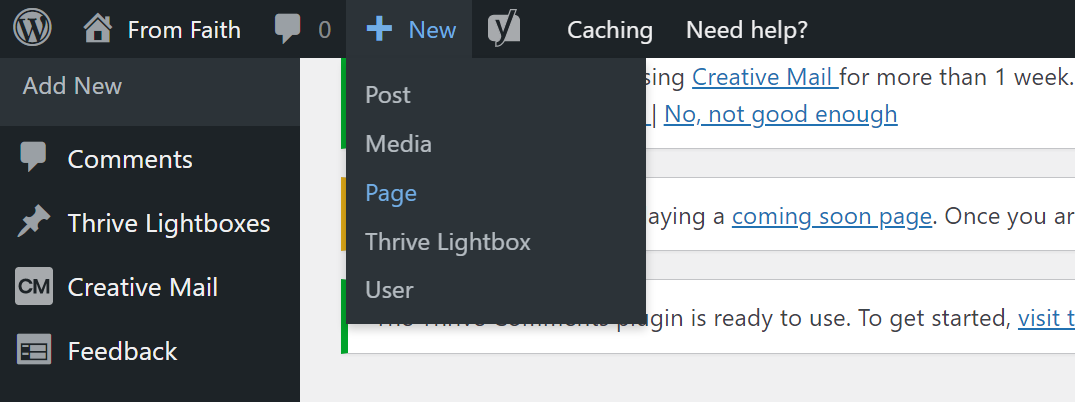
If you don’t want this, you can simply start building your page with TCB without loading a landing page first. If you’re using a Thrive Themes theme you’ll have all the same options as when you’re starting from a landing page. If you’re using another theme some elements might not be available (such as the page section).
I loved your video and learned a lot. Thank you.
I’m still a bit confused. I’d like to understand the difference between:
1 – Content Area (such as provided by a blank landing page)
2 – Page Section
3 – Content Box
4 – Content Container
5 – Borderless Content
The names don’t really say much. They show up in different areas of the TCB editor right hand menu (except for the first “Content Area” which seems to be special in some strange way).
.. Confused .. Michael
Hi Michael,
I’ll try to clear things up a bit because you’re right that the names aren’t very intuitive 🙂
1. Content area is something that can be found when you’re using a landing page template that is boxed (such as the blank page template). In that case the content area indicates where you can drop content. You can change the background color and image and you can add page sections (and any other elements) into the content area. This is not an element that’s available in the Thrive Content Builder so you’ll only find it on certain landing page templates.
2. Page sections: Will always spread full width and allows you to add a color or a background image. If you add a page section on a full width it will act like I showed you in the video, if you add a page section in a content area if will only spread to the width of the content area (the boxed width).
3. Content box is not a background element and allows you to change the color and border of the box when you use style 6. You should think about using a content box when you really see a clear “box” in the design. Most of the time you’ll add these in a column layout or in a page section in a content container.
4. Content container is virtual, you don’t “see” it on the final page but it will restrain the width of the element while keeping it mobile responsive.
5. Border less content is a whole different beast and something that is used only for our themes. If you’re using a theme such as focus blog that automatically ads spacing around the element (through the theme code) you can use the border less content to have the image without the theme settings.
I hope this helped.
Thanks Hanne!
it just so happens that i needed that information this past weekend… fabulous video!
also
what program allows you to show your face in a circle while screen casting?
thanks
sue
Hi Sue,
Happy this came a the right time! About the bubble effect, I actually film myself (with a real camera) while doing the screen cast and then our video editor/magician puts in the bubble effect with Adobe Premiere 🙂
Crystal clear explanation. This is great stuff!
Thanks Nick!
I think that this is the best consolidated summary that I have seen about using these elements and settings in page layouts.
Having a solid understanding about paddings, margins, content boxes, and containers, definitely helps achieve our layout goals. It is essential for ensuring that this extends to effective responsive design.
Thanks Hanne!
Agreed 🙂 Thanks Stephen
Great tutorial as always!
I would love to know how you checked the mobile view… I usually have to open the page on my phone to check mobile view, as making the window smaller on my computer does not show the full mobile experience. (I often find I have nested page sections inside one and other accidentally and this only shows up when viewed on mobile).
I noticed here you did something in the developer view… I followed to ‘inspect element’ but then don’t know what you did to show mobile view…
Thanks!
Hi Kylie,
When you go into your browser settings and you go to more tools -> developer tools (or right click and inspect if you’re using Chrome or inspect element if you’re using FireFox) you can click on a button in the top left corner to switch to mobile view (in Chrome) or in the right corner on Firefox.
This was extremely helpful Hanne! And came at a perfect time. I was having some issues with mobile conversion and after implementing these techniques, it fixed it! Thank you so much.
Yes! Super 🙂 Well done Marcus
Hanne,
I really love how you break down everything in your tutorials and make things simple.
Thanks for all you do for us members, it is appreciated.
Thank you Steve I’m always happy when I can help our members!
Wow! Hanne, thank you so much.
Using the Content Container to keep things mobile, and using the line-height was something new to me.
As always… m(_ _)m
Thanks Ken 😀
This was very useful info. Thanks.
Glad to hear Rodrigo
Lovely post Hanna. I didn’t realise the affect on mobile views of using horizontal margins in text elements instead of restricting width by use of content containers. Thanks. 🙂
Hi Steve, yes it’s one of those tricky things. Happy I could explain how this works and you’ll be able to use it now!
Wow Hanna excellent video. Wish the timing for this had been around 6 months ago. None the less with Thrive support and playing I got there with these issues and this video has given me more insights and awareness around page development. I love your videos. Thanks heaps Hanna.
Hi Colleen, sorry this is 6 months late… But I’m sure it will help you with your next page 🙂
Hi Hanne, thanks for another excellent video. Taking the time to explain these concepts, which many might take for granted, was invaluable.
Great stuff as always from the Thrive Themes team!
Thanks Domenic. Very happy to hear this was useful to you!
Exactly what I was looking for. I just redesigned my homepage. I used blank full width.
I added a menu on top of my landing page and set the colour as follows:
Font – white
Bground – black
Everything look nice on desktop. However when viewed under mobile, the font menu was not visible. as the background colour for mobile menu changed to white.
I have submitted the ticket via support and we are sorting this out.
The point that I would like to highlight here is that there is a possibility that the appearance might be different on mobile.
Hi Wan, that’s a weird glitch… I hope our support team will be able to fix that for you!
It is hard to manage the paddings and margins in TCB.
Do you think about a sollution like instapage use just drag and drop in the right position instead of play with numbers?
Hi Tamás, I’m not sure how Instapages handles margins and paddings but I believe that having the number option is actually a good thing… Especially if you’re a bit like me and you like to have all your margins etc. to be the same 😀
A great video tutorial…I used to watch only Shane’s video earlier 😛 ( just because he was more familiar with me while buying Thrive, literally he sold this great tool to me, and I am happy for that ), now will start watching yours also…it is very very helpful….solved few of my page issues on mobile and background color…..A great help…please keep generating more tutorials like this……Thanks
Hi Pradipta, glad I could convince you to watch mine too 🙂 And very happy this tutorial helped you to solve some issues!
Great Hanne – just what I was looking for as a new member!
In the video you say the reason for using a Content Box is to control background colour. That’s what I thought until…I accidentally used one and thought there was a bug when I couldn’t set it’s background colour.
Your support told me that you don’t have a simple reference page that shows what the 6 Content Box styles actually are, and more importantly what the limits of the different styles are? They told me that I just have to use trial and error!! This reply surprised me, not very customer-friendly!
It seems that Style 4 only has a border, Style 5 seems to be background and no border, and Style 6 both. But why keep this a secret? Not even your support team could tell me this. Your Styled List element is much more user friendly to use!
Something else about margins. Why when margins are set to “0”, don’t elements touch each other perfectly with no space? In your video, with the section margin, this is exactly what happens (0 margin means sections meet perfectly). But with content boxes and containers, this doesn’t seem to be the case, and if I clone a 0-margin Content Box, you put a 22 px space/margin between them. Why do I have to experiment with negative margin to make content boxes line up nicely? And as you point out, I might cause problems for mobile users doing this.
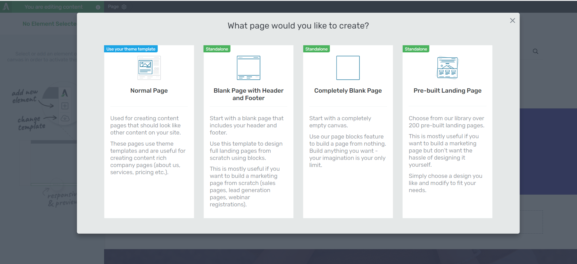
In your demo you used the Blank full-width page. This isn’t a default template – it is on your template cloud. If you use the Blank Template from the Default list, it has something called a “Content Area”, which I cant find any information about on the Knowledge Base.
And there is another mystery. If I use TCB on a blank theme page (not a blank Landing Page), it works…but only kind of. There is no section element, and I cant set the whole page background colour. Is this a limitation with TCB if I want to use it to build a page using my standard theme header and margins?
Hi Ian,
Thank you for taking the time to comment, I’ll try to clarify as good as possible 🙂
For the content box, you’re absolutely right, to have full control (over border and background color) you need to use style 6. I have no explanation as to why and we should probably create this information as a ressource somewhere.
For the margins, there are indeed some elements that have default margins hard coded in them. This is something we originally did to help our users create good looking layouts without having to add margins each time and we’ll fix this in TCB 2.0.
The “blank full width page” actually is a “default template” the only difference between the tab “default templates” and the “templates cloud” is that the default templates are pre-loaded into the plugin. Originally the templates cloud did not exist but that library was getting too big and pre-downloading the templates added too much data to the plugin which caused problems when users had to install the plugin. That’s why all the newest templates are added in the templates library so “default” actually only means “pre-downloaded”.
That being said, the blank template you can find in the first tab is a “boxed” template and the blank template you see in the library is a “full width” template. So if you want to be able to control the full width of the page I suggest you use the one I’m showing in the video, if you’re using the other one, you will always have your content in the box (the content area) and see the page background around the box.
About the landing page vs theme page: some elements are added and controlled by the theme and can only be overwritten when using a landing page (such as the page section) unless you’re using a Thrive Themes theme because then it’s coded in a way that TCB can actually edit these elements too. For the moment this will be the limitation when using TCB but this will be fixed in TCB 2.0.
I’m sorry about the current limitations… But we’re working very hard to fix them!
Thank you Hanne, very timely as I am looking to launch some of the new pages I have created and I used margins everywhere…will redo with content boxes.
Hi Sam, you would have to use content containers most of the time, yes 🙂
Ah, like you Hanne, I could have done with this video when I started! Content containers solved a big problem for me! Great video that will help a lot of people.
And it’s nice to see that your mouse pointer also sometimes hovers about looking for the margins options button! 😉
hahaha yes… especially when I’m trying not to say anything stupid while filming 😀
Hanne,
You are saving me SO much frustration with these awesome videos. Many, many thanks.
So happy to hear that Linda!
I have put the social icons in a content container at the top of my page. It looks fine on desktop but changes from horizontal to vertical on mobile. I thought if I wanted to constrain the width without using padding I use content containers? Any ideas what might be going on?
Hey Jeff,
The social icons act as a column layout, they will stack before becoming smaller. This is a good thing because if they scaled to mobile by becoming smaller, they would probably become impossible to click on.
Thank you Hanne!
I would have love to see this video at day 1.
You are a very good teacher.
Thanks Martin, better late than never, right 😉
I would like to say, “thank you” for the explanation of Margins. Padding, and line height. I have to say you and all of the Thrive Team are a Godsend.
Thanks to all of you, for all that you do.
You’re welcome David 🙂
Very helpful and thorough. Thank you Hanne. Even though I have not yet purchased the Thrive theme plug-in, I have learned so much from your videos. I plan to do that soon!! I’m convinced that I could create a better landing page with Thrive Content Builder, using my current theme on WordPress, instead of changing my theme.
Hi Debby, I’m happy that even though you’re not part of the family yet, you’re already getting value from our content!
Great stuff.
Thanks Johan
Wow! Sooo helpful! Really saved me a lot of time. Thanks a lot Hanne!
I do have one remaining question however…
1. When using the blank sheet as your landing page template, there is the original box that says “This is your first H1”.
Is there any way to eliminate that box? If not, how do you make the box transparent?
At 2:43 of your video you show a landing page that has one large background image with the headline “What facebook ad strategy…”. How would I be able to achieve that if the “This is your first h1 header” box only allows me to change colors?
Am I missing something obvious? I can’t even figure out how to change the height of that H1 header box. I even tried dragging it into a container but it wouldn’t let me.
Please help! (And more video tutorials please! =)) Thanks again!
Hi Bjorn,
First of all make sure to pick the “Full width blank page” not the template “blank page” they are not the same. Then The “box” you’re talking about is a page section. You’ll be able to delete it by hovering over it (not the text element but the section element) en click on the red X in the top right corner.
But if you want to get the same effect as the landing page I’m showing, you can actually keep the page section, click on it and select “background image”. You can see me do it step by step in this landing page from scratch video.
And for the “hight of the H1 header box” I’m assuming you’re still talking about the grey area around the H1? That would change heights depending on the elements inside so if you add more elements (or margins around the elements) you’ll change the height of the page section.
The box Bjorn mentioned is a “Content Area”, in the “blank page” template. I too was confused by this. You cant delete it, but you can format it to make it unseen (by default it has a shadow), and I cant find anything about the Content Area on Thrive Knowledge Base search
I see… That’s why using the blank full width template might be useful (rather than make the box “unseen”).
You’re absolutely right Hanne. The mistake I made was choosing “Blank Page” instead of “Blank Page Full Width”.
After I chose “Blank Page Full Width” it allowed me to delete the box if necessary.
I didn’t see this option initially because it was in the “Thrive Template Cloud” section, and I had to download it first, before it would appear in the “Default Landing Pages” section.
Thanks again!
Thank you, Hanne! These are excactly the issues I am struggeling with. Now it looks much more clear to me. Have some homework now 😉
Happy to hear this cleared things up for you Karin!
Hanne, great key takeaway for me from this tutorial: Content Containers are Mobile Responsive… use them rather than padding/margin. Simple, effective and very useful. Thank you.
Thanks Ryan
This article was my ‘aha’ moment with Thrive Content Builder. Thank you very much!
Thanks for letting me know, Robert 🙂 Glad it helps!
yep very helpful, I was doing the same mistakes 😀
Very clear video, Thanks Hanne. Trouble is I can’t seem to copy a page section like you do. The green icon is not appearing…
Hi Rory,
That’s weird… have you tried a hard refresh (CRTL+F5) to clear the cache? If the problem persists, please open a ticket in our support forum so that the tech support can have a look!
Hanne, Thank you for this video. It came at the perfect time as I was having some responsive problems with my page. I’ve now used the content box to put the text into but for some reason it is moving to the center of the page. Can you help?
Hi Calvin,
You can use the left/middle/right options in the content box if you do not want it to center in the middle.
Hope that helps 🙂
Hanne,
I have tried that but it doesn’t seem to make a difference.
C
Hanne,
Nevermind I think I’ve got it!
Thanks,
C
Hi Hanne,
I’ve got a client that designed their own site layout and I’m having problems making the page wrap nicely into a mobile view. It’s a tricky one because the bullets and text look unnatural (as if there are margins and padding that aren’t really there)
She wants, for example, TEXT bullet TEXT on one line. And then when it wraps it should have such large spaces between the text and bullets.
I’ve played around in the editor for ages but I can’t get it to wrap nicely even using containers and columns.
Any suggestions how to go about making it look better?
I’ve put the website URL into the website field so that it’s not published unnecessarily. 🙂
Thanks!
Seems like those are not really bullet points but rather image elements… that’s probably how I would treat them.
Not sure if it would look good on mobile… Maybe a little design tweak would be helpful 😉
Show the client it looks weird on mobile and offer something similar.
Hi Hanne
I am pretty happy with your excellent tutorial and in fact I wish I found it a little sooner as I worked it all out through trial and error.
My question is : I have been using page sections withing page sections – do you think this is a practice I should avoid?
For example – sometimes I have used a page section within a 2 column element to create a visual background just within one column – like a sky bg or some other
Just curious on your feedback
THANKS
Tschus
Hi Reece,
Hmm page sections in page sections… If it works, why not 😀
Make sure to check on mobile though!
Always brilliant tips and advice here! Thanks Hanne! I built my blog using Thrive Themes – all by myself …and this was a huge feat for me, because this time last year I could barely understand the difference between a post and a page! After a few month online with it, and after building a very small list, I can see how to greatly improve it. It’s so much fun! http://www.therealinternetmarketer.com.
Thanks again Hanne!
Will this video be redone for the new Thrive Architect? This is really really helpful.
Very well done. This cleared up a lot of misunderstandings I had about how the tools and elements worked. Thank you! 🙂