Have you ever walked into a hotel lobby that made you cringe?
Maybe the front desk was a hot mess...
...or the visible carpet stains and run-down lounge chairs filled your imagination with unsavory images of the rooms. Yuck!
At the very least, you knew the service was bad.
Now take a moment to consider whether or not your website's Contact page is giving a similar feeling about your business to new visitors and potential clients.
If so, then maybe it's time to replace that old carpet and upholstrey with some fresh conversion focused designs.
Ready to build a Contact page that impresses your online visitors enough to stick around and reach out? Read on...
More...
The Anatomy of Great Contact Pages
The perfect conversion focused design for your website’s Contact page all depends on the type of business you’re running.
If you need some ideas about what sort of elements should be included on a Contact page, make sure to read this blog post about Contact page fundamentals first.
But assuming you already have the basics down and just need a little help turning theory into practice, this post is going to breakdown 3 kickass Contact page examples and then show you how to build them with Thrive Architect (using a few Theme Block templates you get with Thrive Theme Builder).
Let’s get to it...
Sleeknote: Software & Service Based Business Example
Do you run a business that sells software or even some kind of service?
Then you can create a Contact page like Sleeknote’s, designed around answering new client questions while providing useful links to address common concerns:
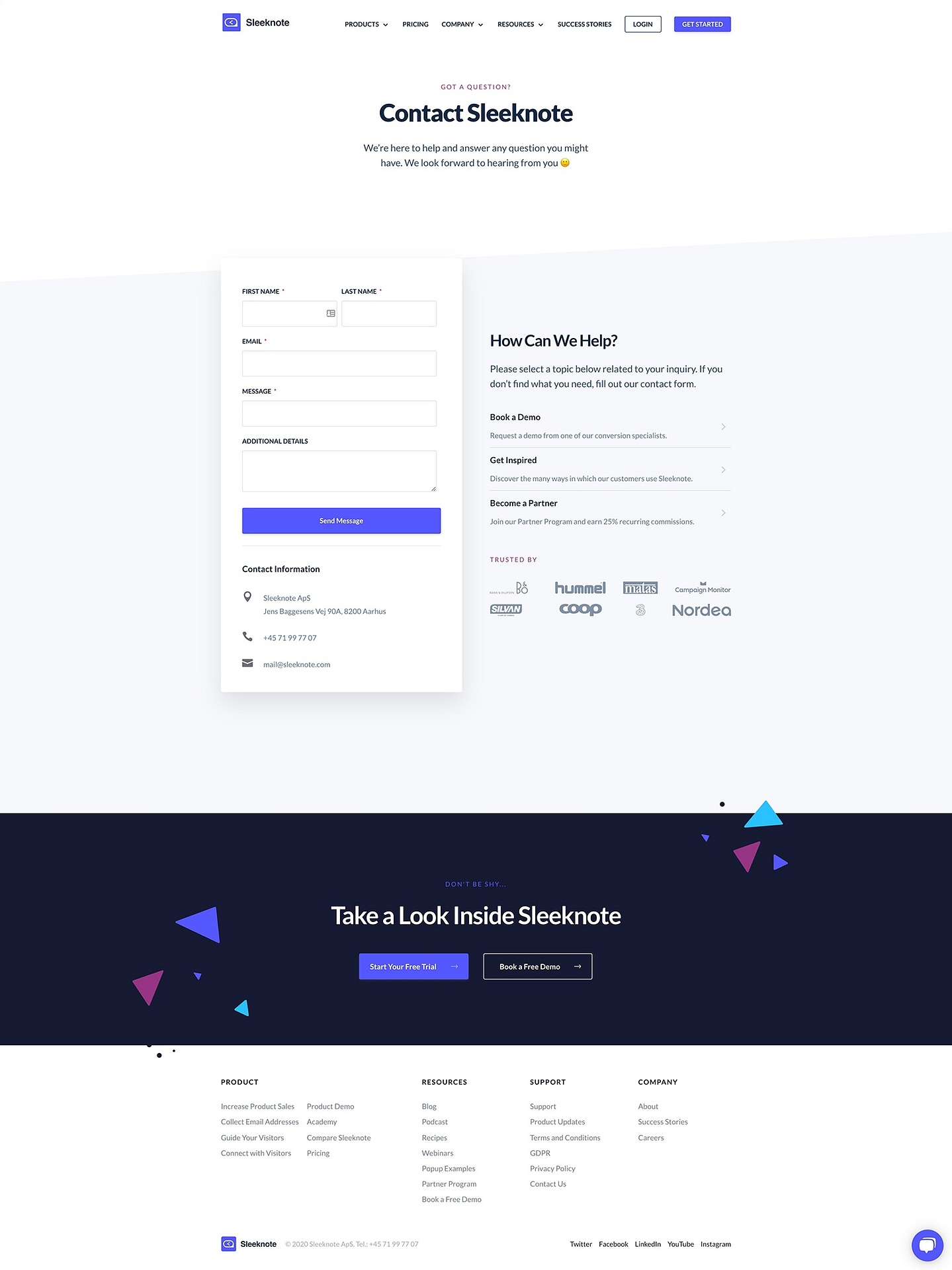
Sleeknote's Contact Page focused on helping potential customers make a purchase decision.
If you don’t count Sleeknote’s sitewide Header and Footer when analyzing this design, you can break their Contact page down into 3 parts, including a:
- Hero Area
- Contact Form + Useful Links Section
- Bottom Section
Let’s take a look at each section in a little more detail — and how to build them with Thrive Architect...
Simple Yet Clear Hero Area
Sleeknote’s Hero Area simply and clearly communicates the purpose of their Contact page:

Sleeknote's simple yet clear Contact page Hero Area.
Got a question? This Contact page exists so Sleeknote’s staff can answer it for you.
How To Build It with Thrive Architect
Replicating this strategy using the Thrive visual editor is as simple as dropping a Theme Block element onto your page (Theme Block templates are available in Thrive Architect when Thrive Theme Builder is active as your WordPress theme), filtering for the “Hero Area” templates, and customizing the design you select to suit your own Contact page needs.
In fact, here’s a Theme Block template that even uses the same slanted bottom border design style that Sleeknote’s Contact page deploys:

An example of a "Hero Area" Theme Block template available in Thrive Architect when Thrive Theme Builder is active as your WordPress theme.
Just swap out the demo image with your own, update the text and you’re already well on your way to publishing a fantastic looking Contact page:
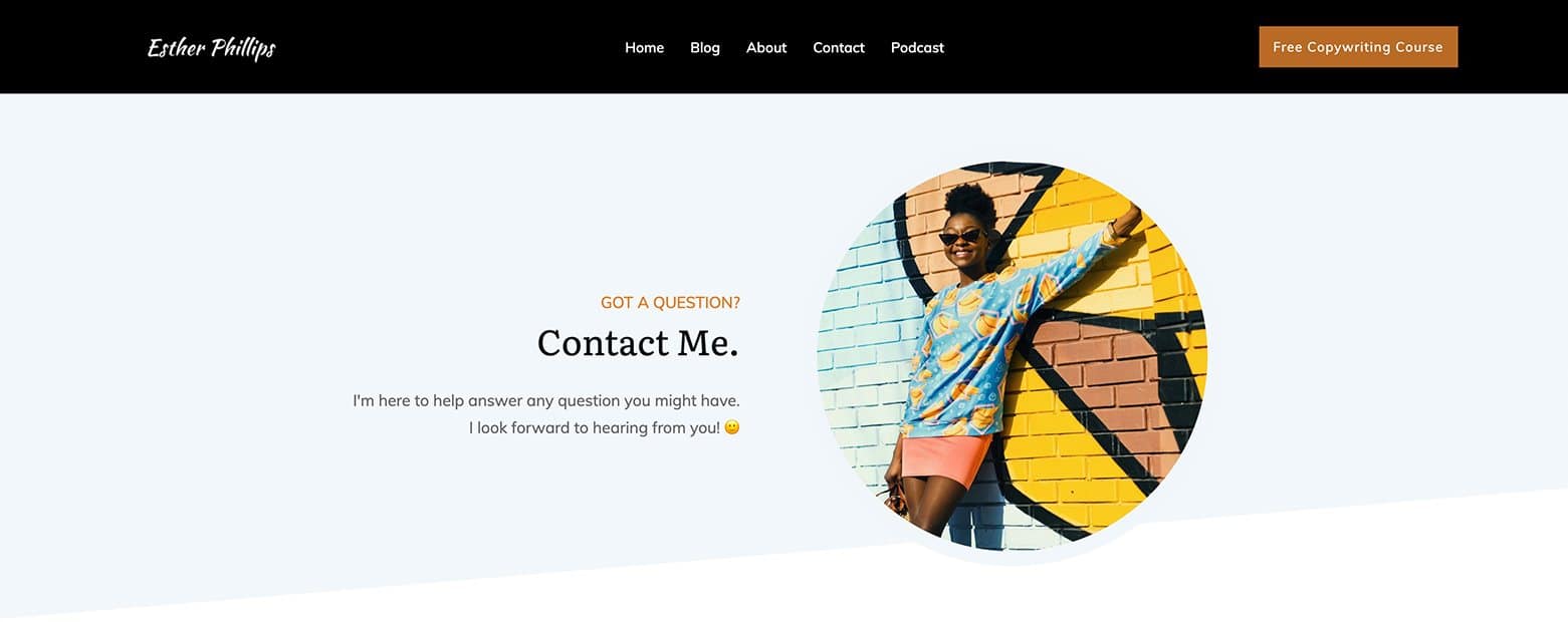
After customizing the text and swapping out the demo image for your own content, your Contact page Hero Area is ready to go!
Contact Form + Useful Links Section
This next section has multiple parts and does the heavy lifting for Sleeknote by presenting both a Contact Form and a series of useful links:
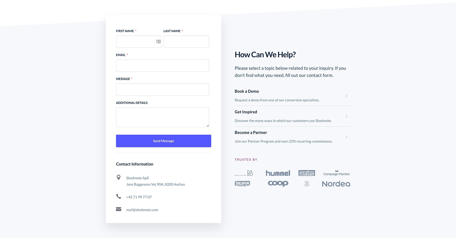
Sleeknote's Contact Form and Useful Links section on their Contact page.
First off, Sleeknote keeps their Contact Form simple by just asking for the following details:
- First Name
- Last Name
- Message (a required text area input)
- Additional Details (an optional text area input)
We think this minimal set of inputs is going to be appropriate for most businesses.
However, the form would work better if the text area labels were specific (like “Your Question” instead of “Message” and “Anything else you’d like to add?” instead of “Additional Details”).
The actual input boxes would benefit from response prompt placeholders too (Like “Type your question here…).
Below the Contact Form, Sleeknote includes some contact information, including their:
- “Book a Demo” (make an appointment to test drive Sleeknote)
- “Get Inspired” (read customer success stories)
- “Become a Partner” (join Sleeknote’s affiliate program)
These clever links may lead potential customers to the pre-sale product info they’re looking for without needing to complete the Contact Form. Not a bad idea for your own Contact page, right?
Finally, it’s always smart to include social proof where possible so Sleeknote displays a “Trusted by” company logo section. This works to establish trust and authority with warm leads who make it to the Contact page.
How To Build It with Thrive Architect
Setting up a conversion focused Contact Form like this using the Thrive visual editor is quick and easy.
Start by adding a Background Section element underneath your Hero Area. Drag & drop a [ ½ | ½ ] Columns element within that.
With the Background Section highlighted, change the “Content Maximum Width” value to your liking (we recommend 1000 pixels if you want to keep your Contact Form appearance narrow like Sleeknote's) within the Main Options tab of the left sidebar.
Now, highlight the left Column element and give it both a white background (#ffffff in the Background Style tab) and a pleasant grey drop shadow (say #50565f in the Shadow tab).
From there you can add a Contact Form element inside that same left Column. A template library will appear from which you can select a Contact Form design (this new template feature became available in this Thrive Themes feature release):
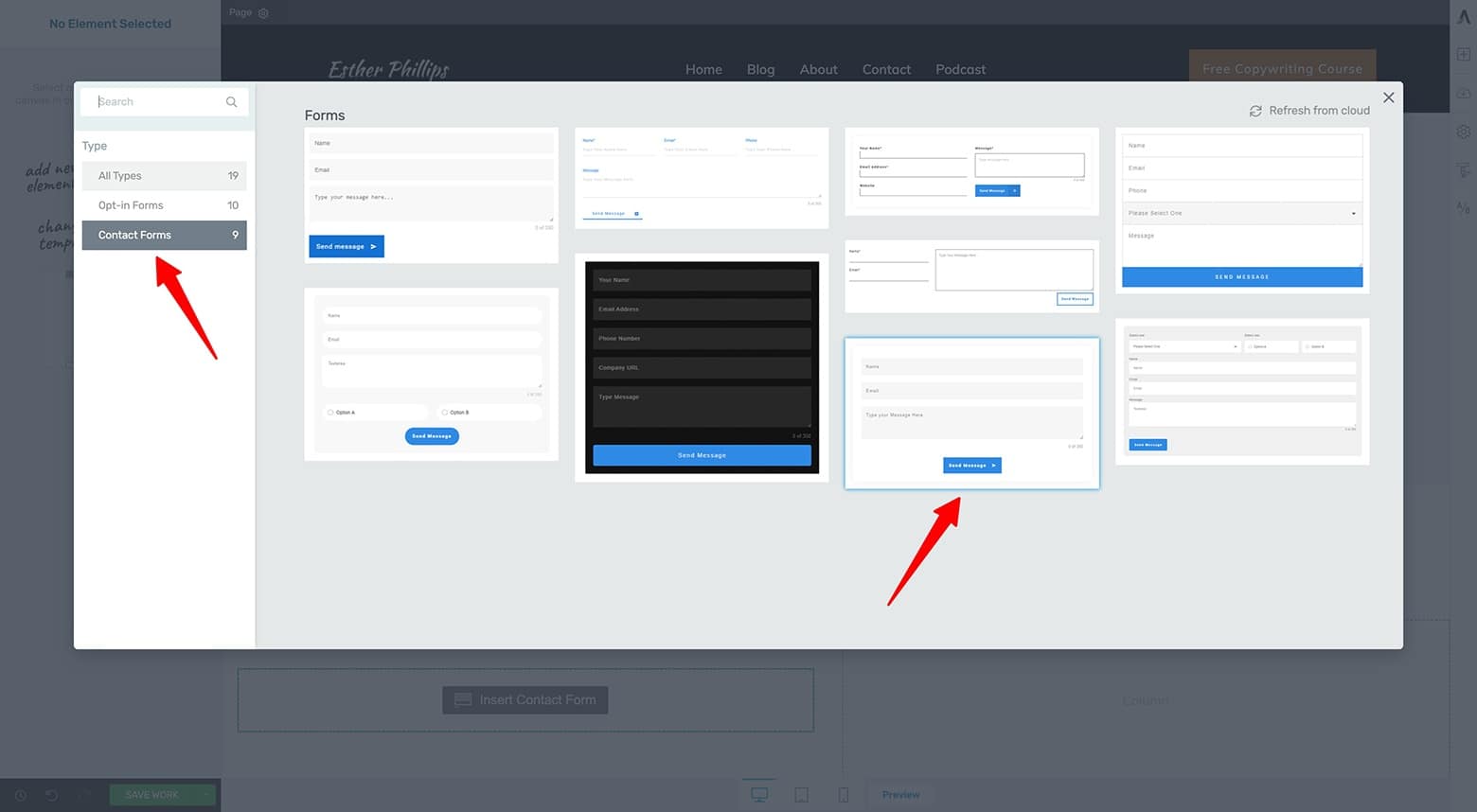
Choose the Contact Form design you like from the Contact Form element template library.
After you select a Contact Form template, it will load on your page (matching your set brand color if Thrive Theme Builder is active).
Next, customize the Contact Form design by adding a second Name and additional Text Area field (if you want to request similar details to Sleeknote’s form). From there, you can customize all the labels and placeholder text as you like.
We suggest making each field required except for the last “Additional Details” text area field:
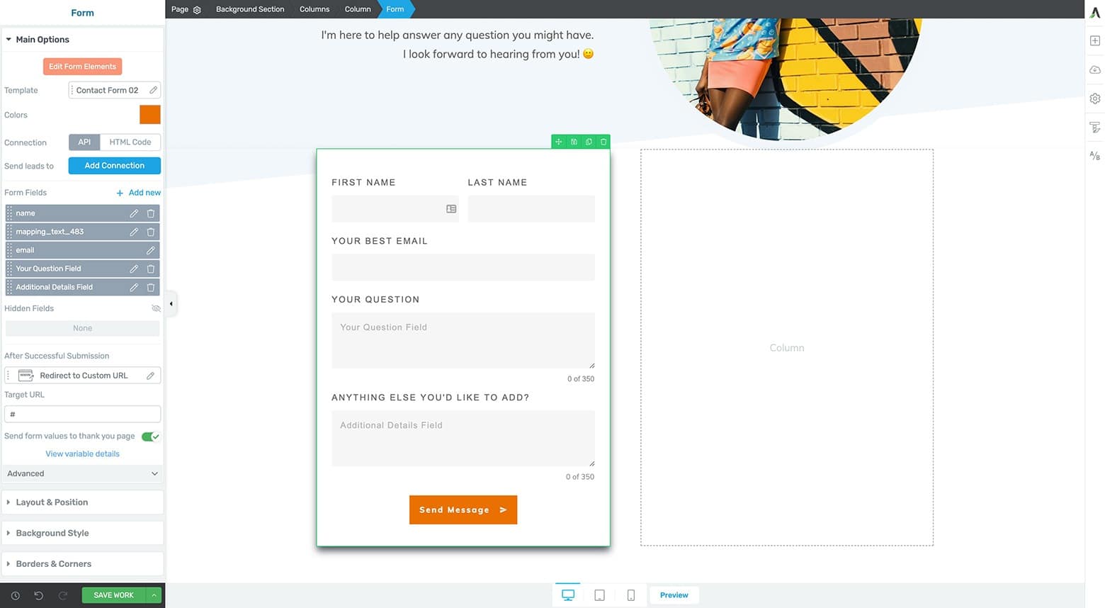
You can customize your Contact Form template as necessary to ask for the info you need from potential clients and customers.
Once your Contact Form design is finished, it’s time to make it functional. This means programming an automated email that will send any submitted details to the email address of your choice.
Do that by highlighting the Contact Form element and clicking on the blue “Add Connection” button under the Main Options tab of the left sidebar. From there, select the “Email” option in the dropdown menu that appears:
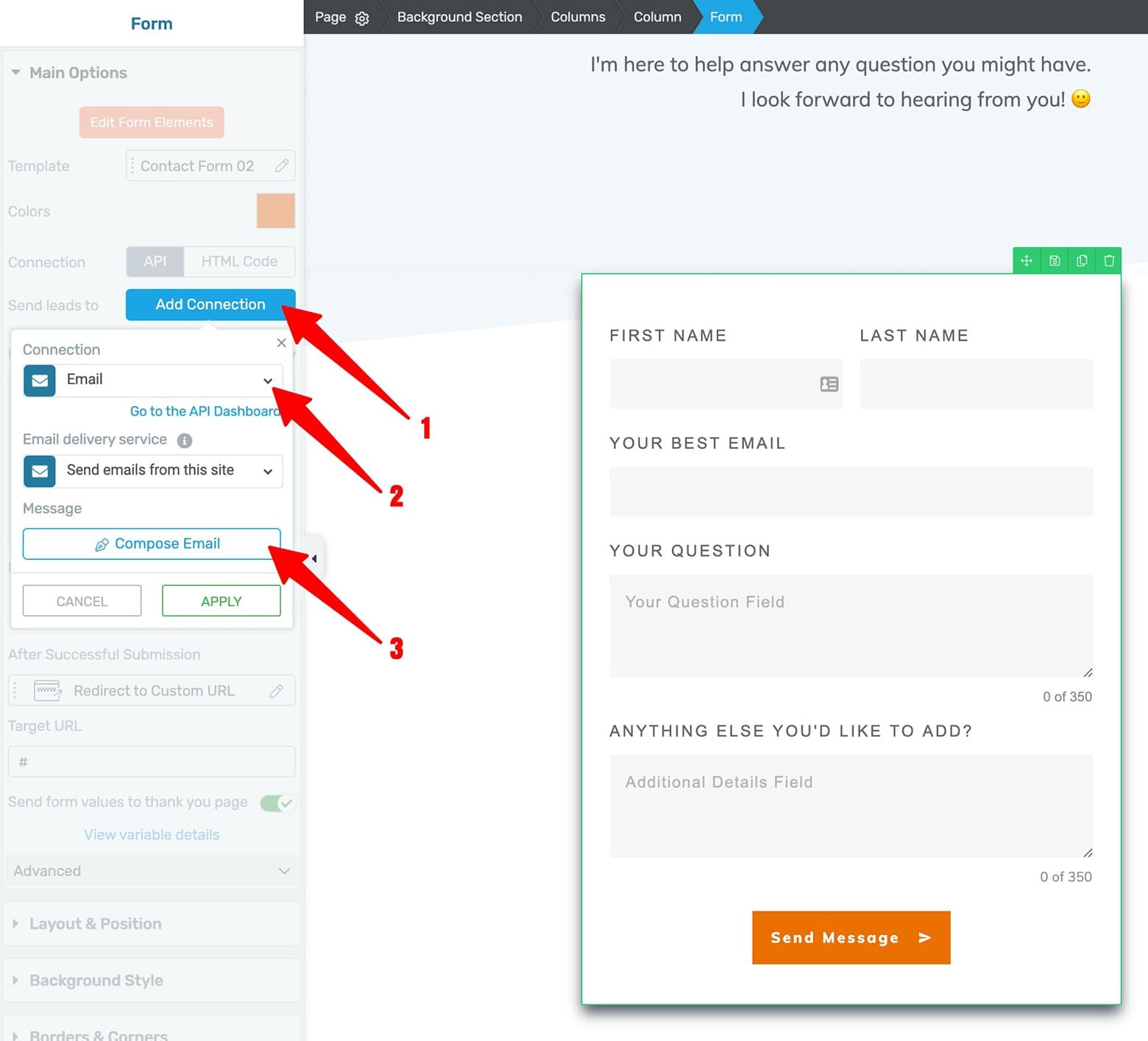
How to set up an email connection with your Contact Form to send an automated email after a form is submitted.
Then click the white “Compose Email” button to program your automated email. You can also program a confirmation email to be sent to the Contact Form submitter:
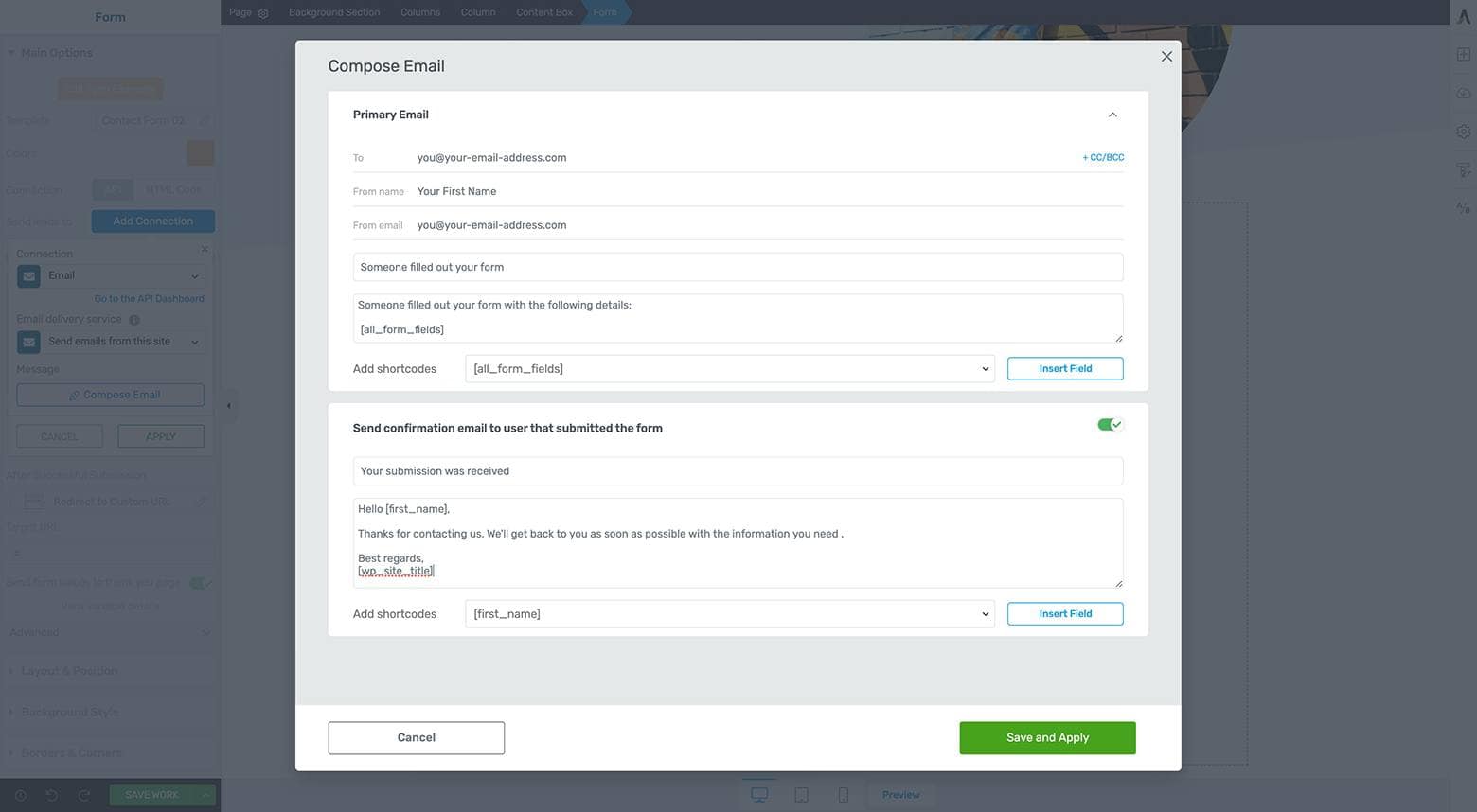
Compose your automated email (and optional confirmation email to the visitor) by clicking on the "Compose Email" button.
On top of that, you can also sync your Contact Form with your email marketing tool or autoresponder!
To do that, simply click the blue "Add Connection" button a second time to connect your email marketing tool, just like you would for any Lead Generation element inside Thrive visual editor:
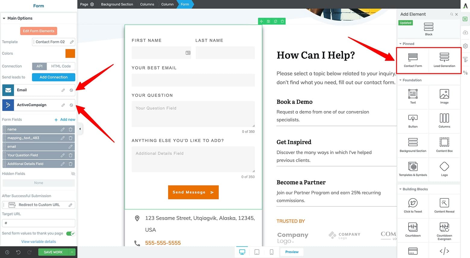
Your Contact Form can also connect with your email marketing tool to add form submitters to your mailing list too. In fact, the Contact Form and Lead Generation elments function exactly the same now. Make sure you're in compliance with local, national and global privacy laws when you use this feature.
That's right, the updated Contact Form element doubles as a Lead Generation element too! In fact, although both elements can still be found in the Thrive visual editor's right sidebar, they're actually one in the same now. Make sure you're in compliance with local, national and global privacy laws when you use this feature.
Important Note! Set up a Transactional Email Service
The above email and any that you send from our Contact Form element will be sent from your WordPress website.
Inboxes are very suspicious of emails that are sent from WordPress. Gmail almost always sends them to the spam folder and even removes the hyperlinks.
If you ever send emails from a WordPress site, it is necessary to set up a Transactional Email Service or SMTP plugin. This means that WordPress creates the content of the email but it will be sent by a respectable email server... and inboxes will happily welcome the email.
Check out our knowledge base article to learn how to set this up.
Now that your Contact Form setup is complete, it’s time to add any necessary Contact Information to the page.
Do this by adding a Styled List element underneath your Contact Form.
Customize and style your icons (you’ll need to ungroup each Icon element within the Styled List element to make it unique) and modify the Text elements to become Global Fields.
You can do this by clicking on the “Dynamic Text” icon (in the floating text styling bar), selecting “Global Fields” from the dropdown box, and then choosing the appropriate contact info item (like “Address” for a location icon or “Phone number” for a phone icon):
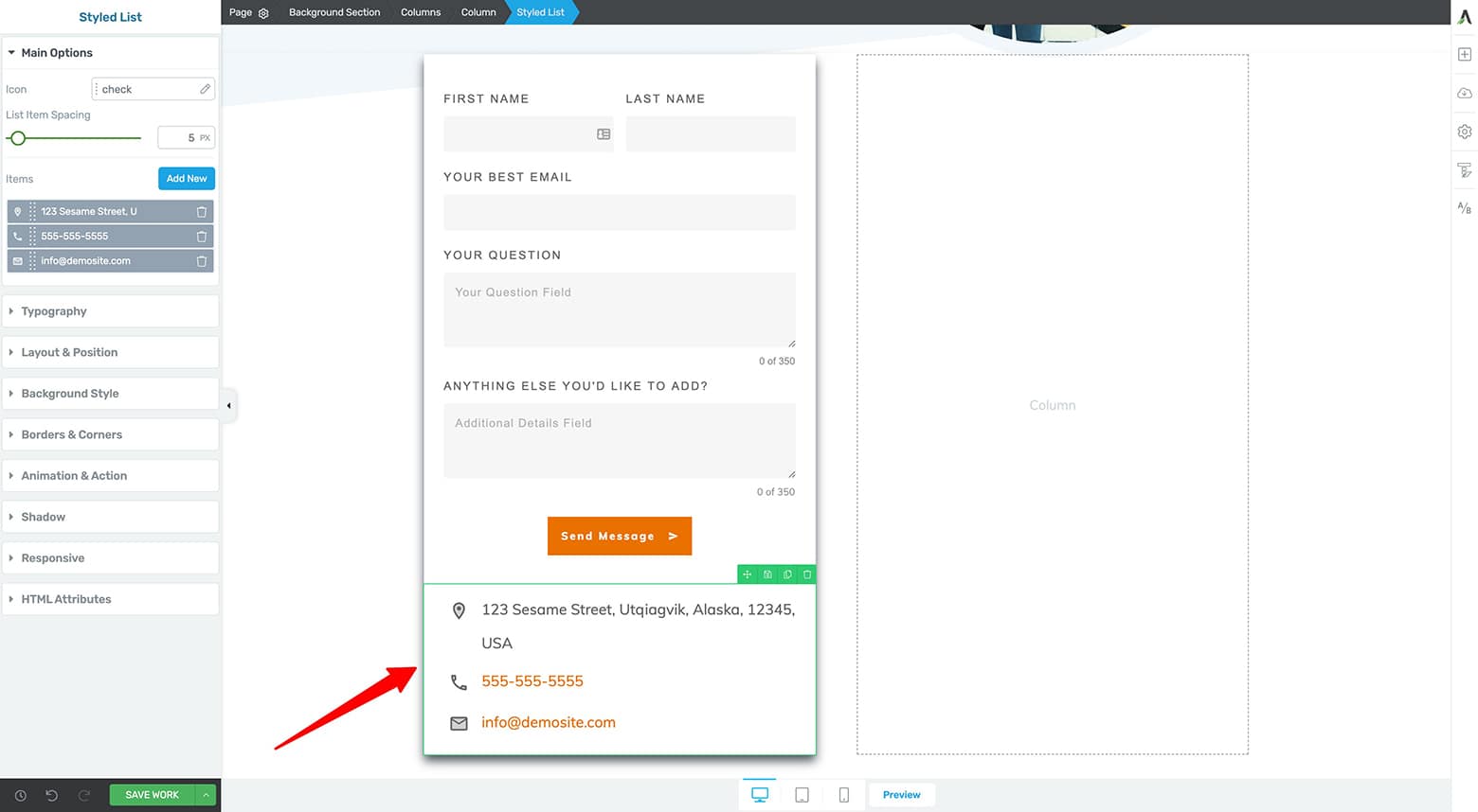
Use a Styled List element to create your Contact Information area underneath the Contact Form.
Let’s move on to setting up your empty right Column element.
Begin by adding an H2 and Paragraph Text element to the right Column. With the parent Columns element highlighted, you can also vertically center the content in the Main Options tab of the left sidebar:
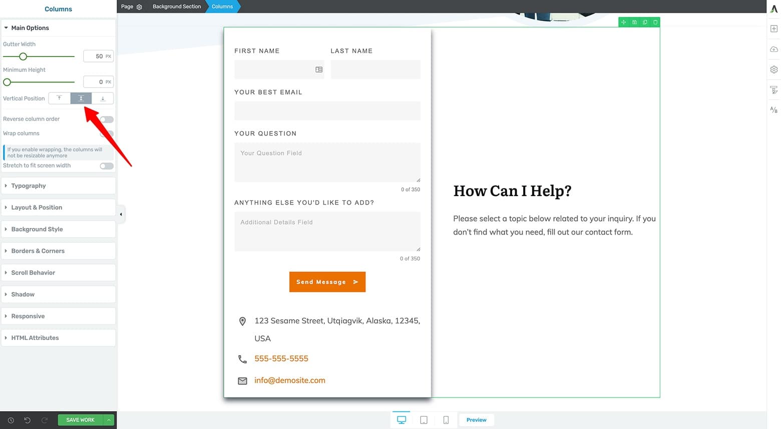
Add an H2 and Paragraph Text elements to the right Column element. Vertically center the parent Columns element.
The best way to add your useful links — in the style of Sleeknote’s Contact page — is with some fancy Content Box element craftsmanship.
Do that by adding a Content Box element underneath the right Column text you just deployed. Add an H3 to serve as your link title in the new Content Box as well as some Paragraph text for context. Style your H3 and Paragraph text.
Then drag & drop an Icon element next to the Paragraph text to create a Columns element within the Content Box. Select a right facing chevron or arrow icon for this. Style the icon and its positioning while also vertically centering the new child Columns element.
Now add a bottom border to the Content Box element.
With the Content Box element still selected, enter the Hover state and add a CSS Animation to the Animations & Action tab in the left sidebar (I recommend using the “Forward” animation option).
Finally, return to the Content Box’s Normal state and add a Hyperlink within the same Animations & Action tab (set to your desired URL).
Now clone and customize this Content Box link as many times as needed to complete your Useful Links section:
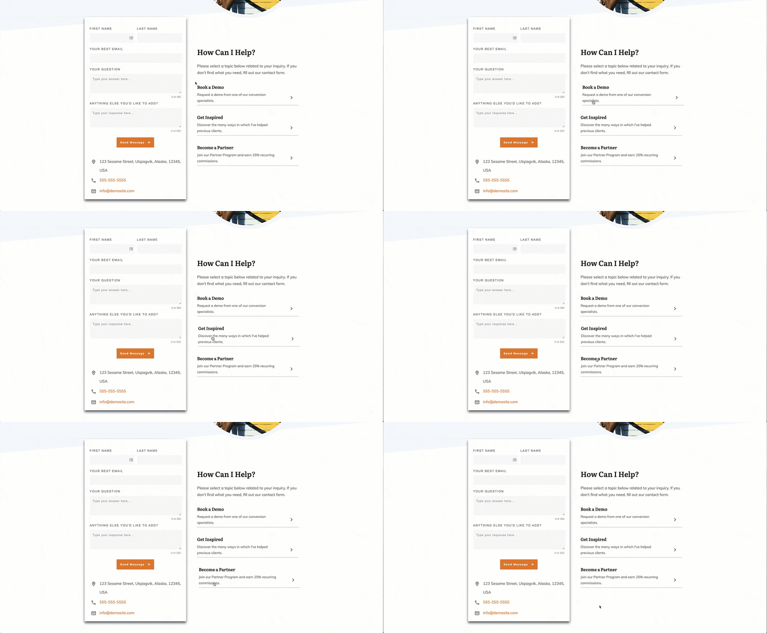
You can animate your Useful Link area Content Box designs with the "CSS Animations" feature inside the Animation & Action left sidebar tab (we recommend using the simple "Forward" animation for this example).
The final detail needed to complete this Content Form section is entirely optional, but featuring a few companies that use your products or services (or even a simple customer testimonial or two) can go a long way to help position yourself as a trusted business in your niche.
To replicate this, just style some text followed by a few logo images (in a [ ⅓ | ⅓ | ⅓ ] Columns element for this example) beneath your useful links area:
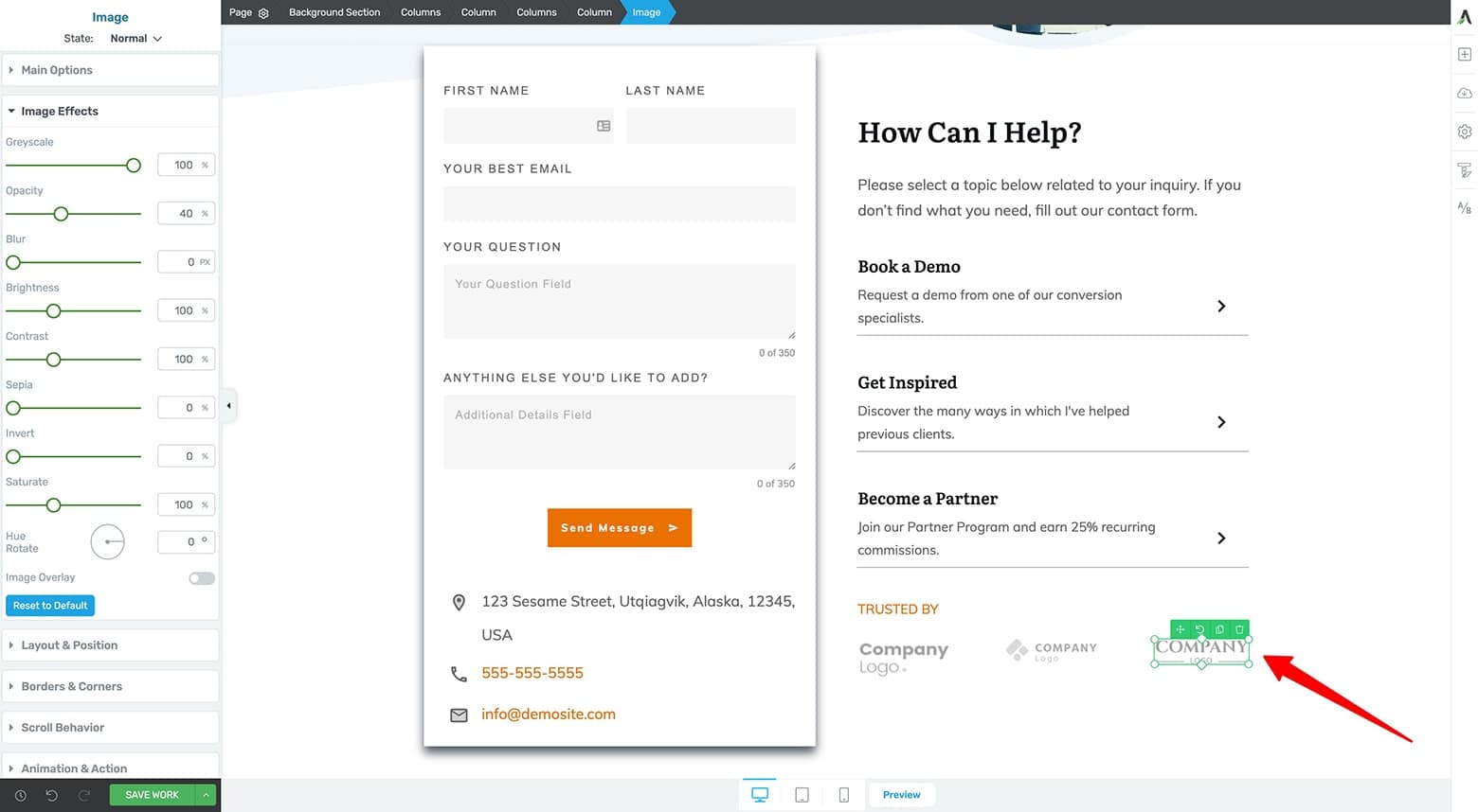
Add a "Trusted By" company logo or testimonials section to boost trust with your potential clients and customers.
And once that’s done, it’s time to finalize this Contact page design with a Call to Action bottom section.
Bottom Section
Sleeknote uses a Bottom Section design to promote their 2 free offers:
- A 7 day free trial
- A free demo session

Sleeknote features a Call to Action bottom section on their Contact page.
This Bottom Section strategy is optional for your own Contact page, but if you do have a compelling free offer that would help your potential customers purchase, consider placing it here.
How To Build It with Thrive Architect
Again, the Thrive visual editor Block element is your friend as it gives you several “Call to Action” or “Lead Generation” Content Block templates you can customize — like this one:

One of the "Call to Action" category Block template designs inside the Thrive visual editor.
After a making a few customizations to the “Call to Action” template and adding a footer to the landing page, we have our final Contact page design modeled after Sleeknote’s:
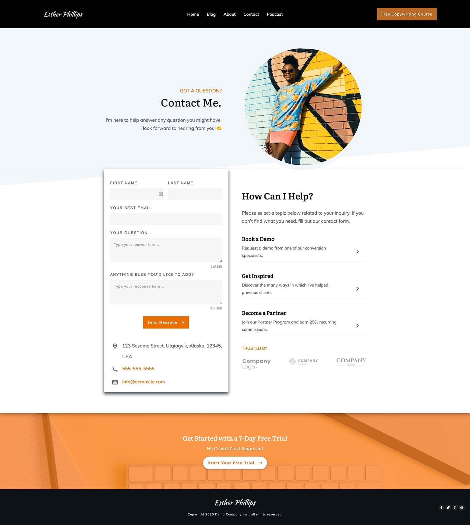
The completed desktop version of a Contact page modeled after Sleeknote's design.
Now that this Contact Page design has been completed on Desktop, you just need to check how everything looks on smaller screen sizes...
Tablet and Mobile Design Optimizations
After completing any landing page on Desktop, the final task is to run through the Tablet and Mobile versions of the design to make any necessary adjustments.
In the case of this example, just a few Background Section and Block element margin & padding settings needed to be changed (found within the Layout & Position tab of the left sidebar) to achieve the following mobile optimized result:
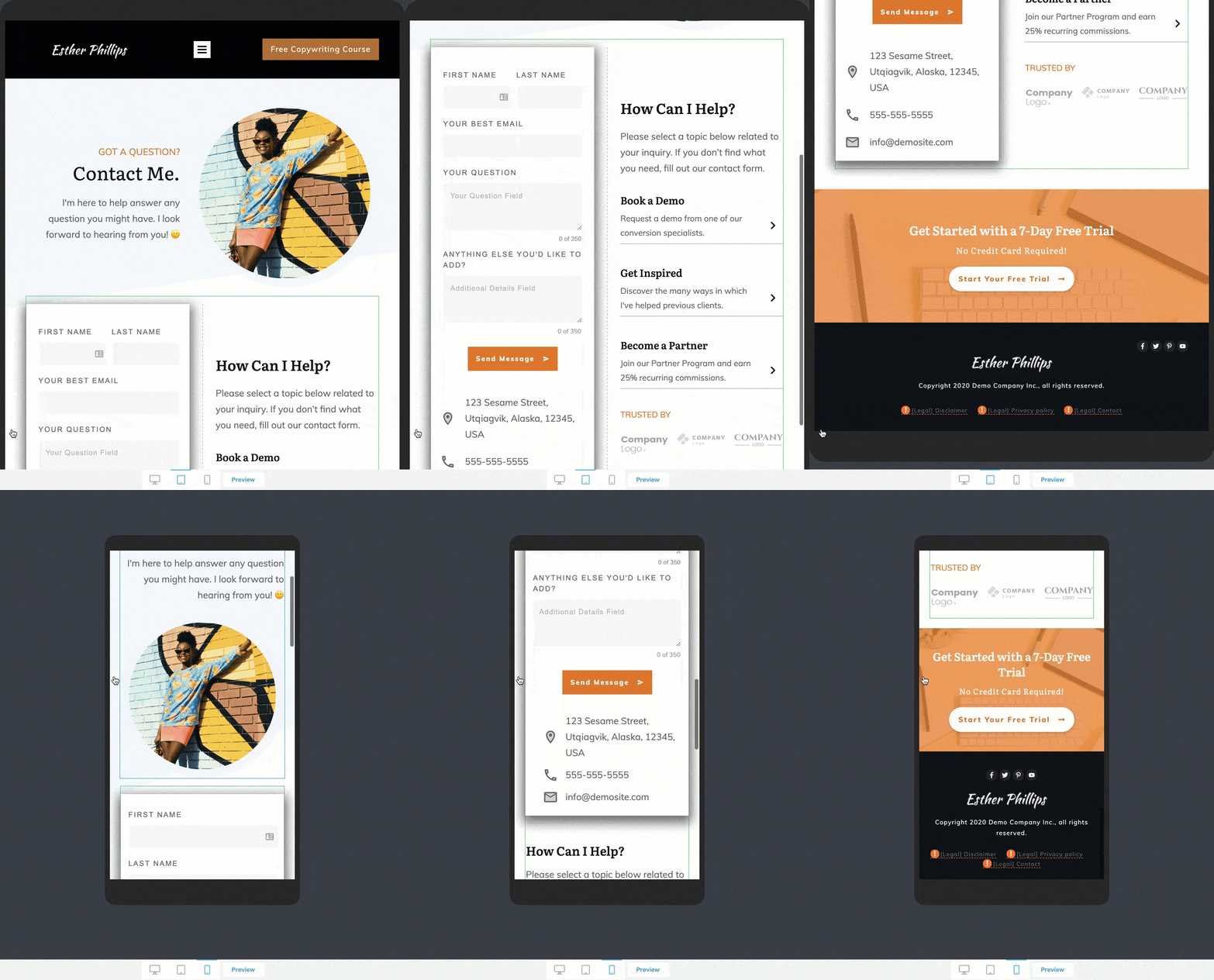
The final tablet and mobile optimized versions of this Contact page design.
And that’s it! Your Contact page is ready to go!
Move with Lara-Lyn: Online Coaching and Consulting Business Example
If you’re an online coach who wants more clients, then you need a Contact page that makes it stupid simple for potential clients to inquire about how to work with you.
And by using one of the “Contact” category Theme Block templates (available inside Thrive Architect when Thrive Theme Builder is active as the WordPress theme), you can create a new client focused Contact page in just a few minutes — just like Move with Lara-Lyn did:
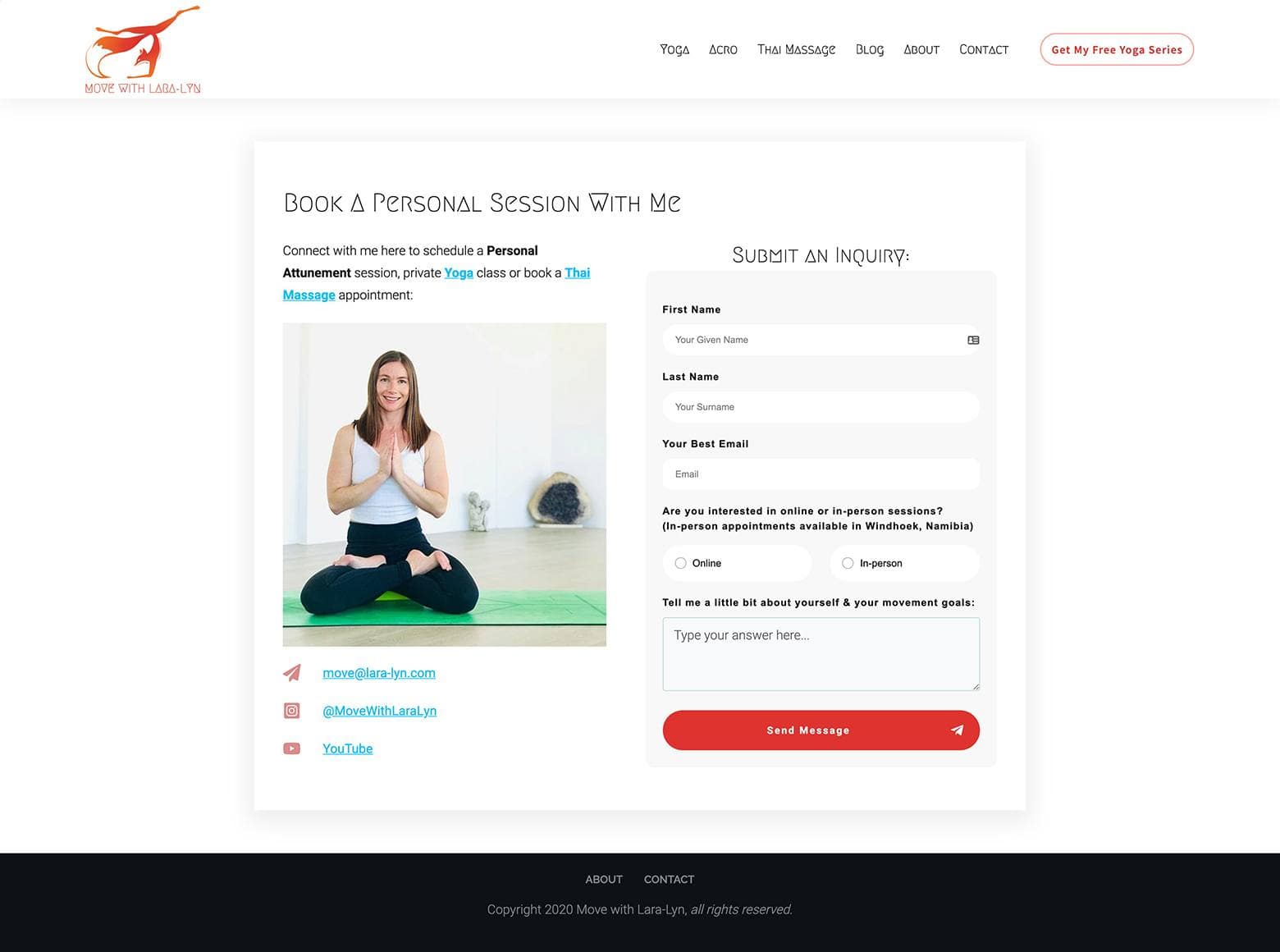
Move with Lara-Lyn's simple but effective Contact page — built with a Theme Block "Contact" category template inside Thrive Architect when Thrive Theme Builder is active as your WordPress theme.
Condensed Coaching Contact Page
Notice this Contact page design is just a streamlined version of the Sleeknote example discussed above. The “Hero Area” top section and “Call to Action” bottom section have been stripped away.
The condensed Contact Form section keeps it simple by displaying:
- Call to Action H2 and Paragraph text
- A friendly picture of Lara-Lyn
- Global Fields contact info and social media links
- A Contact Form (with Radio Buttons!)
However, the one feature that would really make this Contact page NEXT LEVEL is the integration of an automatic scheduling tool (like Calendly or Acuity Scheduling).
By deploying that, potential clients could book their initial consult calls without any back-and-forth communication. If you’re interested in learning how add automatic client scheduling to your online coaching Contact page, check this post out:
How To Boost Your New Coaching Client Conversions & Automate Your Bookings with Thrive Architect
How To Build It with Thrive Architect
You can get this type of Contact page design up and running fast with the Thrive visual editor if you've got Thrive Theme Builder active on your WordPress site. It’s just a Theme Block “Contact” category template.
So on your blank landing page, get started by simply add a Block element to the page and select the following template:
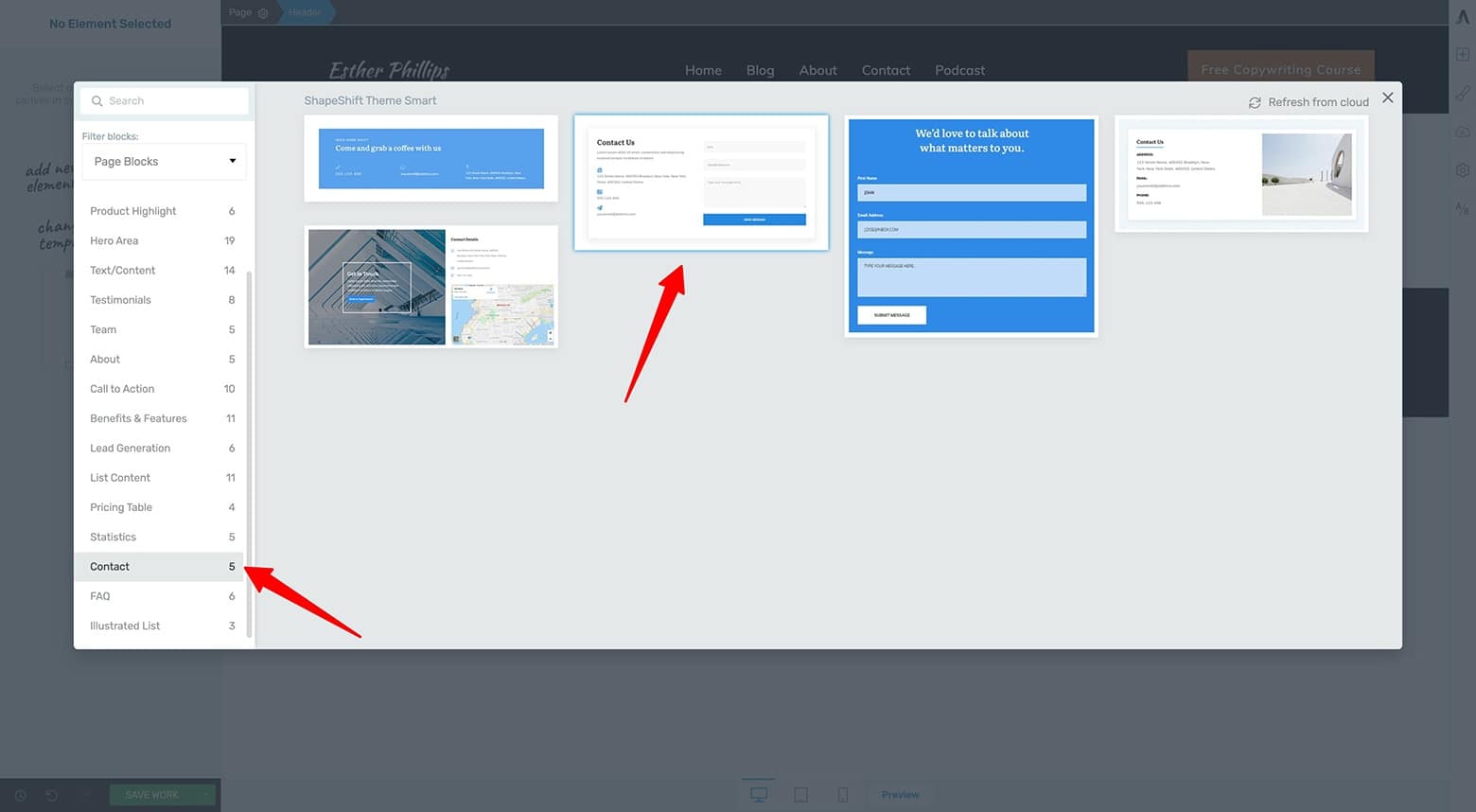
Add a Block element to your page, filter for the "Contact" category Theme Block templates, and select a design.
From there, you can customize the left Column template elements such as changing the Heading and Paragraph text, adding a friendly picture of yourself, and modifying the Global Fields contact information to suit your business needs:
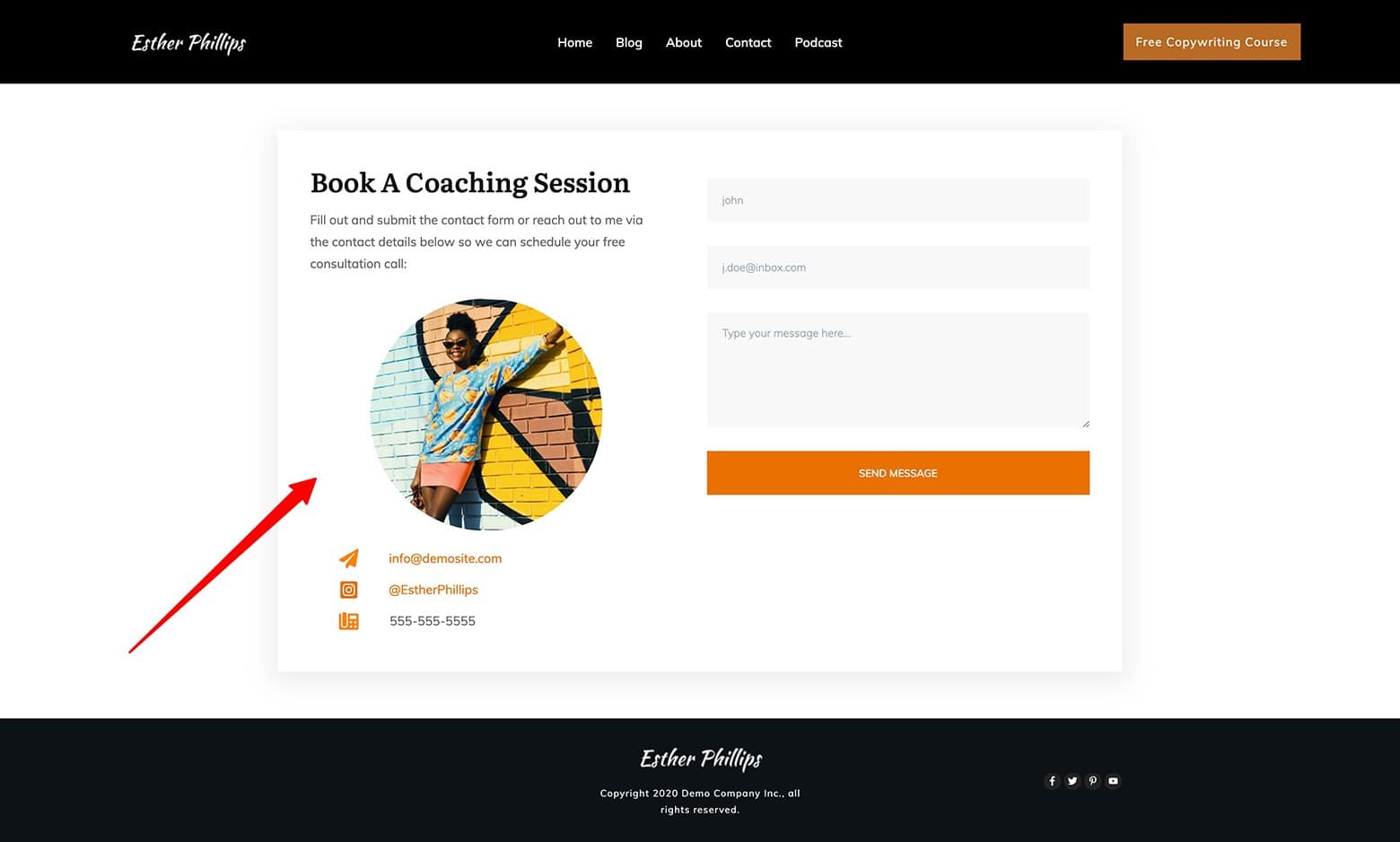
When your "Contact" template loads, customize the text, image and contact details in the left Column.
Now, you just need to customize your Contact Form element.
Do this by either modifying the template’s default Contact Form…
...or deleting it to use a new Contact Form element in its place.
To match the Move with Lara-Lyn example (that uses Radio Buttons), we suggest using this template instead:
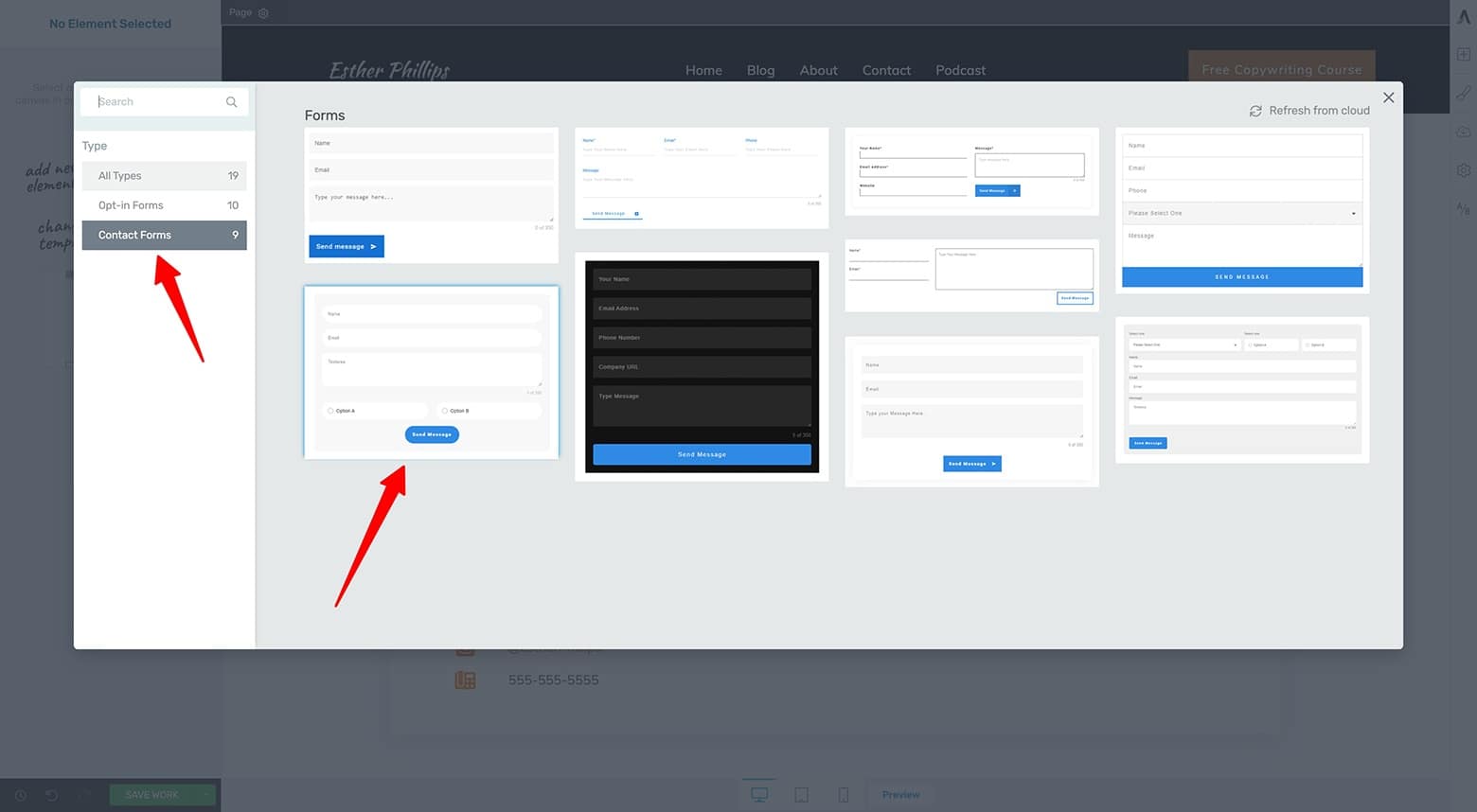
If you want to mimic Move with Lara-Lyn's Contact Form design, use this Radio Button Contact Form template available in any Thrive visual editor.
Always customize the Contact Form template to your own specific business needs. Refer to the Sleeknote example above for details on how to add, remove and customize your input fields.
Keep the information you request to what’s absolutely necessary (so you don’t discourage potential clients from reaching out). And don’t forget to program the Contact Form’s automated emails while you’re at it.
Because Move with Lara-Lyn offers both in-person and online services, she actually uses Radio Buttons on her Contact Form to communicate both options are available. Think about your coaching services to see if there’s specific info you want to learn about clients or info you want to communicate to potential clients with your contact from — like this:
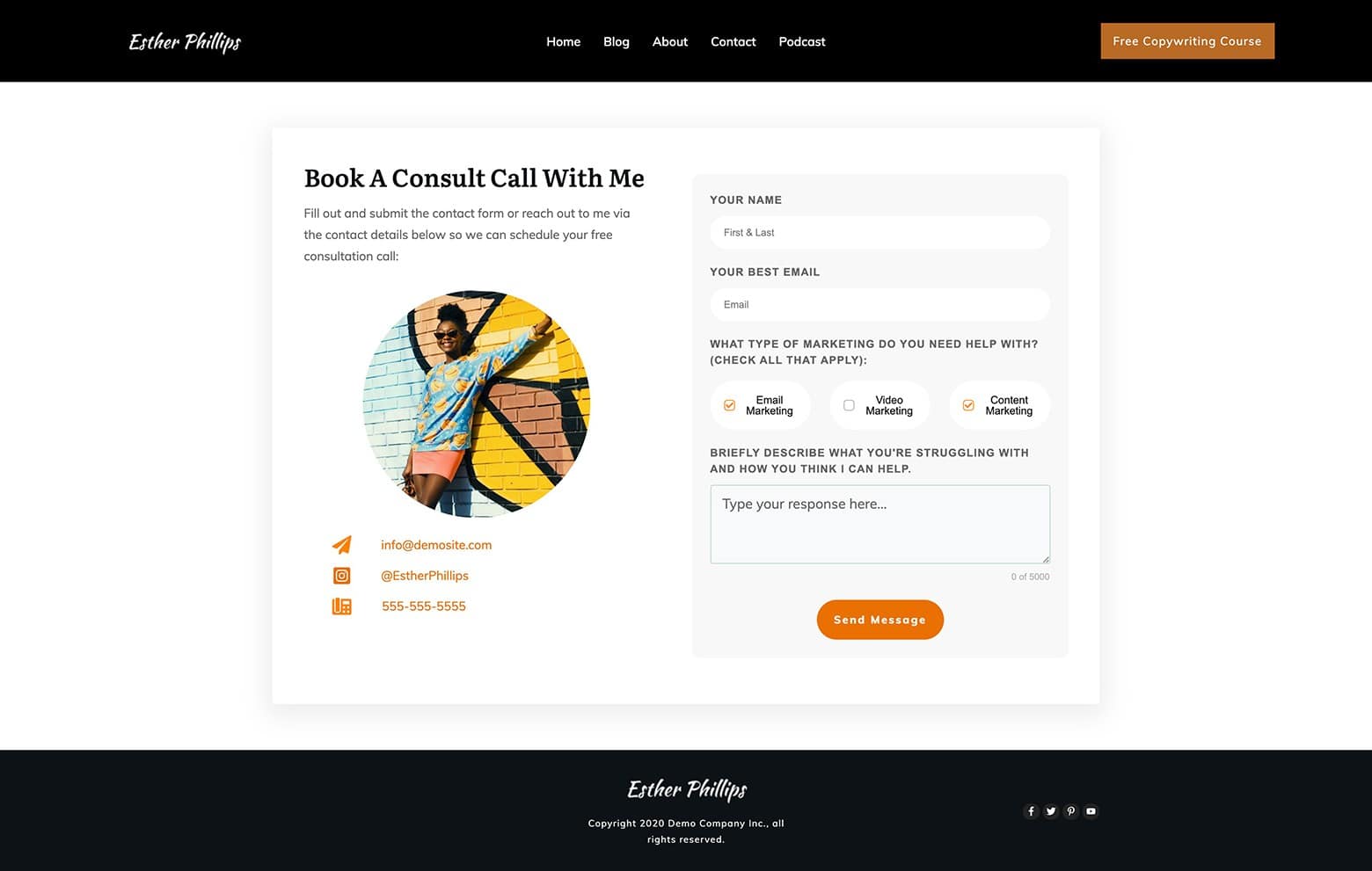
The final Coaching Contant page design — complete with Checkboxes — customized from a Thrive visual editor Block template design.
As you can see, we swapped out the Radio Buttons in this example with Checkboxes. Feel free to make this Contact page design your own!
Tablet and Mobile Design Optimizations
Again, you’ll need to run briefly through the Tablet and Mobile versions of this Contact page design to make any necessary modifications.
After a few adjustments to the Columns element settings as well as a few margin & padding changes, here's the final mobile optimized result:
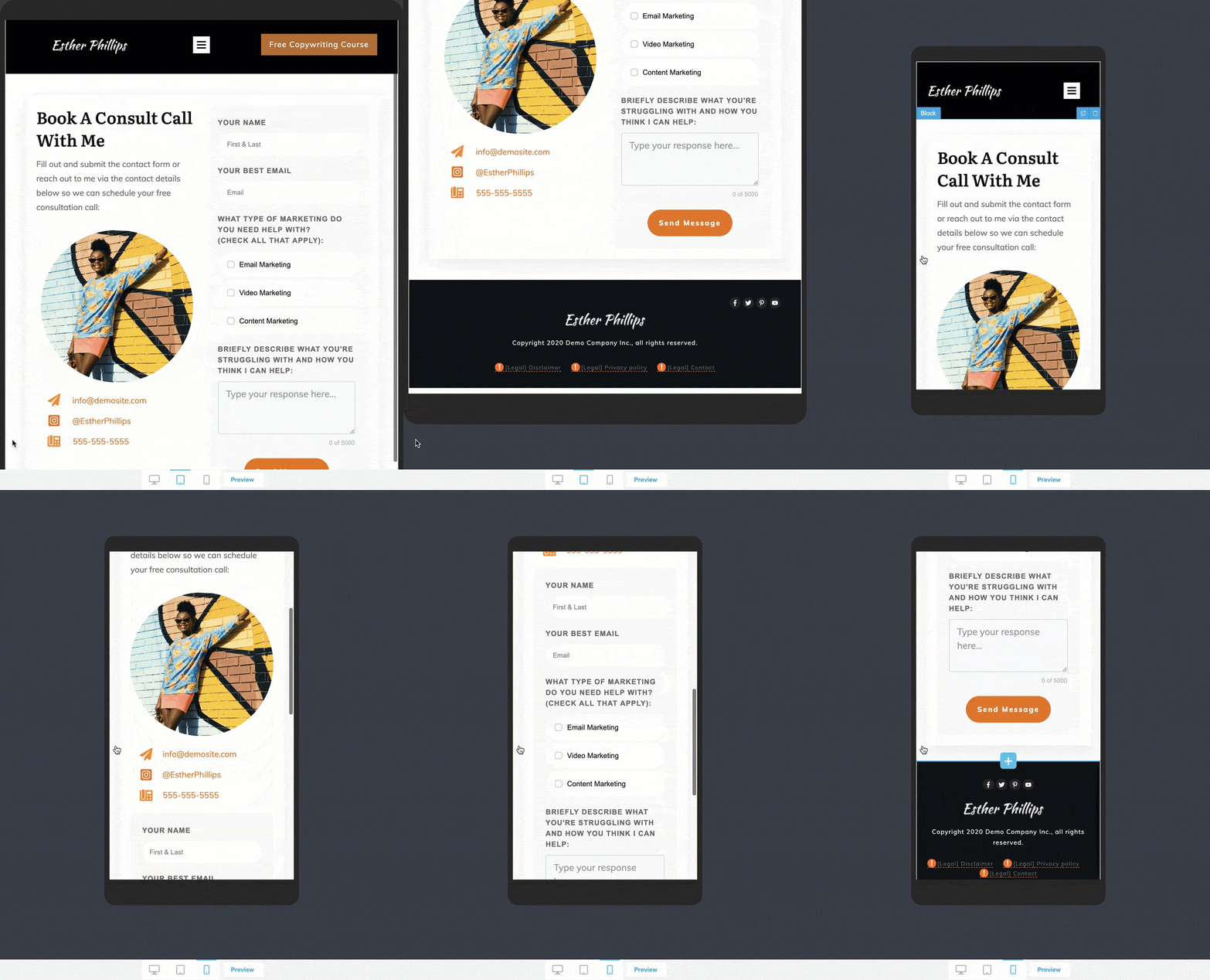
After tablet and mobile optimizing your Coaching Contact page, the final design should look something like this.
But if you’re hoping to create a Contact page with just a little more sophistication, let’s look at one final example...
Zendesk: Simple yet Impressive Contact Form Lightbox Example
So you want to build a “high-tech” Contact page?
Well, we’ve got just the example for you…
High-Tech Hero Area
Check out how Zendesk’s Contact page utilizes a 2-Step popup lightbox strategy:
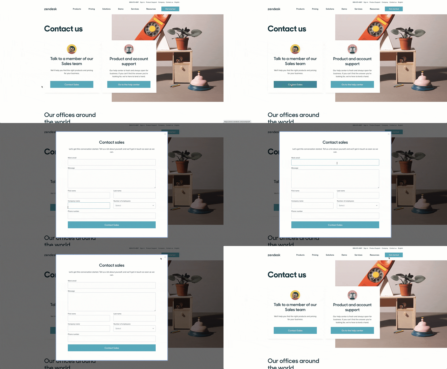
Zendesk uses a 2-step lightbox on their Contact page to present a Contact Form to visitors.
As you can see, Zendesk proudly displays a “Contact Sales” button within the Hero Area that opens a lightbox with a Contact Form inside.
Here’s how to do the same on your own Contact page...
How To Build It with Thrive Architect
Get started by selecting either a "Call to Action category Content Block template (Thrive Architect only) or a “Hero Area” category Theme Block template (Thrive Architect + Thrive Theme Builder) — ideally one that uses a Button element like this:
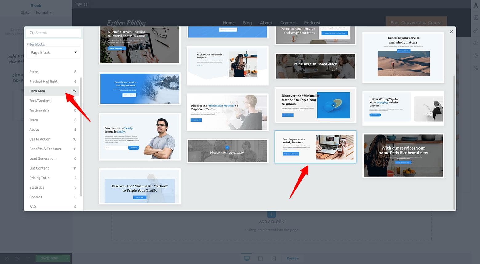
Drag & drop a Block element onto your page, filter for either a "Call to Action" or "Hero Area" category template (a Content Block or Theme Block design depending on which Thrive Themes tool stack you're using), and select a design.
Next, modify the text to match your particular business needs. For the sake of the example, let’s pretend Esther Phillips has a sales team too:
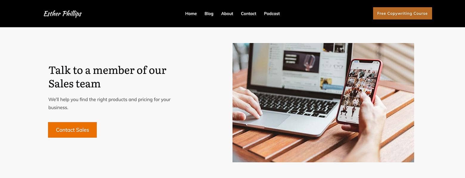
Customize your "Hero Area" category Theme Block template with new text and image content.
Now, move over to your WordPress dashboard so you can create a Thrive Lightbox with a Contact Form inside.
To create a simple Contact Form lightbox like Zendesk uses for your high-tech Contact page:
- Click on the Thrive Lightbox tab of your WordPress dashboard (a Thrive Architect plugin feature)
- Press the “Add New” Thrive Lightbox button
- Title the new Thrive Lightbox
- Publish (or update) it
- Click the “Launch Thrive Architect” button
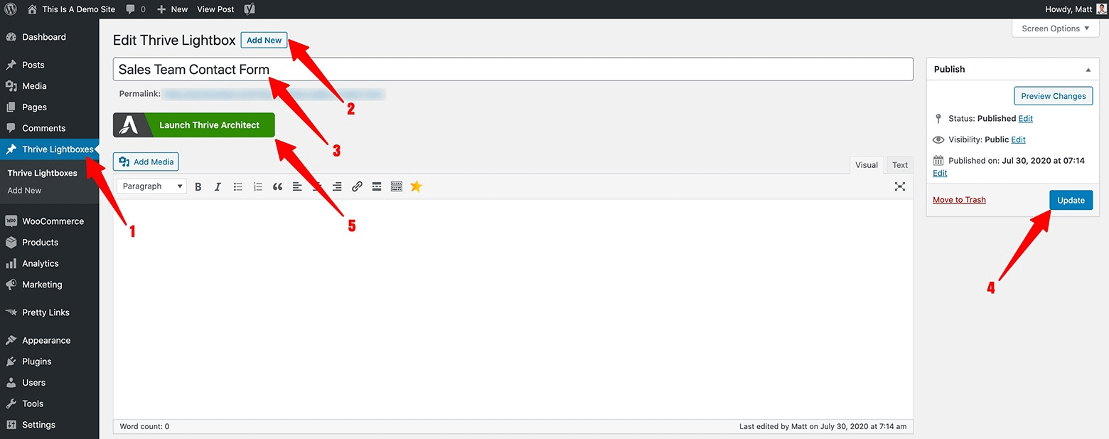
Follow these 5 steps to create a new Thrive Lightbox in your WordPress dashboard. You must have the Thrive Architect plugin active on your site to use this feature.
Now you’re ready to build your Contact Form lightbox.
In the Thrive visual editor that opens, drag & drop some Text and Contact Form elements into the lightbox (select the Contact Form design you like best from the template library that appears):
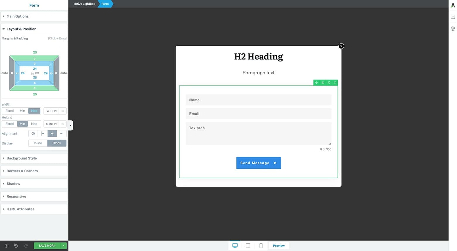
Begin building your Contact Form Thrive Lightbox by adding an H2, Paragraph text and Contact Form element to your Thrive Lightbox.
After that, it’s just a simple matter of customizing your Thrive Lightbox and Contact Form element (just the same as in the first Contact page example) to complete the design.
You’ll also need to change Background Style as well as Layout & Position tab settings of both the Contact Form and Thrive Lightbox elements to achieve the following result:
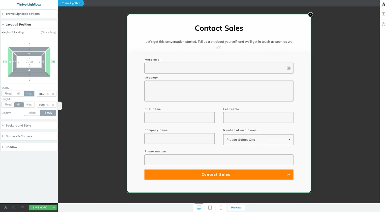
After customizing the Contact Form and Text elements on the Thrive Lightbox, the design should look something like this.
Here, we’ve even included a Dropdown custom field box within the Contact Form to mimic a question that has several possible answers (like the “Number of employees” question Zendesk includes on their Contact Form).
As always, make sure to check if any Tablet and Mobile version modifications are required on the Thrive Lightbox design before heading back to your Contact page to finish up.
After you move back to the Thrive visual editor of your Contact page, just connect the “Contact Sales” button to your new Thrive Lightbox Contact Form you just created.
You can do this by:
- Highlighting the Button element
- Clicking on its Animation & Action tab of the left sidebar followed by clicking the Popups icon
- Selecting the “Open Thrive Lightbox” option and typing your Thrive Lightbox name into the “Lightbox” search bar
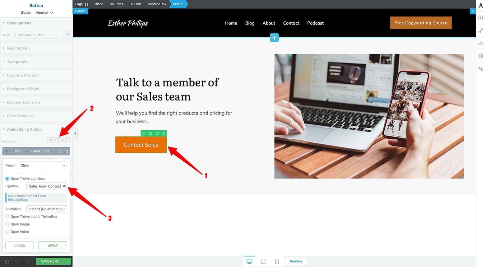
Follow these 3 steps to connect your Thrive Lightbox Contact Form to the Hero Area call to action button.
Once your Animation & Action tab setting is saved, your high-tech Contact page should function like this:

Once your call to action button is connected to your Thrive Lightbox Contact Form, your high-tech Contact page should function like this.
Feel free to customize the rest of your Contact page as needed.
Consider setting up an automatic scheduling lightbox in the following section — like we explain how to do in this blog post:
Automate Your Online Scheduling Using a 2-Step Lightbox
Make Your Lightboxes More Powerful with Thrive Leads
If you have Thrive Leads, you can set up a Contact From lightbox using the opt-in form plugin’s ThriveBox feature as well.
Thrive Leads makes creating your high-tech Contact page even easier as it gives you access to dozens of professionally designed 2-step lightbox templates and several more advanced features not available when using Thrive Lightboxes.
Your Turn to Make Contact
So now that we’ve walked you through how to build a few different conversion focused Contact page designs using Thrive Architect — paired with Thrive Theme Builder for added Block template design power — are you ready to take what you’ve learned to craft your own?
There’s no need to lose business anymore because a poorly designed Contact page isn’t capturing new clients for your coaching, consulting or online services.
Use the designs, techniques and recently upgraded Contact Form element now available inside the Thrive visual editor to finally create a Contact page that converts.
And of course, if you have any questions about the Contact page designs, strategies or techniques we showcased in this post, make sure to leave us a comment below!


Would also be helpful if the images would expand to full size when clicked upon. I want to ZOOM them to larger sizes so the examples can be easily seen. There is a nice box to check inside of TA for that. (snickering)
Thanks for your feedback Mark.
Yes! A lightning-fast video would be awesome! Maybe not a step by step but a quick summary would be nice. If I’m going to follow along I’ll just read the article but a quick summary video first would have been nice.
Thanks Jeanne, good feedback for the video!
Yes, video will be great, please!
On the way!
The tutorial will be better because there are something I can’t add like last name. When I go to choose the name, I can’t choose it anymore. I would like to see you do it.
Hi Genel, I’ll be covering how to add a Last Name field to the form in my video… stay tuned.
Excellent, I too believe a lot of people are missing out on making the most of their Contact or 404 page. Here is mine, built with Thrive. https://www.estheranderson.com.au/reach-out/
Nicely done Esther!
“3. Selecting the “Open Thrive Lightbox” option and typing your Thrive Lightbox name into the “Lightbox” search bar”.
Right below this statement above is a typical on-screen example used for these posts. It is washed out. The text is fuzzy and small. Very hard to decipher. The architect box on the left side is nearly impossible to read. Please figure out how to make the examples clear and with good contrast. This comment applies to almost all your posts. Need much better screen capture for quality purposes. And yes, a tutorial would be preferred.
Hi Tim, I screen capture every image at twice the display resolution at to maximize resolution while minimizing file size (and load time). A video is on its way to help provide a step-by-step tutorial for this post so stay tuned!
please let me know when you add the following widget: Image hotspot widget, conditional logic contact form widget, Profile timeline widget. Because of we are utmost needs theses widget in this regard, I hop so you make it updates soon.
Hi there,
Thanks for the suggestions.
Good article! But. I’m a baby-boomer with ADHD and need some here-and-now visual help through a video! In fact, just reading a post this long is making me antsy, especially since there are so many different things going on here. I need to start and stop as needed. Without a video I can start-and-stop, but it doesn’t mean I’ll remember where I just left off.
Good news Debra… a video is on its way!
very nice options, but as long as there is no possibility that the user email address as the sender in the incoming message is automatically not usable.
If my own email address is the sender in the email, I can only laboriously answer the user’s question.
Hi Dirk, thanks for suggesting this modification to the Contact Form element. We’ve raised the issue with our devs and should have this improvement in an upcoming release. Apologies I didn’t understand the issue correctly when I first read your comment. Hanne got it all sorted for you. 😉
A walkalong video would be awesome.
You got it Michael!
Great post, love watch Thrive move forward in leaps and bounds.
Conditional logic for a field to change where emails are sent would be very helpful.
Thanks Bryce! I’ll pass your idea along to the devs.
Hey there…love love love all the ideas (and have created one new Contact Us page using some of the ideas). Since I already had a basic contact form for my page, stored as a Symbol, I tweaked it. However, when I couldn’t find the “Add Connection” option on the current form, I added a new one just to check it out.
Do I need to create all new Contact Forms with the new Contact Form/Lead Generation element to get this working correctly?
Hugs&Blessings. MamaRed.
P.S. Definitely would enjoy a video, although my first “cut” is still the old-school text thang!
Hi MamaRed,
Yes the old contact form would have to be replaced by a new version (because it actually is a completely new element)
Good thing you used a symbol 🙂
BTW the video is now added
Hi there Hanne…I suspected that to be true and wanted to verify before I recreated the symbol (I LOVE symbols, fields, and other new features).
Thanks for letting me know and for the video.
Blessings
MamaRed
Hey Matt,
This is great! 😀
You already know how I love the TTB BLOCKS element! 😉
Even though I already had my Contact page published, I just had to try the new Hero element & the lightbox for the form was brilliant!
So I replaced my boring, ho-hum “form” with one in the light box!
It’s so cool!
Thanks for more great ideas! <3
Awesome stuff Karen… great to hear how quickly you make new improvements to your site with the Block templates as well as more advanced features like the Contact Form element and Lightbox! More ideas and tutorials coming your way.
That was awesome, going to give this a try on a new site Matt, thanks.
You’re most welcome David… best of luck creating your new Contact page!
Loved this video! Now, would you consider something that is very challenging for coaches and consultants but also crucial?
Guidance to create a professional services page. I feel stymied in styling this kind of page but you need it for credibility. AND, notice that the pricing table is not a good fit for this kind of page. it needs more explaining, proving, and seducing. In a word it needs to be slick but executive. Please help if you can! –Roy
Hi Roy, thanks for the content idea! Could you describe your particular use case a bit more for us so we have a better idea of exactly what you want to build?
Amazing! Video is great.
Thanks Akshita!
Hey there…love what’s up! Is there a template or model or something that would help me create something like this: https://www.cloudhq.net/c/96fa46dbcfe35e
Hey MamaRed, this is a template our own Thrive Themes designers made for us to use on the Thrive Themes blog… but it’s 100% created with the Thrive visual editor so you can definitely recreate it.
Let’s see, the recipe is:
1. a parent Content Box element
2a. a child Content Box element for the top section
2b. a centered Icon element with a -60 px top margin offset. This Icon also has a 25 px padding on each side with rounded borders, plus a colored background.
2c. a Text element below the Icon element
3a. a child Content Box for the bottom section
3b. a Text element inside this child Content Box element
I know that isn’t a perfect recipe, but hopefully it’s enough to help you build something similar and save as a template for your own blog content.
Happy building MamaRed!
wow great info, thanks for sharing dude
Cheers Miraj and you’re very welcome!