...and the revolutionary-business-changing-secret-sauce-landing-page-variation was...
Inconclusive.
Wait, wait, wait, did you just read we spent $5,311.48 for “Inconclusive”?!
Yes, but it’s not surprising and was actually a good thing because of the experiment’s primary goal.
I’ll explain the primary goal of the experiment at the end, and you’ll understand why.
However, first I’m going to give you:
- The 2 mistakes we made so you don’t waste your money making them yourself.
- All the landing pages we tested.
- The best Facebook ads we used to drive traffic to the pages.
You can use it all for your own business so you don’t throw your money away, because even though we didn’t find a higher converting landing page doesn’t mean we didn’t learn anything...
More...
Quick Breakdown
- Test Duration: 86 days
- Landing Page Variations: 4
- Total Conversions: 704 Leads
- Total Spent = $5,311.48
- Total Impressions: 4,787
Google Analytics Test Results
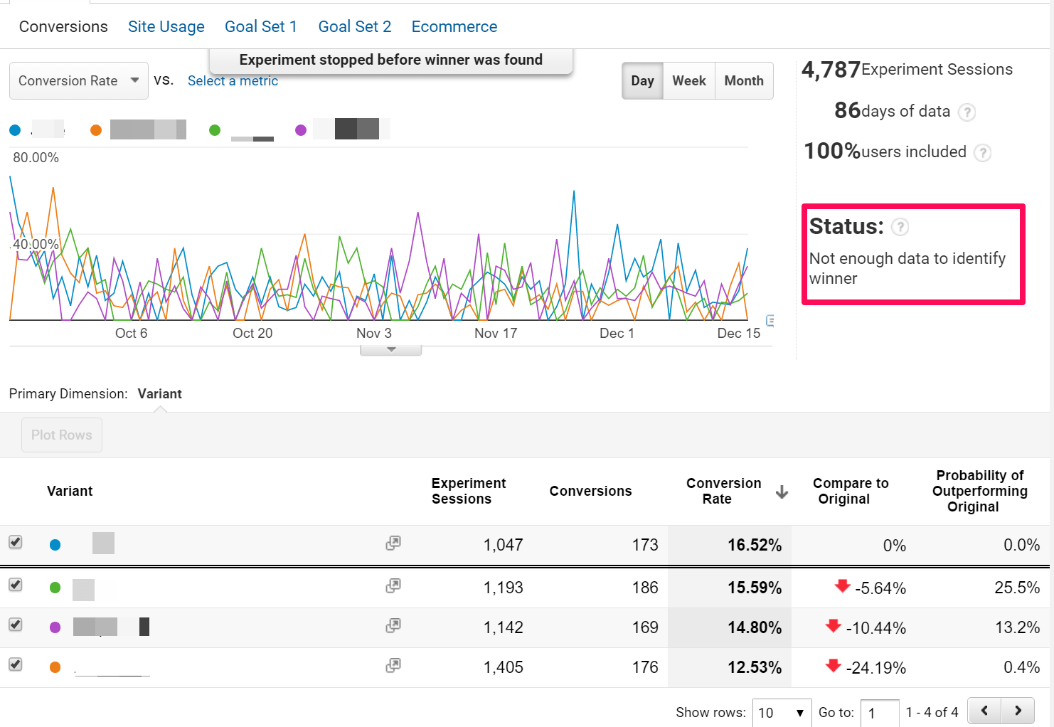
Google Analytics Results (Daily) - Click to Enlarge
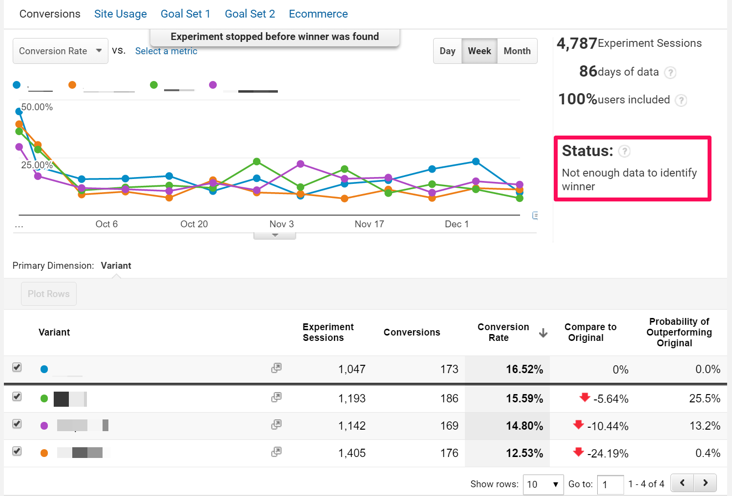
Google Analytics Results (Weekly) - Click to Enlarge
Lesson 1: Test BIG Differences & a SMALL Number of Versions
Here at Thrive Themes we focus on data driven results. It’s why A/B testing is not only a cornerstone of Thrive Themes’ company strategy, but also a cornerstone of most of the plugins we release for our customers.
However, A/B testing can get tricky when it comes to understanding how much data you actually need, and how to interpret that data to make a statistically significant decision.
Key Takeaway
To give yourself the best chance of making statistically significant changes to your website you should test BIG—test paperclips vs. bowling balls and a SMALL number of different versions—test one landing page against another instead of testing four versions like we did here.
The more variations you’re testing the more data you’ll need and the longer it will take to get a statistically relevant result.
The 4 Landing Page Variations Tested:
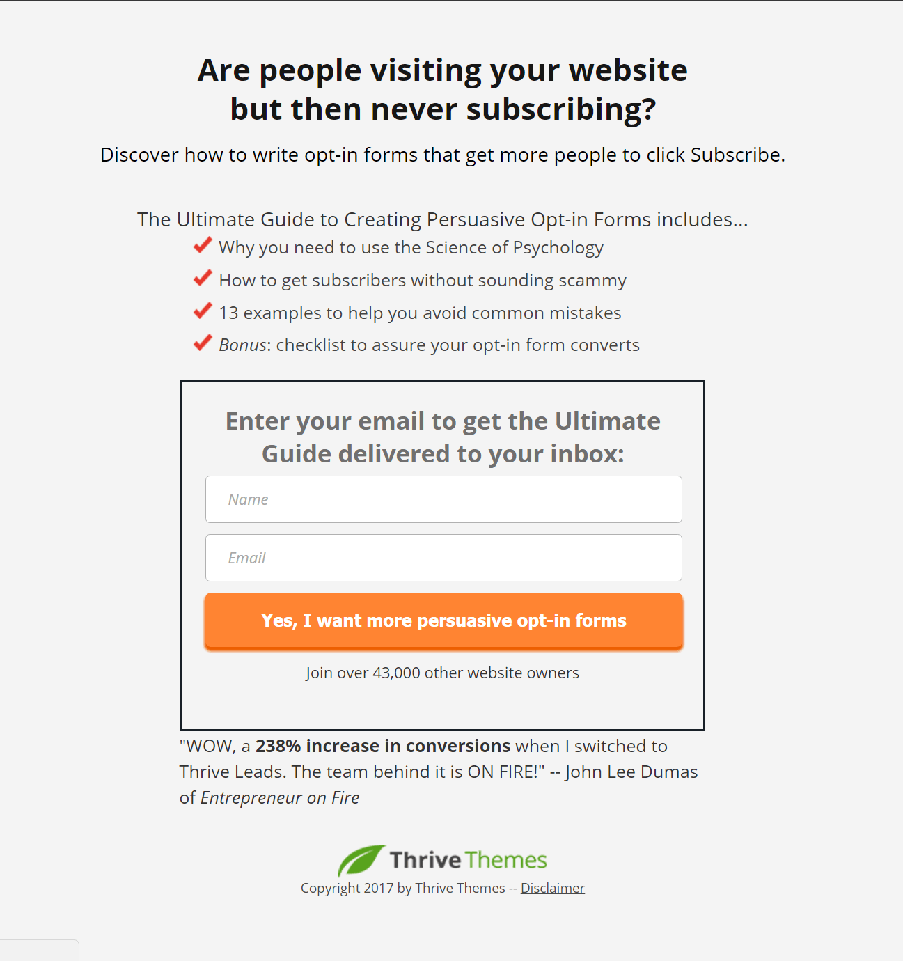
Blue Variation - Click to Enlarge
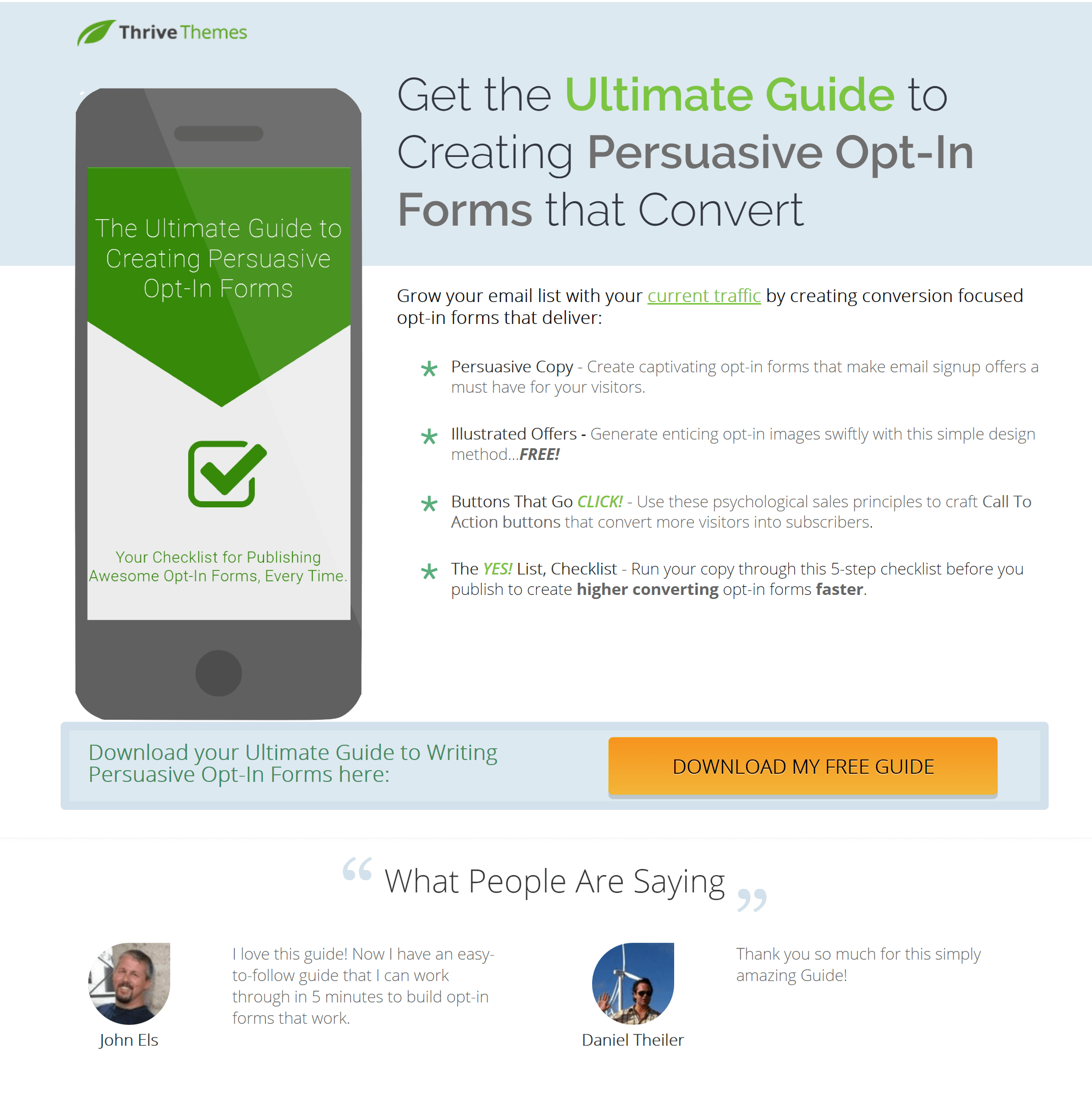
Green Variation - Click to Enlarge
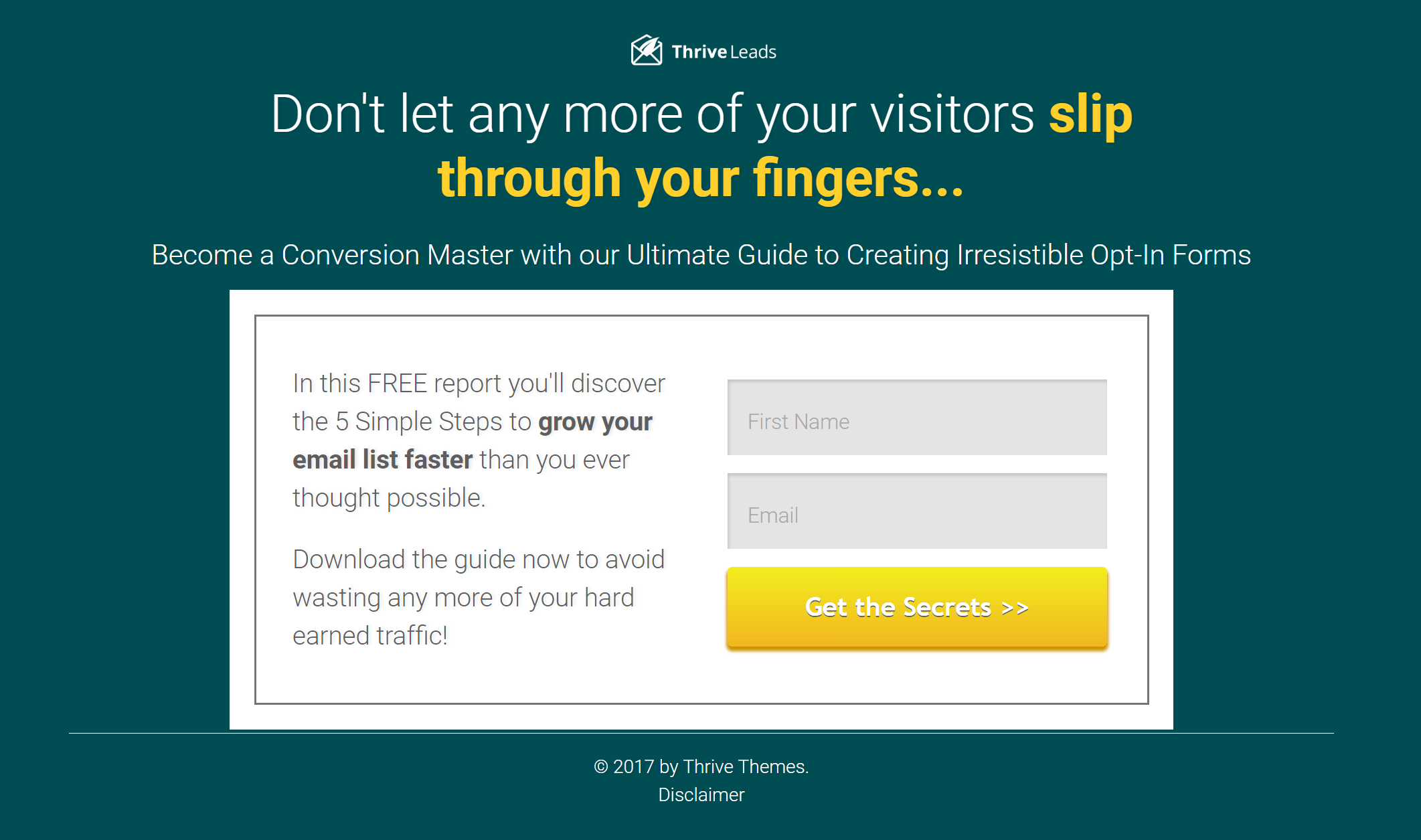
Purple Variation - Click to Enlarge
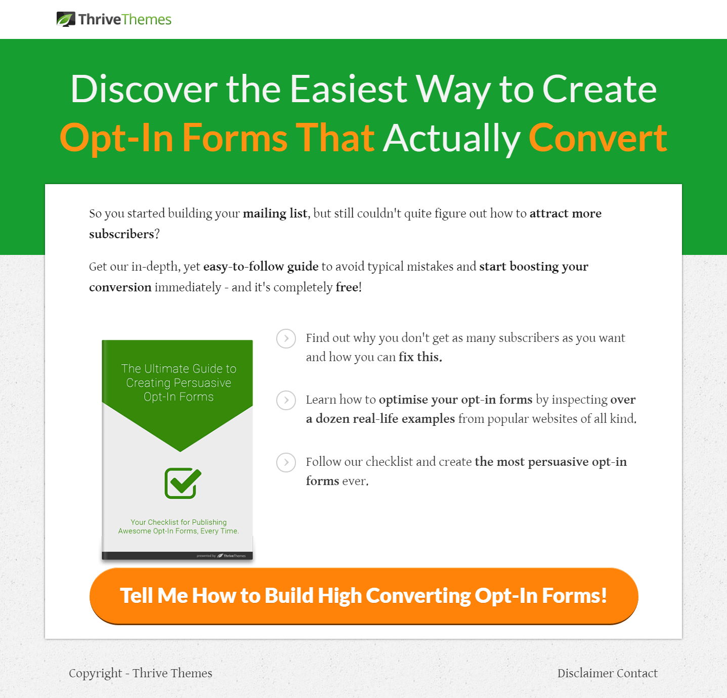
Orange Variation - Click to Enlarge
While they all look different—different colors, different wording, different layout—there’s nothing MASSIVELY different about them.
They are all above-the-fold landing pages, they all hit similar pain-points and they all showcase similar benefits.
But most importantly, they are all promoting the SAME opt-in offer and they all do a GOOD ENOUGH job at it by taking advantage of good landing page practices.
Because of how many variations we were testing, the fact they were all for the same opt-in offer and because of where all the traffic for this test came from, it’s not surprising the test was inconclusive.
This brings us to our next lesson...
Lesson 2: Know How Your Visitors Arrive
For this experiment, all of the visitors to these pages came from paid Facebook traffic.
More specifically, they arrived because they clicked on a Facebook ad only shown to a specifically targeted Facebook audience.
This means: only highly targeted, qualified leads saw these landing pages.
In order to see these pages you had to meet the following criteria:
- Be part of an audience similar to people who have already bought Thrive Leads (the opt-in offer of this experiment shows you how to build better opt-in forms). This audience was automatically created by Facebook and is called a “lookalike audience”.
- “Liked” specific Facebook pages indicating interest in building better opt-in forms. These included (but aren’t limited to): Digital Marketer, Jon Loomer Digital, Ryan Deiss, Infusionsoft, Instapage or Unbounce.
- Found the Facebook ad interesting enough to actually click it.
So by the time someone saw any of these pages, there’s already a good chance they would be interested in signing up.
Key Takeaway
If you’re already sending highly targeted traffic to your landing page you should understand they are there because they want what you’re offering.
Therefore, different page colors and layouts aren’t going to make much of a difference as long as the landing page is good enough (and congruent to the Facebook ad the visitor clicked on).
So what did the Facebook ads actually look like?
Well, we were also running a test on the Facebook ads at the same time as this landing page experiment. Here are the top three performing ads by the highest click through rate (CTR):
CTR: 1.954%
CPC: $2.951
Impressions: 870
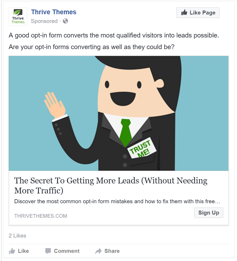
First Place Ad - Click to Enlarge
CTR: 1.877%
CPC: $2.781
Impressions: 1,385

Second Place Ad - Click to Enlarge
CTR: 1.723%
CPC: $3.597
Impressions: 1,161
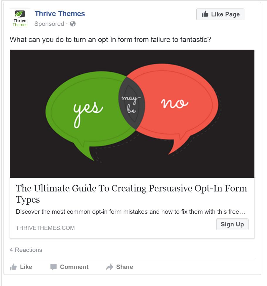
Third Place Ad - Click to Enlarge
As you can see, the copy is somewhat similar to the landing pages, but the images we use in the ads are nowhere to be seen on any of the landing pages.
This is because of the nature of the experiment. We wanted to find the best performing landing page, independent of the Facebook ads, i.e. we tried to minimize how big of an impact the ads had on the landing page test results.
To do this, the ads and landing pages were built independently of each other.
This isn’t the best practice. Generally speaking, you want your landing page to resemble the look and feel of the ad sending them there.
You want them to be congruent with each other because this is a quick indication for the visitor they are in the right place.
Advanced Takeaway - Congruence is Important
If you were looking for high end and designer clothing, the store front on the left would draw you in because it gives you the feel you’re looking for. But imagine you walk in and are met with the image on the right.

You see this on the outside when you walk up...

...but when you walk inside, you see this.
There’s a huge disconnect from what you thought you were going to get and what you actually got.
You want to avoid this online as well by making sure the ads people are clicking on to get to your landing pages are congruent with each other so the visitor doesn’t experience a disconnect between them.
The lack of congruence between the ads and the landing pages in our experiment means there’s an opportunity to see if we can create a better performing landing page if we wanted to take this experiment further…
The next experiment we could run would be to take the best performing Facebook ads and create landing pages based around the Facebook ad image and copy to see if this would work to increase landing page conversions.
This is why we like to say conversion optimization is a marathon. You will rarely get huge wins in your A/B testing, because what usually happens is inconclusive results or tiny wins. And from these you adjust, re-test and then repeat the cycle.
This constant and consistent testing over time will have a massive impact on your conversions.
Why We Didn't Care
As you’ve been reading this post you might have said to yourself: “for a company focused on conversion optimization and A/B testing, it seems like they made some pretty fundamental errors with this experiment…”
Yes, that’s right.
Here are at least three ways we could have designed this experiment to be more successful from the beginning if our primary goal was to increase conversions for our opt-in offer.
- Only testing two landing page variations instead of four.
- Creating more massively different variations since we were already sending very qualified traffic to the pages.
- Making the landing pages more congruent to the Facebook ads.
However, our primary goal for creating four different landing pages wasn’t necessarily to find a higher converting landing page for our opt-in offer (although that would have been a nice bonus).
Our primary goal was to give our four Thrive Themes apprentices a chance to learn, by doing.
Building a landing page for one of our opt-in offers gave them an opportunity to:
- Get hands on experience using Thrive Landing Pages and Thrive Content Builder—two of the plugins we use the most.
- Practice building an effective landing page that arouses curiosity, communicates the USP and focuses on benefits over features.
And because this wasn’t just a theoretical exercise, we were able to:
- Use the data to see if anyone was particularly good (or particularly bad) at building landing pages and give appropriate feedback.
- Generate 704 qualified leads we can potentially turn into customers.
- Use the experiment as a case study to provide you, our audience, with something valuable.
Rapidly building effective landing pages is a fantastic skill to have, and it’s why we wanted our apprentices to learn it. So even though our test came back with inconclusive results, it was far from a failure.
If you’d like to learn this skill yourself, you should sign up for Thrive University and take our RAPID landing page course...it’s free!
And if you want us to spend more money on tests so you don’t have to...leave us your ideas in the comments below!


I love this. When I was a researcher [psychology] my friends and I loved non-results as they said a lot – but journals did not publish no-results studies 🙁 This reminds me of a post a friend just published on NOT having a 6 figure launch [she only made $500] but was very happy…
Your post, and hers, said more to me than the usual platitudes we read!
Glad you enjoyed it Lynn 🙂
As someone who comes from the research world as well, I always found it refreshing when people published the no-result studies. For me, sometimes it’s discouraging when you see all these fantastic results everywhere but can’t hit the mark at home.
The no-results are a good reminder for me that you’re not going to hit home runs all the time, but it’s important to always be swinging!
Thanks for sharing the info. Very valuable indeed. It will be my pleasure to start with the Thrive University.
Awesome to hear Raul, glad you enjoyed the post 🙂
How can I subscribe to your blog?
Hi Jodi, you should sign up for Thrive University – https://staging.thrivethemes.com/university-register/ which will subscribe you to our newsletter. It will also give you access to a bunch of free courses to help you with your online business 🙂
Also, are there any plans of creating a ‘give-away’ template/module? Thanks!
Can you be more specific? Are you looking for a landing page template focused around give-aways or are you looking for a Thrive University course that would teach you how to do a give-away?
Thanks a lot for this. This is awesome information!
Thanks Alastair! Glad you enjoyed it 🙂
I’m gonna say that testing those ads was like testing one buffet against another buffet.
Too many things, too different.
Isolate and test.
One thing…maybe two.
I ran ads on FB a while back and all ads were performing below .80 cents.
Congruency between ad and landing page, yes.
But, the ads themselves could be way better.
“What can you do to turn an opt-in form from failure to fantastic?”
Why is there an image with “yes, maybe and no”?
The ads themselves are confusing…
But, I’m glad you came away from it feeling good about what was learned.
: )
Hi James, you have a point when you talk about testing the one buffet against the other. As for the actual Facebook ads…while they might be confusing to you, it doesn’t mean they aren’t effective and it also doesn’t mean they couldn’t be improved…but, you have to start testing somewhere!
Awesome job on your FB campaign where you were getting below .80 cents! But realize this is also conditional and depends on your targeting, placement AND niche–not just on how the ads look.
Thanks for taking the time to comment, we appreciate it 🙂 And we’re glad we came away with it feeling good, too!
For those of us interested in utilizing Facebook ads in the future, this certainly isn’t a very flattering test at a cost of over $7.54/lead. That’s beyond abysmal! I suggest you do another test and try to get that number down very low and show us a GOOD example of how to do it right. After all, you guys are supposed to be the experts…right?
Here’s a pretty good example of what a successful Thrive Themes campaign looks like (you’ll be hard pressed to find other examples with an ROI like that).
The problem is that in the online marketing space, everyone always shares the best results. Often, you can add insufficient data, “massaging” the results and downright lying to the mix. So it seems like every A/B test must double your revenue, every landing page must convert at 80% and every product launch must bring in millions.
We like to counterbalance that by sharing not only our successes.
Hi Rick, while it may not be flattering for you, it’s the reality of the test. Since we are indeed the experts, we’d never want to mislead you!
Shane linked to a post above that’s a good example of how to do it better, but it’s important for you to realize you are likely in a different space, with different resources and budget. So while we can show you how we do it, your results will most likely be different.
Facebook ads can be tricky, especially when you’re starting out, so our hope is to show people that while it IS possible to be successful, it will take some testing and tweaking to get it right 🙂
Great article! How did you target those who “found the Facebook ad interesting enough to click on it”? Or was this just a generalization?
Glad you enjoyed the article 🙂
So yeah, that was more of a generalization. I was trying to make the point that to see the landing pages, you had to already be pretty interested in the subject material to get there, instead of randomly landing on the page from search or something else.
Thanks for taking the time to do this but I have to say, this was really hard to read. It seems like you were trying to make a lot of cognitively dissonant points and speaking for myself, it’s really hard to digest information when it’s full of “we did this but didn’t care about that” or “we should have done this but we didn’t”.
It was really hard for me to understand the central point of the article.
Maybe it’s just me.
Regardless thanks again and I love Thrive!
Hi Onuora, thanks for the constructive feedback! It’s rare someone will take the time explain why something didn’t quite resonate with them, so I appreciate it 🙂
The goal is always to try and provide actionable advice for our readers, which is why there was some “should haves” in the post. On a personal level, I have always had a hard time staying focused on a central point when I write. I’ll keep working on it!
Hi, was just wondering if you are going to launch an a/b testing feature on thrive in the future?
Many of our plugins have A/B baked in, Thrive Landing Pages is one of the few that doesn’t at the moment, but it’s in the works!
You had the right audience for your product but your best ad got less than 2% response… this disturbs me more than your dissatisfaction with the landing page results. I know “back in the day” a direct mail response rate of 1 to 2% was considered good but surely internet response rates with a targeted audience should be way higher in my opinion. Did apprentices also design the ads?
Hi Mayo, interesting question you pose here. In our experience, 2% isn’t disturbing. However, we don’t compare our engagement to back in the day direct mail response. If we did, maybe we would.
We don’t compare it to that because they are two very different areas. Sure, our engagement might be lower than others using facebook ads, but again the industry plays a big role in this. We are marketing to marketers, which is a skeptical and harder to engage crowd. However, we probably get way better engagement than say, a real estate company, where engagement is notoriously low.
In general, we try to use our numbers as a benchmark for internal comparison of what’s working and what isn’t because it has better results for us. Hope this provides some clarity for your question 🙂
The best way to learn is by making mistakes. This is a great post and useful learning to be had. Much appreciated.
Hey Dave (sweet name, by the way), glad you found the post helpful 🙂
Interesting conclusions.
Wouldn’t it be harder to drill down why a landing page was converting better, had the changes been drastic?
What kind of steps would you take to repeat the success later on?
Also, you’re paying top dollar for these ads, not sure if you’re up to testing something with your ads but if you are, try running video views campaigns or authority ads (goal would be driving traffic to a blog post).
I found it drastically lowered my conversions (from 81 cents to 5 cents on a landing page ad with conversion goal).
Hi Maayan,
I think yes, and no in regards to finding the why behind a converting landing page. Most of us could come up with a general idea on why one did better than another given drastic results using some pretty standard landing page practices. To actually drill down with data and say it was because of x, y, & z might be a bit harder.
As for spending top dollar…awesome ideas on how to lower the price and it IS something we are testing, but it’s important to remember that different industries have different price points, which is why we use our numbers more for an internal benchmark.
Stoked for your .81–>.05 improvement though, that’s massive! Nice job 🙂
Which landing page won?
There wasn’t enough data to make a statistically significant decision
My safe zone has been writing, eight books so far. Am at this moment learning content builder. Each to their own is a good expression. The split testing and the rest went right over my head.
Lucky for me a lot of videos have been made to help. That is why I bought the program, as a human being am not ashamed to shout HELP.
When needed.
Congrats on the 8 books! And good attitude when it comes to asking for help, it’s the best way to pick up a new habit quickly! Keep learning my friend 🙂
The two images of the “arrow-like image (green)” Drew my eye to the “tick box” and away from the CTA button.
Oooo interesting observation! Thanks for pointing it out…definitely didn’t notice that before!
Hi Dave,
Well written experiments.
Looks like the CTR is about 1-2% which I also experience. Am not too sure whether there are any higher CTR experienced by others?
The cost per lead is about $7 which is quite high in my opinion.
Anyway the key takeaways are important for us to take note.
Thanks,
Albert
The CTR will determine a lot on the audience and the niche. As for the cost per lead…it would definitely be worth trying to get lower. Glad you enjoyed the post 🙂
You guys are awesome. I’m struggling a little bit to nail down landing page copy but I know I’ll soon get there with all your valuable blogs and videos. Thank you and keep up the AWESOME work.
No problem Matt! You’ll get there…glad you’re finding the blogs and videos helpful 🙂
Ha, I like the Classy entrance vs. Bargin-bin inside.
Haha thanks Clay, I figured that would be an easy way to understand the concept of congruence. Glad you found it helpful 🙂
Dave, I was very surprised to see you write that all for landing pages were basically the same. Color, layout, and content were all different. Yes, the subject and lead magnet were the same but that’s part of the testing – getting the best opt-in for the basic tenets of the landing page.
Split-testing different lead magnets with a similar color scheme and layout, that makes sense, too.
I just don’t understand how you can say the four in the photos were the same. Maybe I missed or misunderstood something. Figure you know better than me 🙂
Hey Chris, yeah I can see how that might be confusing. What I mean is that all four of the landing pages are basically going to seem the same for the person who will land on it.
Even though they all look different (color and layout) they are all promoting the same opt-in offer, promoting the same benefits. The person landing there is already extremely qualified and has basically they want it before even seeing the landing page, so as long as the landing page is good enough, it should get a conversion. Hope that makes it a bit more clear!