Hoorah!
Through some power of magic... or a whole lot of hard work, you’ve got a new visitor to your site!
Surely if they made the effort to find your site they'd want to stick around for a while, right?
In theory, but in reality getting a visitor to your site is only half the battle. It's just as hard to keep them there.
So why would a visitor so easily abandon content they specifically clicked though to see?
More...
Well if you're making any of these four simple mistakes, you could be pushing your visitor to click away.
You see, we get so caught up in the nitty gritty of building our website that we forget to step back to look at it from a new visitor's perspective.
We become blind through our own familiarity.
But these oversights, while easy to make, can become brick walls when trying to convert new visitors to leads.
So how do you find out if you're making these mistakes on your own website?
Do the tests below to find out...
Mistake #1: Are You Leaving Your Visitor Baffled When They Arrive on Your Website?
When a new visitor arrives on your site it can be the first time they've heard of you.
It’s common just to get straight into the practicals of the site without a proper introduction. This leaves your visitors questioning what you do, and if your business is what they were looking for.
Let’s look at an example:
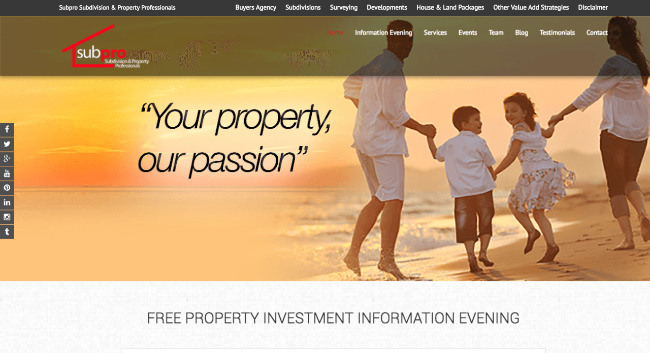
Can you figure out what this company actually does?
Obviously they do something to do with property... but what?
Are they a development company? Do they run courses on property investment? Do they buy houses??
Your guess is as good as mine.
You’re more likely to exit this page than to read on, trying to decipher what services they actually offer.
So how do you know if your website is clear and concise enough?
The Test
Enlist the help of a friend of a friend. Someone who doesn’t know what your business does. Show them your website, and after five seconds close the browser down. Now ask them… “What does my business do?”
Does it clearly capture your business's unique selling proposition?
The Fix
What is the most important thing for your new visitor to know?
How can you sum that up in one or two sentences?
Let’s take a look at a headline that perfectly captures this business's unique selling proposition.
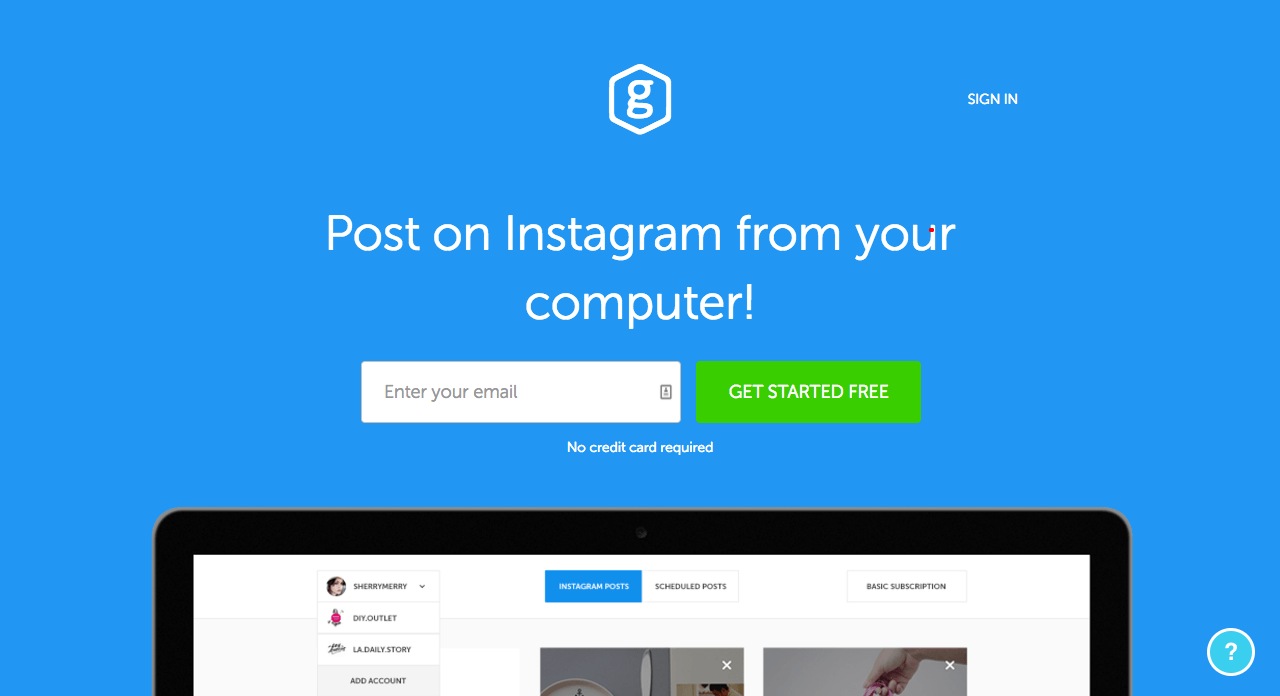
A new visitor can instantly determine what the business does, and if it’s something they’re interested in.
Once you’re figured out your unique selling proposition, make sure it stands out on your site. It should be the first thing your visitor’s eyes are naturally drawn to.
Mistake #2: Are You Overwhelming Your Visitors Before they Even Have a Chance to Get to Know You?
It’s tempting to target every pain point and problem your visitor might be having.
The more lightboxes and free guides you throw at them, the more chance something will stick, right?
Quite the opposite...
The more pop-ups, buttons and opt-ins you bombard your visitor with, the less likely they are to pay attention to them.
Let’s take a look at some examples of how overwhelming too many calls to action can be.
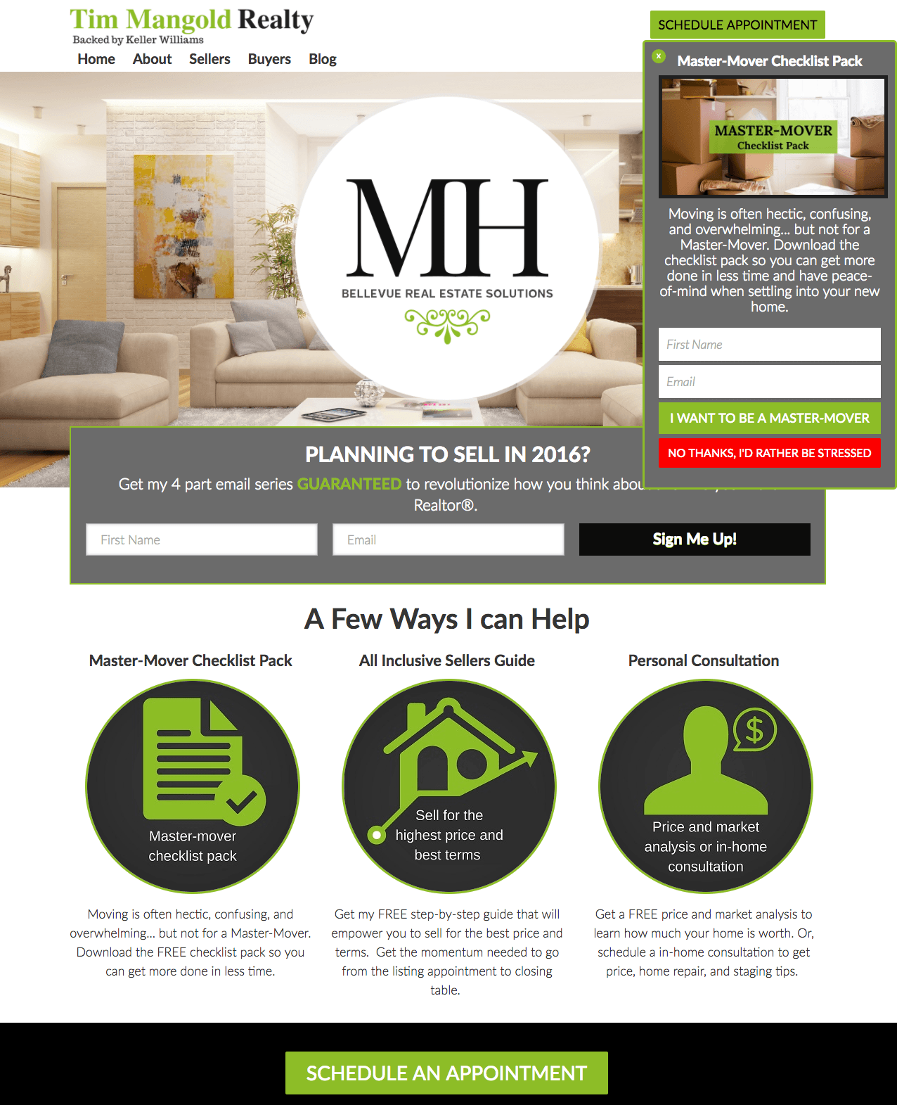
There are 7 separate calls to action on the top of this homepage.
It is impossible to know where to start.
Each of them hold equal visual weight, meaning the design doesn’t highlight any particular option as the most important.
The only thing that really stands out is the NO THANKS, I’D RATHER BE STRESSED button.
You don’t want your ‘no thanks’ option to be the most eye catching element on your page.
Lets take a look at call to action mania in a more intrusive form.
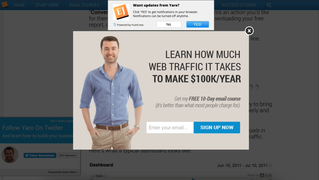
Three separate popups. Can you spot all them all?
Imagine you found this blog post after searching the topic on Google. You click, eager to read the content.
Before you even know who this guy is, he’s asking you to allow browser notifications, add him on twitter and opt-in to his email list.
The piece of content that got you to the site in the first place is now completely hidden behind a list of demands.
The Test
Open your website in an incognito window. This will ensure your website doesn’t recognize you as someone who has already subscribed or visited the site. Some lightboxes and other functions only trigger when your browser recognizes you have not visited before.
Spend about thirty seconds on the homepage to trigger any time delayed lightboxes. Now scroll all the way down the page, and hover your mouse over the exit symbol on your browser. This will trigger any scroll or exit intent lightboxes.
Take note of the most attention grabbing call to action on your site. Is this in line with the most important action you want your visitors to take? Is there more than one option calling for your attention?
Try this on a few different pages of your site.
The Fix
Be clear on the most important action you want new visitors to take when they arrive on your website. Use this as your main call to action, and either eliminate or heavily reduce any other prompts on your site.
If you really need more than one main call to action you have two options:
Option 1: Allow Your Visitors to Self Segment
Say you have few dramatically different services, such as the Tim Mangold Realty example. The site needs to cater to two very different audiences, people looking to buy a house, and people looking to sell a house.
These two groups require different things to move forward in their Buyer’s Journey.
It is possible to cater to both these groups, while still only using one lightbox.
The multi-step lightbox in Thrive Leads allows you to ask your visitor a multiple choice question. Their response determines which opt-in offer they'll be shown.
Let’s take a look at this in action on the Thrive Themes blog.
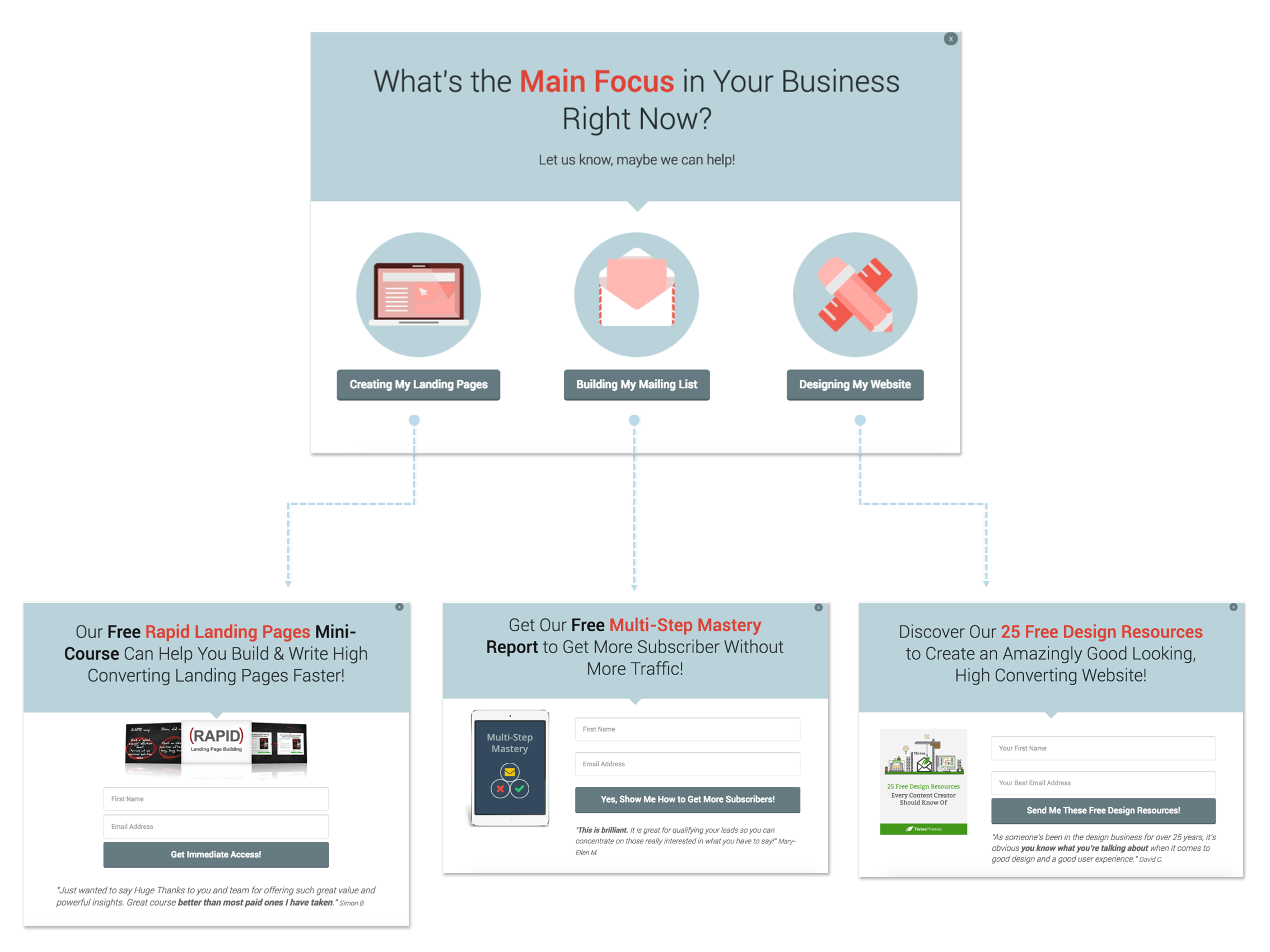
Each option leads to a different opt-in offer, depending on what the visitor’s main focus is.
This dramatically increases your chances of a visitor opting in, and allows you to add tags or assign your visitors to different lists based on their responses.
Option 2: Use the Already Subscribed State
Once your visitor opts in for your initial offer, you can use the Thrive Leads already subscribed state to present a new call to action.
For example once visitors sign up to your email list, the initial opt in offers can be swapped out for a ‘Book a Consultation’ prompt.
This is particularly useful because you know they’ve already taken the first step in the Buyer’s Journey (opting in to your list) and now you can show an offer targeted to someone further down the funnel.
Mistake #3: Can Your Visitor Find What They’re Looking for With Just One Click?
Can your visitor immediately find what they need, or do they have to hunt for it?
Often we just throw up menu items as we add new pages our website. This leads to a severe case of word soup at the top of your page.
Let’s take a look at the Subpro website again.

As you can see there are two separate menus, which makes everything disjointed to begin with.
If you take a closer look you’ll see the menu items themselves don’t make much logical sense.
It’s unclear if the items at the top of the page are referring to their services, information or portfolios.
The second menu has a number of irrelevant headings that leave the visitor wondering where on earth they should click.
The menu item categories don't make sense because of double ups, such as ‘Information Evening’ being separate from ‘Events,’ and the fact that there's a ‘Services’ heading, even though all their services seem to be listed above.
The Test
So how do you know your menu items are easy enough to navigate for your visitor?
If you have more than seven menu items, that’s generally too many. If you have drop down menus within drop down menus - that's definitely too many.
If you have less than seven main menu items, bust out the old friend of a friend test again. Ask them to try to intuitively navigate to a subpage within your site. Can they get there (or to the submenu showing the page) on their first go, and just with one click?
The Fix
List all the pages on your site.
Put each page in one of two categories - important/most frequently visited pages, and not so important pages.
Try to logically sort them into categories that anyone would be able to intuitively navigate, ensuring you important/most frequently visited pages are on the main menu or can be easily accessed from the main menu.
Let’s take a look at how the pros do it.

Now at first these menu items might seem fairly random, but I can assure you a lot of thought has gone into them.
It’s a culmination of the most visited pages and the biggest triggers responsible for converting a new visitor into a customer.
Every item is clear and concise, and caters to different visitor needs and different stages of the decision to buy (aka. The Buyer’s Journey).
Mistake #4: Are You Making It Hard for Your Visitors to Trust You?
Trust is one of the most important factors in collecting subscribers and leads, especially when all a visitor has to judge you by is your website.
A visitor entering their email into your site is almost like a trial run.
They’re trusting you enough to hand over their contact information, and what you do next determines if they made the right choice.
That trust can be undermined by the simplest of things, such as redirecting your visitor to a completely different website after opting in (usually the default thank you page from your email service provider).
Another common oversight is making absolutely no mention of how or when they’ll get the opt-in offer they signed up for.
Let’s take a look at this opt-in to thank you page to see funnel disconnect in action.
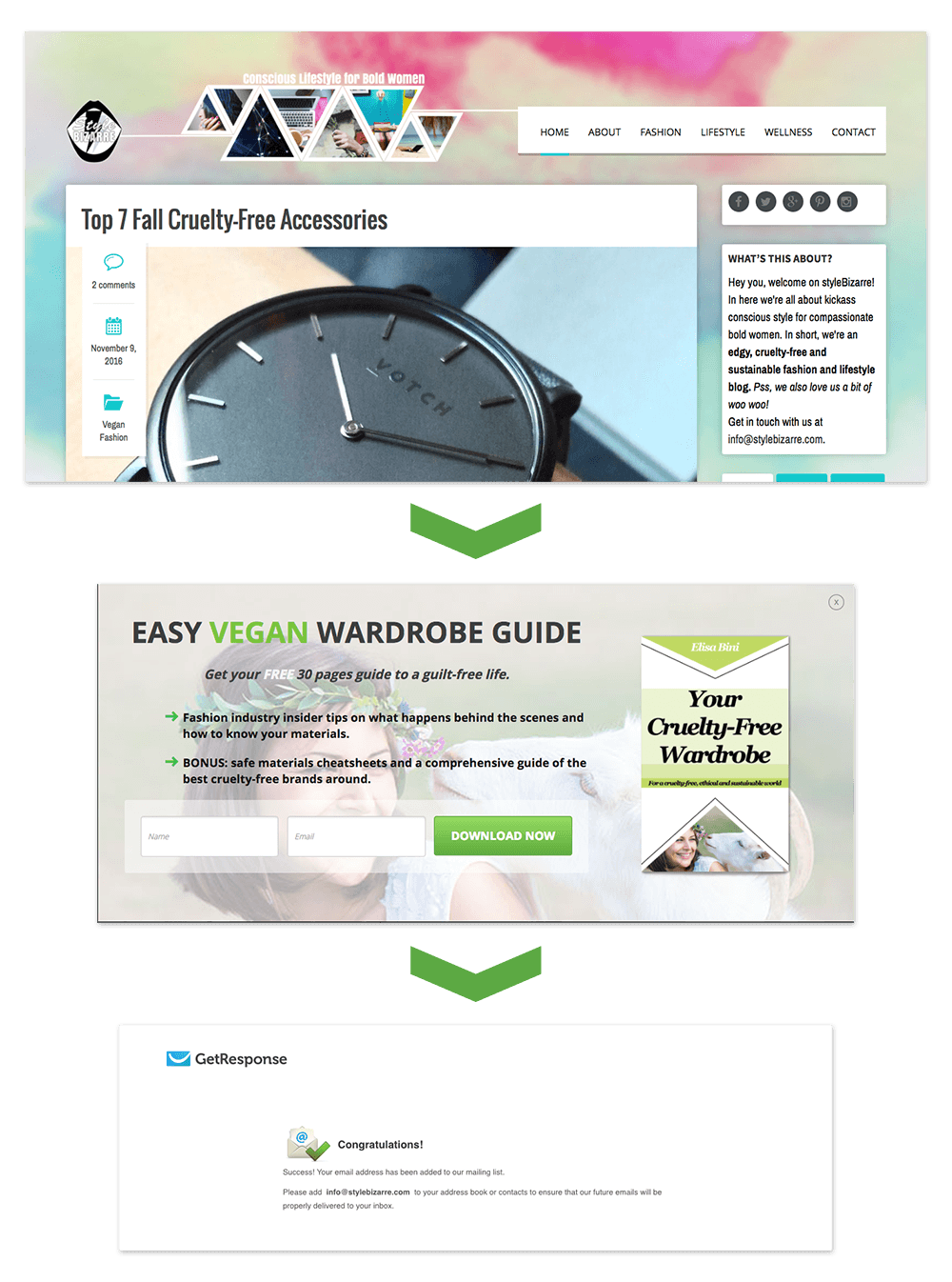
The lightbox offers visitors an ‘Easy Vegan Wardrobe Guide’ if they enter their email address.
Looks and sounds great!
Once they hit the 'download now' button it's like the curtain has been pulled. New subscribers are taken to a completely different website.
“Did I just get scammed? Where’s my downloadable guide? What the hell is GetResponse?”
Not only has the design and url been completely switched up, but there is also no mention of the guide they entered their email in for in the first place.
This adds to the feeling that they’ve just been played.
And on top of all that, there’s not even a link back to the original site so they can continue reading the content that got them there in the first place!
The Test
It’s not often that you subscribe to your own mailing list. Why would you?!
In order to really get a feel for the visitor experience you need to go through the whole opt-in process yourself. Open your website in an incognito window and sign up to your opt-in offer.
What is the experience like? Is the design universal? Does your visitor stay on your site? Is it clear when and how they will receive the opt-in offer they signed up for?
Tip: If your email address is already subscribed, use fakemailgenerator to create a temporary one so you can go through the whole opt in process.
The Fix
Let’s take a look at what a smooth opt-in journey looks like.
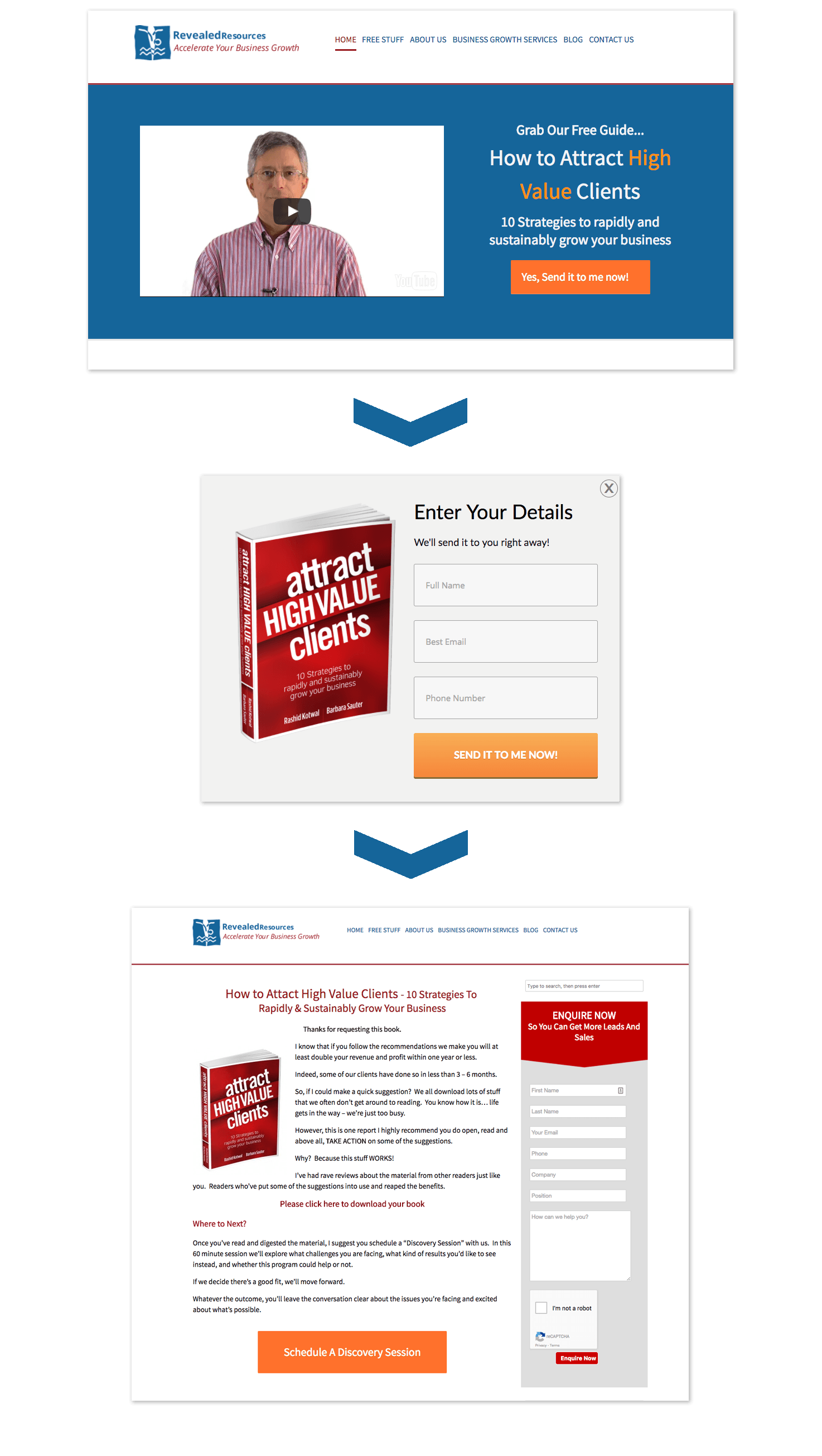
There is a clear congruence between all the steps in this opt-in process.
The design and colors are the same, the wording of the opt-in offer is the same throughout the pages, and the Thank You Page clearly states how the visitor can get what the opted in for.
At no point throughout this process is the visitor left wondering what is going on.
To achieve this kind of flow with your own funnel make sure you always redirect to a custom Thank You Page within your website.
Tell your new subscriber how they can access what they signed up for, and clearly state what the next step is. This may be to confirm their email address, read a particular blog post or something as simple as return to the homepage of your site.
For tips on how to keep subscribers happy further down the funnel, this is only 1 of the 7 mistakes we spotted in the funnels we just analyzed. Check out all 7 mistakes here.
Keep Your Website From Slipping
So how did your site fare?
Were you surprised by how different the experience was in an incognito window?
It’s important to keep these checks up on your site, even if you made it through this round of tests unscathed. Just one new rogue plugin can turn your site from a joy to explore to a nightmare to navigate.
A good practice is to schedule 10 minutes in your calendar every three months to quickly run through these tests. This will ensure you’re never unknowingly alienating your visitors with these common but easy to make mistakes.
I hope this post helped you avoid some common visitor experience faux pas. If you have any questions or comments please leave them below.


Great help here. Thanks!
Thanks for the feedback Jay 🙂
Thanks for the tips and reminders. I’m in the process of re-doing my site and would love feedback.
As a web firm, I get so caught up in helping other clients that I often times never work on my own stuff.
Look forward to feedback.
Hi Nate,
We’ll put it in our website review pool. Keep an eye out!
poor Yaro– hope he gets some traffic from this!
Aw he’s not that bad! Just a bit pushy is all.
Excellent article. Thank you
Great Post!
Nice post Stephanie.
Noticed the Subpro website had that Perth landscape! Lovely!
Too bad about their website nav tho
Thanks Nhut, and nice spot. Perth is where I’m originally from so I had a bit of a soft spot for their site.
Great post! Really enjoyed that and found a few improvements I can make to my landing page (built with thrive). Will be making those updates now that I know what they are (wink).
Great to hear it helped Blake.
GREAT Info!!!!!
Thank you!
This is a sensational article! I have some great action steps to take.
Unfortunatly the video keeps stopping around the 1 min mark.
Thanks Clive, sorry to hear the video is being difficult. If it keeps giving you trouble try right clicking and selecting watch in YouTube.
Helpful information. Thanks Stephanie.
With regards to Mistake #1, what “one thing” would you recommend for a chiropractic business? Ask website visitor to phone? Book online? Opt-in (with follow-up email or phone call)? Other?
Hi Greg,
Mistake #1 was making clear your unique selling proposition so if you have a point of difference I’d point that out.
As for your main call to action, take a look at how you get most of your business. Is it through phone calls or do you find your customers prefer to submit bookings online?
Medical services are usually a little bit different since people don’t tend to browse unless they are considering booking an appointment to solve an immediate problem (as opposed to say an e-commerce site where there’s not a burning problem that needs fixing). So it’s not so much about playing the long game with these sorts of visitors, it’s more about getting them to book in with you instead of the competition.
I would say your best bet (without knowing any more about your business) is to provide your phone number (‘call us to book on ###’) but also a ‘or we can contact you’ option. This can either be a booking form below the phone number or an opt in where you collect their phone number and email address. Maybe sweeten the offer with something that gives them the extra push, and you the advantage over your competitors, such as a free 15 minute consultation.
Once they become customers you can focus on retention through things like email newsletters and providing value through more general health and maintenance content.
No such thing as bad publicity they say 🙂
In all seriousness though I am surprised that you saw the exit intent popup without actually moving your mouse to go to leave the page.
That’s how we have it set up – in fact it’s using Thrive Leads to do so (or not so in the example).
Plus I disagree with your comment about the user not being to read the article as they land on the blog post. The smart slider doesn’t trigger for at least three screen scrolls and the popup is meant to be an exit intent as mentioned. That’s enough to for the reader to engage with the content first.
As for the pushcrew popup, my experiment with that is over as I’ve maxed out the number of subscribers I can have with it (it’s clearly working pretty well!).
All that being said, I think a movement away from these kinds of interrupt style optins is inevitable. Google is showing that intent with their upcoming penalty for mobile search results if your popup is too intrusive. I wouldn’t be surprised if that spreads to desktop search results eventually too.
Yaro
Hi Yaro,
Thanks for commenting, it’s good to get feedback from the sites we feature.
If you take a look at the video you’ll see the lightbox did actually trigger on exit intent when my mouse went to the top of the browser.
I’m glad to hear the pushcrew popup worked well for you. But also glad to hear you eventually plan to move away from so many popups.
Nothing personal using you for the example, I’m a reader of your blog and just happened to notice it was a bit of popup mania!
Keep up the good work 🙂
This is a GREAT article. I see sooooo many websites doing this mistakes. Some do a few, some do all. I myself Have “fix opt-it funnel” on my to-do list, but besides that and thanks to following your guide to build an awesome homepage and other articles, I think I Have the rest of it pretty much nicely laid.
Thanks for sharing this tips with clear examples, as you always do!
Hi Alex, thanks for the comment. Yeah they seem so obvious but almost every website you visit is making at least one of the mistakes. It’s so easy to do.
Glad you’re finding the content useful.
Thank you for the great tips. I am creating a site now so need all the help I can get. This info will help in setting it up correctly… Many thanks for all the great work!
Thanks Maggie, it’s great that your tackling all this stuff right from the start. All the best for the site.
Superb piece Stephanie! I especially liked the “smooth opt-in journey”. As soon as I get a couple of days of extra time, I will be incorporating your idea onto my website. Thank you so much!
Hi Rick,
Yeah thats the other step isn’t it, actually getting enough time to implement it all. Trust me I know the feeling! Glad you found it helpful though.
Stephanie,
Thanks for the post.
But, believe it or not, even though I have been online for 20 years, and have heard of Instagram, I have never been to that site, never used it, nor do I know exactly what they do. And even though you state “A new visitor can instantly determine what the business does”, I actually cannot determine what they do based on the snapshot. Maybe if I saw the entire page, but not from this. “Post on Instagram from your computer” Post what? Videos? Pictures? Some kind of “gram” like a digital telegram or greeting card? A blog post? I am not trying to be cute or funny or critical. I truly, honestly don’t know. I don’t have the “curse of knowledge” giving me a predetermined bias, so even though I am probably the only Thrive member who does not know what Instagram is, I know nothing more after seeing their headline than before seeing it. I still do not know, from this, what their USP is, except that I can post something from my computer to their server.
This is a case where prior knowledge, I believe, determines how we can be baffled (or not) when going to a site and seeing any particular part of it. Obviously, since Instagram is a very well known site (except to me, apparently), it is assumed that people automatically know what they do. The Subpro website above is obviously not that well known and visitors will be far more likely not to have that bias (but the owners know exactly what they do, so they look at their site with their own eyes instead of unbiased eyes), so it’s even more important for sites like that one (or mine) to be very clear about who we are and what our intentions are.
Hi Ron,
Thanks for the comment. I see where you’re coming from but another important point to consider is that your one sentence only needs to tell those visitors you want to attract that they are in the right place.
If you don’t know much about Instagram, a program that allows you to post on Instagram from your computer is obviously of no use to you. In this case they don’t need to cater to that type of customer in their USP.
The one sentence’s main goal should be to let the target customer know they are in the right place and should read further. In the case of Grum, the target customer would be someone who is familiar with Instagram. It’s fine for them to not cover meaning of the terms ‘Instagram’ or ‘Post’ because their target audience already knows exactly what that means.
Hopefully this clarifies.
Excellent advice, as always. Thanks for this – great resource to share with clients.
Best advice ever
Good tips. Our own familiarity can be a weakness..
Depending on your industry and who you are “speaking” to, it’s not a bad idea to run your content through a readability test, to get an idea of how easy-to-digest your content will be to your visitors.
Here’s a free resource that will do it for you:
http://juicystudio.com/services/readability.php
PS. There’s a dent in your Macbook, noooo….
Hi Jordan,
Thanks for the extra tip! Yeah one dent on each side, just to make it even 🙂
Great video and information. I love that you showed examples, this really helps. I definitely want to work on my menu items. I know I haven’t got this right yet.
Hi Wendy,
Menu items are a difficult one, there are no hard and fast rules because it’s such a case by case basis. Installing a heatmapping plugin like the one from hotjar can be helpful to see which menu items your visitors are drawn to most.
Thanks Stephanie – I like your suggestions! So different from what I learned to base my homepage on! You are such a minimalist that you didn’t even put a subject into your email about this 🙂 Anyway, I must say that I love clarity on a homepage. Will try it!
Hi Dietrich,
Thanks for the kind words. And yeah, lets pretend the lack of subject line was on purpose 😉 Although maybe it helps to know even the Thrive Themes team make these common mistakes sometimes too!
Hey Stephanie,
Great post. All your points are awesome. Thanks for sharing.
I’m about to go do those tests. 🙂
Cheers,
Julian
Really great post! Some key things to keep in mind, and each was well explained. Thanks!
FANTASTIC post!
Fantastic blog post, thank you!
One other suggestion. When reviewing a site for ‘mistakes’, it’s generally important to use different platforms — desktop and mobile at least. What works well on a desktop display may be hopeless on mobile, even if the site is responsive, because displaying things vertically instead of horizontally can (for example) push a call-to-action off the bottom of the screen. Sometimes this can be fixed using Thrives ‘reorder columns’ feature, but it’s important to check unless you’re sure that most visitors will be using a desktop.
Very good point David
Stephanie, your video was timely because I’m in the middle of building my opt-in page with TT.
In example #4, you took the subscriber to the thank you where they could download the product. How would this work with a double opt-in form?
Thank you.
If you want them to wait until they’re confirmed their opt-in via email, you can make the thank you link the download page (for the email confirmation). That way they only get the information once they’ve confirmed their subscription.
WoW ! Thanks a lot Shane for sharing this info! That will be very helpful !
Thank You Stephanie for this post ! Checks in incognito mode … is a must from now on …. 🙂
So easy to forget to do!
Welp! Looks like I need to work on those menus again.
Hi Arman,
It’s so hard organizing all the pages into a few categories for the menus. Heat maps might be helpful in identifying the most clicked menu items.
Awesome article!Thanks.
Thanks Richard 🙂
This is one of the most informative videos that I have viewed regarding website conversions.
Thanks ge_west, that’s a big call!
Hi Kelly,
It was an awesome piece of information. It will definitely help me out in my coming projects.
Thanks a lot
No worries Kamran, glad it was helpful
Really to get a visit is not so easy and often leave the site soon and this is not good, I have sites and I will follow your tips to improve it thanks.
Yeah exactly Ananias, it’s so hard to get visitors there in the first place. You don’t want them to leave straight away!
I particularly hate the pop-ups
Very good content, helped on my site to boost conversion!
As soon as I get a couple of days of extra time, I will be incorporating your idea onto my website. Thank you!
I loved the tips, I will pay more attention to these details in my blog after reading this article. Thanks