Since it's the silly season, we decided to give all the affiliate marketers out there an early Christmas present...
Responsive comparison and review tables that actually look good on mobile.
And not only do they look good, they're conversion focused as well. These tables are specifically formatted to keep your buy buttons in view on mobile.
To celebrate, we've released a whole page full of pre-formatted mobile responsive WordPress table templates. You can preview them here. The table template page is under the 'Element Templates' set in the Landing Page cloud.
More...
By saving these templates to your content templates library, you can add pre-built review tables to any post or page with one click. No CSS or HTML coding knowledge is needed, you can simply go ahead an insert a table into your post. All you have to do is fill in the blanks.
Why Responsive Tables are important for SEO?
I'm going to be honest, my SEO knowledge doesn't go too far beyond 'you should probably install Yoast SEO' - so I thought I'd go straight to the source and ask a specialist; testing-based SEO expert Matt Diggity.

Matt Diggity
Diggity Marketing
"Tables, and other forms of formatted/structured content, have become increasingly relevant for SEO. On the surface level, Google seems to be appreciating content that has been structurally marked-up, and tables are a great example of this.
But the main value I’ve seen from implementing tables on my sites has been the ability to steal featured snippets… the coveted position #0 ranking knowledge box at the top of the SERP result.
Based on personal experience, tables that are formatted with the criteria running horizontally, and the evaluated items running vertically have a much better chance to steal the snippet.
An example of this for a sneaker review table would have columns labeled “Name”, “Comfort”, “Durability”, “Price”, “Where to buy” while the rows would be labeled “Nike”, “Puma”, “Adidas”, etc.
The problem with this format is that with mobile devices the “Buy Now” button (call-to-action) usually bleeds off the viewing area. This is why you need a responsive table."
Mobile Responsive Tables in Action
Thrive Architect's mobile responsive tables work by moving the header row into a vertical position, and repeating the header titles for each entry.
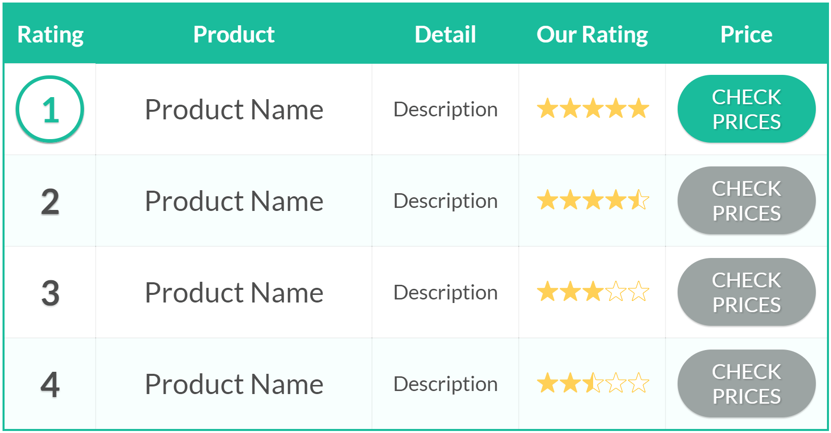
Desktop View
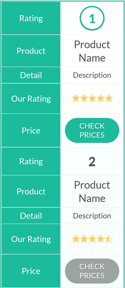
Mobile View
Let's take Matt Diggity's example of the sneaker review post. Below is a Thrive Architect Table Element with mobile responsiveness applied. Take a look on your mobile...
Name | Comfort | Durability | Price | Where to Buy |
|---|---|---|---|---|
 Excel 2000 | 4 out of 4 | 5 out of 4 | $$$ | |
 Converse X | 1.5 out of 4 | 5 out of 4 | $$$ | |
 JumboBoot | 2.5 out of 4 | 2.5 out of 4 | $$$ |
This restructuring works whether you have the criteria running across the top, as Matt suggests, or if you have the products running across the top and the criteria down the first column. Let's take a look at how that format ends up on mobile.
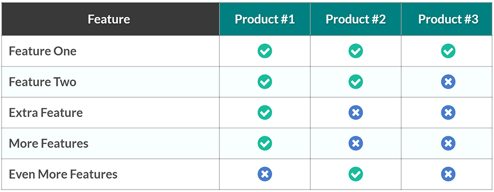
Desktop View
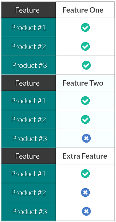
Mobile View
How To Make Your Tables Mobile Responsive
Once your table is created and formatted for desktop (within the Thrive Architect), go to mobile view in your responsive view options.
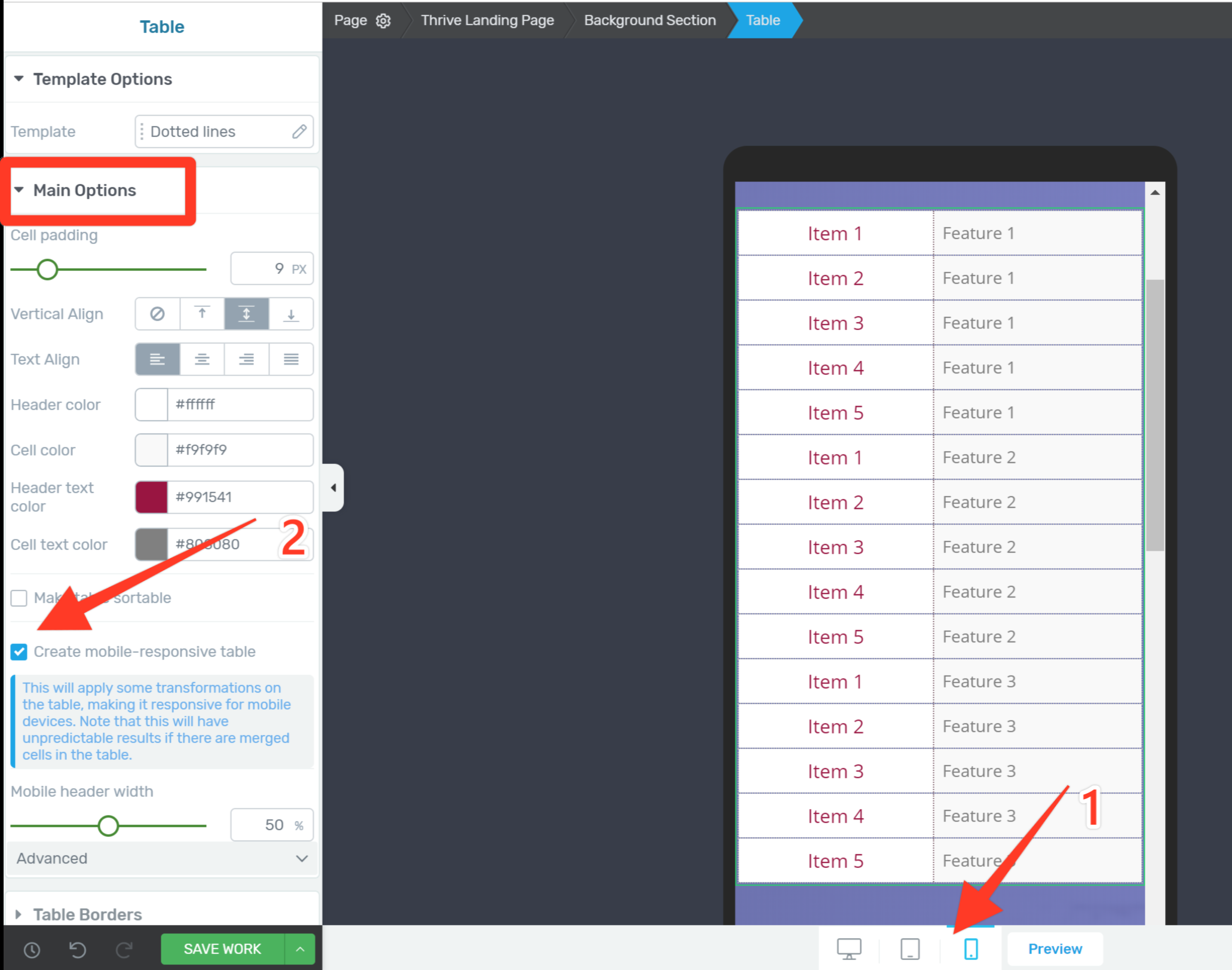
Go to the mobile preview, then click create mobile responsive table
Resize your header text to suit mobile, then click the 'Create mobile-responsive table' checkbox in the main options menu.
Due to the way the re-formatting function works, the elements in the header will no longer be editable.
If you need to make further changes to the header elements, just un-check the box to revert the table to normal, make changes, then click the box again.
Note: The mobile responsive checkbox will only be visible in the table element menu once you've selected mobile view.
What's Your Take?
Is this been something you're been waiting for? Are you excited about these new responsive tables for WordPress sites?
Let us know in the comments below!


It was a much needed feature. Thanks Thrive team for making it happen. Love you 🙂
Glad is was something you were after Istiak!
Thanks stephany , very usefull. Good job you and all of your team
I’ll send your thanks to the team Juan 🙂
Great that this is mobile now
Agreed Johannes, I feel like this is going to make a lot of people very happy.
oh yes Stephanie, that’s fantastic! When will it be available?
Hi Jan. It’s available now within Thrive Architect (using the table element). Just make sure you’ve updated to the latest version of the plugin.
Using the most updated version that released today, I do not see the new table feature.
Hi Doug,
Try following these steps:
(first off, if you’re using any caching, make sure to clear it)
1. Open a page or post with the ‘Edit in Thrive Architect’ button
2. Search for the ‘Table Element’
3. Drag that onto your page or post to add table to your page
4. Change to ‘Mobile’ in the ‘Responsive View’ menu (shown here) and select the table element on the page. You should see the ‘make table mobile-responsive’ checkbox within that menu (there’s a screenshot of this in the article above)
If the option still isn’t showing for you I would suggest contacting our support forum.
This is great and is a awesome and highly needed update. Thank you, Thrive Themes!
Thanks John, and agreed on the highly needed 🙂
Hi Stephanie, I thought so. I have also TA in the newest version 2.0.15 but this menu is unfortunately not available by me 🙁
Hi Jan,
Make sure you’re in ‘mobile’ under the responsive view settings, then select the table element. From the table element sidebar menu you should have the option to make the table mobile responsive. If it’s still not coming up for you, contact our Support Forum and they should be able to help.
Thank you, Stephanie! I never came to this idea that tables could be a ranking factor, but this totally makes sense!
Yep, Google loves organized information. Glad you got something out of the post Christoph 🙂
It looks much better on mobile devices.
Sure does Matthias. A lot more user friendly.
It would be great to be able to insert some spacing between sections (between the old rows, now columns). Not sure if I’m explaining it properly, but between the old row 1 and row 2 in the mobile view, it would be nice to be able to break it up a bit.
Good point I think.
Hi Randy,
I understand what you mean. A suggestion for helping with this is making the first column a different color so that when it changes in mobile there’s a color change to let visitors know it’s a new entry. But I’ll pass this on to the developers nonetheless and see if there’s anything we can do about it.
I am really happy to grab this feature, Thank you!!
Glad you’re happy with it Alica!
Pure genius – and what a great heads up on snippets too from Matt. I don’t know any other CMS as good as ThriveThemes now Architect is firmly established.
That’s Quentin, this is nice to hear 🙂
Thanks Stephanie! i was about to request this feature in thrive forums. thanks!
It’s that ol’ Thrive Themes ESP at work again 😉
Still, I didn’t find this feature “creat mobile, responsible table “?
Hi Galib,
First off make sure you’ve updated to the latest version of Thrive Architect, and if you’re using any caching, make sure to clear it.
Then try following these steps:
1. Open a page or post with the ‘Edit in Thrive Architect’ button
2. Search for the ‘Table Element’
3. Drag that onto your page or post to add table to your page
4. Change to ‘Mobile’ in the ‘Responsive View’ menu (shown here) and select the table element on the page. You should see the ‘make table mobile-responsive’ checkbox within that menu (there’s a screenshot of this in the article above)
If the option still isn’t showing for you I would suggest contacting our support forum.
ALL IN ! So timely ..Building two sites and needed a mobile way to display offerings that didn’t suck…
Now can put my good hands around the neck of more competitors..and show them a thing or two..
I appreciate the violent enthusiasm John :p
Awesome tables and feature!
Side question: how can we make those neat price tag buttons?
Make both top left and bottom left corners radiused. Then use a radio button (selected) icon for the “hole” and adjust your text accordingly.
10 points Robert – I spot a tinkerer 😉
What Robert said 🙂 Just clever use of an icon within the button.
Wow, this is pretty awesome stuff guys. Great work! That was a huge drawback of tables that they just don’t show up nicely on mobile view.
This is a great addition to be able to show tables nicely on both desktop and mobile view. Happy Christmas :)!
Merry Christmas Mike!
This is great, Stephanie. Thanks for the update.
So you know, I think you have the wrong url on the link to the page of table samples. When I click that link, instead of going to a page with table samples, I end up on a page with landing page samples (https://staging.thrivethemes.com/landing-pages-gallery/).
Cheers,
Grant
Hi Grant,
The templates are on the ‘Table Templates’ page within the gallery, which you’re right, is pretty hard to find among them all. The exact preview page is here.
This is great! Is there a way to use this feature outside of TA in a regular wordpress post while using a thrive theme?
Hi Mario,
Unfortunately not, it’s a Thrive Architect element so it can only be created within the Thrive Architect editing window. But you can create and edit posts with Thrive Architect, so you can create whole post with Thrive Architect including the tables.
Will these tables break gracefully on AMP versions of my articles?
Very cool Stephanie! So now that Woocommerce is working on other themes this should be great for your store – something I still have to figure out – when can we expect a post on setting up a photo store with a variety of categories of photo sections with a variety of sizes and types – in other words the photos are imported as a variable product csv table – will be trying to get this done over the next few weeks – will post if I get it working. Looking forward to the new theme – drool, drool!
Hi Craig,
I’m going to be honest, that’s not something we’re planning to create a post about at this stage. It’s a little bit too niche. Although I do understand WooCommerce is being used by a lot of our customers – so I’m keeping a keen eye on how we can integrate that into more of our content. I hope you manage to figure it out! (and I’m also drooling over the new theme 🙂
A recent article buy SEMRush showed the data they gathered highlighted the importance of using tables to be featured in rich snippets, and by coincidence I saw this once myself for a competitor’s site.
However, I wasn’t aware of the item placement (in rows, rather than columns) as being important. This is very helpful.
I’m going to change my tables (current done in the Amazon AAWP plugin) or possibly try with Architect if they can be done with shortcodes perhaps.
Thanks
Great to hear Marty, I hope this gets you that feature snippet 😉
Hi, How can make mobile responsive tables from old version? I am using 1.5 version. Thank you
Hi Abu,
In order to get the updates you need to update the Thrive Architect plugin to the latest version.
This is really neat! I think it would look better if there were some separation between each of the rows when they stack up on mobile so it’s not as difficult to see where one stops and the next one starts. Possibly just a thicker divider line or something.
Hi Christina,
Thanks for the suggestion. I’ll send it through to the developers. An immediately implementable solution for this is to have a different color for the first or last entry in the table so the visitor knows when that color repeats it’s a new entry.
Brilliant! You guys are sooo good. Thanks Stephanie.
Glad to help Bob 🙂
This is fantastic! Thank you! I was just able to update a pricing table on my website. It looked good on desktop, decent on tablets, but crashed on mobile. Now it looks great on all 3 devices 🙂
Good job!
Yeah it was pretty frustrating not being able to optimize for mobile. Glad it’s helped on you site John!
The best xmas gift ever!
Merry Christmas Bo 🙂
Going to find a reason to use this, just because it looks awesome ????????
Mary!! I had exactly the same idea. That’s why everyone ended up with a template too, I wanted to play with the tables 🙂
COOL nice feature thanks Thrive
We’re getting a little bit fancy over here at Thrive Themes 😉
Nice one. Esecially to combine with the template save. Cya, Steffen
Yeah once you start building multiple post the templates help a lot! Thanks Steffen
I had a client complaining about the non-responsive table I built with the old content builder, so this is fantastic news!! Love it. Big thanks to the team.
I’ll send on the thanks Andre!
Great addition. You guys (& gals) just keep on producing and over-delivering.
Thanks Keith!
What about making columns mobile friendly as well?
Hi Jaco,
The columns are already mobile responsive. You can chose to either stack the columns on mobile and tablet, or reduce the size of the content so the content will still fit next to each other on mobile. More details on the responsiveness of columns can be found at around 12.50 of this video.
Thank you for that Stephanie! The problem is I had to begin with a blank page in order to get my header exactly as I want it to be. A logo on each side and the menu in the middle. The problem is it looks fine in Desktop view but are totally chaos in mobile and tablet view. As soon as I hide certain elements for certain views, I can’t add new elements in the mobile and tablet view. I know it works from Desktop view downwards but truly a headache! Thank you for your assistance and comments on all of our opinions. Appreciate it! 😉
Hi Jaco,
You need to add all elements in desktop view, and you can chose to hide or show them on desktop and/or tablet and/or mobile from there. I’d suggest watching a few of our latest landing page from scratch videos to learn the best practice for responsive editing.
I’d recommend starting with the Thrive Architect Quick Start Tutorial and this post on mobile editing.
Hope that helps!
Thank you for the Christmas present and the know how on additional comments about the SEO benefits of this. Loved the gallery.
Take care Stephanie.
Thanks Luis, Merry Christmas 🙂
Great! also love the table templates, so easy to use and they look great as well.
Glad they were helpful Tim!
Is there a way to import the elements into my thrive architect instead of making it on my own? I am looking for the “Basic Comparison Table” and “Product Quick Stats” that would been a great help!
Thanks!
Hi Yarik,
You sure can, that’s what the tables template page is for. Create a new page in Thrive Architect, load a new landing page template, go to the ‘Element Templates’ set, click on that and choose the ‘Mobile Responsive Tables’ template. Once the page has loaded follow the instructions to save the tables as content templates- to use anywhere in your posts and pages.
Thank you so much, appreciate that :)!
Hi Stephanie,
just followed the instructions of the Tutorial, but there is only a “Styles” Dropdown. Is it possible that the templates are just available for Thrive members (I bought Thrive Themes before you launched the Membership).
Thanks
Will this be updated to pull images and prices from amazon? There is a new one out there that has these features. It will be so much easier to create amazon tables
This is not on the development timeline Manuel, but I do know there and plugins that can generate this content for you quite easily.
Thank You to the good people at Thrive Themes! I call this a beautiful thing for sure…Well played once again from the solid value that is Thrive Themes.
Thanks Mr. Ritter!
Nice feature, thanks. One irrelevant question, though. What app do you guys use for the talking head feature on your tutorials?
Hi Michael,
We got asked so much that we made a tutorial on how to do it. 🙂
Hello! Thanks for your work! You are best.
Thanks stephany! Before i didn’t know about this things but, now i can understand that. Thanks once again.
Hi
I am not getting tables, landing pages option… I have found one landing pages templates but there is no option like a table and other elements.
Thanks
Hi Prince, it’s one landing page template that is full of table designs. The table template page is under the ‘Element Templates’ set in the Landing Page cloud.
How can I add a Column to the Feature Comparison Table? I have one more product that needs to be added.
Hi Norman,
This tutorial on the table element should have the information you need.
Hi Stephanie K, I haven’t find the button of create mobile-responsive table in my side. Could you help me to solve this problem? Many thanks.
Hi Helicia,
You have to switch the view to mobile in order for the button to show up (also make sure to have the latest version of the plugin installed).
I found this article very informative.
Thanks so much for sharing and making it possible.
Thrive Architect is an awesome product with lots of future.
Keep it always up! You guys rock..
Hello how about for tablets? Do you have a link how to fix tables when using a tablet? By the way this is what I really need for the mobile view thanks. I fixed my tables already but now I am having issues when viewed on a tablet.
Stephanie,
Question I have a legacy website that was developed utilizing tables. Is there a way to convert to responsive using thrive?
Hi,
No you would have to rebuild the tables with Thrive Architect.
How do you get more than 6 rows in these tables? Nothing I try seems to work and I can’t find any tutorials about it either. Currently I use TablePress but that isn’t responsive.
When you’ve created a table, select it and go into edit mode for it. There, you have the options to add and remove more rows and columns.
This is awesome! But you guys really need to make it easier to find and import those pre-formatted tables. It took me over 20 minutes to figure it out!
Sorry Bill,
That element does not have templates attached to it, which makes it harder to deliver the templates to you. But happy you like them!
Table looks very cool – a reason to buy Thrive Architect it seems.
I would imagine many Amazon Associates would be looking for this except I can find no way to insert the product image without physically downloading the image onto my server and then linking to it. Which all works fine except it is totally against Amazon’s terms of service.
Is there a way I am missing?
This is the normal way to show images in WP, yes. You could use the “WP content” element instead of the image element and use the link to the amazon image. I don’t know if this is accepted in the Amazon terms of services, but in this way you’re not hosting the image on your site.
I’m sorry, I don’t understand these instructions, and therefore I can’t make my tables mobile-responsive. How/where do I get the Create Mobile Responsive Table checkbox? Is it in the Responsive menu or the Table menu? I have tried both areas and still can’t get Mobile Responsive checkbox to appear.
Hi Melanie,
First you have to put the canvas on mobile view (in the middle on the bottom of the editor). Then in the main options you’ll see the “create-mobile responsive” option.
https://cl.ly/2ae691d55e0a
Hey!! everything is ok but I’m facing some issues on how to fix tables on tablets? Do you have anything about how to fix tables when using a tablet? If you have any information about that kindly share. This really helped me a lot.