Looking to learn the top landing page mistakes so you can avoid them?
This is the guide for you.
I remember when I first started creating landing pages early in my freelance career. I thought I had it all figured out. Great offer? Check. Good enough design? Yep. “Great” copy? I certainly thought so.
But when I looked at my client’s conversion rates at the time, my hopes were dashed.
Thank goodness for growth.
Landing page design isn’t as straightforward as it seems, and it’s easy to make mistakes.
I’ve put together a list of the 11 biggest landing page mistakes marketers and business owners make. More importantly, you’re going to learn how to fix them.
Let’s dive in.
Are Your Landing Pages Not Meeting Your Conversion Expectations?
You know that feeling when you check your landing page stats and your heart sinks a little? Yeah, that one. Where the traffic's decent, but the conversions aren't what you expected.
It's frustrating, right? You've put in the hours, written what you thought was killer copy, and picked images that would make Instagram jealous. But somehow, the results just aren't matching up with all that effort.
We've all been there. Seriously. Even the marketing gurus you follow had their fair share of landing page flops before they hit their stride. The secret? They learned from their mistakes. And that's exactly what we're going to do.
A Breakdown of the Most Common Landing Page Mistakes (+ Solutions)
Here's a hard truth: most landing pages are leaving money on the table. I've reviewed hundreds of them over the years, and the same conversion-killing mistakes keep popping up. These aren't just minor design flaws – they're serious roadblocks between you and your goals.
The good news? Most of these mistakes are surprisingly easy to fix once you know what to look for. I've compiled the most common pitfalls I see, along with proven solutions to help you turn more visitors into customers. Let's dive into what's likely holding your landing pages back.
Mistake 1: Not Planning for the Future
When I first discovered page builders, I thought I'd hit the jackpot.
I started off with a free one and dove right in, designing my landing page as best I could.
My design skills weren’t that great, but I managed to put something together. I was thrilled. No more dealing with the WordPress Block Editor (which was just Gutenberg back then) – and for free??
Score.
Fast forward a few months, and my freelance business was growing. Great news, right? Well, not for my landing pages.
I needed to add new sections, update my offer, and optimize for mobile. But every time I tried to make a change, something else would break.
The tool I'd chosen just couldn't keep up and I was stuck with a page that couldn't grow with my business. Leaving me kicking myself for not thinking ahead.
The Problem
See, what I hadn’t realized back then is: when you don't use the right tools from the get-go, you're setting yourself up for a ton of stress down the line.
Poor design choices often lead to pages that are clunky, outdated, or way too complex. And, unfortunately, those pages don't convert well.
It goes beyond looks, too. When your landing page is hard to update or your design tools clash with your other plugins, you're stuck. You can't easily adapt to changes in your business or take advantage of new digital marketing strategies.
What to Do Instead
My strong recommendation: use the right tools from the start.
And, often, to find the right tools, you’ll need to spend some money. Free tools are good to start off with, but they’re very limited compared to paid plugins.
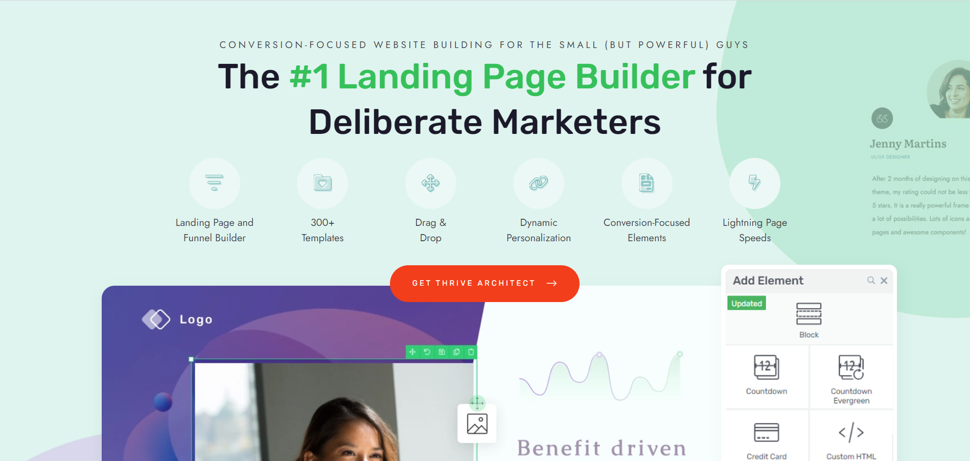
If you’re looking for a premium landing page plugin that’s also affordable – Thrive Architect is your winner.
This tool strikes a balance between design flexibility – so you can create unique landing pages that stand out – and ease of use.
You get a drag-and-drop builder equipped with design elements and templates that will help you build landing pages that are focused on conversions.
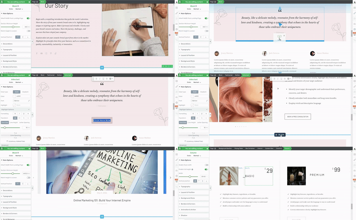
Thrive Architect in action
What I appreciate about this plugin is how it meets you at your level of experience. If you’re a WordPress beginner who doesn’t want to build from scratch, simply choose from the library of page templates and replace the placeholder images and text with your own.
And if you’re a more experienced WordPress user who wants a tool that offers a lot of customization options and allows you to design without needing to code – this tool is right up your lane.
Thrive Architect puts you in the driving seat. You get to build your pages on your terms, without the hassle of needing to learn HTML or CSS.
It also grows with your business. You can easily hop in and make changes to your landing pages without needing to start from scratch. Saving you a lot of time (and headaches) in the future.
Mistake 2: Not Prioritizing Above-the-Fold Content
Did you know that the average human’s attention span is roughly 8 seconds?
Which means, when someone comes to your landing page, you have 8 seconds (give or take) to grab their attention and encourage them to keep scrolling. That isn’t a lot of time.
The Problem
I'll be honest, I used to make this mistake all the time.
I'd spend hours thinking I was creating the perfect landing page, working with the idea that I needed to ease visitors in gently.
But the problem was, the “good stuff” – the value proposition – would be so far down the page, I’m sure a lot of visitors left without reaching that point.
I quickly learned that when visitors landed on my page and couldn't immediately figure out what I was offering or why they should care, they'd bounce faster than a rubber ball. It wasn't that they weren't interested – they just didn't have the time or patience to dig for information. Those precious 8 seconds were ticking away, and I was wasting them on fluff.
What to Do Instead
If you want to get the top section of your landing page right, first start by addressing these three questions:
- What are you offering?
- How does it solve the visitor's problem?
- And what should they do next?
Then design your page in a way that answers these questions immediately.
Use your hero section to communicate your value proposition, touch on the audience’s pain points to build trust, and a prominent call-to-action that guides them to the next step.
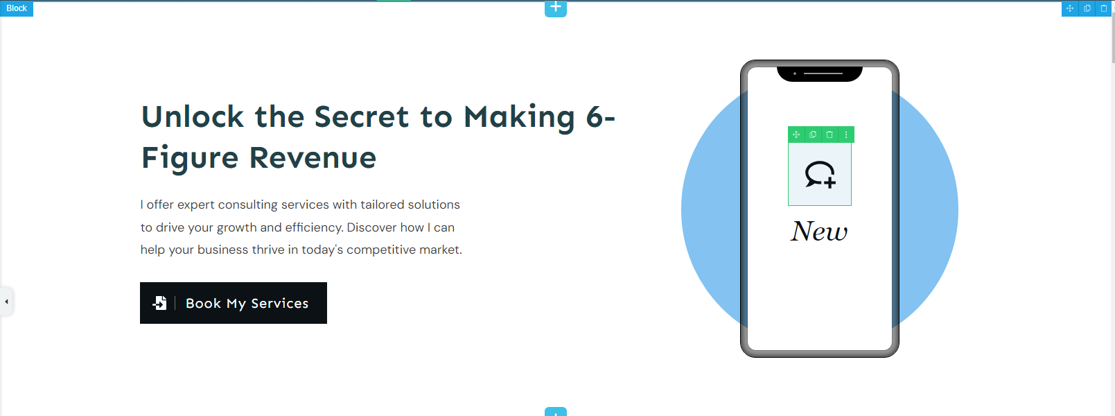
Throw in other visual elements, like a relevant image or short video, to reinforce your message, but remember – they should enhance, not overshadow, your core message.
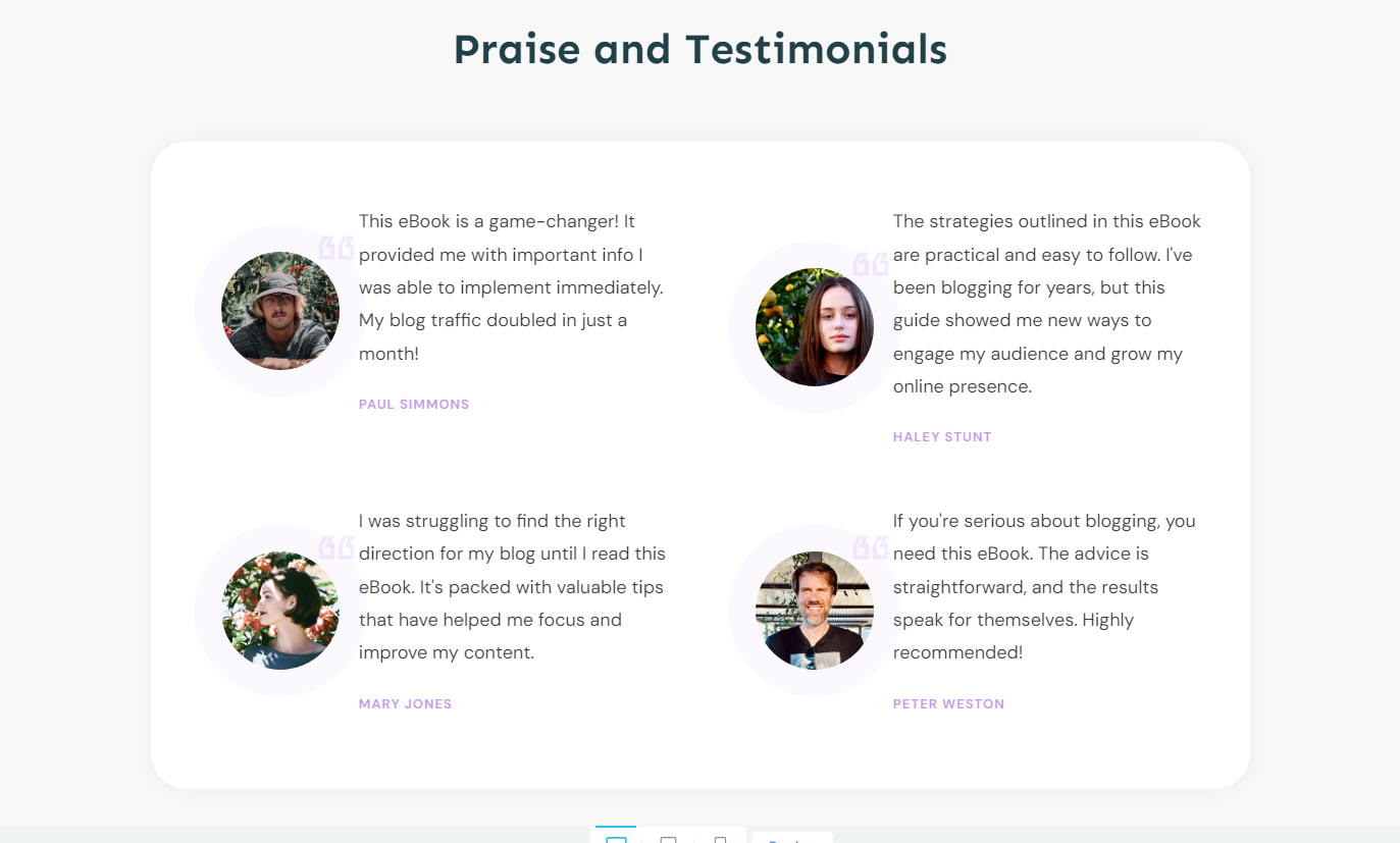
Use the space after your hero section to solidify the bit of trust you’ve just built. Add your strongest social proof to show your audience that you know what you’re doing – and other people agree.
Now that you’ve got their attention, show them you understand their pain. Use your next section to outline their pain points or challenges, before you introduce them to the solution.
The first third section of your website is where you hook your visitors. Don't waste it on fluff.
Keep it simple: Show what you're offering, how it helps, and what they should do next. Make it clear, make it quick, and make it interesting. Your visitors will thank you for it - by sticking around and maybe even becoming customers.
Mistake 3: Using Generic, One-Size-Fits-All Copy
Early in my marketing career, when I started creating landing pages, I thought the goal was to cast the widest net possible. "If I make my copy broad enough," I thought, "it’ll be relevant to everyone!"
Big mistake.
The Problem
When you try to speak to everyone, you end up connecting with no one.
I’d compare generic copy to lukewarm coffee – it won’t offend anyone, but no one’s going to rush for it.
This type of copy won’t catch your audience because they can’t relate to it. You’ve avoided addressing their specific needs, desires, or pain points. There’s little to no incentive for a website visitor to keep reading.
What to Do Instead
The key to creating copy that resonates with your audience is specificity.
When your target customer lands on your page, they need to go through your copy and think, “Wow. They’re talking to me.”
And you can’t do that without speaking directly to your target audience and addressing their unique problems.
Here are some practical copywriting techniques to make your landing page more targeted and effective:
Mistake 4: Using Too Much Jargon and Complex Language
When you pepper your landing page with industry jargon and complex terminology, you risk alienating a significant portion of your audience.
Not everyone visiting your page will be an industry expert, and even those who are might prefer simpler, more direct communication.
The Problem
Overly technical or complicated language can make your offer seem intimidating or inaccessible, potentially driving away interested prospects who simply don't understand what you're saying.
This can lead to higher bounce rates and lower conversion rates, as visitors quickly click away from content that feels confusing or irrelevant to them.
What to Do Instead
Focus on clear, concise communication that speaks directly to your audience's needs and pain points.
Use plain language that's easy for anyone to understand, regardless of their level of expertise. Explain your product or service in terms of the benefits it provides and the problems it solves, rather than its technical specifications.
For example, instead of saying "Our proprietary algorithms optimize cross-platform synergies for maximum ROI," you could say "Our software helps your team work better together, saving you time and money."
If you must use specialized terms, provide brief, clear explanations. Your goal is to make your visitors feel informed and confident, not confused or overwhelmed.
Mistake 5: Neglecting the Power of a Narrative
Scenario: You walk into an event – a neighborhood party, for example – when suddenly, someone pops out of nowhere and starts listing off their accomplishments and skills without any context.
Awkward, right?
Well, that’s how it would feel if a visitor came to your landing page and found a lot of information with no story or narrative to guide them.
The Problem
Humans are wired for stories. It’s how we make sense of the world and connect with each other.
When your landing page features a collection of facts, descriptions, and features – and no messaging to connect with your audience — it comes off as mechanical.
Your visitors might understand what you're offering, but they won't feel it. And if your target customer feels no connection with your offer, there’s a high chance they’ll drop off without engaging or converting.
What to Do Instead
Go beyond presenting information and weave a narrative that takes your visitors on a journey.
If you aren’t familiar with copywriting, don’t stress. There are several frameworks you can apply to your writing to add that storytelling element:
- Problem-Agitate-Solution (PAS): Start by identifying your visitor's problem, then dig into how that problem affects their life or business, before presenting your product or service as the solution (learn more here).
- Before-After-Bridge (BAB): Paint a picture of your visitor's world before using your product, contrast it with how amazing things could be after, then position your offering as the bridge between these two states.
- Hero's Journey: Cast your customer as the hero facing a challenge. Your product or service plays the role of the wise guide, helping them overcome obstacles and achieve their goals.
Pro tip
The secret to good copywriting is keeping it simple and using the formulas experts have already created. That way, you don’t have to spend as much time trying to crack the code yourself.
If you need more expert copywriting tips, check out this guide here.
Mistake 6: Relying on Stock Images That Lack Authenticity
You’ve seen them. I’ve seen them.
Perfectly polished stock photos of people in suits shaking hands or staring at computer screens with impossibly wide smiles. While they might look great, if these images have nothing to do with the offer at hand, they’ll end up hurting your chances of converting potential customers.
The Problem
Using generic stock photos can make your brand feel distant and impersonal. This lack of authenticity can erode trust and make it harder for potential customers to connect with your brand on a human level.
What to Do Instead
Put aside the cheesy stock photos and throw on your creative cap.
If possible, take photos of your products and business (if you have a physical location) and put them on your website and landing pages.
Most smartphones today have great cameras, so you don’t have to worry about hiring a pro photographer if you don’t have the budget for it.
You could also ask customers to take photos of them using your products and add those to your landing pages – this is perfect social proof and helps build trust.
Canva is a great source for business owners who want to create custom illustrations – you’ll just need to spend some time customizing your templates to give them a unique touch.
Thrive Tip: Looking for more DIY image creation tips? Check out this free guide.
Mistake 7: Overloading Your Page with Multiple Calls to Action (CTAs)
The last thing anyone wants is to be bombarded by buttons, pop-ups and links all vying for their attention.
"Sign up!" "Download now!" "Learn more!" "Subscribe here!" It’s too much.
The Problem
Your visitors came to your page with a purpose, but now they're faced with several decisions at once. This often leads to decision paralysis - that feeling of being stuck, unsure of what to do next. And when people feel stuck, they often choose the easiest option: leaving the page entirely.
Having multiple CTAs also dilutes your main objective.
If you're trying to get visitors to sign up for a free trial, but you're also asking them to download an ebook, schedule a demo, and subscribe to your newsletter, you're splitting their focus.
In turn, you’ll confuse your visitors, muddle your analytics, and make it harder to measure what's actually working on your page.
What to Do Instead
Your landing page should focus on a single, primary call to action that aligns with your main conversion goal.
What’s the one action you want most visitors to take?
Once you know, use every element on your landing page to guide your website visitors to take that action.
Your main CTA should be the most prominent. Make it stand out with contrasting colors or a slightly larger size. Place it where it's easily noticeable - typically near the top of the page and again after you've presented your key benefits.

For other actions you want visitors to take, consider using micro-CTAs. These are smaller, less prominent calls to action that don't compete with your main goal. They could be simple text links or smaller buttons with labels like "Learn More" or "See Details".
It's okay to repeat your main CTA as visitors scroll down the page. After you've addressed a key pain point or showcased a major benefit is a good place to reintroduce it. Just don't overdo it - you want to guide your visitors, not nag them.
Mistake 8: Failing to Offer a Tangible Next Step After Conversion
Getting a visitor to convert is a big win – but it’s not the end of the journey.
I’ve seen a lot of business owners make this mistake. They manage to score conversions through their landing page, but there’s no follow-up afterwards.
The customer or lead gets their offer and is left hanging. And this is a big mistake.
The Problem
When you don't guide users to a next step, you're essentially closing the door on deeper engagement. You've captured their interest, and they've taken action - this is the perfect moment to introduce them to more of what you offer. But if you let this opportunity slip away, you'll miss a chance for immediate further interaction. What could have been the start of a lasting, profitable relationship might instead remain a one-time conversion.
What to Do Instead
Turn your “Thank You” page into a launchpad for more engagement.
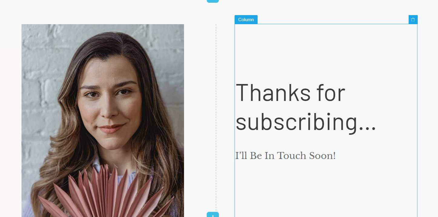
After a conversion, provide a clear and enticing next step that keeps your customer moving through your funnel. This could be an invitation to access exclusive content, join an upcoming webinar, or explore related products or services.
For example, if someone has just downloaded an ebook, you might offer a complementary video series or invite them to join a community discussion on the topic.
The goal is to keep the conversation going and deepen the relationship – and we have more “Thank You” page tips right here.
And don’t forget to engage your customers through email marketing, too.
Post-purchase funnel flows are key for encouraging first-timers to return and buy from your business again.
Mistake 9: Overlooking the Importance of Page Load Speed
I think I speak for everyone when I say: no one likes a slow-loading website.
We want our information now. If I have to wait more than a minute for a website to load, there’s a chance I’m leaving.
Unfortunately, this applies to your website and landing pages, too.
The Problem
When a page takes too long to load, it feels like something's wrong.
People might think your site is broken, or worse, that your business doesn't really have its act together. And let's be honest, if someone's frustrated before they even see your content, they're probably not in the best mood to become a customer.
Besides irritated visitors, slow loading times will hurt your search engine rankings, too.
Search engines actually pay attention to how fast your page loads. If it's too slow, they might not show your page as high up in search results. So you could be missing out on potential visitors without even realizing it.
What to Do Instead
First off, take a look at your images. Big, high-resolution photos are big no because they can really slow things down. Always optimize your images – (we even have a guide to show you how to do it the right way).
Next, make sure you’re using themes and plugins that are frequently updated and use clean code. If there are any plugins you aren’t using, deactivate them.
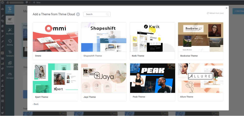
All themes from Thrive Themes are built with lean, clean code and are optimized for speed
Also, make sure your web hosting provider is optimized for speed too. Read reviews or check the site’s feature list to see if they have tools to improve your site’s performance. Look for things like fast servers, content delivery networks (which help your site load quickly for visitors all over the world), and built-in caching systems.
And use tools like Page Speed Insights to “speed test” your website and understand what changes you need to make.
Tip: This is just the tip of the iceberg. Dive into our speed optimization guide to learn more best practices.
Mistake 10: Ignoring or Not Using Your Analytics
You ever come across someone who refuses to ask for directions? They’d rather figure it out themselves? Only to end up getting to their destination hours later?
Well, that’s what it looks like when you don’t pay attention to your site’s analytics. Hear me out.
The Problem
When you don't keep an eye on your analytics, you’re basically relying on guesswork to figure out what’s working and what isn’t – and that can be exhausting.
The data you get from your analytics can show you where visitors are dropping off, what they’re engaging with the most, and how they’re ending up on your pages. And with that information, you can create a better marketing strategy because it’s backed by numbers and data.
What to Do Instead
So, what's the fix? Start paying attention to your analytics. Google Analytics is the best place to start.
Now, I know Google Analytics isn’t the easiest thing to navigate (especially after the GA4 update) but there are ways to make this process easier for you.
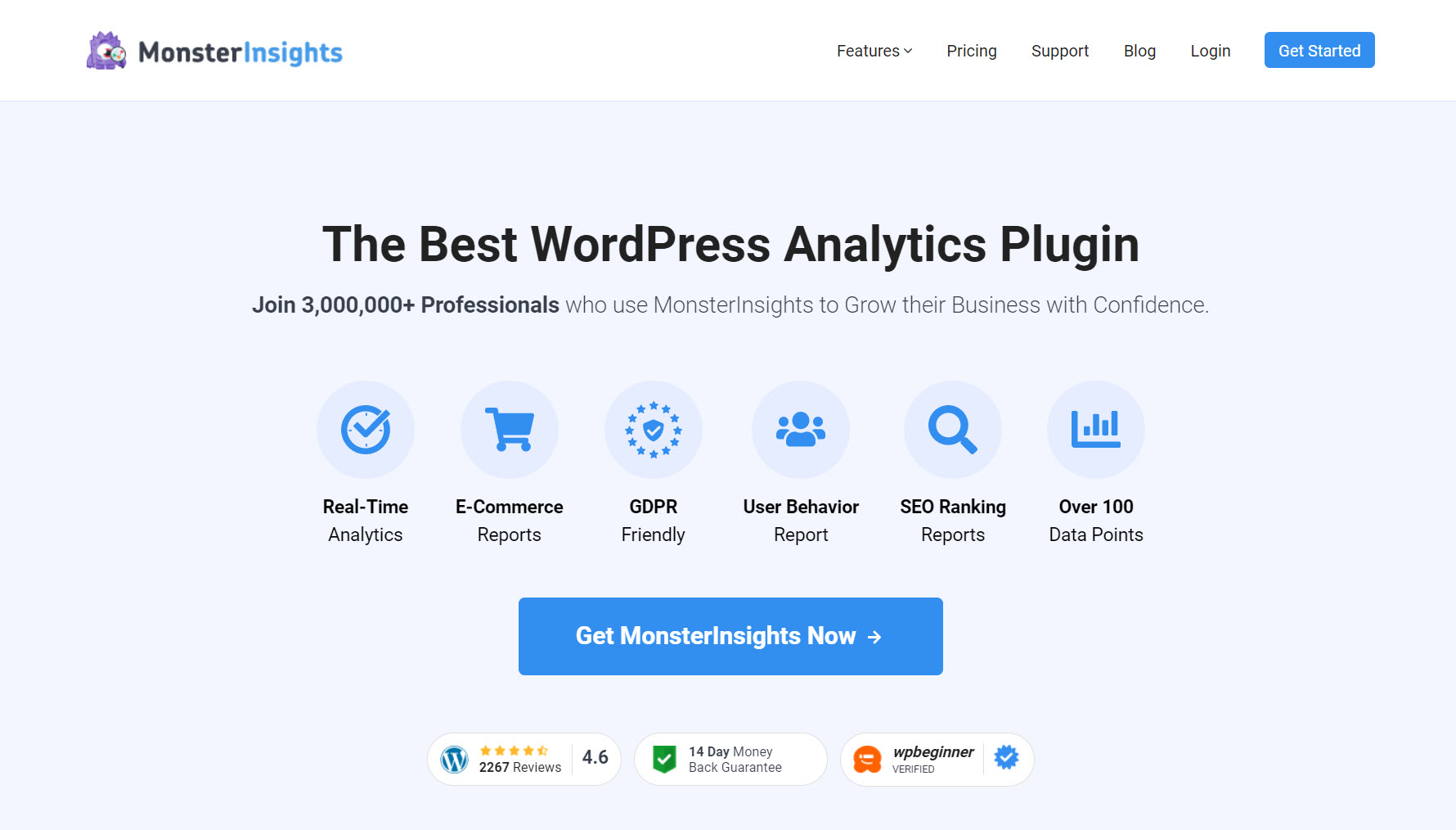
MonsterInsights is my go-to plugin for making my site’s analytics easier to read and understand.
I may be an experienced marketer who’s had to figure out complex analytics tools, but simpler is always better for me.
I hop into my dashboard, get the info I need, and adjust my content strategy accordingly. It really is that easy.
If you’re like me and prefer tools that let you get straight to the point, then this is one worth looking at.
Mistake 11: Not A/B Testing Your Pages
I have a confession.
I used to think A/B testing was an unnecessary step. “My first design is my last design” was my motto.
By now, I’m sure you know how this goes: I was wrong.
The Problem
It's easy to fall into the trap of thinking your first design or copy is the best it can be. I mean, you put a lot of thought into it, right? But, what we fail to realize is that the audience might have different ideas about what works best.
When you don't A/B test, you're practically putting all your eggs in one basket – and we already know how that goes.
You might have a hunch about what will resonate with your visitors, but without testing, it's just that - a hunch.
What to Do Instead
The solution here is simple: split test your landing pages.
A lot of business owners shy away from this practice because they think it’s complicated – but it actually isn’t.
Basically, you're creating two versions of your landing page and seeing which one performs better.

Thrive Optimize split test in action.
One version is your control – you don’t make any changes to it. In the second (or other versions), change a couple of elements – headlines, position of CTAs, etc. But don’t make too many alterations otherwise you’ll struggle to identify what’s making a difference.
Once your test is up and running, give it some time. You want to make sure you're getting enough visitors to make the results meaningful. Then, dive into the data. Which version is performing better? Is one getting more conversions? Are people spending more time on one version?
This is a summed up version of A/B testing, but we have a guide here that shows you how to get set up – check it out.
And there are tools out there that make this process really simple. You don’t have to be a web expert to split test your pages.
My recommendation? Thrive Optimize.
If you’re using Thrive Architect to build your pages, you get immediate access to this tool. Setting up your tests is straightforward and you can test more than two pages at a time.
Next Steps: Set Up Your Site Analytics the Right Way
You can’t truly know the effects of your landing page optimization without tracking your analytics.
Good analytics show you how visitors interact with your page. As I mentioned earlier, they reveal where people lose interest, which elements they engage with, and what leads to conversions. It’s a key part of any sales or lead gen strategy.
So, before you start making changes to your websites, get your Google Analytics setup.
If you read this guide, then you’ll know that MonsterInsights is my top recommendation. It makes your data easy to read and even easier to act on.
And if you’re not sure how to get started, check out this step-by-step tutorial.
Landing Page Mistakes to Avoid: Wrapping Up
We've covered a lot of ground here, from the importance of above-the-fold content to the power of having a clear call to action.
Landing page design is a process, and you’re only going to get better with time. So don’t feel discouraged if your pages aren’t performing the way you hoped they would, okay?
The key is to learn from each attempt and apply those lessons moving forward.
And now that you’re armed with all this information, it’s time to take action.
Review your existing landing pages with fresh eyes. Look for areas where you might be making these common mistakes, and start making improvements.
If you feel like your current page-building tools aren’t helping the way they should, you know what to do.



Great!
Thanks, Chipo!
You’re welcome, Chris 😀