This one element can make your homepage or landing page look very professional or really amateurish...
Your background image.
After looking at hundreds of homepages and landing pages we keep seeing the same issues over and over again.
These issues hurt your conversions and your brand.
The good news is that you can fix your background designs in 4 simple steps!
Keep reading to learn more.
More...
The Most Common Problems With Website Background Images
There are two obvious and two less conspicuous problems with background images.
The Obvious: Speed and Readability.
We noticed that many background images took a long time to load. This happens when the image is too big or not optimized for the web. It's super annoying for visitors, but is also a negative factor for SEO.
The second and even bigger problem is readability. Unfortunately, some images just don’t work well with text overlays which can make your actual homepage message impossible to read.
The title of your homepage or landing page is the most important element of that page. It's what gets visitors to stick around and read on. If that title is hard to read because it doesn't overlay well on your background image, chances are that new visitors will bounce rather than squinting to figure out what your website is trying to offer.
The Less Obvious: Brand Image and Clarity
Not every business can afford to have custom images taken by a good photographer. Luckily, there are a lot of websites that offer free, natural looking stock images. But this also means that everybody has access to the same photos.
Using the exact same stock image as your competition can hurt your brand image and make you blend in rather than stand out from the crowd.
We talked about this in depth in the article "How to Use Free Stock Photos on Your Website Without Hurting Your Conversions".
The choice of your image also plays a big role in the clarity of your message.
Because of the growing trend in full screen background images, we’ve seen businesses use them even though the actual image has nothing to do with the product or service they provide.
You shouldn't use an image just for the sake of having an image...
If you can't find a photo that’s closely related to your business, ask yourself if using an image is the best choice here. You can make a good looking design using colors, gradients and patterns rather than images. That's exactly what the websites below are doing.
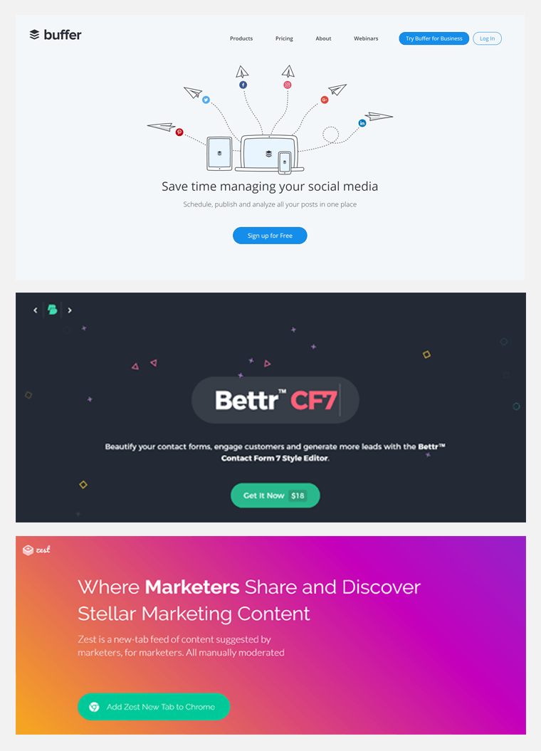
Examples of websites that use colors, gradients and patterns rather than images for backgrounds.
Having an unrelated image is bad for clarity, but so is counting on the image to do all the talking.
If the image is necessary to understand what the website is about, you will have a big problem with SEO.
Search engines can only read code. They can not “see” images. An image like the one below will never help the site rank for anything fitness related.
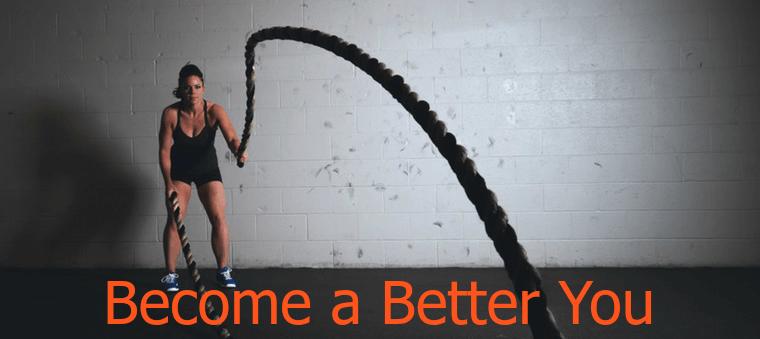
Don't count on your image to do all the talking...
The only thing Google can read on this image is "Become a Better You".
Although you can add attributes to your images to help search engines understand what the image is about, it will never be as visual for your “human” visitors or have the same impact on your rankings as words in a big homepage headline will.
Now that we’ve covered the 4 problems with background images, let’s see how you can avoid making the same mistakes.
Follow the next 4 steps and you'll never have these problems again on your site.
Step 1: How to Choose Your Background Image
First question: What image will help you communicate your core message?
Brainstorm a bunch of words you would like to have pop up in the visitor's mind when landing on your website.
Now, go to a free stock images sites such as pixabay, Stocksnap.io or Pexels and put the words in the search engine to see what comes up.
Of course if you have original, high quality photos, that’s even better.
Look for an image with uniform colors. A text overlay on an image with very dark and very light areas will always be harder to read than a more uniform image.
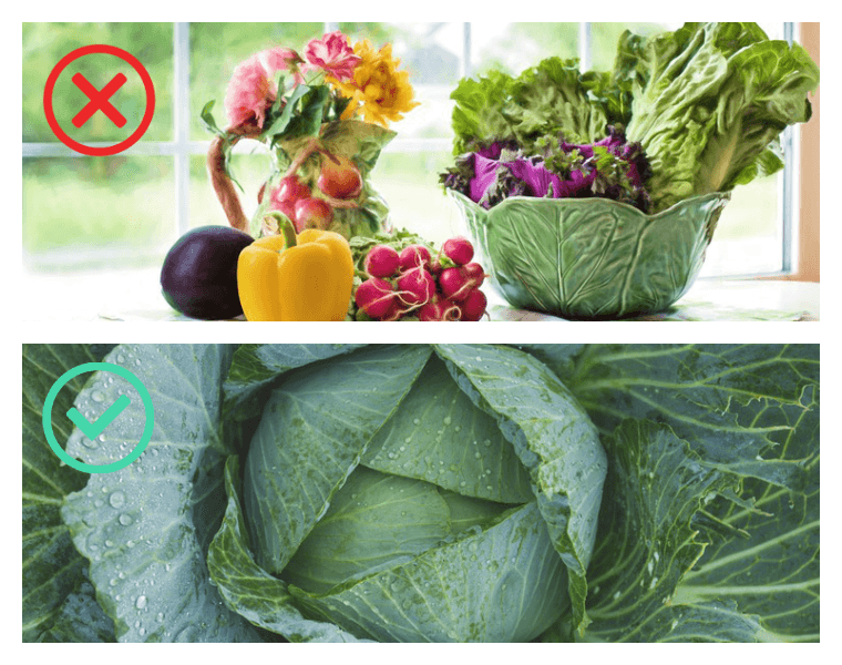
Images with uniform colors are more suited as background images.
Download the photos you like in a resolution that's at least 1920 px wide.
Step 2: Optimize Your Image for Speed
Now that you have your image in the right dimensions (1920 px), it’s time to optimize it for the web.
If you have Thrive Suite and you're using one of our conversion-focused companion themes, Thrive Theme Builder's built-in optimize function will take care of this step for you. You can see how to use this cool feature here.
But if you're not, you can use an image optimizing tool, we recommend Kraken.io.
Select the "web interface" option and upload your image. Download your optimized website and add it to your website.
The data size of your image is instantly reduced without any visible loss in quality!
Step 3: Improve the Readability of Your Text Overlays
Now there is one simple trick to making any image instantly more suitable for a text overlay.
What this simple trick?
Adding a color overlay on top of your background image.
With Thrive Suite, this is super simple.
You'll need Thrive Theme Builder (for your site-wide theme customizations) and Thrive Architect (for your single-use page and post customizations). You won't need a separate photo edition tool!
- Add a background section to your page and make that section full width
- In the "Background Style" menu add first a solid color (this will allow your text overlay to be readable even when your photo is still loading)
- Then add a second background layer. This time choose the image overlay and insert your background image. Make sure the dimensions are set to "full width".
- Now, add a third background layer. This time add a color overlay but reduce the opacity to make the photo visible again. Typically, adding a white (#ffffff) or black (#000000) overlay works best.
- That's it!
If you want to go fancy, you could add a gradient overlay instead of a solid color on top of the image.
And if you're looking to use a photo of yourself then you suggest checking out this tutorial: Create a Pro Looking Hero Image Header
Step 4: Make Your Mobile Visitors Happy
These type of big background images look amazing on desktop. But what about mobile?
The very first question is, do you want this image to show on mobile? Maybe you can just simply use a colored or gradient background.
In that case, go to the mobile view and delete the background image.
If you want to keep the background image, make sure to:
- Reduce the text size of the title
- Decide where you want the image to be scaled from. This will have an impact on which part of the image is shown.
- Reduce the background section height.
If you want to learn more about how to add background sections to your pages, check out this Thrive Knowledge Base article on background sections.
Website Background Image Checklist
Bonus Tips: Build an Impressive, Conversion-Focused Website with Thrive Suite
If you really want to make your website look better so your target audience stays on it for longer…
You’ll need to do more than just find the right background image for your website.
What if you could design a super impressive website in rapid time – without needing to learn a single line of code?
Then you need Thrive Theme Builder and Thrive Architect.
With Thrive Theme Builder, you get to build a custom WordPress theme in a few minutes. You have complete control over every aspect of your website's design, from colors and fonts to page layout and styles.
And Thrive Architect lets you drag and drop elements to create beautiful pages in minutes. No coding required! You can easily add a variety of conversion-focused elements to show off your products or services, and put your business in the best light.
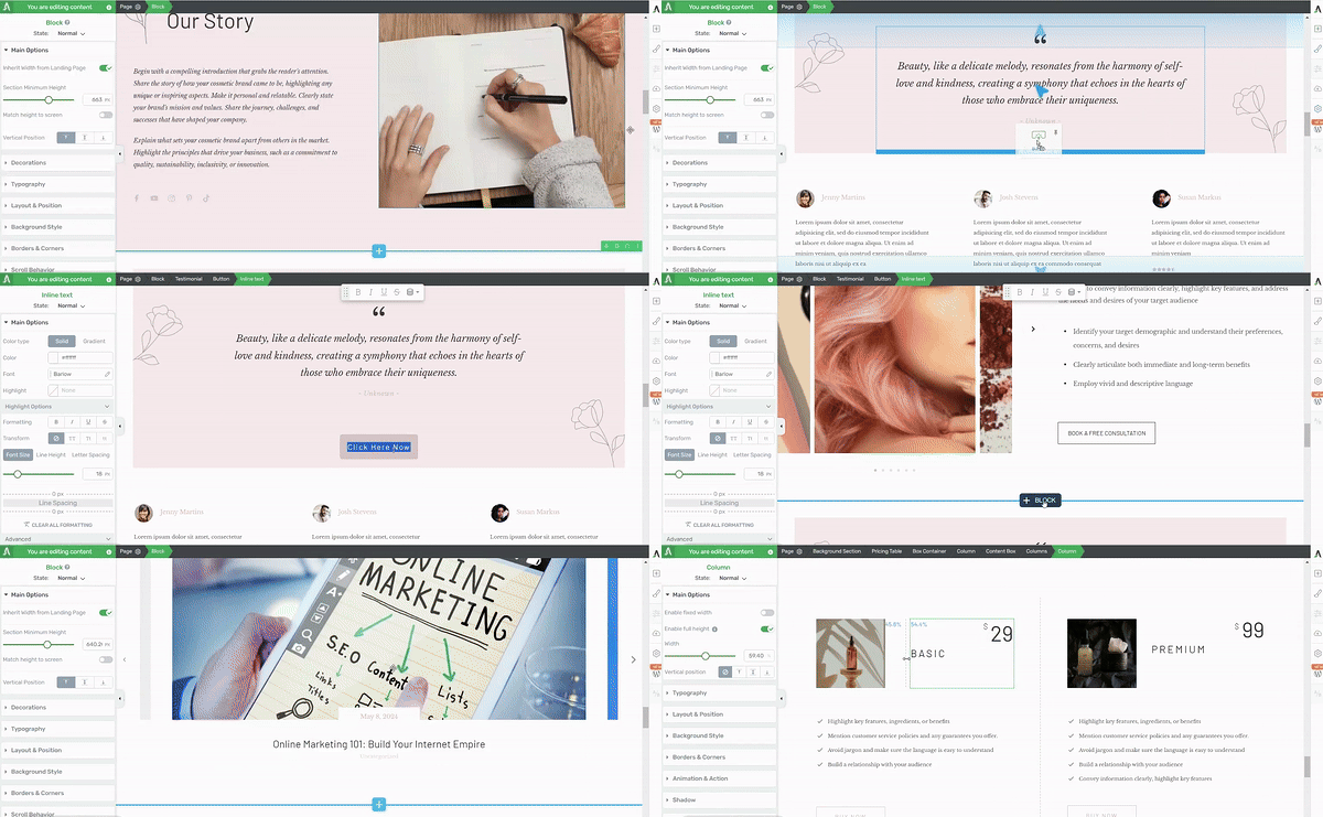
Thrive Architect in action
The best part? You don't need any technical skills to use these tools. They're designed with you, the business owner, in mind. Whether you’re a WordPress beginner or a pro who needs a time-saving tool, you can create a professional-looking website that stands out from the competition, all on your own.
Take control of your brand's online presence with Thrive Theme Builder and Thrive Architect. These tools make it easy to build a website that looks amazing and helps your business grow.
It's Your Turn Now to Create Stunning Background Images
Now you have everything you need to make your website look professional and impressive. If you want more tips to create a conversion-focused website, check out these resources:
- How to Create a Video Background for Your WordPress Website
- How to Build a Website Using WordPress Templates (The Easy Way)
- How to Use Pop-Ups on Your WordPress Website (+ 8 Best Practices)
- How to Build Your First Sales Page on WordPress
Ready to take your website to the next level?


