Looking for ways to boost your call-to-action (CTA) click-through rate?
If your audience isn’t making the desired action through your landing pages and email marketing campaigns, then it’s time to revise your call-to-actions.
Most times, simple changes need to be made — e.g. changing button color or tweaking CTA copy.
But if you aren’t an experienced marketer or designer, you’ll struggle to identify the exact areas of improvement.
This guide can help.
Keep reading to learn 9 ways to create effective calls-to-action and achieve higher conversion rates.
Why Your Call to Action Sections Matter for Revenue Growth
Your landing pages, lead-generation forms and digital marketing strategies are only as effective as the conversions you generate through them.
The purpose of these pages (and forms) is to get your target audience to take a specific action through your pages and email campaigns – hence the need for a call to action button (or section).
These sections are responsible for growing your email lists and generating more revenue for your business.
If your CTA sections aren’t designed to compel your audience to click and convert – something needs to be fixed.
Without these clicks, you can’t generate revenue. And without revenue, your business will struggle to grow.
We don’t want that to happen to you and that’s why we’ve created this guide. So, keep reading to learn 9 actionable tips to improve your call-to-action click-through rates (CTRs).
9 Tips to Improve Your CTA Click-Through Rates and Drive Conversions
This section covers 9 clear practical ways to boost your CTA click-through rates.
Most of these tips are simple tweaks that are often overlooked, but by the end of this guide you’ll know what to fix and how.
These tips apply to all kinds of websites (eCommerce, consulting, etc.) and any webpage (homepages, sales pages, and more). You can even apply these to your popup forms.
1. Use Strong, Compelling Words
Words wield the power to evoke emotion, create a sense of urgency, and drive a user to click.
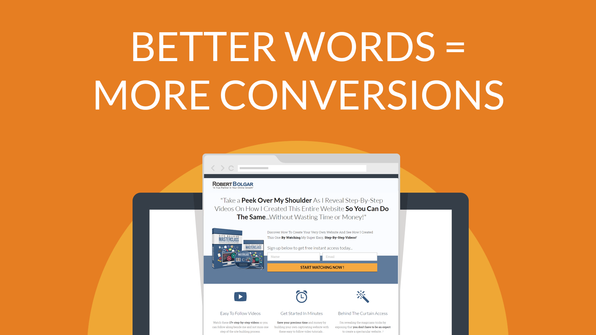
Avoid using generic terms like “Click here” or “Submit” – these are bland and uninspiring. “Buy Now” and “Shop Now” are overly common as well.
But don’t overdo it by trying to use hyperbolic language like “instant results” and “revolutionary” – that comes off as insincere.
Think of the difference between these two CTAs:
- Click Here to Join the Group
- Become a VIP Member Today
Which uses more power words? Yes, the second one.
Always focus on being direct, positive, and relevant.
Words like “Unlock”, “Discover X Secrets in this Case Study”, “Start Now”, and “Limited Offer”, immediately draw your audience’s attention and appeal to their curiosity or emotions.
A quick hack is to think of what you want your audience to feel and find words that appeal to that emotion.
2. Use Relevant Visuals
For your CTAs, adding relevant and striking visuals can significantly uplift your click-through rates.

Example of a CTA Section Template in Thrive Architect
Choose images, icons, or graphics that align with your CTA's message.
Imagine using an image that showcases the benefit of your offer – this not only captures attention but also communicates your value proposition more effectively than words alone.
But, be mindful of the size and placement of these visuals.
They should be eye-catching but not overwhelming, subtly guiding the user’s gaze toward your CTA button. Make sure that there’s ample white space between your text and images as well for easy reading.
Well-placed icons or arrows can be particularly effective in steering attention in the right direction.
3. Highlight the Benefits in Your CTA Section
Users are more likely to take action when they clearly understand what's in it for them. Therefore, your CTA should succinctly communicate the value proposition.
For example, “Get Your Free Customized Diet Plan” or “Start Saving 20% on Your Bills Today” instantly inform users of the tangible rewards they can expect.
This approach shifts the focus from the action itself (clicking) to the positive outcome of that action, making the CTA more compelling and directly relevant to the user’s interests and needs.
4. Create a Sense of Urgency
When users feel that they might miss out on something valuable if they don't act quickly, they are more inclined to take immediate action.
Phrases like “Limited Time Offer”, “Hurry, Sales End Soon” and “Only X Spots Left for this Webinar” are effective CTAs that appeal to your potential customers’ FOMO (Fear of Missing Out) and pushes them to click.
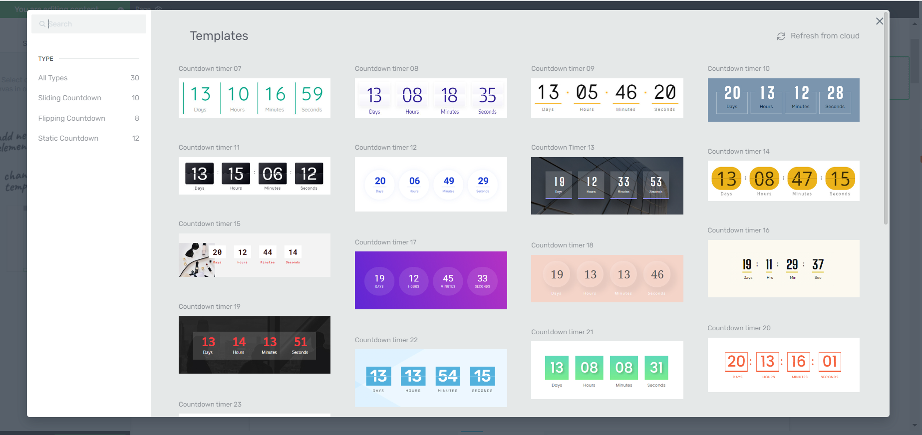
Countdown Timers in Thrive Architect
Using design elements like countdown timers and dwindling supply indicators can also help boost your CTA click-through rates.
However, use this strategy sparingly to avoid eroding trust with your audience in the long run.
5. Include Social Proof
Social proof, in the form of customer testimonials, user reviews, or endorsement counters, demonstrates the value and popularity of your offer, making new users more comfortable and inclined to engage.
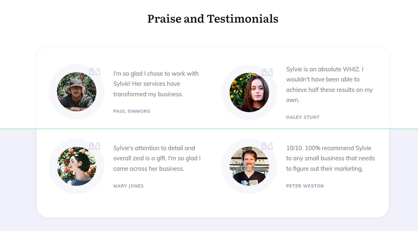
Testimonial block example
For example, adding a simple line like “Join 10,000+ Happy Subscribers” or “Rated 4.9/5 by Over 5,000 Customers” near your CTA can be very persuasive.
It provides tangible evidence of others’ positive experiences, which can be a powerful motivator for potential customers.
The key is to present this social proof in a way that complements your CTA, without overshadowing the action you want the user to take
6. Make Your CTA Stand Out
Your CTA buttons shouldn’t blend in with your landing pages or forms, otherwise they’ll be missed.
Visually, your CTA section should be one of the focal points on your page, guiding your audience’s eye toward it naturally.
So, choose contrasting colors to ensure your CTA button pops – but don’t clash with the overall color scheme.
Also consider adding spacing between your call-to-action buttons and accompanying text for better readability, too. The same applies for your overall CTA section and the rest of your landing page.
Avoid reducing any margins or padding on your landing page templates, as they’re usually set that way to ensure your pages can be read and interacted with easily on all devices.
You can also use bold headlines and text highlights to make your CTA headlines stand out.
Top landing page builders like Thrive Architect include a set of attention-grabbing text highlights – and you don’t need to know how to code to use them.
7. Use Multiple CTAs and Place Them Strategically
Your landing pages should have 2 to 3 call to action sections – depending on the length of your page.
The best places to put calls-to-action are:
A header (e.g. a Click to Call button)
Hero section
Middle of the page after the features & benefits section
Towards the end of the page (possibly after a few testimonials)
The footer
Space out your CTA sections on your page to prevent them from overwhelming your audience.
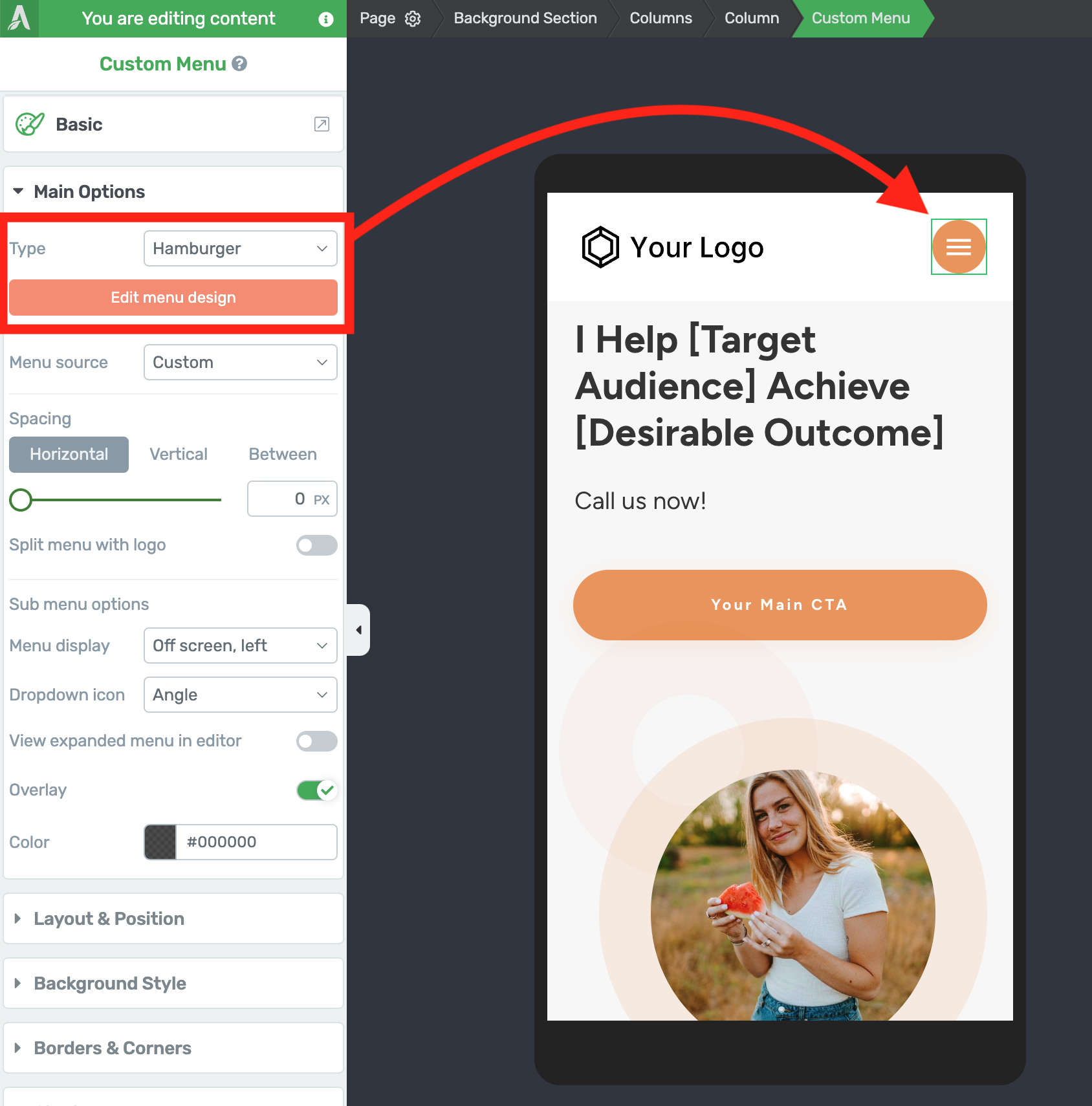
8. Make Your CTA Sections Mobile-Friendly
If your landing pages aren’t optimized for mobile, you’ll lose a lot of conversions.
Your audience should be able to easily scroll, zoom in, and select clickable elements on your pages from desktops, tablets, and mobile devices.
This improves the user experience and increases the chances of your target audience scrolling through your page and, eventually converting.
The easiest way to do this is to use a page builder that comes with built-in mobile optimization features.
9. A/B Test Your Pages to Track Key Metrics
The best way to know what’s helping (or hurting) your landing page conversion rates is through A/B testing.

By testing different versions of your landing pages and forms, you can identify the best colors, placements, and text for each CTA section.
Next Steps: Set Up Your First A/B Test
As you make changes to your landing pages and forms, you’ll need to keep track of what’s contributing to increased conversion rates.
The best way to do this is by running an A/B test.
For beginners who are new to this strategy, here’s a free video tutorial from Tony, showing you how to set up an A/B test to boost conversions:
Boost Call-to-Action
Click-Through Rates to Grow Revenue
With these key tips, you can make a big change to your conversion rates and see more results from your marketing campaigns.
And you don’t need to be an expert marketer or designer to make that happen.
As you focus on optimizing your landing pages for more conversions, start thinking about how to drive more traffic to your website, too.
Here are 4 free resources/tutorials to help you grow your audience and direct them to your site:
- How to Create SEO-Friendly Blog Posts Users and Bots Will Love (14 Tips)
- 9 Content Marketing Hacks to Grow Your Online Business
- 7 Keyword Research Tips for the Busy Entrepreneur
- 13 Copywriting Tips for Beginners (How to Write Like a Pro)
And if you feel like your current landing pages are in need of a big change, then you should consider using Thrive Architect, our landing page plugin.
Thrive Architect makes page design easy – really easy. Saving you time in learning so you can focus on creating the web pages, landing pages, and sales funnels you need to generate leads and sales.
This plugin gives you access to hundreds of customizable templates to create stunning webpages that leave your audience going “Wow. I want to learn more about this business”.
Every page template was built with conversion generation in mind, so you’ll find all the crucial elements you need to guide your site visitors to buy or sign up.
Interested?
Learn more about the landing page plugin that could transform your online business.


