
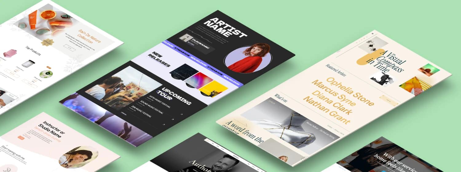

TL;DR: Advanced Website Customization Made Simple
If you’re here, you’re past the point of just changing colors and fonts. You’re looking for genuine control over your digital assets. Advanced website customization isn't about cosmetic tweaks; it’s the strategic alignment of your site's architecture, data, and intelligence systems to deliver personalized, high-converting experiences using dynamic content.
A truly customized website feels like it was built for the visitor, not just at them.
What Advanced Customization Really Means:
It’s the ability to control all three layers of your website: the Data (your content structure), the Logic (how the content behaves), and the Interface (what the user sees). This control is the foundation of modern component-driven design.
The 3 Biggest Mistakes Beginners Make:
- Designing first, structuring later: You need a solid data model before you start building layouts. Otherwise, you’re building a beautiful house on quicksand.
- Relying on bloated plugins: Customization should reduce complexity, not add 15 new dependencies that slow you down and create security headaches.
- Ignoring performance: A custom site that loads slowly is a custom failure. Speed is part of the experience.
The 3 Most Powerful Strategies:
- Visual Coding: Using tools that give you the speed of a builder with the granular control of code (like Thrive Architect).
- Structural Data Modeling: Organizing your content using custom fields and post types to unlock dynamic content layouts.
- AI-Powered Personalization: Using intelligence to adapt content blocks and CTAs based on user behavior.
At Thrive, I see this through the lens of conversion. Our Theme Builder provides the architectural foundation, Architect delivers the custom layouts and visual coding control, and tools like Conditional Display and Apprentice allow for the structural and logical customization required for modern, adaptive websites.
We’re in the era of powerful websites.
For years, when someone mentioned website customization, I pictured a designer agonizing over the perfect hex code or a developer wrestling with CSS overrides. That era is over.
If your goal is to build a business asset—not just a brochure—then advanced website customization is less about aesthetics and more about strategic engineering. It’s the difference between painting a room and designing a custom-built house tailored perfectly to your family’s needs.
The industry has moved rapidly: from rigid templates to modular designs, then to component systems, and now, we’re entering an age of AI-driven, adaptive interfaces.
Today, the reader's expectation is simple, yet profound: Make my website feel like it was built for me, not for everyone. If you can meet that expectation, you win. (Meeting expectations is just the start; if you want to truly crush your goals, we can show you How to Increase Conversion Rates (25+ Tips).)
The Four Pillars of Advanced Customization
To achieve this level of strategic control, we need to focus on four core pillars that guide true advanced customization:
- Architecture: The underlying data, structure, and systems.
- Experience: The visual identity, layout, and interaction design.
- Intelligence: The use of AI and logic for personalization.
- Performance & Security: The invisible backbone that makes everything fast and reliable.
💡 Before you even think about layouts, you really need a solid strategy, so check out our guide on How to Plan a Website (Like Someone Who Wants Results).
What “Advanced Website Customization” Actually Means Today (Control Over Dynamic Content)
I often hear people confuse customization with simple styling. Let’s clear that up immediately.
A website is fundamentally made of three layers:
- Data: This is your content—the text, images, products, user profiles, and settings.
- Logic: This is how the data behaves and interacts—the rules, the conditional displays, the workflows, and the navigation structure.
- Interface: This is the visual layer—what the user sees, clicks, and reads.
In the old days, customization meant tweaking the Interface (changing fonts, colors, layouts).
It’s a far cry from the limitations of WordPress Full Site Editing, which we cover in our analysis: WordPress FSE: Is It Time to Switch?.
Advanced website customization means controlling all three layers. It means structuring your data so that your logic can dynamically display the right interface to the right person at the right time.
It’s the difference between having a standard blog post template and having a dynamic course lesson template in Thrive Apprentice that automatically shows a progress bar, hides the next lesson until the previous one is complete, and displays a custom CTA based on the user’s subscription level. That requires control over data, logic, and interface to deliver truly dynamic content.
If you're building a membership site, you definitely need to compare the best Membership Site Platforms Compared to make sure your architecture can handle this level of complexity.
The Power of Integrated Tools
Building this level of control is hard if your tools are fighting each other.
Advanced customization works best when your theme, layouts, dynamic content, and conversion logic are designed as one system—not stitched together from five different plugins.
Thrive Suite was built for this exact stage: when you’ve outgrown templates and want structural control without developer dependency.
This Why the Old Way of Web Customization Is Broken (And How Component-Driven Design Fixes It)
If you’ve ever tried to make a significant change to a theme you didn't build, you know the pain. You edit a CSS file, and suddenly, three other elements break. This fragility is the hallmark of the old, broken customization paradigm.
The Old Way: A Recipe for Bloat and Anxiety
- One Theme, Endless Overrides: You start with a rigid theme and try to force it to do something it wasn't designed for, leading to layers of fragile custom CSS and JavaScript. It’s like trying to turn a sedan into a pickup truck with duct tape.
- Bloated Plugin Stacks: Every new feature requires a new plugin, creating dependency hell, security risks, and massive performance drag.
- No Content Structure: Content is dumped into a massive WYSIWYG editor, making it impossible to reuse or dynamically display in different contexts. (This is why the whole debate around Gutenberg vs Page Builder is so important for modern site architecture.)
The Modern Way: Component-Driven and Strategic Architecture
Modern web development has moved toward building systems, not just pages. This shift is driven by the need for speed, resilience, and adaptability.
1. Component-Driven Design
Instead of designing a page from top to bottom, you build reusable, self-contained blocks (components) that look and behave consistently across your site. Think of it like Lego.
If you change the color of the "Pricing Card" component, it updates everywhere that card is used. This approach minimizes repetitive design work and makes large-scale customization manageable. It’s the only way to scale design without losing your mind.
2. Structural Data Modeling
This is the most crucial architectural shift. You stop treating content as monolithic text blocks and start treating it as structured data. You use tools like custom fields and custom post types to define the type of content you have (e.g., "Team Member," "Product Feature," "Case Study").
This modeling is what unlocks **dynamic content**. When the data is structured, you can build a single template that automatically pulls the correct "Job Title" field for every team member, rather than manually updating 50 separate pages every time someone gets promoted.
3. Visual Coding Builders
Tools like Thrive Architect let you visually manipulate complex layouts while retaining the clean code structure necessary for performance and scale. This is the sweet spot: the speed of visual design combined with the reliability of modern, semantic HTML and CSS. You get the control of a developer without needing to write a single line of code unless you want to.
If you're still shopping around for the right visual tool, we compared the best options in our guide on Let’s Compare the Best Landing Page Plugins.
The Architectural Problem of WordPress Customization
This is where most WordPress sites quietly fall apart.
Not because the ideas are wrong—but because the tools weren’t designed to support them.
Component-driven design, dynamic templates, conditional logic, conversion-focused layouts…
These aren’t features you bolt on one by one without paying for it in speed, complexity, or maintenance stress.
Thrive Suite works because it treats customization as an architectural problem, not a design trick.
One foundation. One logic system. One conversion layer.
That’s how you move from “custom-looking” to strategically customizable.
→ See why Thrive Suite is built for this level of control
The 3 Levels of Advanced Customization
To help you strategize, I like to break down customization into three manageable levels. You don't have to jump to Level 3 immediately, but you should understand the roadmap.
Level 1: Visual Customization (Design + Layout)
This is the foundation. It’s where you establish your brand identity and layout systems.
Level 1 Focus: Consistency and Global Styles
- Visual CSS Control: Using a builder to control margins, padding, typography, and colors without writing code. (And speaking of colors, you need to make sure you Update Your Website Color Scheme the Smart Way to drive action, not just look pretty.)
- Tokens & Global Styles: Defining your brand variables (colors, fonts, sizes) globally so a single change updates the entire site instantly. This is essential for maintaining consistency.
- Micro-Interactions: Adding subtle animations and hover effects to guide the user's eye. (Don't forget the subtle touches—you can learn more about The Power of Motion: How to Use Animation in Web Design to guide your users without distracting them.)
Thrive Tie-In: Thrive Theme Builder handles your global architecture, while global elements ensure consistency across headers, footers, and sidebars.
Level 2: Structural Customization (Data + Logic for Dynamic Content)
This is where the website starts thinking for itself. You move beyond static pages and into dynamic content systems. This is the level that delivers the most immediate ROI for marketers.
Level 2 Focus: Dynamic Content and Personalization
- Custom Fields & Post Types: Defining specific data points for specific content types (e.g., adding a "Speaker Bio" field to an event post).
- Dynamic Templates: Creating a single template that automatically pulls in the correct data based on the content type (e.g., all your course lessons use the same dynamic template).
- Conditional Display Logic: Showing or hiding entire sections, blocks, or CTAs based on who the user is, where they came from, or what they’ve already done.
Thrive Tie-In: Thrive Architect’s dynamic placeholders pull in custom field data seamlessly. Our Conditional Display feature is the perfect tool for setting up audience-based personalization rules.
Level 3: Architectural Customization (Decoupled Systems and AI Integration)
This is the cutting edge, reserved for complex applications, large-scale publishing, or businesses needing extreme performance and flexibility. This level deals with how the website is fundamentally built and served.
When to Consider Decoupled Architecture
The term "headless" or **decoupled architecture** means separating your content management system (CMS, often WordPress) from your presentation layer (the frontend the user sees). Your content lives in WordPress, but it’s displayed on a lightning-fast frontend built with modern frameworks like React or Vue (e.g., Next.js or Gatsby).
💡This architectural choice is a big commitment, so make sure you weigh the pros and cons against traditional WordPress in our SaaS vs. WordPress comparison.
When Decoupled Architecture is Necessary (Level 3)
You should only consider this when:
- Extreme Performance is Non-Negotiable: You need sub-second load times globally, often required for high-traffic e-commerce or publishing sites.
- Omnichannel Delivery: You need your content to feed not just your website, but also a dedicated mobile app, smart displays, or other external platforms.
- Specialized Frontend Needs: Your interface requires complex, application-like functionality that is difficult or impossible to achieve efficiently within the constraints of a traditional CMS theme.
For the majority of businesses, the overhead and complexity of managing two separate systems (the CMS backend and the custom frontend) are not worth the marginal performance gain. A well-optimized, traditional WordPress setup is usually the smarter, more efficient choice.
- Custom API Integrations: Connecting your website directly to external services (CRM, payment gateways, custom databases) to exchange data in real-time, often bypassing standard plugin functionality.
- AI-Driven Layouts: Using machine learning to generate personalized content recommendations or even dynamically adjust the layout based on real-time user behavior.
The Conversion Layer: Customizing With Intent and Dynamic Content
If you’re going to invest in advanced website customization, it must serve a business goal. Customization without a conversion focus is just expensive hobby work.
I customize not to be flashy, but to remove friction and increase clarity.
Customization Must Drive Conversion
- Custom Layouts Improve Flow: A custom-designed landing page, free of distractions, will always outperform a generic theme page when the goal is a specific opt-in or purchase. (To really nail that flow, you need our Ultimate Landing Page Guide to Get Real Results which breaks down the 3P Conversion Framework.)
- Consistency = Credibility: When your design tokens and components are consistent, your site feels professional and credible. Credibility is a prerequisite for conversion.
- Dynamic CTAs: Instead of showing a static "Buy Now" button to everyone, you use conditional logic to show:
- "Download Free Guide" to a first-time visitor.
- "Start Your Trial" to a returning visitor who read three features pages.
- "Log In" to an existing customer.
This is where the power of tools like Thrive’s Conditional Display truly shines. You are customizing the experience based on the user's journey, making the call-to-action feel inevitable, not intrusive.
Metrics That Matter: Customization and ROI
The real strategic value of advanced customization is its direct impact on your bottom line. When you move from static design to dynamic logic, you are essentially optimizing the sales floor.
ROI of Dynamic Customization (Case Studies)
- Optimizing Form Fields: By using custom fields and dynamic logic to auto-populate known information or remove unnecessary steps (e.g., hiding the name field if the user is logged in), you can see a measurable lift in form completion rates. I've seen clients achieve a 15% increase in lead generation simply by personalizing form fields based on known data. (If you want to maximize those lead gen results, you absolutely need to A/B Test Opt-In Forms like a smart marketer.)
- Dynamic Lead Magnets: Showing a highly relevant, context-specific lead magnet (e.g., a "Checklist for SaaS" on a SaaS-related blog post, versus a generic newsletter signup) can dramatically improve opt-in quality and volume. This shift often results in a 20-30% higher conversion rate on lead magnet pages. (If you're still using lame freebies, you need to read our guide on How to Get Lead Magnets Right to make sure your offers are irresistible.)
- Personalized Checkout Flows: For membership sites or e-commerce, using conditional logic to streamline the checkout process—showing only relevant upsells or payment options based on the user's history—reduces cart abandonment. This strategic friction reduction can lead to a 5-10% improvement in purchase completion.
The 7 Core Techniques of Advanced Website Customization
To move from Level 1 to Level 2 and beyond, you need to master these techniques.
1. Structured Data Modeling
Think of your website content not as paragraphs, but as data points. Structured data modeling is simply organizing that data strategically.
If you are building a recipe site, you don't just put the ingredients in the body text. You create custom fields for "Prep Time," "Cook Time," "Ingredients List," and "Allergens." This is like adding columns in a spreadsheet for your content.
💡This structured approach is also perfect for creating professional documentation, like using our proven Best Case Study Template to showcase client results.
Why this matters: Structured data unlocks dynamic templates and personalization. You can now build a single template that automatically displays the Prep Time in a visually distinct box on every recipe page.
2. Component & Token-Based Design
This is the secret to scaling design without breaking consistency.
- Design Tokens: These are named entities that store visual properties (e.g.,
$primary-color: #007bff,$font-size-large: 24px). When you change the token definition, every element using that token updates. - Components: These are reusable, self-contained UI blocks (e.g., a pricing table, a testimonial slider, a header navigation).
Using components eliminates repetitive design work and ensures that your website looks and feels like a single, cohesive product, no matter how many pages you have.
3. Visual Coding
Visual coding is the sweet spot between drag-and-drop simplicity and true code power. It's not "no-code" (which often limits control); it's a visual interface for generating clean, semantic code.
Tools like Thrive Architect give you the ability to manipulate complex CSS properties (like flexbox and grid layouts) through a visual interface, letting you design custom layouts quickly while maintaining the performance benefits of clean code.
4. Decoupled Architecture (Headless)
The concept is straightforward: Your content (data) is managed in one system (the CMS), and the presentation layer (the interface) is built and served separately. They communicate via an API.
When to use it: When your business demands Level 3 customization—extreme speed, complex application interfaces, or the need to feed content to multiple platforms beyond the main website. For everyone else, focus on optimizing your traditional setup first.
5. AI-Assisted Personalization & Generation
AI is quickly becoming the ultimate tool for advanced website customization.
- Predictive Content Blocks: AI analyzes user behavior and predicts the most relevant next piece of content or product to display.
- Generative UI: In the near future, AI won't just suggest content; it will dynamically adjust the entire layout of a page based on whether the user is a first-time visitor or a repeat buyer.
6. Security-by-Design in Custom Environments
When you customize, you take on more responsibility. Every piece of custom code, every external API connection, is a potential vulnerability if not handled correctly.
Safe Custom Code Practices:
- Input Validation: Never trust user input. Always sanitize data coming into your system.
- Dependency Audits: Regularly check any external libraries or plugins you use for known security issues.
- Use Frameworks: Stick to established, secure frameworks (like the architecture provided by Thrive) rather than writing raw, unvetted code from scratch.
7. Performance as a Customization Constraint
Performance is not a feature you add later; it’s a design decision you make upfront. A website built with advanced customization must be fast, or the effort is wasted.
Techniques like lazy loading (only loading images when they enter the viewport) and code splitting (only loading the JavaScript necessary for a specific page) are essential parts of modern, custom web design. If your customization choices hurt your Core Web Vitals, you are actively damaging your business.
Proprietary vs. Open Source: Choosing Your Customization Path
When you choose tools for advanced customization, you are essentially choosing an ecosystem. The decision often boils down to proprietary (like Thrive Suite) versus open-source (like pure WordPress combined with modern frameworks). There is no "better" choice, only the choice that best fits your technical skill, budget, and speed requirements.
Proprietary vs. Open Source Ecosystems for Customization
Feature | Integrated Proprietary Suite (e.g., Thrive) | Open Source / Decoupled (e.g., WordPress + React) |
|---|---|---|
Speed of Deployment | Fast. Tools are pre-integrated and designed to work together out of the box. | Slow. Requires significant initial setup, configuration, and integration between systems. |
Maintenance Overhead | Low. Updates are managed by a single vendor; fewer dependency conflicts. | High. You are responsible for integrating, updating, and troubleshooting every component. |
Conversion Focus | High. Tools are explicitly built around marketing, testing, and conversion logic. | Low/Neutral. Requires custom development to add specific conversion features. |
Vendor Lock-In | Moderate. You rely on the vendor's continued support and development. | Low. You own the code, but you still rely on the community and specific framework updates. |
Ideal User | Marketers, entrepreneurs, agencies prioritizing speed, integration, and Level 1/2 customization. | Developers, enterprises, or sites requiring extreme Level 3 customization and omnichannel delivery. |
For most businesses focused on digital marketing, courses, and lead generation, the efficiency and pre-built conversion logic of an integrated proprietary suite will deliver ROI faster and with less maintenance anxiety. You are paying for the integration and the strategic focus.
If your primary goal is to build a complex software application that happens to use WordPress for content management, then the flexibility of a decoupled, open-source approach is likely necessary, provided you have the dedicated development resources to manage it.
Advanced Customization With Thrive Suite (The Practitioner Way)
You don't need a massive development team to start applying these advanced concepts. Thrive Suite is built to bring Level 2 customization (Structural and Logic) within reach of smart marketers and entrepreneurs.
Thrive Suite Tools for Advanced Customization
Technique | Thrive Tool | How It Enables Advanced Customization |
|---|---|---|
Global Architecture | Theme Builder | Defines the site structure, global headers, footers, and templates for post types, ensuring consistency and easy maintenance. |
Dynamic Content | Thrive Architect | Use dynamic placeholders to pull in custom field data, ensuring content is reusable and templates are efficient. |
Conditional Logic | Conditional Display | Show specific content blocks, CTAs, or entire sections based on user login status, membership level, or tags. Essential for personalization. |
Structured Content | Thrive Apprentice | Builds robust course and membership structures, automatically creating dynamic lesson templates and managing access logic. |
Conversion Focus | Smart Widgets & Opt-ins | Deploy custom, high-converting forms and widgets that can be dynamically placed and targeted using the other tools. |
Avoid These 10 Common Mistakes
If you’re serious about advanced website customization, steer clear of these pitfalls:
Top 10 Advanced Customization Mistakes to Avoid
- Designing first, structuring later. Define your content model (custom fields) before you touch the visual layout.
- Over-relying on animations. Subtle is smart; excessive animation is distracting and hurts performance.
- Ignoring mobile-first design. Customization must start with the smallest screen.
- Mixing too many page builders. Pick one robust solution and stick to its ecosystem for consistency and performance.
- Customizing without tracking performance impact. Always measure Core Web Vitals before and after significant changes.
- Building static content that should be dynamic. If you copy and paste the same element across 10 pages, you should have built it as a reusable component or dynamic block.
- Failing to document custom logic. If you use complex conditional display rules, write them down. Your future self will thank you.
- Using weak, non-semantic code. Make sure your visual builder generates clean HTML that search engines can easily understand.
- Over-optimizing for the 1% use case. Build for your 80% audience first, then add conditional logic for the edge cases.
- Treating security as an afterthought. Custom environments require proactive security measures.
Your Customization Roadmap
Feeling overwhelmed? Don't be. Advanced customization is a journey, not a destination. Here is a realistic path forward:
The Step-by-Step Customization Roadmap
- Start with Templates: Use a robust theme builder (like Thrive Theme Builder) to establish a consistent global architecture.
- Move to Dynamic Content: Identify content types that are repeated (team members, resources, products) and define custom fields for them. Build your first dynamic template.
- Implement Tokens & Components: Define your brand colors and typography as global styles. Convert repetitive blocks into reusable components. This is the core of component-driven design.
- Add Conditional Logic: Use tools like Conditional Display to show targeted CTAs or content based on simple rules (e.g., logged-in vs. logged-out).
- Explore API Integrations: Connect your site to your CRM or marketing automation tool to exchange data.
- Finally, Decoupled/AI Personalization: Consider decoupled architecture or advanced AI tools only when your business scale demands extreme performance or hyper-personalization.
FAQ: Quick Answers to the Questions People Actually Ask
The Future of Website Customization Is Composable and Intelligent
The era of static, one-size-fits-all websites is over. The future of advanced website customization is about building composable, intelligent systems that adapt in real-time. This is the promise of component-driven design.
It’s not about being the flashiest site on the internet. It’s about building a website that grows with your business, adapts to your audience’s needs, and converts consistently because it feels perfectly tailored to the person viewing it.
This level of control requires a strategic mindset and the right tools. Focus on structuring your data, defining your logic, and using visual coding to execute your vision.
Your next step isn't to hire a developer; it's to look at your existing templates and ask: How can I make this dynamic? How can I make this conditional? That is the core of smart, conversion-focused customization.
The Strategic Advantage of Thrive Suite
Advanced customization isn’t about doing more—it’s about building smarter.
When your website is structured properly, logic replaces repetition.
Personalization replaces guesswork.
And conversion becomes a natural outcome of clarity, not pressure.
Thrive Suite exists for builders who are done hacking their way forward—
and ready to design a site that adapts, scales, and converts as the business grows.
If you’re serious about moving beyond static pages and into intelligent, conversion-aware architecture, this is where that shift starts.
Break tasks into subtasks
Checklist UI within tasks
Subtask completion tracking
File Attachments
Attach files to tasks
Image/document preview
S3 storage integration
Task Notes/Comments
Add notes to tasks
Timestamped comments
Voice notes
Quick Navigation: SaaS Landing Page Strategy
- TL;DR: The Strategy Behind the Screenshots
- Core Conversion Patterns (The 5 Rules)
- 5 High-Converting SaaS Landing Page Examples
- Pricing Page Psychology: The Final Hurdle
- Under-the-Radar Examples No One Talks About
- Step-by-Step Blueprint for Execution
- Frequently Asked Questions
TL;DR: The Strategy Behind the Screenshots
The Strategy Behind the Screenshots
If you’re here to skim, I get it. Your time is valuable, and your landing page needs to be built, not just admired.
This guide moves past pretty screenshots to dissect the structural and psychological patterns that make the best SaaS landing page examples actually generate revenue. I can tell you that the difference between a good page and a great one is often a matter of strategic structure and clear pricing presentation, not just aesthetics.
Here are the three most critical takeaways you’ll find inside:
- Clarity Always Wins: Your hero section must pass the “3-Second Blink Test.” If a visitor has to think about what you do, you’ve already lost the conversion.
- Show, Don’t Tell: Trust is built with visual proof. Replace abstract illustrations with high-fidelity UI screenshots, video loops, or optimized micro-demos that show the product in action.
- Structure is Conversion: The best pages follow a predictable, modular Z-Pattern flow that addresses skepticism sequentially, guiding the user from curiosity to commitment, including handling the final hurdle: the price.
If these strategic shifts sound like the difference between doubling your conversion rate and just tweaking a font, you might want to grab a coffee and read the full breakdown. I’ll show you exactly how to rebuild these patterns on your own site.
If you’re running a SaaS business, your landing page isn’t just a static document; it’s the engine of your unit economics. A page converting at 4% versus 2% can literally double your growth rate and extend your runway.
I’ve seen waaaay too many roundups of SaaS landing page examples that feel like digital mood boards. You know, pretty screenshots with zero strategic value. Your landing page is not design inspiration. It’s a carefully engineered conversion machine.
So, in this guide, I’m not just showing you beautiful pages. I’m walking through real-world SaaS landing page examples that teach something fundamental about psychology, data, and conversion patterns. More importantly, I’ll break down why they work and show you how to rebuild the same strategies on your own site using high-leverage, low-friction tools.
We’re going beyond aesthetics to focus on the structure, messaging, visual proof, and pricing presentation that turns skeptical visitors into paying subscribers.
If you’re ready to dive deeper into the mechanics of high-performance pages, check out This Is Your Ultimate Landing Page Guide to Get Real Results.
The Conversion Toolkit for Strategists
Want to get ahead of this?
When I’m building or rebuilding SaaS landing pages like the ones you’ve just seen, I use Thrive Suite for everything — structure, messaging, testing, and iteration — without duct-taping five different tools together.
It’s the fastest way I know to go from “this looks nice” to “this actually converts.”
👉 See what Thrive Suite gives you out of the box
SaaS Landing Page Best Practices: The Core Conversion Patterns
Before we dive into specific providers, you need a mental model. The best SaaS landing pages stick to a predictable set of rules because those rules align with how human brains process information and make decisions.
If you can master these five patterns, your page will already outperform 80% of the competition.
Pattern 1: The 3-Second Blink Test
When a visitor lands on your page, you have about three seconds to pass the “Blink Test.” This isn’t about looking nice; it’s about reducing cognitive load.
The 3-Second Rule: Clarity Over Cleverness
Your visitor must instantly understand three things from the hero section:
- What is this product? (The category: project management, SEO tool, design platform.)
- Who is it for? (The audience: marketing teams, developers, small business owners.)
- What does it do for me? (The transformation: save time, increase revenue, reduce errors.)
Most pages fail here because they lead with jargon or a clever, abstract headline that requires the visitor to think. Clarity always beats cleverness. If I have to scroll down to figure out what you sell, you’ve lost.
💡If you struggle with distilling your message, learning How to Write a Value Proposition that gets ’em in 5 seconds is a must.
And to see more examples of hero sections that nail this clarity test, I analyzed 50+ Hero Section Examples that stop the scroll.
Pattern 2: “Show, Don’t Tell” UI Realism
Abstract illustrations and stock photos are out. UI realism is in.
The best SaaS pages use high-fidelity screenshots, short video loops, or micro-demos to show the product in action immediately. This isn’t just about looking modern; it’s psychological.
Why UI Realism Builds Trust
Showing the interface:
- Builds Trust: It proves the product actually exists and works.
- Reduces Friction: It lets the visitor visualize themselves using the tool, making the barrier to entry feel lower.
- Demonstrates Quality: A clean, functional UI suggests a well-engineered product.
You don’t need a massive video player; a simple GIF or a Lottie animation showing a core feature loop is often enough to convey the value.
💡If you want to use motion without slowing things down, you should definitely read up on The Power of Motion: How to Use Animation in Web Design.
Pattern 3: The Z-Pattern Rhythm
SaaS landing pages rarely deviate from a predictable, conversion-optimized flow—the Z-Pattern. This rhythm guides the eye and builds trust incrementally.
- Hero Section: Instant clarity + primary CTA.
- Trust Bar: Logos of recognizable customers or media mentions (social proof).
- Feature-Benefit Zig-Zag: Modular sections alternating text and visuals, focusing on outcomes.
- Social Proof Wall: Testimonials, case studies, or review scores. (Speaking of social proof, if you’re using WordPress, here’s a quick guide on How to Add Google Reviews to a WordPress Website to instantly boost credibility.)
- CTA Squeeze: A final, prominent call to action before the footer.
This structure works because it addresses skepticism sequentially: What is it? → Who else uses it? → How does it help me? → Is it reliable? → Okay, sign me up.
If you’re trying to figure out the exact flow, this guide on the Optimal Landing Page Structure breaks down the science behind it.
Pattern 4: Objection Handling Through Smart FAQs
A high-converting page anticipates friction points. The FAQ section is your dedicated space for objection handling, not just a list of technical specifications.
Place a short FAQ section near the bottom, just above the final CTA. This placement catches the visitor who is 90% convinced but has one lingering doubt (e.g., Is it secure?, How long is the free trial?, Will it integrate with my existing tools?). Answering these questions preemptively removes the final barrier to conversion.
I also wrote a full breakdown on How to Handle Customer Objections that you should check out if you want to master this technique.
Pattern 5: Mobile-First Structure
While many signups happen on desktop, discovery often starts on mobile. You must optimize your page for the thumb-zone and the mobile mindset.
Mobile Optimization for Conversion
Mobile users are often scanning quickly. This means:
- Shorter Copy: Get to the point faster.
- Thumb-Zone CTA: Make sure the primary CTA is easily reachable with a thumb, often by using a sticky header or a prominent button placement.
- Efficient Scrolling: Use accordions or tabs to hide dense information, keeping the primary flow clean.
💡 To make sure your page is fully optimized for small screens, don’t miss these 5 Proven Mobile Landing Page Best Practices that get results.
Let’s Analyze 5 High-Converting SaaS Landing Page Examples
Let’s look at specific SaaS landing page examples and break down the actionable strategies you can steal.
[Example 1: Asana — Minimalist Focus, Maximal Clarity](https://asana.com/)
What’s Happening: Asana uses extreme whitespace, focused typography, and large, clean UI screenshots. The hero headline speaks to a high-level goal (“Work smarter, not harder”) before immediately clarifying the function (“Asana is the work management platform…”).
Asana’s Conversion Insight: Goals Over Features
Why It Works: The cognitive ease is paramount. The clean design suggests the product itself is simple and easy to use, which is a massive selling point in the crowded project management space. Crucially, the copy focuses on goals (getting results) rather than features (managing tasks). I particularly like how they use the hero section to immediately define the category—work management—which cuts through the noise of competing apps.
What to Steal:
- Goals Over Features: Invert your messaging. Instead of “Our tool has X feature,” say “Achieve Y outcome using our tool.”
- Whitespace Discipline: Use empty space intentionally to draw the eye to the headline and the single, focused CTA.
- Single CTA Focus: Asana’s hero has one clear path: “Get Started.” No distractions.
Rebuilding Asana’s Strategy in Thrive Architect
|
Strategy |
How to Rebuild in Thrive Architect |
|---|---|
|
Simple Hero |
Use a two-column layout. Left for the headline/CTA, right for a clean, looping GIF or Lottie animation of your UI. |
|
Whitespace |
Use the Spacing and Padding controls aggressively to create visual breathing room around key elements. |
|
Sticky CTA |
Set up a sticky header or bottom bar with a single, high-contrast CTA button that follows the user as you scroll. |
If you want your buttons to really pop, I put together 9 Hacks to Boost Your Call-to-Action Click-Through Rates that are worth testing.
[Example 2: Ahrefs — High-Density Proof for High-Sophistication Buyers](https://ahrefs.com/)
What’s Happening: Ahrefs’ landing pages are data-heavy, featuring expert language, dense dashboards, and immediate proof points (e.g., “Trusted by the world’s leading SEOs”).
Ahrefs’ Conversion Insight: Density Signals Credibility
Why It Works: Ahrefs knows its audience—professional SEOs and marketers who are highly technical and skeptical. For this persona, dense design signals credibility and depth. They are selling a sophisticated tool to sophisticated users, so they don’t shy away from complex data visualizations. I thought their approach to matching information density to buyer sophistication was brilliant; they don’t try to appeal to everyone, just the people who matter.
What to Steal:
- Match Density to Buyer: If your product is complex (e.g., enterprise software, financial tools), don’t dumb down the page. Use proof-first copy and show complex data to establish authority.
- Expert Language: Use the specific jargon your audience uses. It shows you understand their world.
- Proof-First: Lead with data, not promises. Show charts, metrics, and specific outcomes.
[Example 3: Canva — JTBD Personalization at Scale](https://www.canva.com/)
What’s Happening: Canva excels at creating thousands of job-specific landing pages (e.g., “Instagram Story Maker,” “Presentation Creator”). The hero section often allows the user to “start creating” instantly, offering instant value before requiring a sign-up.
Canva’s Conversion Insight: Instant Gratification
Why It Works: This approach uses the “Jobs-to-Be-Done” (JTBD) framework perfectly. Users arrive with a specific task in mind, and Canva immediately lets them experience the emotional win of completing that task. This creates the endowment effect—once they’ve invested a few minutes creating something, they are far more likely to sign up to save it. I find this strategy highly effective because it delivers instant gratification, reducing the perceived risk of signing up.
What to Steal:
- Preview Outcomes: Let users preview the result or interact with a limited version of the tool before demanding an email address.
- Niche Pages: Identify 5–10 high-intent use cases for your product and build hyper-specific landing pages for each one.
- Zero Friction Hero: Reduce the barrier to entry in the hero section to the absolute minimum.
A great hero starts with a great headline, and I’ve got some killer tips on How to Make Headlines Stand Out if you need help with that.
[Example 4: Zoom — Segmented Landing Pages Done Right](https://www.zoom.com/)
What’s Happening: Zoom uses segmented landing pages targeting specific industries (Healthcare, Education, Financial Services). The messaging, hero visuals, and social proof change drastically to reflect the needs and compliance requirements of that niche.
Zoom’s Conversion Insight: Deep Relevance Accelerates Trust
Why It Works: Trust accelerates conversion, especially in regulated fields. By speaking directly to a niche, Zoom reduces skepticism. A doctor visiting the Healthcare page sees HIPAA compliance badges and testimonials from hospital systems, which is far more convincing than a generic “video conferencing” page.
What I appreciate here is the discipline to sacrifice broad appeal for deep relevance to a high-value segment.
💡 This strategy is basically the core of Niche Marketing Strategies: selling without targeting everyone, which is super smart.
What to Steal:
- Build Audience Versions: Create 3–5 audience-specific versions of your core landing page.
- Compliance-First: If your audience requires security or regulatory assurances, make those badges and trust markers highly visible.
[Example 5: Slack — The Brand Voice Anti-SaaS Approach](https://slack.com/)
What’s Happening: Slack uses human-first illustrations, a conversational tone, and a focus on team connection rather than technical complexity. Their design breaks the mold of cold, corporate SaaS.
Slack’s Conversion Insight: Tone as a Competitive Advantage
Why It Works: Slack is selling a human category (communication). By using personality, warmth, and relatable illustrations, they differentiate themselves from sterile enterprise software. They prioritize connection and ease-of-use over feature lists. I thought this was a risky but successful move; they used tone as a competitive advantage in a crowded market.
What to Steal:
- Break the Mold: If everyone in your niche uses cold, corporate design, use tone and personality as your differentiator. (Honestly, the whole industry needs a shake-up, and I think my thoughts on why SaaS Marketing Is Broken and how to fix it are pretty relevant here.)
- Human Storytelling: Focus on the emotional benefit (less stress, more connection, better collaboration) rather than just the functional benefit.
The Conversion Gap: Where Most Pages Fail
Knowing why great SaaS pages work is one thing.Actually rebuilding those patterns — clean Z-flows, segmented messaging, pricing psychology, fast load times — is where people get stuck.
Usually because their tools aren’t built for conversion thinking.
Not by adding more complexity — but by giving you one conversion-first system where:
- Structure comes first (not decoration)
- Messaging, proof, and CTAs are designed together
- Testing and iteration are baked in, not bolted on later
So instead of fighting your page builder, you can focus on the work that actually moves the needle: clarity, trust, and momentum.
👉 Build landing pages like a strategist, not a decorator
Pricing Page Psychology: The Final Conversion Hurdle
Now that we’ve covered several top Saas landing page examples you can copy, let’s move on to a real key factor: PRICING.
Your pricing page, or the pricing section on your landing page, is often the final landing page before conversion.
You need to present your offer in a way that minimizes decision fatigue and maximizes perceived value.
The best SaaS companies use psychological triggers to guide the visitor to the right plan.
1. Pricing Placement: When to Show the Money
The decision of where to place pricing depends entirely on your product model.
Pricing Placement Strategy by Product Model
|
Model |
Pricing Strategy |
Example Analysis |
|---|---|---|
|
Freemium/Free Trial (Low Friction) |
Price is secondary. Lead with the “Free” CTA in the hero. |
Asana, Canva, Slack: They offer a clear path to start for free. The landing page focuses on the product experience, deferring detailed pricing until the user is invested. |
|
High-Cost/Enterprise (High Friction) |
Price is often hidden or requires a “Contact Sales” CTA. |
Zoom: For enterprise segments, they focus on compliance and features, knowing the price will be negotiated later. The landing page is a lead qualification tool. |
|
Tool/Utility (Mid-Friction) |
Price is clearly linked or displayed lower on the page, after value is established. |
Ahrefs: They display clear pricing tiers, but only after the page has established their authority and the depth of their data. The price justifies the high value. |
The Rule: If you have a free option, make that the primary conversion goal of the landing page. If you require a commitment, make sure the visitor has seen all the value and proof before they see the price.
Your pricing page deserves its own deep dive, so make sure you read How to Customize Your Pricing Page for More Sales—it’s more than just listing numbers.
2. Anchoring and Decoy Effects
Anchoring is the psychological principle where the first piece of information offered (the anchor) influences subsequent judgments.
- The Decoy: Introduce a high-cost, high-friction plan that you don’t necessarily expect people to buy. This makes the next-highest plan—the one you want them to buy—look significantly more reasonable and valuable by comparison.
- Highlighting the Winner: Use visual cues (a different color, a bold border, a “Most Popular” badge) to guide users to the plan that offers the best balance of features and profit margin for your business.
How to Implement: When building your pricing table, make sure the plan you want users to select is visually distinct and placed between a cheaper, less-featured plan and a more expensive, feature-heavy plan.
If you’re building your site on WordPress, I show you two easy methods for How to Add a WordPress Pricing Table that actually converts.
3. Framing Value, Not Cost
Never let the conversation be about the dollar amount; it must always be about the ROI and the value delivered.
- Focus on the Outcome: Instead of saying “$99/month,” say “Less than $3.50 a day to save 10 hours a week.”
- Annual Discounting: Present the monthly price, but heavily incentivize the annual commitment (e.g., “Save 20% by paying annually”). This locks in revenue and reduces churn.
- Feature Gating: Make sure the features gated behind higher tiers are truly valuable and solve a specific pain point for that advanced user segment.
A Word of Caution: Don’t try to trick people with pricing. Use these psychological triggers to clarify the best option, not to confuse the buyer. Transparency builds trust, and trust is the ultimate conversion driver.
Under-the-Radar Examples No One Talks About
To give you a competitive edge, let’s look at a few less obvious SaaS landing page examples that offer powerful, niche lessons.
The “Anti-Design” Brutalist SaaS Page
For developer tools or niche technical products, you sometimes see a brutalist or anti-design approach (think mono fonts, high-contrast colors, bold borders, and minimal styling).
What It Signals: This design signals authenticity, rawness, and a focus on function over polish. For a developer audience, this translates to: “We spent our time building a powerful tool, not a fancy website.”
How to Replicate the Energy: You don’t need to destroy usability. Use intentional contrast, high-information density, and a straightforward layout. Use bold borders and system fonts to achieve the aesthetic without sacrificing clarity.
A Micro-SaaS Example with Perfect Clarity
Micro-SaaS companies (single function, niche audience) are forced into supreme clarity because they have only one thing to sell. Their landing pages are often masterpieces of focus.
What Big Companies Can Learn: If a micro-SaaS page takes 10 seconds to explain its value, a complex tool should aim for 30 seconds, not 3 minutes. Learn to strip away every unnecessary element and focus the entire page on proving the value of that single, core function. This simplicity can be rebuilt into complex tools by dedicating specific landing pages to specific features.
An AI Tool That Uses Personalized Hero Messaging
The rise of adaptive landing pages means the hero headline changes based on firmographic data (e.g., industry, company size) or referral source.
How SMEs Can Recreate the Feeling: You don’t need complex AI. You can manually recreate this feeling using conditional content based on UTM parameters. For instance, if a user clicks a link tagged utm_source=linkedin_finance, you can conditionally display a hero headline that says, “Financial Teams: Stop Wasting Time on X.” This makes the visitor feel instantly understood.
How to Create and Execute a High-Converting SaaS Signup Page Design: A Step-by-Step Blueprint
Showing examples is one thing; building your own is another. Here is a blueprint for translating these strategies into action.
Step 1: Define the Outcome You’re Promising
Drop the jargon. Your H1 should not describe your product; it should describe the transformation your user experiences.
- Bad: “Integrated, multi-channel marketing automation platform.”
- Good: “Get 20% More Leads Without Hiring Another Person.”
Step 2: Decide on Your Information Density
Your page length and visual style should match your buyer’s sophistication level and the complexity of your product.
Information Density Strategy
|
Buyer Type |
Product Complexity |
Page Strategy |
|---|---|---|
|
Low Sophistication |
Simple, Low-Cost |
Short, visual, outcome-focused. |
|
High Sophistication |
Complex, High-Cost |
Long, data-heavy, use toggles/tabs for depth. |
For complex products, you could try using accordions, toggles, or tabs to create “density sections” that lets the interested user dive deeper without overwhelming the casual scanner.
Step 3: Pick Your Visual Strategy
Avoid generic illustrations unless they are highly branded (like Slack or Mailchimp). Your primary visual should be proof:
- UI realism (high-fidelity screenshots)
- Video loops (showing the product in use)
- GIF demos (highlighting a specific feature)
Step 4: Map Your Z-Pattern
Structure your page modularly. Before you start designing, write down the block structure:
- Hero (H1, CTA, Visual)
- Trust Wall (Logos)
- Benefit 1 (Outcome focus)
- Benefit 2 (Outcome focus)
- Social Proof (Testimonials)
- Objection Handling (Mini-FAQ)
- Final CTA Block
Step 5: Handle Objections Before They Kill the Conversion
Every SaaS product faces five common objections. Make sure your page addresses these, either in the copy or the FAQ:
- Cost: Is it worth the price? (Address with ROI or value proposition.)
- Time: How long does it take to set up? (Address with “Quick Start” copy.)
- Security/Trust: Is my data safe? (Address with badges/compliance.)
- Integration: Will it work with my existing stack? (Address with logo bar.)
- Risk: What if I hate it? (Address with free trial or money-back guarantee.)
Step 6: Speed is a Feature: Optimizing Performance for Conversion
Load time is not a technical detail; it is a conversion factor. If your page takes more than three seconds to load, your conversion rate drops significantly, and your bounce rate spikes. We aren’t just talking about general speed—we need to focus on the metrics that directly impact user experience and Google’s ranking factors, known as Core Web Vitals.
The most critical metric for a landing page is Largest Contentful Paint (LCP). This measures how quickly the main content (usually your hero headline and visual proof) loads. If your LCP is poor, the visitor can’t pass the 3-Second Blink Test, and they leave.
Here is how you can make sure your page loads fast and feels fast:
Prioritize Above-the-Fold Assets
The hero section must load instantly. This means the primary image, the H1, and the main CTA button should be prioritized by the browser. If you use a page builder, make sure it’s not loading unnecessary CSS or JavaScript for elements that are far down the page.
Use Efficient Visuals
Heavy video files and unoptimized UI screenshots are conversion killers.
- Compress Everything: Use modern image formats (like WebP) and compress all visuals, especially those large UI screenshots.
- Optimize Micro-Demos: If you use a GIF or a Lottie animation for your UI demo, you’ll want to keep it lightweight. A GIF should be under 500kb if possible.
- Lazy Load Below the Fold: Use native browser lazy loading for any image or video that is not immediately visible when the page loads. This frees up resources to load the critical LCP elements first.
Minimize Code Bloat
A lightweight page builder is essential here. Bloated code means the browser spends too much time parsing instructions before it can render the page. You’ll want to use tools that prioritize clean, efficient code and let you build pages without injecting excessive, unnecessary scripts.
Step 7: Optimize for Mobile (Not Just Responsiveness)
Don’t just shrink your desktop page. Write real mobile copy—shorter, tighter, and more direct. Make sure your primary CTA is always visible and actionable within the thumb-zone.
Implementation: Building High-Converting SaaS Landing Pages
This is where we move from theory to execution. I use tools like Thrive Architect because they let you rapidly prototype and test these sophisticated conversion patterns without needing a developer.
For those of you building these pages on WordPress, my Thrive Architect Review covers exactly how easy it is to set up these custom layouts without code.
Implementation Summary: How to Build High-Converting SaaS Landing Pages
Execution Summary: Building High-Converting Pages
|
Execution Step |
What You Do |
Why It Works |
|---|---|---|
|
Start with Smart Templates |
Use conversion-optimized landing page templates that already follow a Z-Pattern and include CTA, testimonial, and benefit blocks. |
Removes structural guesswork so you can focus on clarity, messaging, and outcomes instead of layout decisions. |
|
Segment with Conditional Display |
Swap headlines, visuals, and testimonials based on traffic source, campaign, or audience type. |
Makes each visitor feel like the page was built specifically for them — increasing relevance and conversion rate. |
|
Use Lightweight UI Previews |
Add looping GIFs or Lottie animations instead of heavy videos to show the product in action. |
Preserves speed and Core Web Vitals while still delivering visual proof and reducing friction. |
|
Clone for Jobs-to-Be-Done Pages |
Duplicate a high-converting master page and tweak the hero, visuals, and first testimonial for each use case. |
Lets you scale high-intent pages quickly without redesigning from scratch — perfect for SaaS growth funnels. |
Use Smart Landing Page Templates as Your Base
You’ll want to start with conversion-optimized templates that already follow the Z-Pattern and include modular blocks for testimonials, feature lists, and CTAs. This saves the cognitive load of designing structure and lets you focus purely on messaging.
Use Conditional Display to Build Segmented SaaS Pages
This is a high-leverage trick. If you know a visitor is coming from a specific campaign (e.g., a LinkedIn ad targeting small agencies), you can use Thrive’s conditional display features to automatically swap out the hero image, headline, and testimonials to match that segment. This makes the page feel deeply personalized.
Add Looping UI Previews Without Adding Weight
Heavy video files kill load time. Instead, use optimized GIF loops or Lottie animations for micro-demos. You can easily embed these into background sections or image elements, creating that essential UI realism without slowing down the page.
Build Hyper-Specific “Jobs-to-Be-Done” Pages Using Cloning
Once you have a high-converting master template, use the cloning feature to rapidly create variations. Change the hero headline, the main visual, and the first testimonial to target a new “job” or audience segment. This funnel logic—category page → job-specific page → conversion—is how you capture high-intent traffic efficiently.
Frequently Asked Questions About SaaS Landing Pages
A SaaS Landing Page Isn’t Just a Page — It’s a Product Feature
Every landing page is a promise. Every design choice affects trust.
The SaaS landing page examples we reviewed today are reminders that your page is the first feature your users ever experience. It requires the same care, iteration, and purpose as the product itself.
Start by setting up the Z-Pattern, obsessing over clarity, and using visual proof. Once you have that foundation, you can use tools like Thrive Architect to segment your audience, optimize your pricing presentation, and test your way to higher conversion rates.
Your next step is simple: Pick one strategy from this guide—maybe it’s inverting your headline to focus on the outcome, or maybe it’s adding a looping UI demo—and set it up on your highest-traffic landing page this week.
Your Landing Page is Part of Your Product
It’s not a one-off asset.It’s a system you refine — just like onboarding, pricing, and retention.
If you want pages that evolve, segment, and convert without rebuilding from scratch every time, you need tools that are designed for that reality.
That’s why I recommend Thrive Suite.
It gives you the leverage to turn everything you just learned — psychology, structure, proof, pricing — into a repeatable, scalable conversion engine inside WordPress.
No Franken-stack.No design-only tools pretending to care about results.Just a system built for people who want their pages to do their job.
