If you’re wondering how you can achieve an effect just like the one below, then keep on reading this article:

In this quick tutorial, we’ll have a look at the steps that you can take in order to add animations to an element from your opt-in form when it comes into viewport and also when you hover over it:
Access your opt-in form
First off, head over to your Thrive Leads dashboard, from the left sidebar navigation panel:
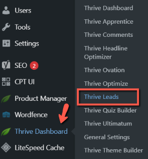
Find the form you want to work on, and go into the “Edit Design” mode:

Check out this quick start article about how to create and display your first Thrive Leads form.
If you’ve already chosen a template for your form, then the editor will load it by default; if not go ahead and choose one:

The form can have by default the element on which you want to apply animations or, naturally, you can add it for the right sidebar list of elements.
In this tutorial, I will be working with this “Image” element from my form, but keep in mind that the same steps described here can be used on other elements as well:

Apply an animation in ‘Normal state’
With your element selected, head over to the “Animation & Action” section of your left sidebar and click on it to expand it:
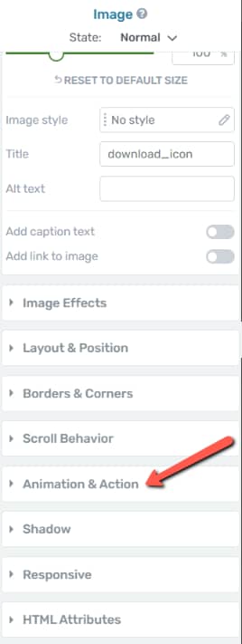
In this section, click on the “CSS Animation” option:
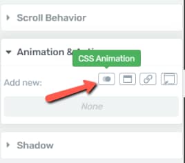
This will prompt you with a pop-up list of available animations:
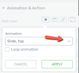
I’ve selected a “Rotate” type of animation (but you can simply select and go through each of them, and see a small preview of the action on the element itself):

Lastly, click on “Apply” to save your changes:

Add an animation in ‘Hover state’
You can now go ahead and apply an animation to the element that will be visible only when hovered over it.
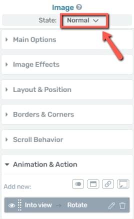
With the same element selected, click on the “Normal” state from the top part of the left sidebar list of options:
Select “Hover” from the list that opens:
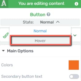
Now, any change that you will bring to the element will only be visible when you hover over it.
From here onwards, the same steps apply – you first have to open the “Animation & Action” section:

Select once more the “CSS Animation” option:
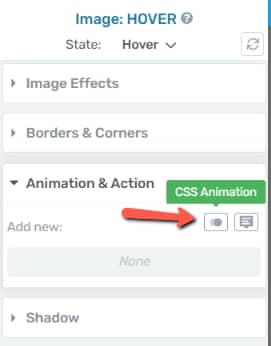
And here as well you will have a list of animations you can add to your element. Select it from the list and see how it looks like on the element itself:

Once done, click on “Apply” and return to the “Main Options”:
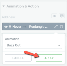
Your element should now have two separate animations added to it: one when it comes into the viewport, and then another one when hovered over.
Hopefully, this quick tutorial was useful to you, and as always, make sure to check out our knowledge base for more articles of this type.