If you want to learn how to add a “close” button to your form, then this article might be useful to you.
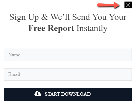
Usually, the opt-in form designs available in the Thrive Leads library come with a “close” button, from where the user can close the form:

You can also add it by yourself, should you want, with the help of the “Icon” element.
Step 1: Add the “Icon” element to your form
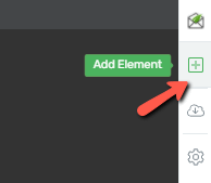
The first thing you need to do is to add the “Icon” element to your opt-in form, from the right sidebar:

Now look for the “Icon” element in the list, and once found, drag and drop it to your form:

Scroll through the available icon pack and choose the desired icon, or simply write the word “close” in the search field. Once you found the appropriate icon, select it and click on “Select”:

Step 2: Position the element
If you want to position the icon and set it in the right corner of the opt-in form, where the “close” button usually is, you need to access the “Layout & Position” section of the left sidebar:

Here, click on the “Advanced” field to open the available list of options:

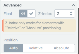
The advanced options are “Float”, “Z-index” and “Position”:

You can read more about what each option does in this dedicated article linked here.
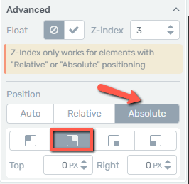
Select the “Absolute” button, which will trigger another set of options from where you can choose where exactly should the icon be placed:

As you can see in the above snapshot, you can choose between the top right, top left or bottom right, bottom left part of the container. Furthermore, you can also use the “Top” and “Right” pixel fields to further adjust the positioning of the icon in relation to the container’s margins.
3. Set the Z-index
Next, from the same window, set the “Z-index” to 10 for example, or higher, in order to make sure this icon will always be on top of other elements that are part of the same form:

The “Z-index” works only for elements that have “Relative” or “Absolute” positioning, and its main purpose is to ensure that the element with the higher Z-index will be displayed on top of the other elements on which he is stacked.
If, for example, you have several elements staked on top of each other, the one with the higher index will be visible first.
Whilst you are still in the left sidebar options of the element, feel free to use other features to customize the icon as you best see fit, so that it blends with the rest of the elements available in the form.
Step 4. Add the “Close form” action
The last step in the process is to link an action to the element – in this case, a “close” action so that when the user clicks it, the form will close.
This can be done from the “Animation & Action” section of your left sidebar:

Click on the “Custom Integrations” button:

From the list that appears on the screen, select “Close form” as the action to be performed, and then click on “Apply”:

Now the “Icon” element should work exactly as the initial “close” button available in the form:

These are the steps in which you can add a “close” button to your opt-in form. If you want to read more about how to customize your form, you can do that in the dedicated knowledge base section linked here.