Wrapping text around images can be done using two different approaches. The first one is by using the “Layout & Position” options, whilst the second one is with the help of a “Columns” element (and it’s recommended for mobile responsive pages):
1.Using the “Layout & Position” options for the “Image” element
Add the image above the text
First, drag and drop the “Image” element above the text that you want to wrap it around:

Then, either select the image you want from your Media Library or if it isn’t there yet, first, upload it and then, add it to your page:

Position the image
In order to be able to wrap the text around the image, you will have to position the image on the left or on the right.
You can do that by going to the “Layout & Position” options of the image (you can find this in the left sidebar) and then, clicking on the left or right position from the “Alignment” section:

Important!
Please keep in mind, that the text wrapping option only works, if you have chosen the left or the right alignment for your image.
Activate the “Float” option
The next step is to open the “Advanced” section (from the same left sidebar set of options):

Here, activate the “Float” option. This will allow the text to be wrapped around the image:

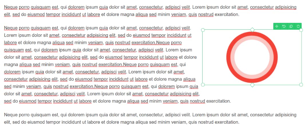
Once this is done, the text will be wrapped around the image:

This is you can wrap texts around your images in a few steps.
Although wrapping the text around images looks good on average desktop screens, it might happen that at certain screen sizes the text will get squeezed into a narrow space.
For instance, if your visitors will view your page from a tablet or a mobile phone. You can check this with the Responsive View option from the bottom-center part of the editor:

If you click on either of the mobile device views, you will see that the image and the text around are displayed differently depending on what device you are viewing it.
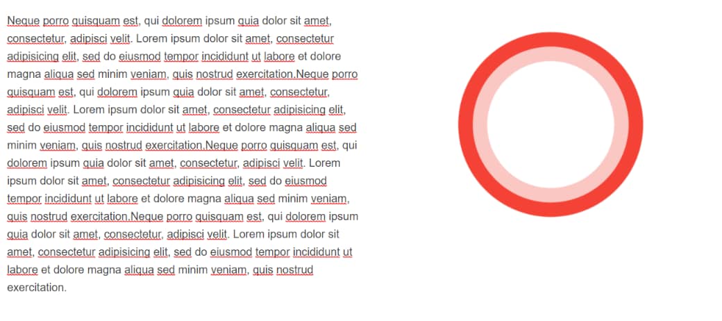
- This is an example of how texts wrapped around an image will be displayed on a PC:
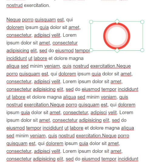
- This is how the same texts and image will be displayed on a tablet:
- And lastly, the mobile view:
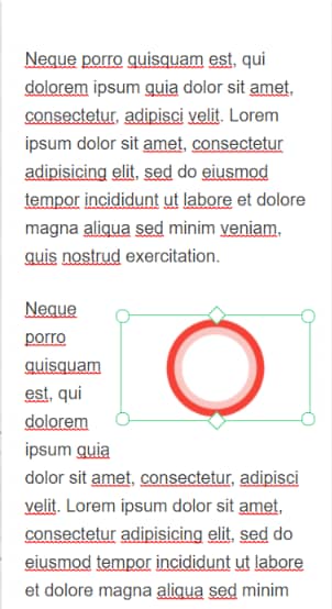
Therefore, this first solution might not be entirely mobile-friendly. In order to have a page that is also optimized for mobile screens, we recommend you use column layouts instead of wrapping the text around images.
2.Using the “Columns” element
Add the “Columns” element to your page/post
First, go back to the desktop view:

Then, drag and drop a “Columns” element onto your canvas:

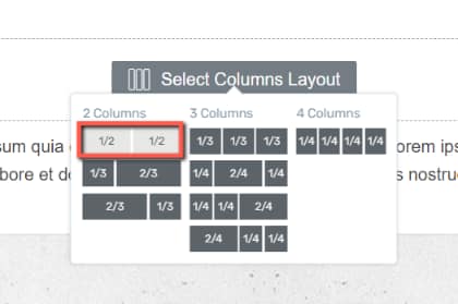
Select a layout for your columns (in this case the first option, as we are trying to align an image and some text):
Then, add an “Image” and a “Text” element in each column:
If you need more details on how to do this, please check out the video above or this tutorial.
Adjust the proportions of the columns
And lastly, adjust the proportions of the two columns from the dotted line that shows up when you hover over them:

Now, with the image and text placed in two separate columns, the page will look like this when viewed on a mobile device:

This way, you can make sure your page will look just as good on a tablet or on a mobile phone, as it does on a PC.
If you wish to find out more about the elements and options in Thrive Architect, please follow this link.