When creating a theme in Thrive Theme Builder, you can customize the theme templates, using the Thrive Theme Builder editor.
Customizing these is an essential part of making the theme suitable to the purpose of your site. Here are some resources if you need help with this part:
Now, what happens if you also want to use the WooCommerce plugin when customizing your theme?
After setting up the plugin and activating it from your Thrive Theme Builder dashboard, you will get some more custom WooCommerce templates, as well as some WooCommerce widgets.
Check out this article, if you need to find out how to get started with WooCommerce, when customizing a Thrive Theme Builder theme.
The purpose of this article is to present all of these widgets and to show the ways in which you can use them.
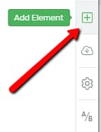
In order to access these elements, in the Thrive Theme Builder editor, click on the plus sign from the right sidebar:
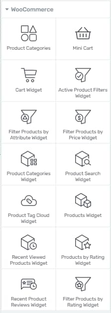
The elements will be found under the “WooCommerce” section, so scroll down until you get to it:
The Mini Cart Widget
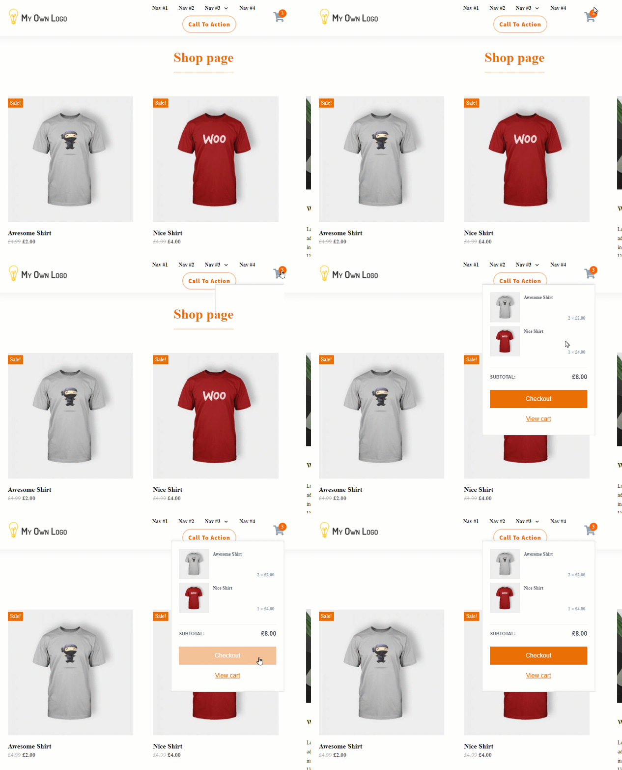
The “Mini Cart” widget will allow you to add a small cart icon to your template, which will let the users know the number of items they’ve added to their cart, and also see a small preview with the products:
You can customize this widget in various ways, and here is how:
Note: Don’t forget that, if you want to add this widget to a “Header” section, you will first have to select and edit the “Header” section, and only after that, you will be able to add the widget to this section:
After you add this widget to your template, its options will appear in the left sidebar:
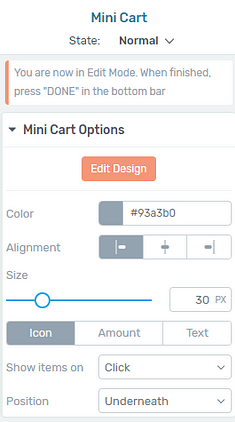
We’ll focus on the “Mini Cart Options” section, but feel free to use the rest of the general options, as well.
Edit Design
The first option from this section is the “Edit Design” one. Just like in the case of most of our elements, accessing this option will take you into the “Edit Mode” of the element.
This is how you will be able to edit all of the items of the “Mini Cart” widget (icon, items counter, colors, etc.), as well as the way the cart looks like if there are no elements inside it, and so on.
If you want to customize any of the elements mentioned above, click on “Edit Design”:

What you will see in the left sidebar, are some options that you can use to customize this widget in the “Normal View”:

However, you will also be able to edit the “Expanded” mode, in situations when the cart is empty, or when users have items in their cart. To change the “View” you are editing, you can click on the “Normal View” section from the lower side of the screen:

Then, choose the “View” you want to customize, from the dropdown that opens:

Normal View
In the “Normal View”, you will be able to edit the cart icon, add the price, change the colors, etc. For all of these, you can use the options from the left sidebar:
-
Color
To change the color of the cart icon, click on this color box:

A pop-up will open, with a color picker, that will allow you to choose another color for this widget.
-
Alignment
Next, you can also choose the position of the cart, and align it to the left/right/center side:

-
Size
If you want to change the size of the cart icon, you can use this slider and drag it from side to side, or you can enter the number of pixels in the field next to the slider:

-
Icon/Amount/Text
The next option will allow you to choose if the “Mini Cart” widget should only have an icon, or it should also show the total amount, or have a “Text” element next to the icon.
Choose the suitable option by clicking on it:

When you choose the “Text” option, another field will appear, where you can insert the text that you want to be shown next to the “Mini Cart”:

-
Show items on
You can also choose if the items of the card should be shown upon hovering, or only when someone clicks on the “Mini Cart” widget. Choose the option that you prefer, from the dropdown that appears when you click on the “Show items on” field:

-
Position
This last option will let you choose the position of the expanded cart, whether it should be placed underneath the cart icon, or to the right/left side of the site. Click on the “Position” field, and choose the one that best fits, from this dropdown:

‘Expanded – empty cart’ View
After you customize the “Normal View”, you can start customizing the way this widget looks like in the “Expanded – empty cart” state, by choosing it from this dropdown:

This means that you will be able to edit the expanded view in the case that no products have been added to the cart:

You can use all of the left sidebar options to customize this part.
‘Expanded – items in cart’ View
Lastly, you can also edit the way the widget looks in the expanded view when products have been added to the cart. For that, choose the last option from this dropdown:

Then, feel free to select all of these items from this container, and use the left sidebar options to customize them as you wish:

Besides customizing the widget in all of these views, you’re also able to edit the “Cart Icon” and the “Cart Items Count”, while you’re still in the “Edit Mode” of the widget.
-
Cart Icon
If you want to modify the “Mini Cart” icon, simply click on the icon, in the editor, and the options of this icon will appear in the left sidebar:
The ways to edit an icon are described in more detail in this article, so check it out if you want more information about how to customize an icon in Thrive Architect.
-
Cart Items Count
Similarly, you are also able to customize the small item count number from the corner of the cart icon:

All you have to do is to select it, and the “Cart Items Count” options will appear in the left sidebar:

The color can be easily changed, as well as the size and position.
To exit the “Edit Mode” of this widget, click on the orange “Done” button:

Besides the “Edit Design” option, there are some more options in the left sidebar, but they have all been described when explaining how to edit the “Normal View”, here.
Of course, besides the “Mini Cart Options” section, you can use all of the rest of the general options found in the left sidebar to fully customize this widget.
The Cart Widget
You can add this element to your template, and this way the users will see what they have in their cart.
After you add the element, its options will appear in the left sidebar:

One of the sections here is the “Cart Options” section. Click on it, to expand it:

Edit Design
The first option of the “Cart Widget” element is the “Edit Design” option, which will let you enter the “Edit Mode” of the widget and customize each item inside it:
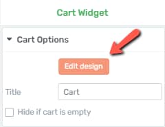
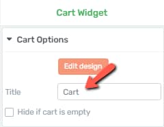
Title
You can change the default “Cart” title into another one that you see fit. In order to do that, simply delete the default title from this field, and write in your own:
Hide if the cart is empty
Using the next option, just like its name says, will hide this widget if there’s nothing to be shown in the cart. If you want that, check the checkbox in front of this option:

Besides the “Cart Options”, feel free to also use the rest of the general options from the left sidebar, to customize this widget.
Note: Keep in mind that, when editing a WooCommerce Cart Template, this element will not be available in the list of elements.
The Product Categories Widget
The “Product Categories” widget will allow you to add the categories of your products on a template.
Naturally, to be able to use this widget, you will have to create some categories first, for the products of your store. This can easily be done from the WordPress admin dashboard, if you hover over “Products”, in the left sidebar.
Then, from the small sub-menu that opens, click on “Categories”:

This will open the categories page, and you can set them up as you wish.
Then, if you add the “Product Categories Widget” element to a template, its options will appear in the left sidebar:

Here is how you can use the options from the “Product Categories Options” section:
Edit Design
The first option here is the “Edit Design” option, which will let you enter the “Edit Mode” of the widget and customize each item inside it:
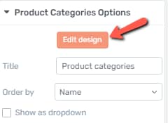
Title
Again, just like in the case of the “Cart Widget”, you can change its title, from “Product Categories”, to another title of your liking. Simply delete the default name from this field, and write in your own:

Order By
The next option will allow you to set the criteria for the ordering of the categories. Click on the field next to the option, to see the available criteria:

Then, choose the option you prefer from the small dropdown that opens:

Show/Hide certain items
Next comes a set of some items that you can choose to hide or show from this widget:

Show as dropdown
If you want this widget to be shown in a dropdown form, click on the checkbox in front of the “Show as dropdown” option:

In this case, the product categories will be grouped in a dropdown:

Show product counts
If you check this option, the number of products from a respective category will also show, next to the category it belongs to:

Show hierarchy
Naturally, if this option is checked, then the categories will be shown according to their hierarchy. For example, the parent category for the “Wallpapers” category is the “Photography” one, thus this is the way they will be displayed:

If you uncheck this option, the categories will all have the same level.
Only show children of the current category
Should you want to only show the children of the category, check this option:

Hide empty categories
You also have the option to hide the categories that do not have any product assigned to them. For that, click on the checkbox in front of this option:

Maximum Depth
This option will let you choose the maximum number of depth to be shown here. This refers to the maximum number of hierarchy levels to be shown. You can insert a numerical value in this field:

To make this more clear, I will give an example. I’ve created 4 categories, called “1”, “2”, “3” and “4”. The category named “1” is a parent to category “2”. “2” is a parent to “3”, and “3” is the parent category to “4”. there are 4 levels of hierarchy here.
This is how the categories will be shown if I check the “Show hierarchy” option:

Now, if I write “3” in the “Maximum Depth” field, this will mean that the widget will only show the first three categories from the hierarchy, like so:

These were all the options from the “Product Categories Options” section. As usual, feel free to also use the rest of the general option, for better customization of the widget.
The Product Search Widget
This text widget is a search bar, that you can place in your templates if you want to offer the users the possibility to look for a certain product. After you add the widget, you can click on the “Product Search Options” section, to expand it:

Edit Design
Here, as well, you can access the “Edit Mode” of the widget, which will allow you to customize each item inside it:

Title
You will also have the “Title” option available. By default, when you add this widget to your template, it will not have a title. However, you can provide one, if you want, by entering it in the field next to this option:The mo

The Product Tag Cloud Widget
Adding this widget will insert a list of the product tags, in the template. Here are the specific options that you can use for this one:
Edit Design
Entering the “Edit Mode” of this widget will come in handy in case you want to modify each item inside the element:

Title
This one, too, only has the “Title” option, under the “Product Tag Cloud Options” section of the left sidebar. Enter a title in this field, if you want to change the default “Product Tags” one:
If you want to manage your tags, you can do that from your WordPress admin dashboard, by hovering over “Products”, and clicking on “Tags”:

This will open the page from where you will be able to manage your tags.
Besides the “Title” option, you can use the general options to further customize the widget.
The Products List Widget
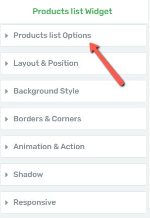
The next available widget is the “Products List” widget. This will be a list of all your available products. Click on the “Products list Options” section, to expand it:
Edit Design
Firstly, you are able to enter the “Edit Mode” of the element, and thus modify each item inside it:

Title
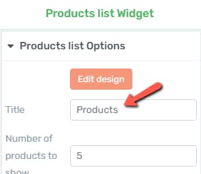
This widget, too, allows you to enter your own title, and thus changing the default “Products” one. If you want to do that, enter the new title in this field:
Number of products to show
Next, you can choose the number of products to be shown in this widget. The default value for this is 5. If you want to modify it, simply delete it, and write another numerical value in the field, or use the up/down arrows to set it:

Show
You are also able to filter the products to be shown, by clicking on the field next to the “Show” option:

This will open a small drop-down, and you will be able to select one of these three options:

Order By
If you want, you can order the products by:
-
Date
-
Price
-
Random
-
Sales
If you want to do this, click on this field:

Then, choose the desired criteria from the list that opens:

Order
You can also set to order the products in an ascending (ASC) or descending (DESC) way. Click on this field, and choose the suitable option:

Hide free products & Show hidden Products
Lastly, you can choose to hide the free products from this list or to show the hidden ones. If you want any of these enabled, click on the checkboxes in front of the two options:

Then, after using all of these options, you can continue customizing this list, by using the rest of the general options from the left sidebar.
The Recently Viewed Products Widget
The next available widget to be added is the “Recently Viewed Products” one. Just like its name says, this will be a list with all the recently viewed products. For this one, you will find three options, in the first section with options:
Edit Design
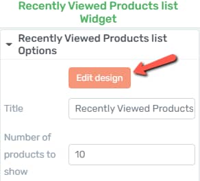
You are able to enter the “Edit Mode” of the element, and thus modify each item inside it:
Title
If you want to change its title, delete the default one from this field and write in your own:

Number of products to show
Next, you can change how many recently viewed products to be shown. If you want to change it, you can either enter a numerical value in this field, or you can use the up/down arrows:

Besides these two options, which can be found under the “Recently Viewed Products Options” section of the left sidebar, you can also use the rest of the options to modify the widget (such as “Layout & Position”, “Shadow” etc.)
The Products by Rating Widget
This widget is similar to the one above. This represents a list of your products, ordered by their rating. In the “Products by Rating Options” section, you will be able to find these options:
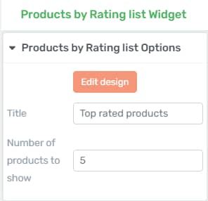
The way to use these options is exactly as described in the case of the “Recently Viewed Products” widget.
The Recent Product Reviews Widget
This widget, too, is similar to the other two above. If you add this one, you will have a list of the recently reviewed products.
Again, you can use all of the options from the left sidebar to customize the widget. These are the options that can be found in the first section of the left sidebar:
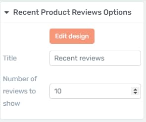
You can provide a title to this widget, and set the number of recently reviewed products to be shown.
The way to use these options is exactly as described in the case of the “Recent Viewed Products” widget.
The Filter Widgets (Shop Templates Only)
There are some widgets that can only be used when editing a Shop Template. These can be used to filter the products from the Product List. Here are all the widgets and how to use their options:
Active Products Filters Widget
If you add this widget, a list of your active products will be shown on the template. For this widget, you can enter the “Edit Mode”, to customize the items inside the widget, or you can set its title, by modifying the default one:

Moreover, you can also use the rest of the general options, to further customize this widget.
Filter Products by Attribute Widget
The next filtering widget allows you to show a list of some products that have the same attribute applied to them.
Firstly, to add attributes, you can go to your WordPress admin dashboard and hover over “Products”, in the left sidebar. A list with some options will appear. One of these is the “Attributes” one, which you can access, in order to manage your attributes:

When you add this widget, you will have some options that you can use, under the “Filter Products by Attributes Options” section of the left sidebar:
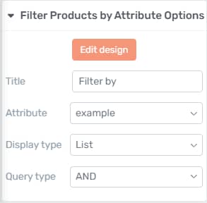
Here is how to use the options of this widget:
Edit Design
Using this button will let you enter the “Edit Mode”, and each item inside the widget will become available for you to customize.
Title
You can change the title, by deleting the default “Filter By”, and entering your own in this field:

Attribute
This is where you can set which attribute should the products be filtered by. Click on the field next to the option, to open the list with all of your attributes, and choose one from this list:

Display Type
You can choose the way the attributes should be displayed – in a list, or in a dropdown. Choose the suitable option:

Query Type
Lastly, click on the field next to the “Query Type” options to choose the one that best fits:

Of course, you can also use the rest of the general options from the left sidebar.
Filter Products by Price Widget
If you add this widget, the customers will be able to set a price range for the products.
You can modify the title of this widget, using this option from the left sidebar, or you can use the “Edit Design” option to enter the “Edit Mode” of the widget:
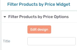
For further customization of this widget, you can use all of its options from the left sidebar.
Filter Products by Rating Widget
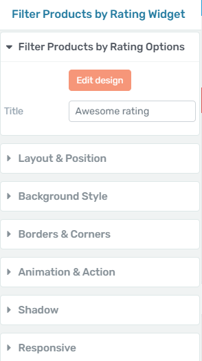
Lastly, you can also add the “Filter Products by Rating” widget, if you want. For this widget, too, you can change the title, enter the “Edit Design” mode or you can use the general options to set it up:
The Shop Element
You can also add the “Shop element” and customize it to your liking:

We have described the ways to customize this one, separately, in this article, so please check it out, if you want to find out how to customize the element using all of its options.
The Product Categories Element
Lastly, you can also use the “Product Categories” element if you want to display the products on your template, sorted by categories:
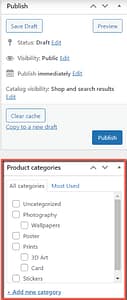
You can learn all about how to use and customize this element in the article linked here.
These are the ways in which you can add and customize the widgets that you can use when creating your WooCommerce templates.
If you need more information about the way WooCommerce and Thrive Theme Builder work together, you can also read this article.
If you want to find out more about Thrive Theme Builder, make sure to also check out our knowledge base.
I hope this article was useful to you. Don’t forget to leave a smile below 🙂
