This article will help you understand how to use the “Toggle” element and how you can easily customize it using its options.
Add the Element to the Post/Page
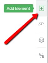
The first thing you need to do is to add the “Toggle” element to your post/page. To do that, click on the plus sign from the right sidebar:
Then, a list with all of the available elements will open. Look for the “Toggle” element, or search for it in the search bar:
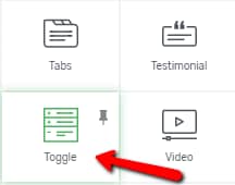
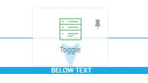
Drag and drop it where you see fit on your post or page:
Choose the Template
After the element has been added, you will notice that some options appeared on the left sidebar:

From the first available section, you can change the template of the element. This is where you can play around and try different templates for the “Toggle” element until you find the one that fits the best:

This will open a pop-up with all the available templates. Scroll down to see all the different templates. Click on one in order to select it, and then click on the green “Replace Template” button:

Note: It is important to choose the template before adding content to the “Toggle” element, otherwise the content will be lost when you switch with another template.
Use the “Edit Toggle Items” Option
Note: Some of the templates come with a dummy content. If you are using one of those, don’t forget to replace it with your original content.
The first option is the “Edit Toggle Items” one. To edit the toggle items, click on the orange button, with the option:

This will open another set of options, that you can apply to the items of the element:
Group Styling
“Group Styling” is applied in the case of the “Toggle” element. This way, besides using the “Main Options” and the general options, you can also use the “Group Styling” feature to further customize your “Toggle” element.
“Group Styling” will help you modify parts of the “Toggle” element in a fast and easy manner.
In order to do this, first, click on either a heading or a content box of the “Toggle” element, you will see the “Currently styling” section on the left sidebar:

This section is where you can choose what exactly you want to customize:
-
Grouped Toggle Items
-
Grouped Expanded Toggle Items
-
Grouped Toggle Content
-
Alt text(s)
To select any of those, click on the field below “Currently Styling”:

A drop-down menu will open. Click on what you want to customize:

After you choose an option from the drop-down, below the “Currently Styling” section, various options will be displayed, based on what grouped elements you chose to customize.
Grouped Toggle Items
The first option from the drop-down menu is the “Grouped Toggle Items” one. This allows you to edit the element items as a whole. Click on it in order to select it:

When this group styling option is selected, it means that you can change the way the “collapsed” items look like. To be more clear, this is how the collapsed items look like:

And this is how the expanded items look like:
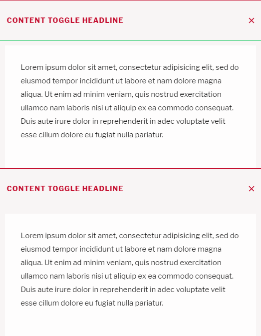
You can collapse or expand each “Toggle” element item by using the green “Expand” and “Collapse” buttons that appear on the top-right corner of the item when you click on it:

Going back to the option, when you select the “Grouped Toggle Items” from the drop-down, you will be able to edit the “collapsed” items. When you use the options from the “Main Options” section below the “Currently Styling” section, they will apply to all the items.
Change text type
You can change the text type, from one heading to another, make it a “Paragraph” text, or a “Plain” one. To do that, click on the field next to the “Change Text Type” option:

A drop down will open, where you can choose the text type that you want to use:

Whichever text type you decide to use, it will be applied to all the “Toggle” element options.
Default State
The next option here is the “Default State” one, where you can choose the way the items should be by default, collapsed, or expanded.
-
Collapsed
Naturally, if you choose this option, the default state of the item that you have selected will be collapsed, as shown here:

-
Expanded
This option makes the default state of the selected item to be expanded, like so:

Show Icon
Next, you can choose if the “Toggle” items should also contain an icon. If you want that, click on the switch button next to the option, if the option is disabled (this depends on the template that you have chosen for the element):

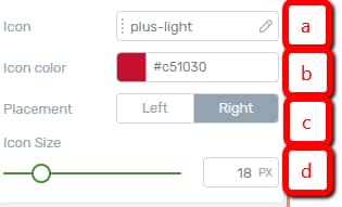
If you do that, the options of the icon will appear below, and they can be used as follows:
-
a – Icon: This is where you can choose the way your icon looks. Click on the field next to the option to choose one:

This will open a pop-up with various icon templates. Choose the one that you see fit and click on “Select”:

-
b – Icon Color: Click on the color box field next to the option to open the color picker pop-up:

The color picker pop-up will appear. Choose a color using the color picker, or enter a numerical value in the HEX/RGB field:

When done click on “Apply”:

-
c – Placement: This is where you can choose if you want the icons to be displayed on the left side or on the right side of the headings. To do that, click on the placement option that you prefer:

-
d – Icon Size: You can also modify the size of the icon, by dragging the slider from side to side, or by entering a numerical value in the field next to the slider:

Grouped Expanded Toggle Items
If you go back to the “Currently Styling” option and choose the second option from the drop-down, “Grouped Expanded Toggle Item”, you will be able to modify only the “Toggle” items that are “expanded”. To choose the option, click on the “Grouped Expanded Toggle Items” from the drop-down menu:

Grouped Toggle Content
The next option of the “Currently Styling” drop down is the “Grouped Toggle Content” one. This allows you to only customize the content of each item, using the options that appear on the left sidebar. To select this “Currently styling” option, choose the last one from the “Currently Styling” drop-down:

Then, you can simply use the options from the left sidebar in order to style the “Grouped Toggle Content”.
Alt text(s)
The last option of this drop-down is the “Alt text(s)” option. This allows you to change the actual text from each toggle. If you want to do that, select the last option from the drop-down:

Then, simply click on the text that you modify, and the left sidebar will show the options of the “Text” element, which you can use to edit the text:

Add a new Toggle Item
While you still are in editing mode, you should know that you can easily add a new toggle item. If you want to do that, simply hover over the element, in the editor. A blue plus sign will appear:

If you click on it, a new “Toggle” item will immediately appear. You can add as many items as you like.
Exit Group Styling
If you have finished customizing the different parts of the “Toggle” element, you can use the “Exit Group Styling” option from the “Currently Styling” section:

This will take you back to the “Main Options” of the “Toggle” element. You can also click on the orange “Done” button, which will take you to the “Main Options”, as well:

Learn more about the “Group Styling” feature here.
Use the Main Options
After you customize the “Edit Toggle Items” section, you can also make use of the rest of the “Main Options”:

Colors
This first option will contain the accent colors of the “Toggle” element. These colors will be generated based on the selected template. However, you can easily change it, by clicking on the color box next to the option:

Note: For some of the templates, there might be more than one color in this option. You can change them individually, by clicking on each color box and modifying it.
Once you click on the color box, a color pop-up will open. You can change the accent color by manually picking one from the color picker, or by entering a HEX / RGB code in the dedicated field:

You can also choose one of the already existing colors from the “My Colors” and “Theme Colors” sections.
After you are done, don’t forget to click on the “Apply” button to make sure all your changes have been saved.
Columns
The next option is the “Columns” one. You can set the number of columns that you want to have your element divided in. To adjust the number, drag the slider from side to side, or enter the number of columns in the field next to the slider:

Max Width
Next, you have the option to set the Maximum Width for the element. Again, do that by dragging the slider from side to side or by manually entering the number of pixels in the field next to the option:

Vertical Space
This option allows you to set the vertical spacing in between the element items. To modify it, drag the slider from side to side, or enter a numerical value in the field:

Horizontal Space
This option can be used for adjusting the horizontal space between the toggle elements. Just as in the case of the other two spacing options, you can adjust the horizontal space by either dragging the slider from side to side or by inserting a numerical value in the field:

Auto Collapse Toggles
If you choose this option, this means that the user or the visitor of your website cannot open more than one toggle at a time. When clicking to open a toggle, any other open toggle will be automatically closed.
If you want to use the option, click on the on/off switch next to it to activate it:

Dropdown Animation
By default, there is no animation set for the “Toggle” element. However, you can choose an animation for it, when you expand or collapse the element items. To do that, click on the field next to the “Dropdown Animation” option:

A sub-menu will open, where you can choose what type of animation you want to choose for the element:
Animation speed
If you decide to choose an animation, another option will appear, below the “Dropdown Animation” one, where you will be able to set the “Animation speed”. To choose a variant, click anywhere on the field next to the option:

A drop down will open. You can decide between three options: “Slow”, “Medium” and “Fast”. Click on the one that you prefer:

Toggles
The next and last option available inside the “Main Options” section is the “Toggles” one. Here is where you can add new toggle items, edit their title, switch their order, or delete them:

-
If you want to add a new item to the element, click on the “Add new” button:

You can add as many toggle element items as you want.
-
If you want to rearrange the elements in the list, hover over the dotted side of one of the items, until you see the “move” icon:

Then, click to grab the list element and drag it anywhere you want (in between, before, or after the other items):

-
If you want to edit the title of the toggles, click on the pencil symbol next to the toggle items:

A small pop-up will appear, where you can input the title of the toggle, and then click on “Apply”:

-
Lastly, you can delete the “Toggle” element items by clicking on the trash can icon next to them:

You can test all the variants and, to see what they look like, you can save the changes and then click on the blue “Preview” button from the bottom side of the editor:

This will take you to the “Preview” mode, and you can test all the options, to see which one you prefer.
These were the ways in which you can customize the “Toggle” element using its “Main Options”.
Use the Rest of the Options
Just like in the case of other elements, besides the “Main Options”, you can use some other general options, as well (such as Layout&Position, Borders&Corners, etc.):

If you want to know how to use the rest of the options from the left sidebar, make sure to take a look at the articles and tutorials from our knowledge base.
I hope this article was useful. If that’s the case, make sure to reward our efforts by leaving a smile below 🙂