The “Tabs” element can help you organize your content into tabs, allowing you to place any kind of element you need inside as many tabs as you need.
This article will guide you through the process of adding the element, customizing it, and understanding how to use its options.
Add the Element to the Post/Page
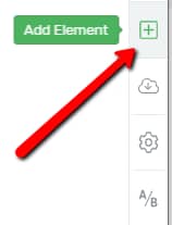
In order to add the element to your page, click on the plus sign from the right sidebar:
This will open a list of all the Thrive Architect elements. Look for the “Tabs” one or search for it in the search bar:
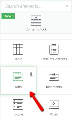
Drag and drop it anywhere on your editor, depending on where you want the “Tabs” Element to show on your page:

After you place it, a pop-up will automatically open, where you can choose the template from:
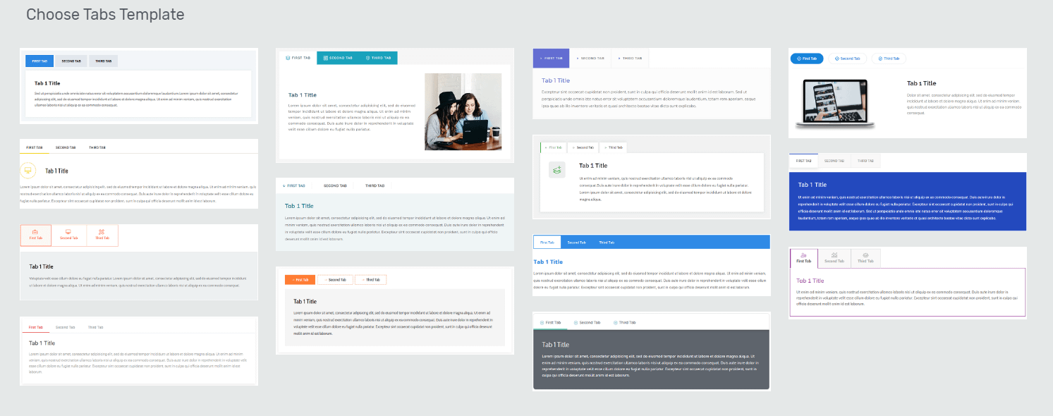
When you find the one you like, click on it and it will be automatically applied to the “Tabs” element:

Then, the element has been added and you can start customizing it.
Choose the Template
The first section of the left sidebar is the templates library one. Here is where you can change the template of the “Tabs” element, in case you are do not want to use the one that you have previously chosen when adding the element:

The same pop-up mentioned above will open, and you can choose the template that you want to replace the first one with:

Note: If you want to replace the template, make sure you do this before adding any content or customize the existing content of the “Tabs” element. This is because, when changing the template, all the initial content and modifications will be lost.
Once you find the template that you want to use, click on it in order to select it, and then click on the green “Replace Template” button:
After that, you can move on and start customizing the element using the rest of the options from the left sidebar.
After the “Template Options” section comes the “Main Options” one. Here you can find various ways in which you can edit the design of the element. You will notice that there is an “Edit Tab Items” option. This can be used in order to edit each “Tabs” item separately, rather than the element as a whole:

Use the “Edit Tab Items” Option
If you are looking to edit the items one by one, click on the “Edit Tab Items” button from the “Main Options” section:

Once you click on it, you will be taken into “Edit Mode”. This means that you will be able to edit the items of the “Tabs” element one by one.
While you are editing the element in the “Edit Mode”, another thing that you can do besides customizing the tab items, is adding various elements to the “Tabs” element content.
Add Custom Content to the Element
By default, when you add the element to your post or page, it will consist of a title and a paragraph. By clicking on the plus sign from the right toolbar, you will be able to add whichever element you prefer to the “Tabs” content.
As an example, I will add an image to my first tab. To do that, I will click on the plus sign, and drag and drop the “Image” element inside a tab:

After playing around with the “Image” element options, the “Tabs” element will then look like this:

When you add any type of element, its options will appear on the left sidebar, and you can customize it from there.
In order to go back from editing the newly-added elements to editing the tab items, click on “Tab Content” in the breadcrumbs:

Customize the Normal/Hover/Selected States
When using the “Edit Mode”, you can edit the way the items look like in the “Normal” state, in the “Hover” state (how the element looks like when someone hovers over it), as well as in the “Selected” state (how the element looks like when it is selected).
In order to switch the state and customize each one, click on the down arrow next to the “State: Normal” section from the top part of the sidebar:

A small drop-down will open, with the three options. Click on one of them in order to customize the respective state:

The customization can be done with the use of the options from the left sidebar. When you’re done modifying the “Hover” and the “Selected” states, go back to the “Normal” state so that you can continue customizing the “Tabs” element.
Use the Group Styling Option
Going back to the “Edit Tab Items” options, the “Group Styling” option can be used while editing the “Tabs” element. This means that, besides using the “Main Options” and the general options while editing the tab items, you can also use the “Group Styling” feature to further customize your “Tabs” element.
“Group Styling” will help you modify parts of the “Tabs” element in a fast manner.
In order to do this, first, click on either a tab item or a content box of the “Tabs” element, and you will see the “Currently Styling” section on the left sidebar:

There are two ways in which you can choose which items you are currently styling:
-
you can select them from the drop-down menu that appears when you click on the field next to the option:

Then, simply click on one of the four options in order to use the group styling on the respective items:

-
you can click on each item that you want to edit, directly from the editor;
For example, if I want to edit the tab items, I will click on one of them in the editor:

The “Grouped Tab Items” option will automatically be selected in the “Currently Styling” drop-down. The same goes if I were to click on the tab content, for example. After I select it, the “Currently Styling” section will automatically show the “Grouped Tab Contents” option in the drop-down:

Here is what each of the options of the “Currently Styling” drop-down allows you to edit:
1. Grouped Tab Items
If you want to edit the tab items, choose this option from the drop-down. Some specific options will appear on the left sidebar, under the “Main Options” section:

The modifications that you make using these options will be applied to all the tab items of the “Tabs” element.
Change Text Type
The first option that is available for the “Grouped Tab Items” is the “Change text type” one. You can change the text type, from one heading to another, make it a “Paragraph” text, or a “Plain text” one. To do that, select the text that you want to modify and then click on the field next to the “Change Text Type” option:

A drop down will open, where you can choose the text type that you want to use:

After you choose a text type from the drop-down, it will automatically be applied to the selected text.
Show icon
Next, you can choose if the tab items should also contain an icon. If you want that, click on the switch button next to the option, if the option is disabled (this depends on the template that you have chosen for the element):

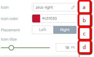
When the option is activated, some more options will appear below, and this is how to use them:

-
a) Icon
This is where you can choose the icon from a list of available icons. Click on the field next to the option in order to choose one from the list of icons:
From the pop-up that opens, scroll down until you find the one that best fits. Click on it in order to choose it, and then click on the green “Select” button:

-
b) Icon color
In order to change the color of the icon, click on the color box next to this option:

This will open a color pop-up. In order to choose the desired color, either select it manually using the color picker or enter a HEX / RGB code in the dedicated field:

You can also choose one of the already existing colors from the “My Colors” and “Theme Colors” sections.
After you are done, don’t forget to click on the “Apply” button to make sure all your changes have been saved.
-
c) Size
You can also modify the size of the icon, by dragging the slider from side to side, or by entering a numerical value in the field next to the slider:

-
d) Icon/Image Position
This option can be used for both the icon and the image position. This is because, when editing the “Tabs” element, the tab items can either show a text-only, or they can also have an icon or an image next to the text. You cannot place both an icon and an image inside a tab element. In order to choose a positioning, simply click on one of the options:

Show Tab Image
This option is disabled by default. This means that the tab items do not contain an image. You can, however, place an image inside the tab items by activating this option. If you want to do that, click on the switch next to the option:
If you enable this option, the same Icon/Image Position option as the one described above will be available, so that you can choose the positioning of the image inside the tab items.
2. Grouped Tab Contents
If you go back to the “Currently Styling” drop-down and choose the second option, you will be able to edit the content of the tabs. You can customize the content and its design by using the general options found in the left sidebar:

If you are not sure how to use these options, we do have separate articles in our Knowledge Base.
3. All title(s)
The third option of the “Currently Styling” is to edit all the tab content titles. Again, feel free to customize the titles as you wish by using the options found on the left sidebar when you choose this option:

If you want to find out how to use the options in order to customize the titles, you can go ahead and read this article about the “Text” element.
4. All Paragraph(s)
The last option that you can choose from the “Currently Styling” drop down is the “All Paragraph(s)” option. If you choose it, you will be able to modify and customize all the “Tabs” element paragraphs. Just like in the case of the titles, you can customize the paragraphs by using the options from the left sidebar. You can find much more detailed descriptions of these options in the “How to Use the Text Element” article, here.
Enable/Disable Group Styling
Besides the drop-down, the “Group Styling” feature has two more options. Firstly, if you want to only edit one item of the “Tabs” element, you can do that by pressing on the lock icon, next to the drop-down:

This will disable the “Group Styling” and you will only be able to edit the selected item. For example, if I want only the second tab item to have an image, I will select it by clicking on it inside the editor:

The “Currently Styling” drop-down will automatically select the “Grouped Tab Items”. I will click on the lock icon next to the drop-down:

This means that all the modifications that I make now, using the options from the left sidebar, will only be applied to the second tab item. I will activate the “Show tab image” option:

As a result, the tab items will look like this:

Exit Group Styling
Lastly, if you have finished customizing the different parts of the “Tabs” element, you can use the “Exit Group Styling” option from the “Currently Styling” section:

This will take you back to the “Main Options” of the “Tabs” element.
The way to exit the “Edit Mode” and save your modifications is to click on the orange “Done” button, which will take you to the “Main Options”, as well:

Learn more about the “Group Styling” feature here.
Use the Main Options
After you have done all the necessary modifications in the “Edit Mode”, click on “Done” to go back to the rest of the options of the “Tabs” element. On the left sidebar, the first option below the “Edit Tab Items” button is the “Color”.
Color
Depending on the template that you have chosen, the “Colors” option will contain one or more “Main Accent” color boxes. If you want to change it, click on it:

This will open the color pop-up, which you can use just as described above.
Default Tab
The option that comes next is called the “Default Tab” and this is where you can choose which tab opens when someone accesses the “Tabs” element.
In order to choose the default tab, click on the field next to the option:

This will open a small drop-down, where you can choose which tab should be the default one:

Hover Effect
This option represents what happens when someone hovers over one of the tabs. In order to use it, click on the field next to the “Hover Effect” option:

Choose the animation that best fits from the drop-down that opens:

Content Switch Animation
The next option is the “Content Switch Animation” one. You can choose an animation for the content of the tabs. For example, when I click on a tab to open it, the content can slide in from the right side. Similar to the other options, in order to choose an animation, click on the field next to the option:

Then, choose one from the list of animations that opens:

Enable Progress Styling
The last part of the “Main Options” section from the left sidebar is the “Enable Progress Styling” option. This option is disabled by default. If you activate it, the selected tab and any tabs placed before it will be styled as “active”. If you want to enable “Progress Styling”, click on the switch:

As an example, if I activate this option and click on the second tab, the first tab item will look like the active one (in this case, the second one), as shown in the image below:

Whereas, if I were to keep the option disabled, this is how the “Tabs” element looks like when I select the second tab:

These were the ways in which you can use the “Main Options” and easily customize a “Tabs” element.
Important!
You can add as many tabs to the “Tabs” element as you wish. How do you do that? You just have to go to the “Edit Tab Items” option and click on it:

As mentioned at the beginning of the article, this is how you enter the “Edit Mode”. In the editor, if you hover over the tab items, a plus sign will appear. Click on it in order to add a new tab:

The new tab will be added on the right side of the plus sign that you have just clicked on:

After adding a new tab, you can use all the above-mentioned options in order to customize it.
Use the Rest of the Options
Besides the “Main Options”, you have a few more option sections available in the left sidebar. For example, you can customize the layout & position of the tabs, as well as the borders & corners, shadows, and so on:

We have dedicated articles for each of the sections in our knowledge base.
One of the most commonly used options is the “Typography” one:

You can change the default font, color, alignment, etc. from here. You can also customize the font size, line height, and letter spacing.
If you need more information about the general options, check out our knowledge base articles about it.
This concludes the article about how to use the “Tabs” element. If you found it useful, don’t forget to rate us with a smile below 🙂