When using Thrive Theme Builder, you can customize all the different sections of your template very easily. This article will explain how you can customize the “Sidebar” Section on a post or page.
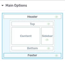
When you open the Thrive Theme Builder editor, you can immediately notice the “Main Options” in the left sidebar:

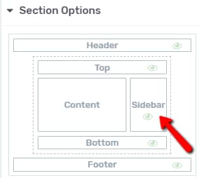
This is where you can specifically choose which section you want to customize. You can do that by clicking on the desired section. In this case, I will click on “Sidebar”:

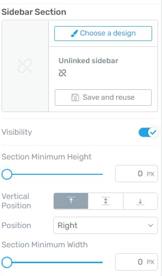
You can then start to use the options that appear on the left sidebar. The first set of options from the left sidebar is the “Sidebar Section” one:

You can insert a sidebar section that comes with the theme, or you can use one that you have previously saved.
Before doing this, though, make sure that you customize the “Sidebar” section as you wish. For that, you can make modifications to the design of the section. You can add new elements to it, as well.
In order to add elements, you can proceed as you normally would. Click on the plus sign from the right sidebar, which will open a list of all the available elements.
Then, drag and drop each element to the “Sidebar” section. The element options will appear in the left sidebar. After you use them to customize each element, you can go back to the “Sidebar” section options by clicking on “Sidebar” in the breadcrumbs:

Then, if you want to use the “Sidebar” section that you have created in more templates, you can do that with the use of the “Save” option.
Save and reuse
If you want to save the section, click on the orange “Save and reuse” button:

You will then be asked to name the section. Click on “Save to library”:

This will save your custom “Sidebar” section, and you will be able to find it under the “My Saved Sidebar Section” tab:

Once you choose another “Sidebar” section, if you click on it on the editor, you will notice three more options:

This is how you can use the three options:
-
the “Choose a design” option takes you back to the same pop-up described below, where you can choose a different sidebar from;
-
if you choose “Edit”, you will be taken into the “Edit Mode”, where you can edit the section and the elements inside it using the options that appear on the left sidebar:

Besides that, you can also add elements to the sidebar, as well.
When you finish editing the sidebar using the “Edit Mode” you can click on “Done”, so that you will be taken back to the “Sidebar” section options:

-
you can use the “Unlink” option if you want to make modifications to the “Sidebar” section without affecting the other templates, where the same “Sidebar” section is used.
Also, after you choose to use a previously saved, only a few options will be available. However, if you unlink the section, you will be able to use the rest of the options, described below.
Choose a design
Another option that you can use is the “Choose a design” option. If you want to change the section, click on this option:

This will open a pop-up, which allows you to choose a new sidebar section from the two sources (“Theme Sidebar Sections” and “My Saved Sidebar Sections”):

If you want to select a sidebar section, simply click on it and it will automatically apply:

After you are done choosing the “Sidebar” section, feel free to use the rest of the options in order to further customize it:
Use the other Sidebar Section Options
Visibility
This option lets you choose whether you want to have a “Sidebar” section or not. It is enabled by default and, if you disable it, the section will be removed.
If you want to do that, click on the switch next to the option

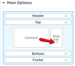
Note: Another way to change the “Visibility” setting is by clicking on the eye icon from the “Main Options” section of the left sidebar:

If you click on it and hide the section, the eye icon will become red, letting you know that the section is not visible. If you want to switch it to visible, simply click on the icon again.
Section Minimum Height
After that, comes the “Section Minimum Height” option, where you can choose the minimum height of the “Sidebar” section. You can do that by using the slider and dragging it from side to side. You can also manually enter a numerical value in the field next to the option:

Vertical Position
The next option below the “Section Minimum Height” one is the “Vertical Position” option. You can choose how the “Sidebar” area should be aligned vertically. Choose one of the positions by clicking on the one you prefer:

Position
Next comes the “Position” option. You can decide if the “Sidebar” section should be placed on the left side or on the right side of the post or page. In order to choose the placement, click on the field next to the option:

This will open a small drop-down menu, with the two options. Click on the one you prefer:

Section Minimum Width
The last option is the “Section Minimum Width” one. If you want to modify the width of the “Sidebar” section, you can do that by dragging the slider from side to side, or by entering a numerical value in the box next to the slider:

Use the Sidebar Display Options
Besides using the options presented above, which can be found in the “Section Options” section of the left sidebar, you can also customize the sidebar using the options in the “Sidebar Display”. Click on this section, to expand its options:

The first option will allow you to choose whether you want the sidebar to be a normal one or an “Off screen” one:

An “Off screen” sidebar will have the advantage that it can be expanded or collapsed by the user if they want to get it out of their way at any point while visiting your site.
By default, “Normal” is chosen here, but you can select the “Off screen” option if you want to create such a sidebar:

-
If you opt for an “Off screen” sidebar, some more options will become available right away:

-
If you choose the “Normal” sidebar, the next available option will be the “Enable Sticky Sidebar” one:

You can find details about this option a bit later in the article. Let’s see how to use the “Off screen” sidebar options first.
Default State
This option will let you choose which state of the sidebar should be set as default when someone visits the website. You can choose between the “Expanded” and “Collapsed” states:

If you choose “Collapsed”, when someone visits your site, they will not see the sidebar at first, only after they open it, using a trigger of your choice (explained below). If you set the default state to be “Expanded”, it will be open by default.
View expanded sidebar in editor
This option refers to the way the sidebar looks like in the Thrive editor. This can be helpful for you when editing the section.
If you want the “Sidebar” section to be expanded in the editor, while you make the necessary modifications, make sure this option is switched on:

Show Sidebar
When the sidebar is expanded, you can choose what happens to the content. You can have the sidebar overlapping the content, in which case you will have to choose the “Over Content” option:

The other available option is the “Push Content” one, which will move the content when the sidebar opens so that no bits of content will be covered:

Choose the preferred option by clicking on it:

Overlay
By default, this option is disabled. If you switch it on, a default color will be added as an overlay to the content:

This way, you can really focus the attention of the visitors towards the sidebar section, when the sidebar is expanded.
If you want to use this option, make sure to enable the switch next to it:

Once you do that, the “Color” field will also be available. This will let you choose a custom overlay color. Simply click on the color box, to open the color picker and choose the color that you want to use:

Quick Toggle Icon
The next option refers to the trigger that opens/closes the sidebar. We have designed a version for this trigger, which we call the “Quick Toggle Icon”. When you activate the “Off screen” sidebar, this will be applied by default.
It can be customized as you wish. You simply have to click on it, and the options of the “Icon” element will appear in the left sidebar.
If you want to use the “Quick Toggle Icon”, make sure to activate the switch next to this option:

-
Quick toggle icon: enabled
If this is activated, you can also choose the positioning of the trigger. Use the “Position” option to place the trigger on the top/center or bottom side of the sidebar:

-
Quick toggle icon: disabled
If the option will be switched off, the toggle will disappear. However, you can add custom triggers that the visitors can use to open or close the sidebar.
We have written a separate article in which we’ve shown how to create custom sidebar triggers, so make sure to check it out here, if you want to find out how to do that.
|
Here are some things to keep in mind regarding the sidebar triggers:
|
Close Icon
A “Close” icon can also be added to your sidebar if this option is enabled:

Naturally, should you activate this option, the “Close” icon will appear on the top right side of the sidebar:

If you want to customize it, click on it, and the “Close icon” options will appear in the left sidebar:

These were the options that you can use to customize and set up an “Off Screen” sidebar.
|
Note: Please keep in mind that some of the options presented above will not be available in the “Mobile View”, as the screen size will be more narrow, and the sidebar will always be displayed over the content. |
If you want to use the “Normal” sidebar, you will be able to make it sticky (an option that is not available for the “Off Screen” sidebar).
Enable Sticky Sidebar
If you want, you can make the sidebar section “sticky”. This means that even if someone scrolls down the page, the sidebar will not move:

To do that, activate the “Enable Sticky Sidebar” option:

Distance from top or bottom
Then, you can set the distance from the top or bottom sections, by entering a number in this field, or by dragging the slider from side to side:

Sticky Until
Finally, you can choose for the sidebar to be sticky until the end of the main container, the end of the page, or until it reaches another element.
Click on this field, to choose one of these options:

-
Sticky until the end of the main container
If you choose this option, then the sidebar will remain sticky until the user scrolls past the main container. After this will be passed, the “sticky” behavior will end:

-
Sticky until the end of the page
This option is similar to the previous one, but the behavior will remain activated until the user reaches the end of the page.

-
Sticky until it reaches another element
In the third case, you are able to set the sidebar to be sticky until the user reaches a certain element. To determine which element that is, you will have to set an ID for it. You can do that by selecting the element and providing an ID from the “HTML Attributes” section of the left sidebar:

Then, enter that ID in this field, in the “Scroll Behaviour” settings:

Once you do that, the “sticky” behavior will be enabled up until the point when the user gets to the respective element:

These were the ways in which you can customize the “Sidebar” section using the options from the left sidebar. Keep in mind that, besides the options described above, you can also use the rest of the options, such as “Layout & Position” or “Borders & Corners” in order to further customize the section.
If you need more information about the Thrive Theme Builder elements and features, make sure to read the articles from our dedicated knowledge base section.
I hope this article was useful to you. If so, make sure to leave a smile below 🙂