The “Search” element is a very useful tool to add to your website in order to improve the general experience of the users that browse through your posts or pages.
This element allows the users to search for specific content on your website, making the search process easier and more time-saving.
If you want to find out how to use and customize the element, keep reading this article.
Add the Element to the Post/Page
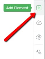
The first thing you need to do is to add the element to your post/page. To do that, in the Thrive Architect editor, click on the plus sign from the right sidebar:
This will open a list of all the elements that you can use to customize posts or pages. Scroll down until you see the “Search” element, or look for it in the search bar:

Then, drag and drop it wherever you want on your page:

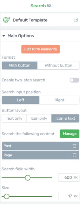
Now, once you’ve placed it wherever you see fit, some options will appear on the left sidebar:
Choose the Template
The first section from the left sidebar is the template library one. This means that you can customize the element by choosing a different template for it. Click on the template field:

This will open the template pop-up, with all the available “Search” element templates. Find one that you like, select it, then click on the “Replace Template” button to apply it:
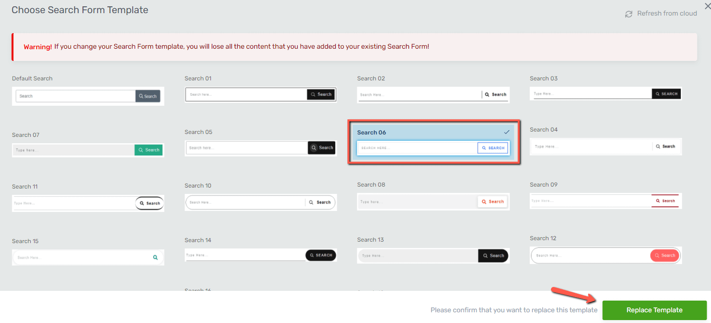
Note: Before changing the template of the “Search” element, please bear in mind that if you do this, all the customization that you have previously applied to the element will be lost.
This is why we recommend you select a suitable template for your “Search” element before you start customizing it.
Use the Edit Form Elements Option
The next section of the left sidebar is the “Main Options” section. The first option is the “Edit Form Elements” one. Click on the button in order to access it:
This option is where you can edit each element of the “Search” bar. You will be taken into the “Edit Mode”. This means that you will be able to edit the parts of the “Search” element one by one by clicking on them and then using their specific options that will appear in the left sidebar.
Keep in mind that while you are in “Edit Mode”, editing the different elements that belong to the “Search” element, you will not be able to select or edit other elements on the page.
Search Input
If you click on the search bar, you will be able to edit the “Search input”:

Placeholder
You will notice the “Placeholder” option on the left sidebar:
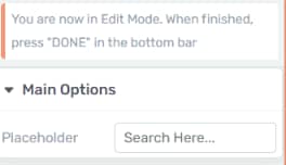
To change the placeholder, simply click on the field next to the option and write your own text. Then, click anywhere outside the field, or press “Enter”, and the placeholder will change:

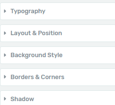
You can further customize the element by using the rest of the general options available in the left sidebar:
Search Submit
If you click on the search button from the search bar, you will be able to edit the “Search Submit” element:

Master Color
The first option from the left sidebar, when editing the “Search Submit”, is the “Master Color” one. To change the color of the button, click on the box with the color next to the option:

This will open the color picker. You can manually choose a color using the color picker, or enter a HEX/RGB code in the dedicated field:

When you’re done, click on “Apply”:

Besides the color, you can use the rest of the general options, just like in the case of the “Search Input”.
Icon
Another part that you can customize in the “Edit form elements” option is the icon from the “Search Submit” element. To do that, click on the icon:

Once you select it, the corresponding options will appear in the left sidebar:
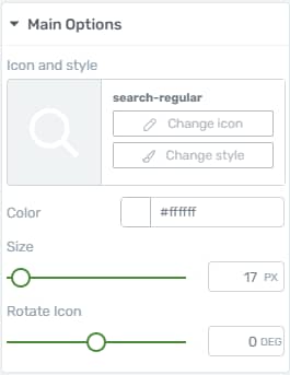
Icon and style
This is where you can change the actual style of the icon. Click on the field next to the option to do that:
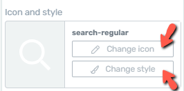
Clicking on “Change icon” will open a pop-up with all the available icons. Scroll down through the list until you find the one you prefer, select it, and click on the green “Select” button:

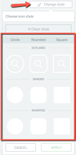
If you want to apply changes to the style, click on “Change style” and select one of the available options:
Color
After choosing a suitable icon, you can change its color. To do that, click on the color box next to the “Color” option:

This will open the color picker, which you can use just like the one described above.
Size
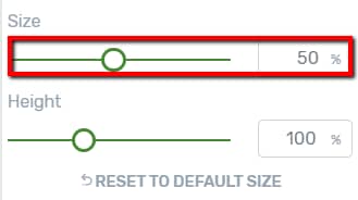
The last way in which you can modify the icon is to change its size. To do that, use the slider below the “Size” option, or manually enter a numerical value in the field next to the slider:
You can also customize the icon with the use of the rest of the general options.
Rotate Icon
Use this option to rotate the icon as you best see fit, by using the slider or by inserting the degrees in the corresponding field:

Hover State
Besides the “Main Options” and the general options when editing the elements belonging to the “Search” element, you can also customize how these will look like in the “Hover” state.
To do that, first, click on the element that you want to customize in “Hover” state. Then look for the “State” section below the name of the element in the left sidebar. We will use the “Search Input” as an example.
Once you have found the “State” section, click on “State: Normal” and choose the “Hover” option from the drop-down that appears:

Customize the hover state as you wish, using the options specific to the element that appear in the left sidebar:

After you have finished customizing the “Hover” state of the elements as well, you can go back to the “Normal” state by selecting the “Normal” option from the drop-down.
These were the ways in which you can use the “Edit Form Elements” option. When you are done customizing the elements in the “Edit Mode”, make sure to exit by using the “Done” button from the bottom side of the editor:

This will take you back to the “Main Options” of the “Search” element.
Use the Main Options
Format
Going back to the “Main Options” of the “Search” element, the first one is the “Format” option. This is where you can choose if the element should contain a search button or not. To choose a variant, click on one of the two:

If you choose the “Width button” option, you will be able to also choose the layout for the button, the options being the ones below:

Choose the one that best fits your page by clicking on either of the options.
Enable two-step search
If you enable this toggle, anyone using the element will be able to open the search field either by clicking or hovering over the search button:

So, at a first glance, the search field itself will not be visible anymore, only the search button:

Furthermore, after you enable the toggle, several new options will appear in the left sidebar:
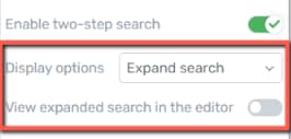
From the first drop-down you can choose what happens on click and on hover:

Here’s an example of how the element would expand the search field on click:

And here’s an example of the tooltip that would appear on hover, if you select that option:

View expanded search in the editor
Naturally, if you activate the toggle next to “View expanded search in the editor”, then the expanded view will appear by default:

Search input position
Next you can decide on which side should the search field appear:

Select the one that best suits your needs:

Content to be searched
Next, you can choose the content that will be searched. To do that, click on “Manage”, next to the “Search the following content” option:

This will open a pop-up, where you can check/uncheck the boxes next to the content that you want the search to be made in, whenever someone will use the “Search” element from your page/post:
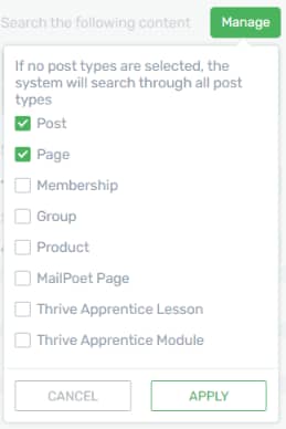
Click on “Apply” when you’re done:

The post types that you’ve selected will also appear below the “Manage” button. If you want to remove one from the list, you can go back to the list and un-check it, or you can delete it directly from here, by clicking on the trash can icon next to the item:

Search field width
The next option is the “Search field width” one, where you can change the element’s width. To do that, either drag the slider from side to side or write a numerical value in the field next to the slider:

Size
The last option from the “Main Options” section is the “Size” option. This allows you to modify the size of the entire element. To do that, drag the slider from side to side or enter a numerical value in the field next to it:

Use the Rest of the Options
These were the ways in which you can customize the element using the “Main Options”. However, you can use the rest of the general options, as well (such as Layout & Position, Background Style, etc):
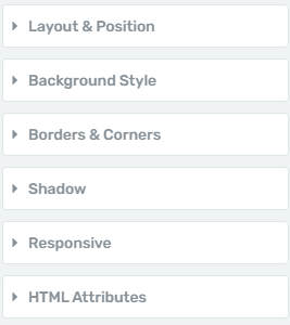
We have separate articles for them, which can be found in our Knowledge Base.
This concludes the article about the “Search” element and the ways in which you can customize it.