There are various options you can use when editing a header from a Thrive Theme Builder template or from a Landing Page.
Besides the header specific options for which you can find a separate article linked here, you can also use the more general ones located right under the “Header Options” section:
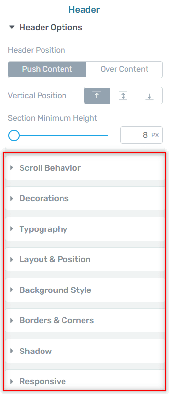
In this article I will be focusing on the options located right in the “Scroll Behavior” section, and I will be using a Thrive Theme Builder page template.
So, while you are in the edit mode of your header, expand the “Scroll Behavior” of your left sidebar:
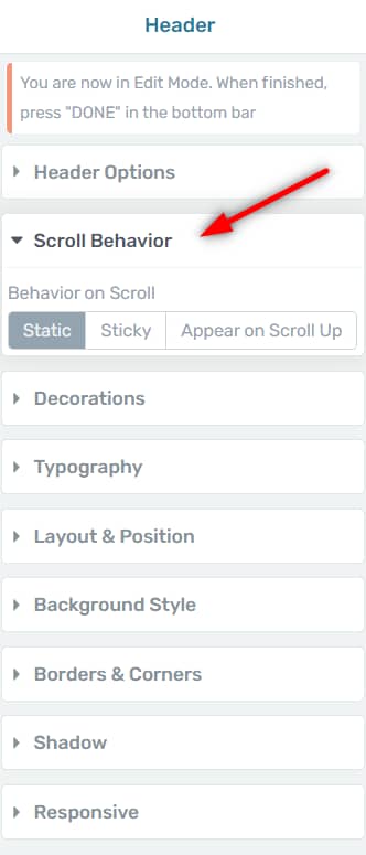
These are the three behavior on scroll options that should become available for you to use:
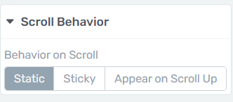
Let’s take them one at a time:
Static
The “Static” behavior means that the header will not move – it will remain in the default position even if you scroll down the page:

The header will be visible only when reach the top of the page.
Sticky
The “Sticky” behavior means that the header will remain in view-port, even if the users scroll down the page:

As you can see, a whole new set of options becomes available after you select it:

Visible on
Here’s where you can decide if you want the sticky behavior to only be visible on certain devices.
You have the desktop mode:

This means that the sticky behavior will be visible when viewed on desktops (anyone opening this page on a tablet or mobile will see the regular static header).
The tablet:

And lastly, the mobile devices:

If you want, you can also select multiple options:
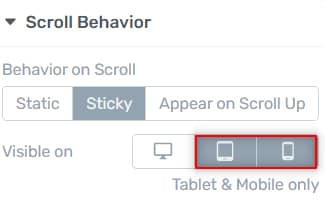
As per the above example, the sticky header will only be visible and enabled on the tablet and mobile devices.
Try this!
For example, one way in which you can use this behavior is with a reduced opacity for the header, in order to obtain an interesting effect.
With this option selected, access the “Background Style” options and reduce the opacity of the base layer to 50%:

This way, even through the header is sticky on scroll, the user will still be able to view the content behind it:

Distance from the top of the screen
This slider allows you to adjust the distance between the sticky header and the top of the page:

Here’s how it would look like with a 100 px distance:

Keep in mind that if you decide to use this feature, you might need to do further adjustments so that the header and the title, for example, don’t overlap at the top of the page (as visible in the above example).
Sticky until
This feature allows you to determine until what part of the page should the sticky behavior be visible.
If you open the drop down list you get two more options to choose from:
- End of the page
With this option selected, the header will be sticky until the end of the page:

- End of parent container
The “End of parent container”, in this case in which you are applying it to a header, will work just as the “End of the page” option.
This is due to the fact that here the parent container is the page itself, so the header will be sticky until you scroll down to the end of the page.
If you want to read how to use this option on other elements, then check out the general article for the “Scroll behavior” option.
- It reaches another element
For this option, you will have to manually define an element from your page that will basically disable the sticky behavior once the header reaches it:

In order to set the ID of that element you first have to exit the “Edit” mode of the header, and look for the element within you template.
Right before my post content, I have a “Columns” element, for which I want to define the HTML attributes. So basically I want my header to be sticky just until it reaches this set of columns.

With the element selected, I will access the “HTML Attributes” section:

Important!
Keep in mind that the “HTML Attributes” option is only available for certain elements.
Then, in the section that opens, go ahead and add a identifier in the “ID” field:

Then enter once more the “Edit” mode for the header, access the “Scroll Behavior” set of options and type in the element ID in the corresponding field:

Save your work and preview the page. The header should now keep the sticky behavior until it reaches the element defined by you:

Switch on scroll
The “Switch on scroll” option is slightly more complex than the previously explained ones:

We have a separate article in our knowledge base that goes into more detail about how to use it. I will cover the main points in this article as well, but you can also read the dedicated article for it, if you want to learn more about this topic:
This feature allows you to achieve various transition styles between two headers.
Once you activate the toggle, the states panel will become available for you to use:

The “Switch after” toggle can be used to adjust how much the users need to scroll until the headers will switch:

Then, in the states panel, with the “On load” option selected you can see how the “Static” header (before scrolling) will look like. Feel free to customize this using the left sidebar options.
Try this!
As an example, I’ve added a fancy divider to it:

This means that when the page loads, the header will first look like this.
Then, after the users start scrolling, the header will change it’s appearance based on what changes I make to it while I have the “On scroll” option selected in the states panel:

So once you select this, you’ll see that you get your default header back:

And you can now apply the changes you want, which will start being visible when the users start scrolling.
For this example, I decreased the opacity of the header from the “Background section”, in order to achieve this effect:

Appear on Scroll Up
The “Appear on scroll up” option means that once the user start scrolling down the page and then back up, the header will appear in view port:

The scroll up action brings back the header even if you have not reached the top of the page yet.
These were the ways in which you can use the “Scroll Behavior” options when working with a Thrive Theme Builder template.