If you are using Thrive Architect, and you want to display multiple images in a fun and creative way, you can create a gallery.
A gallery can be easily added to any post/page from your website, and you can find it in the list of elements, under the “Image Gallery” name.
This article will show you how you can include such an element in your posts/pages, as well as how you can customize it, to fit your website’s branding and aspect.
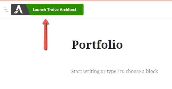
If you want to include a gallery of images on your post/page, you will have to launch the Thrive Architect editor on that post or page:

Once the editor opens, you can start setting up the element.
Add the Element to the Post/Page
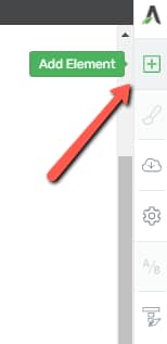
To get started, you will have to add the element to the page/post. For that, click on the plus sign from the right sidebar, to open the list of all of the Thrive Architect elements:

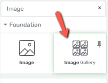
You can then scroll down, to look for the “Image Gallery” element in the list, or you can even start typing the name in the search bar:

When you find the element, grab it and, using the drag&drop method, place it anywhere you want, on the page/post:

This will open your Media Library. You can select the photos that should appear in the gallery, from the images that you have already added to the library, or you can add new ones:

Once you’ve selected multiple images, click on “Add to gallery”:

Before inserting the gallery in the editor, you can edit it, or add more photos:

-
1: Cancel Gallery – this will remove all images from your selection;
-
2: Edit Gallery – this is currently selected, as this is the state in which you find yourself when seeing this pop-up (from the image above). Of course, this will allow you to edit the gallery using the options presented in this list;
-
3: Add to Gallery – if you want to add more images to the selection, you can use this option, and it will show you the rest of the images from your media library, that have not yet been added to the gallery;
-
4: Reverse Order – if you click on this option, the last image will become the first one, and the rest of the images will be placed from the last one to the first one;
-
5: – Captions – you can add captions to the images, before inserting them in the editor. However, captions can also be added later on, in the Thrive Architect editor;
-
6: – Remove Images Individually – you can click on the “X” sign from the top right corner of each image, to remove it from the gallery;
When you finish editing the gallery from this pop-up, click on “Insert Gallery”:

Once you do that, the pop-up will close and the “Image Gallery” element will appear in the editor. You will notice that some options will appear in the left sidebar, which you can use to further customize this element:

Use the Main Options
The first section from the left sidebar is the “Main Options” one, and this is where you will find some options that are specific to this element:

Edit Selection
The first option is the “Edit Selection” one, from where you can re-open the same pop-up, if you want to access it again and change the images:

You will also have a counter of the number of active images (the number of images currently included in the gallery):

Edit Design
The option that comes after the “Edit Selection” one, is the “Edit Design” option:

This works the same just like in the case of any other Thrive Architect element for which it is available – if you click on it, you will be taken to the “Edit Mode” of this element.
In the “Edit Mode”, you are able to customize the items inside the “Image Gallery” element, which, in this case, are the individual images:

If you click on one of the images, some options will appear on the left sidebar, which you can use to customize them:

|
Note: When editing one of the images in the “Edit Mode”, all of the other ones will inherit the same changes, to keep consistency throughout the entire element. |
-
“Main Options” section
Using the “Main Options” section of an image, while in the “Edit Mode”, will let you modify the image style, its title, as well as alt text:

-
“Image Effects” section
This next section of options contains all the image effects that can be applied to each image:

We’ve described each of these in the article we have written for the “Image Element”, so please check out this part of it, if you want to see how these effects can be used and applied.
-
The rest of the sections
Besides the two above-mentioned sections, you can also customize the images using the “Borders & Corners” and “Shadows” sections, for which we have created separate articles in our knowledge base.
-
The “Hover” state of the images
Moreover, while in the “Edit Mode” of this element, you can also edit the “Hover” state of the images. This means that you can choose what the images will look like when someone hovers their cursor over them.
If you want to modify the “Hover” state, select one of the images and click on the down arrow next to “State: Normal”:

A small dropdown will open. Click on “Hover”:

Use all of the available options from the left sidebar to customize the “Hover” state of the images, and, when finished, you can click on the same down arrow again and go back to the “Normal” state.
|
Note: When you customize the “Hover” state of one of the images, the same modifications will be applied to the “Hover” state of all of the other images as well, in order to keep the consistency throughout the element. |
Here is an example of adding a “Greyscale” effect on “Hover” state:

This is how you can use the “Edit Mode” of the “Image Gallery” element, to customize each image individually. When you’re done using it, you can go back to the “Main Options” of the “Image Galery” element, by clicking on “Done”:

Gallery Type
Next, you are able to change the type of gallery to be displayed. You can choose between the “Grid”, the “Vertical Masonry”, the “Horizontal Masonry” and the “Carousel” types:

-
the “Grid” type will look something like this:

Check out this video tutorial, to see how you can configure this type of gallery:
-
the “Vertical Masonry” will display the images something like this:

-
the “Horizontal Masonry” type will show the images in a similar manner to the one below:

Take a look at this video tutorial, if you want to see how you can set up a “Masonry” type of gallery:
-
and the “Carousel” type will show the images in the form of a slide show:

You can take a look at this video tutorial, for more information about how to create a “Carousel” gallery type:
Select the one you want, and then you can adjust the images, to create the desired aspect.
|
Note: If you choose the “Carousel” gallery type, please check out this article that we’ve created, dedicated to all the options that are specific to this gallery type. |
Show Captions
The next set of options will let you add and customize captions for the images.
If you want to display captions for one or more images, you can switch the next option on:

Of course, for the captions to be visible, you will also have to add them to each image. There are two ways to do that:
-
You can add captions to each image, from the pop-up from where you’ve previously selected the images:

-
Or you can add a caption to the image by entering the “Edit Mode” and hovering over the lower side of the image, until the insertion point appears instead of your regular cursor. Then, you can just start typing the caption:

Please keep in mind that, for the second way to add a caption, the “Show captions” option has to be enabled.
If you want to customize the captions, the process is described a bit later, in this article, here.
Crop Images to Fit
If you’ve chosen the “Grid” or “Carousel” gallery type, the next option will be the “Crop Images to Fit” one.
This is useful to enable in case you are using both vertical and horizontal images, and you want the images from the grid to have the same dimensions:

Next, depending on the chosen gallery type, here are the options that will be available:
Images Per Row
The option that comes next is the “Images per row” one, available for the “Grid” and “Vertical Masonry” gallery types. Naturally, with the help of this option, you can set the number of images that should populate one row.
You can do that using the slider, or by simply entering the number of images in the field next to the slider:

Horizontal and Vertical Space
The “Horizontal Space” and “Vertical Space” options are useful if you want to modify the spacing in between the images. These will also be available for the “Grid” and “Vertical Masonry” gallery types only.
For these two, as well, you can modify the number of pixels either by dragging the slider from side to side, or by entering the number of pixels in the fields next to the sliders:

|
However, if you’ve chosen the “Horizontal Masonry” gallery type, instead of the options shown above, you will be able to modify the “Column Height” and “Gutter” of the element. Column HeightTo change the column height, simply drag this slider from side to side, or enter a numerical value in the field next to it:  GutterThe gutter can also be changed for the “Horizontal Masonry” gallery type. The “Gutter” represents the distance in between the images. You can modify its width, by dragging this slider from side to side, or by entering a number of pixels in the field next to the slider:  |
Thumbnail Size
Next, you can choose the thumbnail size, and choose between the available options:

You can choose between the “Automatic”, “Medium” and “Large” thumbnail sizes.
Please check out this article, for a more detailed guide on how to choose the thumbnail sizes.
Click Behaviour
Now, you can opt for the images opening in a lightbox, when someone clicks on one of them.
The “Click Behaviour” option will allow you to deactivate this feature if you want to. By default, the “Open fullscreen lightbox” option is selected here. However, if you want to change that, click on this down arrow:

From the list of options that opens, you can choose “None (links can be added in edit mode), and no action will be taken if someone clicks on one of the images:

You can select this option if you want a certain URL to be opened when someone clicks on the images. For that, after selecting this option, enter the “Edit Mode” of the “Image Gallery” element, click on the images, and the “Add link to image” option will be available:

For each image, you will be able to add a different link to be opened when someone clicks on it.
Show Captions on Lightbox
Note: this option is only available if you’ve chosen the “Open fullscreen on lightbox” option in the “Click Behaviour” section.
When someone watches the gallery from your website, if they click on one of the images, they will open them in a “Carrousel” structure. A “Carousel” is similar to a slideshow, and it makes it easier for the users to navigate through the images.
We call this structure a “Lightbox”, and it looks something like this:

When this lightbox opens, you have the possibility to choose if the captions should be displayed or not.
If you want to display the captions, make sure to activate this option:

This is what the lightbox will look like for the visitors:

Customize the Image Captions
Now, of course, if you want to display captions in your “Image Gallery” element, you also have the option to customize them. This means that you can change their position, font, color etc.
If you want to do that, enter the “Edit Mode”, using the “Edit Design” option, and select one of the captions, in the editor. You will be able to tell that you’re editing the caption, as the “Image Caption” element will appear in the breadcrumbs, as well as the left sidebar:

You will notice two sections from where the captions can be edited: the left sidebar, and the top panel:

In the left sidebar, you can find options to modify:
-
the position of the caption: you can place it above, below or inside the image:

|
Note: If you go for the “Inside Image” option, you can also choose the vertical position of the caption, inside the image:  |
-
other formatting options: Color, Font, Highlight, etc. All of these features are explained in this article, if you need help setting them up.
-
the rest of the options sections, such as “Layout & Position”, “Background Style”, “Borders & Corners”, etc. all for which we have dedicated articles in our knowledge base.
In the top panel, you will also find some formatting options. These are all described here, so please take a look, if you need to find out more information about how to set them up.
Full Screen Image Size
If you’ve selected that the lightbox with the images should open when someone clicks on them, this option will be available for you.
Similar to choosing the dimensions of the thumbnails, you can also choose the image dimensions for when someone opens them in full screen mode.
Here as well you can choose a medium or large one, or keep its original dimensions:

Carousel Options
As mentioned above, the “Carousel” gallery type will have a few extra options, that are specific to this type of gallery only.
We’ve decided to create a separate article, to show you how you can edit and customize a “Carousel” Image Gallery, so please check it out here, if you want to see how to use all of the options that appear when choosing this type of “Image Gallery”.
These were all the options that can be found under the “Main Options” section of the left sidebar. However, there are a few other sections that you can use to further customize the “Image Gallery” element.
Use the Rest of the Options
I’ve described the ways in which this element can be customized with the help of the “Main Options” section, but please remember that you can utilize these other sections as well:

For all of them, we’ve created separate articles in our knowledge base, and you can quickly access them here:
You might also be interested in this article, in which we show an interesting way as an example of using the carousel “Image Gallery”.
This is how you can add and customize an “Image Gallery” element in Thrive Architect. I hope this article was useful to you. If so, don’t forget to leave a smile below 😄