This article will show you how to add an image to your page and edit it using Thrive Architect.
Add the image
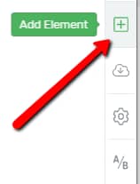
In your Thrive Architect editor, click on the plus sign from the right sidebar. This is where you can add a new element from:
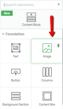
Look for the “Image” element or search for it in the search bar. Drag and drop it on your page wherever you desire:
A pop-up will open with your Media Library. This is where you have to select your image from. You can either upload one from your PC, or you can use one that you’ve previously uploaded in your Media Library:
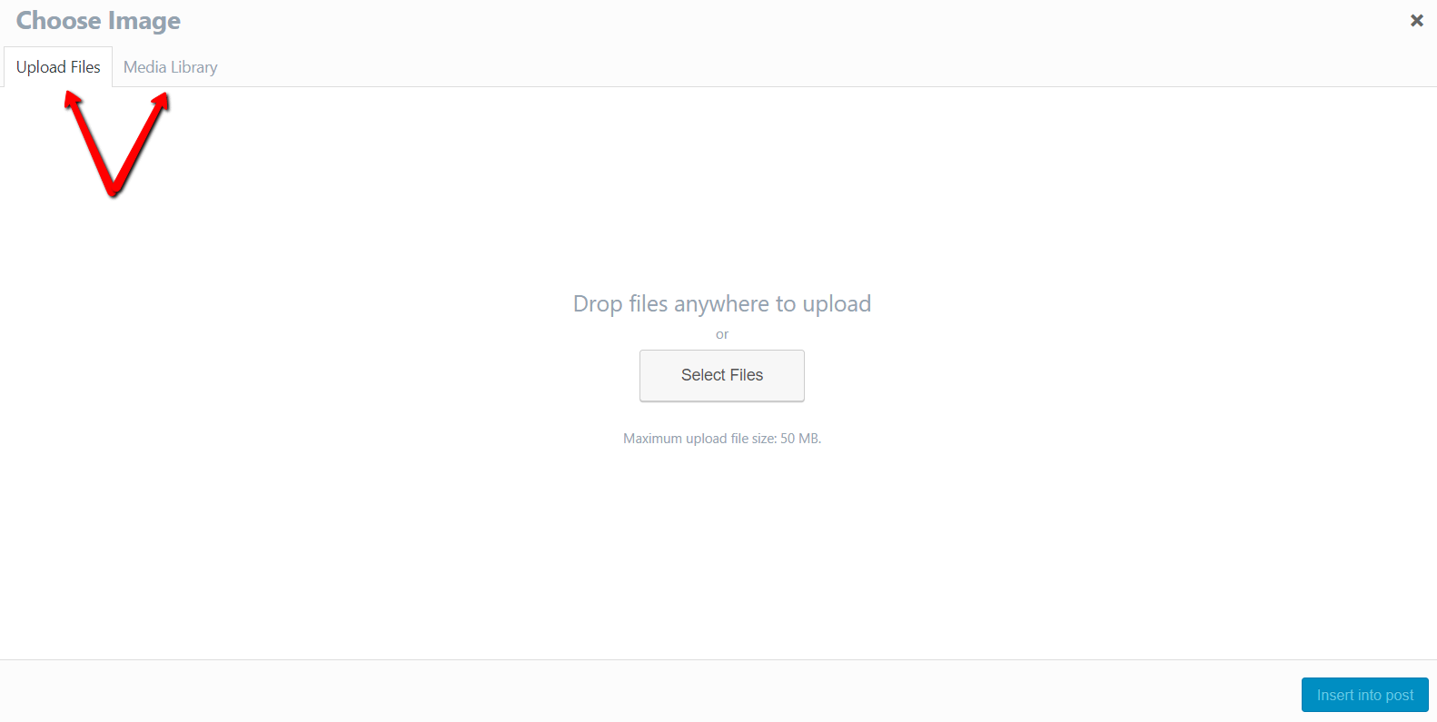
To upload a new file, simply drag and drop the image anywhere on the pop-up, or click on “Select Files” to browse through your computer:

If your image was previously uploaded in your media library, go to the “Media Library” tab and select your image:

Once you’ve selected or uploaded an image, click on the blue “Insert into Post” button from the bottom right corner:

Important!
When choosing an image from the WordPress Media Library, make sure to check the Size from the Attachment Display Settings:

This may be a problem when you are trying to display a large, full sized image on your site, but the Media Library size is set to “Thumbnail”. This will make your image look blurry and broken.
If this is the case, simply go and select “Full Size”, from the drop-down, and then insert your image on your page.
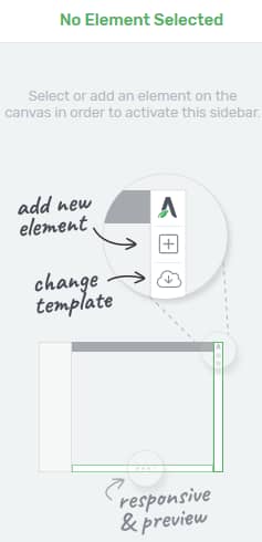
After you’ve inserted the image, you will notice that its options will appear on the left sidebar:
Main Options
Under the “Main Options” section, you will be able to find the following:
Element Type
The first option that you can use in this section is the “Element Type” option. There are two types of images that you can use – static and dynamic.
Static
If you choose a “Static” image, the source of the image will be manually chosen, as described above. In order to choose this option, simply click on it, next to the “Element Type” option:

Dynamic
If you want to use a dynamic source for your image, click on the “Dynamic option”:
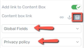
Another field will appear if you choose this option. It is called “Dynamic Source” and this is where you can choose where the image should be imported from.
Click on the field below the option in order to open a drop-down menu with the options:

-
Featured Image
The first option from the drop-down is the “Featured Image” one:

If you have a featured image set for the post or page that you are adding the “Image Element” into and you choose the “Featured Image” option from the drop-down, the image that you have set as a “Featured Image” will be automatically imported.
Important!
If you want to use this option, you first have to make sure that you have set a “Featured Image” from your WordPress Admin Dashboard.
If you did not set a “Featured Image”, but you want to do that, here is how to set it. In your WordPress Admin Dashboard, go to “Pages” or “Posts”. For this example, I will set a “Featured Image” for a page, so I will go to “Pages”:
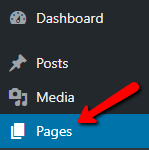
Here, look for the page that you want to add the “Featured Image” to, hover over it, and click on “Edit”:
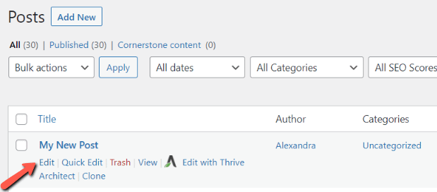
On the right sidebar, you will notice some options. Among these, you will be able to see the “Featured Image” section. Click on it in order to expand it:

Once expanded, click on the “Set Featured Image” button:

This will open a pop-up, where you can choose the image from. You can either upload a file or choose an image directly from your Media Library. Choose the image, and then click on the blue “Set Featured Image” button:

After that, you should be all set to choose the “Featured Image” option as a “Dynamic Source”:

-
Author Image
The next option from the “Dynamic Source” drop-down is the “Author Image” one:
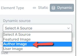
This option will automatically import the image that the author of the respective post/page has previously set.
Important!
In order to use this option, you first have to make sure that the author image has been set. If you want to find out how to do that, we described the process in this article.
After the author image has been successfully set from the WordPress Admin Dashboard, if you choose the option from the “Dynamic Source” drop-down, the author image will be imported:

-
User Image
This is the last available option from the drop-down list. This source will be available only if you have previously set a user image in your Gravatar account.
If you have followed the steps described in this article, then you should be able to choose the “User Image” source, like so:

Once you choose this source, the image will change and display the user image set in your Gravatar account, just as in the case of the “Author image” described above.
The remaining options available in the left sidebar, right underneath the source types, are described below in the article.
We have selected the “Static” type of element once more, and now we will explain the remaining options of the left sidebar which are applicable to both the “Static” and the “Dynamic” element type:

Select Image
If you decide the image is not quite right, you can replace it by clicking on the “Replace Image” field with the double arrow sign:

This will take you back to the media library pop-up.
Note: While you are in the Media Library, you can use the “Use Dynamic Source” feature:

When you click it, the image will automatically change to a “Dynamic” type of element, and the use for this has already been described above:

Also, if you want the full-size image to open when the user clicks on it, check the “Open full size image on click” check box:

Size
You can change the size of the image either by dragging the slider or by entering a value in the box next to it:

You can either resize the picture using a percentage (1-100%) or using the numbers of pixels. In order to change from pixels to percentage or the other way around, simply click on the “%” or on “PX”. This will open a drop-down menu where you can choose the measurement unit:

You can also edit the size of the image directly from your editor. The way to do that is by using the dots that appear in all four corners of the image when it is selected:

You will notice that when you hover over one of the dots, they turn green. Once you hover over one of the dots, click and drag the corner to resize the image as you wish, like so:

Tip: In order to have a better result and to make the resizing process easier, try to center align your image. You can go that by going to the “Layout & Position” section of the left sidebar.
Height
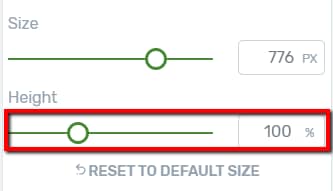
You can adjust the height of the image as well, by using the “Height” slider or by manually entering a numerical value inside the box next to the slider:
There is also a way to change the height of the image (crop it) directly from the editor. You will notice two diamond shape icons on the middle top and bottom of the image. When you hover over them, they turn green:

To change the image height, click on one of the diamond icons and drag and drop the image to adjust it just as you wish:

Tip: To get an even better result when adjusting the height of the image, try to center align it. You can do that by going to the “Layout & Position” section of the left sidebar.
When the height goes over or below the value of 100% (the image does not have its original height), you will be able to move the image around and focus on a certain section of the image:
-
If you adjust the height of the image to be over 100%, a zoom effect will be created and you will be able to move the image from side to side
-
If you adjust the height of the image to be below 100%, you will be able to move the image up or down in its container.
In order to do either of these hover over the image. A four arrow icon will appear. Then, click and drag to move the image around and place it in the position that you want:


Reset to Default Size
If you want to start over with the resizing or height adjusting of your image, using the “Reset to Default Size” button will take your image back to its original size:

Note: Keep in mind that cropping or shrinking an image does not reduce the file size or the load time of the image.
Image Style
If you want to choose a style for the image, you can do that by clicking on the field next to the “Image Style” option:
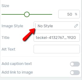
A list containing all the available image styles will open. You can scroll down to see all the available styles and choose the one that you prefer:

After that, click on “Apply”:

Title
You can change the title of the image by entering the new one in the “Title” box:

Usually, the image title appears when the user hovers over the image.
Alt Text
The “Alt Text” field is useful for cases when for some reason (e.g. slow connection, an error in the src attribute, the user views the image on a screen reader, etc.) a user cannot view the image. Therefore, if you want you can enter an informative message about such cases in this field.

Add Caption to Text
If you want to add a caption to your picture, click on the switch next to the “Add Caption Text” field:

This will insert a “Text” element underneath your picture:

In order to add your caption, click in the text field, delete the default text (Edit your caption text here), and then replace it with the caption you want for the image.
Note: To change the text, you will have to click outside the element first, and then click directly on the caption text.
You can also customize the caption text by using the options that appear in the left sidebar for the “Inline text”:

After you have finished, go back to customize the image further, using the rest of the options. In order to do that click on “Image” in the breadcrumbs:

Add a Link to an Image
To choose this option, click on the switch next to it:

This option will redirect the user to a link when clicking on the image. The link can be a Static Link, a Jumplink, or a Dynamic Link.
Static Link
Choosing the chain icon next to the “Image Link” option will give you the possibility to add a static link to the image. First, type either the URL or a search term in the input field to find and insert the link:

Then, choose whether or not you want this link to open in a new tab or be no-follow, by checking the boxes next to these options:

You can find more information about the static links in this article.
Jumplink
In order to add a jumplink, select the anchor icon next to the “Image Link” option:

If you want the jump link to take the users to the target element using smooth scrolling, then check the “Smooth Animation” option. If you want the link to take them directly to the target element, without the animation, then, simply leave the “Smooth Animation” unchecked:

Next, click on the “Select Target” button to open the select mode. Scroll up or down on the page until you see the element you want this jump link to take your users to:

After you have found it, click on it to select it and last, but not least, click on the “Add Jumplink” button, from the bottom-center part of the page, to insert the jumplink:

You can find more information about inserting a jumplink in this article.
Dynamic Link
In order to insert a dynamic link, click on the dynamic links option:

Dynamic links are useful if you want to redirect users, who click on the image, to a specific place/content, in just a few clicks, without having to type the URLs. You can check out this article about how to use the dynamic link feature on images.
Image Effects
Right below the “Main Options” section of the left sidebar, you can see the “Image Effects” section. Most of the options here have a slider and box next to them. You can either use the slider to adjust the values, or you can manually enter a numerical value inside the boxes:

Greyscale
A greyscale image is one that is composed exclusively of shades of grey, varying from black to white.
Therefore, using the “Greyscale” option will cancel the colors and turn your image into a black and white one, this depending on the percentage you go for:

Opacity
The “Opacity” option will allow you to make your picture as opaque, or as transparent as you like. The default on this option is 100%, which means that the image will be opaque by default. Lowering that value, your image will become more transparent, allowing other elements that might be placed behind the image to show:

Blur
A blurred image is one that is in loss of focus. The default blur is 0 PX and increasing this value will make your image look like this:

Brightness
Using this option will allow you to lighten or darken the image. The default is 100%. Going below that, your picture will become darker, like in the first image. Going over 100%, your picture will become lighter, as shown in the second image:


Contrast
You can also adjust the contrast of the image. A high contrast image will have bright highlights, dark shadows, and bold colors, whereas a low contrast image will have a narrow range of tones and might look flat or dull.
If you change the value for one that is lower than the default (100%), the image will have low contrast and it will look flat, similar to the first picture.
If you decide to increase it and go with a value higher than 100%, it will look similar to the second picture:


Sepia
A sepia photography is a monochrome image that also has a tint of brown to warm up the tones.
Raising the default value (0%) will gradually turn your image into a monochromatic one, with a tint of brown:

Invert
Inverting an image represents converting it into a negative. This means that the dark areas will become bright, and the bright areas will become dark. Hues are replaced by their complementary colors. Thus, using this option and raising the value, or moving the slider towards the right, the image will look like this:

Saturation
The saturation of an image refers to the intensity of a color. The higher the saturation, the more vivid the picture is. Lowering the saturation will make the image turn grey. The default value is 100%, so going below that will make your image look like the first picture. Going over that value will make your image similar to the second picture:


Hue Rotate
You can use the “Hue Rotate” option to give your image a tint of a certain primary color. You can either use the wheel and rotate it towards the left or towards the right, depending on what color you want the tint to be. You can also manually enter a value (between 1-359, since it’s measured in degrees):

In this example, I entered the value 90, which gave the image a tint of green:

Image Overlay
Another option available in the “Image Effects” section is the “Image Overlay”. To activate this, click on the on/off switch next to it:

This option allows you to overlay a color on top of your picture, thus giving the picture a tint of a certain color that you will decide on.
Once you activate the option, click on the field next to it, in order to choose a color:

This will open the color pop-up, where you can choose the color you prefer. You can manually pick the color, or you can enter the HEX/RGB code:

You can also choose one of the already existing colors from the “My Colors” and “Theme Colors” sections.
The default opacity is set to 0. Enter a value in the box next to “Opacity” in order to change it.

After you are done, don’t forget to click on the “Apply” button to make sure all your changes have been saved.
Reset To Default
The last option in this section is the “Reset to Default” button:

If you click on the button, each option will go back to its default value.
After you are done using the “Main Options” and the “Image Effects”, you can also use the general options that are available in the left sidebar, under the aforementioned ones, to customize your image even more.
We have separate tutorials about each of these, so if you require in-depth information about how to use them, check out our knowledge base. Here are two of these general options that can be important when customizing the “Image” element:
Layout & Position
You can use this option if you want to set some margins, adjust the alignment of your image, as well as set some other display options. This article goes in more detail about how to use the “Layout & Position” option on an element from Thrive Architect.
Borders & Corners
This option allows you to add borders or modify the corners of the image. You can check out this article on how to use the “Borders & Corners” setting on a Thrive Architect element.
Until now, you have customized the image in “Normal” state. After you are happy with how your image looks in this state, you can also customize your image in its hover state.
Hover State
Customizing an image in “Hover” state means that you can change the way it looks when a user places the cursor on top of it. You can easily do that by going to the top part of the left sidebar and clicking on the down arrow next to “State: Normal”:

This will open the drop-down menu containing the two states of the image. Click on “Hover” to change the state:

You will notice that you have a few options similar to the ones from the “Normal” state:

Use these options to customize the image as you please. You can also reset the state by clicking on this button:

Resetting the state will bring the image to the settings that you have chosen for the “Normal” state. Click on “Reset” to do that:

Once you’re done customizing your image, don’t forget to save everything by clicking on the green “Save Work” button from the bottom left corner of the editor:

This concludes the article about how to use the image element in Thrive Architect. If you want to find out more about various elements in Thrive Architect, check out our Knowledge Base.
I hope this article was useful for you. If that’s the case, make sure to reward our efforts with a smile below 🙂