This article will explain how to use the “Divider” element, as well as the “Star Rating” one. If you want to find out how to add the elements and customize them, keep reading.
The “Divider” element
The divider is a simple line that you can place inside your website or page to separate two pieces of content.
Add the element
In order to add the element to your post or page, click on the plus sign from the right sidebar:
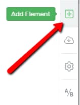
This will open the list of all the Thrive Architect elements. Scroll down and look for the “Divider” one, or search for it in the search bar:

Then, drag and drop it anywhere on your page, where you want to use it:
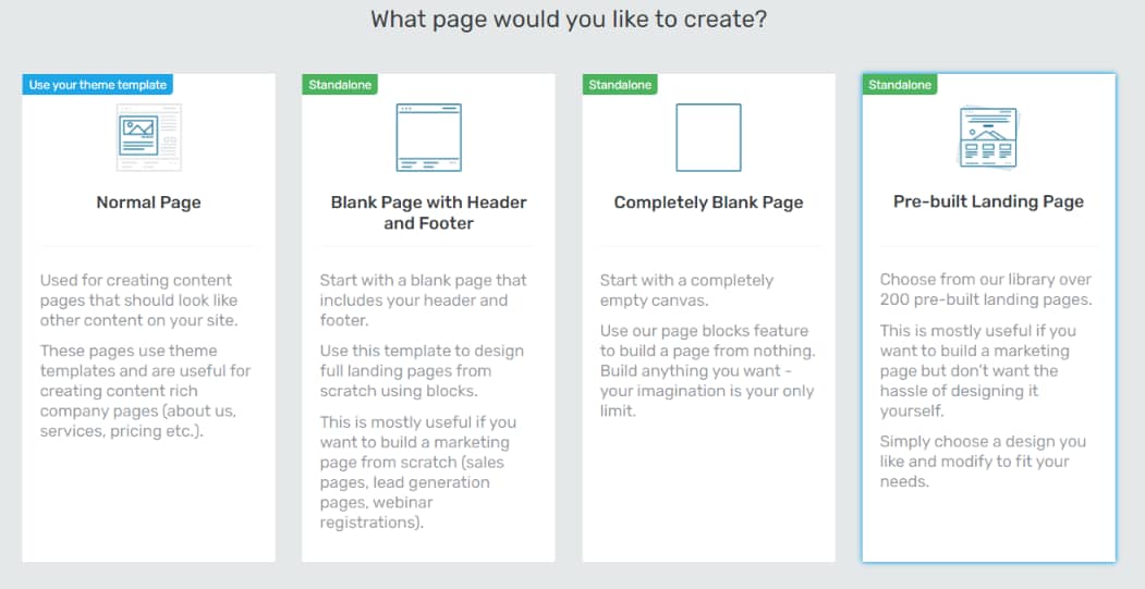
Use the Main Options
Once you place the element, you can start customizing it. You will notice the “Main Options” section open in the left sidebar:

Choose Divider Style
The first section of the Main Options is the “Choose Divider Style” one. This means that you can change the element’s style by selecting one from the list of existing styles.
To do that, click on the field next to the option:

This will open a drop-down menu with all the available divider styles. Click on the one you prefer, and then click on the green “Apply” button”:

Fill
Next, you can change the color of the divider. To do that, click on the color box next to the option:

A color pop-up will open. You can manually choose a color using the color picker, or you can enter a HEX/RGB code inside the box:

Click on “Apply” when you’re done choosing a color:

Thickness
Another thing you can customize is the thickness of your divider. You can simply drag the slider in order to modify the thickness, or you can enter a numerical value in the box next to the slider:

These are the options that you can use in order to change the aspect of the “Divider” element. Don’t forget to click on the green “Save Work” button when you’re done customizing. You can find it in the bottom-left part of the editor:

However, besides the main options, there are some other general options in the left sidebar as well, such as change the “Layout & Position” or “HTML Attributes”. You can use them in order to further customize the element.
The “Star Rating” Element
This element allows the users on your website to rate something on your page using the star rating system.
Add the Element
Just like in the case of the divider, the first thing that you need to do in order to add the element to your page is to click on the plus sign from the right sidebar:

Then, scroll down until you find the “Star Rating” element, or search for it in the search bar:

Then, drag and drop it on your page, wherever it fits best.
Use the Main Options
Just like in the case of any other element, after you’ve placed it on your page, the “Main Options” will appear on the left sidebar:

Note: If you have previously set up a “Number” custom field type, using the “Advanced Custom Fields” plugin, and assigned a value for it for the page you are editing now, then you will be able to use it with the “Star Rating” element.
In this case, you will notice that the first option from the left sidebar will be the “Element Type” option. This is where you will be able to choose between “Static” or “Dynamic”. In order to use the custom fields, choose “Dynamic”:
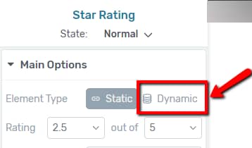
If you choose “Dynamic”, the “Custom Source” field will appear. You can click on this field to open the list with the custom fields and choose the one you want to use.
If you want more details about using the custom field with the “Star Rating” element, check out this article.
Keep in mind that the “Element Type” option will be visible only if you have gone through all the steps explained in this article.
Rating
Next, you can choose how many stars you want to display on your rating. The default is “2.5 out of 5”, but you can easily change that by clicking on each number field:

For each value that you click on, a drop-down will open, where you can choose the value that best fits your needs:

Style
Next, you can choose a style for the element. To do that, click on the field next to the option:
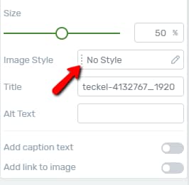
This will open a pop-up where you can choose the preferred style. Select it, and then click on “Apply”:

Fill
The next option is the “Fill” one. This is where you can choose the color of the stars. To do that, click on the color box:

This will open the color pop-up, that you can use just as described above, for the “Divider” element.
This is an example of how the “Star Rating” element looks like with a modified “Fill” color:

Background
Then, you can choose the “Background” color, which means that you can choose a different color for the stars that are not being selected.
In order to change the “Background” color, click on the box with the current color, from the “Background” section field:

Then, the color picker pop-up will open. After you select the color you want, make sure to modify the default opacity value, which is set to 0:

Don’t forget to click on “Apply” when you’re done.
This is an example of how the “Star Rating” element looks like with a modified “Background” color:

Outline
The last color that you can set is the outline color of the “Star Rating” element. To do that, click on the field next to the option:

After you choose a color, similar to the cases above, click on “Apply”.
This is an example of how the “Star Rating” element looks like with a modified “Outline” color:

Size
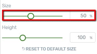
The last option from the “Main Options” section is the “Size” one. You can modify the element’s size. To do that, simply drag the slider, or manually enter a numerical value in the field next to it:
Besides the main options, you can also customize the element by using the general options, also available in the left sidebar:

If you want to find out how to use them, you can check out our knowledge base, where you can find information about various options and elements.
State
Last but not least, you can also use the “State” option to modify the element in different states. Choose which state you want to modify: normal or hover. To change the state, click on “Normal”, next to the “State” option, and choose the state from the drop-down menu that opens:

By default the “Normal” state is selected, so you have customized the element in this state. The “Normal” state is how the element looks normally, whereas the “Hover” state represents the way the element looks when someone hovers over it.
When customizing the element in the “Hover” state only some of the options available in the “Normal” state will be available:

After you’re done customizing the element, don’t forget to click on the green “Save Work” button found in the bottom-left corner of the editor:

These were all the ways in which you can customize the two above-mentioned elements, the “Divider” element, and the “Star Rating” one.
I hope this article was useful for you. If that’s the case, make sure to reward our efforts with a smile below 🙂