With the help of the “Contact Form” element, you can give your visitors an easy way to contact you.
Add the Element to your Post/Page
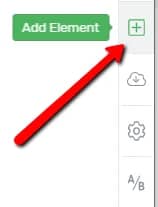
Firstly, you will need to add the element to the post or page you want it to be placed in. For that, click on the plus sign from the right sidebar, to open the list of elements:

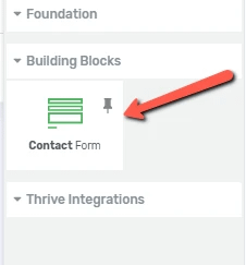
Then, look for the “Contact Form” element:

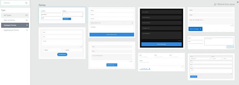
Grab it, and drag and drop it to the editor. A pop-up will open, where you will have to choose a template for the form:

Click on the one you prefer, and it will be applied to the form:

Choose the Template
The template that you’ve selected for this element when you added it, can be changed at any time. If you want to do that, click on the first available field from the “Main Options”:

This will open a pop-up window with various template designs:

Scroll down to check all the templates and, when you have found the one that you like best, click on it, and the selected template will be applied to your contact form:

Note: If you want to replace the template, make sure you do this before adding any content or customize the existing content of the “Contact Form” element. This is because, when changing the template, all the initial content and modifications will be lost.
Use the Main Options
After you add the element to the editor and select a template, its options will appear in the left sidebar:

The “Contact Form” element is basically a version of the “Lead Generation” element, with the specific purpose of allowing the users from your site to submit a contact form.
This is why all of the options of the “Contact Form” element are the same ones as the options of the “Lead Generation” element.
All of these options will be described below, in a brief manner, and you can check out this article for more in-depth details about them.
Use the Edit Form Elements
The very first option under the “Main Options” section is the “Edit Form Elements” one. After you have set up the element, you can use this “Edit Form Elements” option to edit the design/the way various parts of the “Contact Form” element look.
If you want to do that, access this option:

This will take you into the “Edit Mode” of the element.
While in the “Edit Mode”, you can customize your contact form even further, separately, using the options that appear on the left sidebar, upon selecting various elements.
Since the “Group Styling” mode is on, the changes will be applied to every item/input of the same type.
However, you can also customize each part of the contact form items individually as well.
All you need to do is click on the specific label, box/input, or button that you want to customize and exit “Group Styling”.
This can be done by clicking on the “Lock-Unlock” button that appears in the item’s upper left corner, or on the one that is in the sidebar:

If you have exited “Group Styling”, the changes that you make to the item/input will only be applied to that specific item. Learn more about the “Group Styling” feature here.
You can find out more information about this, as well as more detailed instructions on how to use the “Edit Form Elements” option, here.
Colors
Also, if you want, you can change the color of the element. If you’re using a Landing Page, or Thrive Theme Builder, the color will be inherited either from the Thrive Theme Builder template or from the Landing Page, depending on the way you’ve constructed the page.
If you want to modify the color, click on the color box next to the option:

Then (if using Thrive Theme Builder or a Landing Page), from the color picker pop-up that opens, choose if you want to edit the entire template color, or if you want to unlink from the template color, thus only editing the colors of this specific element:

After choosing the preferred variant, either use the color picker or enter a HEX/RGB code in the dedicated field, to change the color. When finished, click on “Apply”:

Connection
Important!
Using the “Contact Form” element will serve you no purpose, unless you connect it to a service of your choice, or create an HTML connection. If you do not do this, then the information submitted by your users will get lost.
Thus, using this next option, you will be able to either create an API Connection or an HTML one. Click on the option that you want:

- API Connection
If you want to create an API connection, click on the first option. You will then be able to connect your “Contact Form” element to the service of your choice. This can either be an email delivery service, a marketing tool, or even WordPress, depending on the goal you want to achieve with this element.
We’ve described the ways to properly set up an API Connection for the “Lead Generation” element here, so please make sure to follow the detailed steps you will find there.
Moreover, if you want to find out what services you can create the connection to, please check out this list, as well as the tutorials we’ve created for each service.
- HTML Connection
If you are not looking to connect a service via API, but rather to do an HTML integration, make sure you select the second “Connection” option:

The difference between these two ways is that the HTML integration gives you the possibility of adding extra fields with the help of an HTML Autoresponder Code.
After you select the “HTML Code” option, a field will open, where you can insert your HTML code, and then, you will have to click on the “Generate Form” button in order to apply the HTML code to the “Contact Form” element:

Clicking on the “Generate Form” button will show the changes directly in the editor, applied to the “Contact Form” element.
Form Fields
After you set the proper connection, whether that’s via API or HTML code, the next step is to set up the fields of the form. Depending on the “Contact Form” template that you’ve chosen, you will have some form fields already set here:

Add a new field
If you wish to add a new field, all you have to do is click on the “Add new” field option:

This will open a pop-up, where you will have to set the new field from:

This can either be a “Name”/”Email” field if you do not already have one of each, or a “Phone” or custom field.
- If you want to add a new “Phone” field, select it from the “Field Type” section, and set it up as shown here.
- If you are looking for ways to set up various types of custom fields, then please feel free to check out this separate article we have written about adding custom fields.
When setting up a new field, you will usually have to choose a name and a placeholder for it, as well as decide whether the field should be required, or it should show its label.
However, please check out the above-mentioned article, since each type of custom field setup may vary, as well as the ways to customize them.
Edit a field
You can also edit the existing form fields. For that, click on the pencil icon next to the one that you want to edit:

This way, a pop-up will open, and you will be able to modify what’s needed:

Delete a field
Lastly, you can also delete a field, if you need to. All you have to do is click on the trash can icon next to the field you want to remove:

The field will immediately be removed from the form.
Hidden Fields
In case you have set up a “Hidden” field, you will be able to see/edit or customize it from the next section:

The way to add a new “Hidden” field is described here. You can edit or remove a “Hidden” field, just like you would in the case of a normal one, described above.
After Successful Submission
After you’ve finished setting up the form fields, the next step is to choose what happens after someone submits the “Contact Form”. There are two available options: you can either redirect the users to a custom URL or show a success notification.
By default, the “Redirect to Custom URL” option is selected. However, if you click on this field, a drop-down will open with the other option as well:

You can find a more in-depth description of each of these actions, here.
Advanced Options
Lastly, in the “Main Options” section, you will be able to use the “Advanced” options:

If you click on this field, the section will expand:

- Enable asset delivery
Activate this toggle if you want to enable the asset delivery feature for this form:

After you activate the toggle, you can proceed with selecting an asset group from the next drop-down:

If you want to learn more about asset delivery and how you can use it on your website, then this article from our knowledge base might be useful to you.
- Form identifier
In the next field, you are able to find a unique form identifier, that you can copy and use with other Thrive Suite products:

You can easily and quickly search for this form in Thrive Ultimatum or Thrive Automator, simply by pasting this code in the form field.
- Spam prevention
Should you want to get ahead of spam signups, you can add a captcha system to your “Contact Form” element:

In order to do this, you must first have an API connection set up with Google ReCaptcha.
If you need help with this, please check out this tutorial.
- Edit error messages
If you want, you can also edit the error messages, by using this next option:

After clicking on this option you will see a pop-up window open with various types of error messages that you can customize:

You can replace the default messages by typing in the messages that you want your users to see if they do not fill out the respective fields correctly.
There is also the option of adding an additional error message called “Signup failed”. If you activate this option you will be able to set one more error message for the rare cases when the sign-up will fail.
First, check the “Add ‘Signup failed’ error message” checkbox, and then type in the message you want to show in these cases in the field that appeared with the default “Error” text:

Click on the green “Save” button when you’re done:

Receiving an Email When Someone Submits the Form
As already mentioned, the contact form needs to be connected through the API in order to properly work. The users filling out this form will be able to get in touch and submit their information only if the form is connected to your autoresponder.
But on top of this, you can also configure it in such a way that when someone fills it in, both the administrator and the user receive an email about the form submission.
The process of achieving this is the same as explained above – you have to make sure your form has at least the name, email and message field and that it is connected to the autoresponder of choice.
Then, you will also have to set up an e-mail connection, just as described in this dedicated article from our knowledge base:
This connection will allow you to receive direct email notifications whenever someone will fill in the contact form:

From the pop-up that opens, you are able to select the email delivery service:

And also, compose and customize the email that will be sent to users after filling in the form:

With the form connected to your autoresponder and with an active e-mail connection, you should start receiving e-mails as well when someone successfully submits the form.
Use the Rest of the Options
Last but not least, the more general options are also available for the “Contact Form” element, thus you can use these too if you wish to further personalize the form. You can use some other general options such as Layout&Position, Borders&Corners, etc.:

Are you struggling with creating a contact page on your website? This post examines the anatomy of the perfect contact pages and includes some practices along with some good and bad examples for you to study.
If you would like to find out more about the general options or how other Thrive Architect elements work, please follow this link.
Hopefully, this article was useful for you. If so, please give us a smile below 🙂