This article will go through the process of adding and customizing the “Comments Section” element to the template that you are currently editing using Thrive Theme Builder.
The element is very useful to use in case you want people to be able to comment on your website.
Important!
This element is not available if you already have Thrive Comments installed on your website. Therefore, if you plan on using this element on your templates, make sure you deactivate Thrive Comments before.
Add the Element
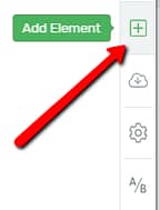
Firstly, you have to add the element to your template. In the Thrive Theme Builder editor, click on the plus sign from the right sidebar:
A list of all the elements will open. Here, look for the “Comments Section” element, or search for it in the search bar:
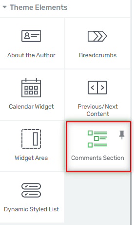
Grab the element and drag and drop it wherever you see fit on your page:

Note: Keep in mind that you can only have one “Comments Section” inside a page. If you have already placed a “Comments Section” element on your page, you will no longer be able to find the element in the element list.
The options of the element will then appear in the left sidebar, and you can use them in order to customize the section just as you wish.
Use the Template Options
The first section from the left sidebar is called “Template Options”, and here is where you can change the template of the element. In order to do that, click on the field next to the option:

A pop-up will then open, where you can see all of the different templates. You can scroll down to find the one you prefer, click on it in order to select it, and then click on the green “Replace Template” button:
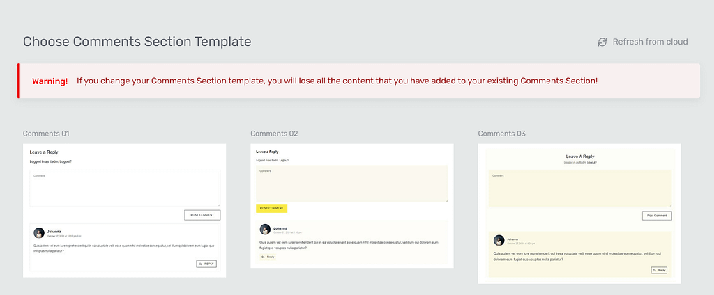
Note: Make sure you choose the template before you make any modifications to the element. We recommend you do this because, when you change the template, all the content or modifications you have made to the previous one will be lost.
After the template has been chosen, you can move forward and customize the element using its main options.
Use the Main Options
The next section of the left sidebar is the “Main Options” one, where you can find the “Edit Elements” button:

If you click on it, you will be taken into the “Edit Mode”, where you can customize each item that forms the “Comments Section” element, one by one.
Comment Form
Once you open the “Edit Elements” option, you will see the “Comment Form” option in the left sidebar:
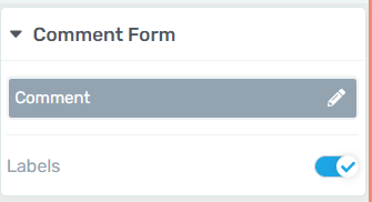
This is where you can establish the labels and placeholders for the “Comments Section” fields. You can very easily change the placeholders, but you first have to select one of the three viewing options. You can do that from the “Editing Comments Section” option.
Editing Comments Section
On the lower part of the editor, you will notice the “Editing Comments Section” part.
Logged In User View
Inside the “Editing Comments Section” pop-up, there is a field that says “Logged In User View”:

This means that you are currently viewing and editing the comment form as a logged-in user. This is how the comment form looks like from a logged-in user’s perspective:
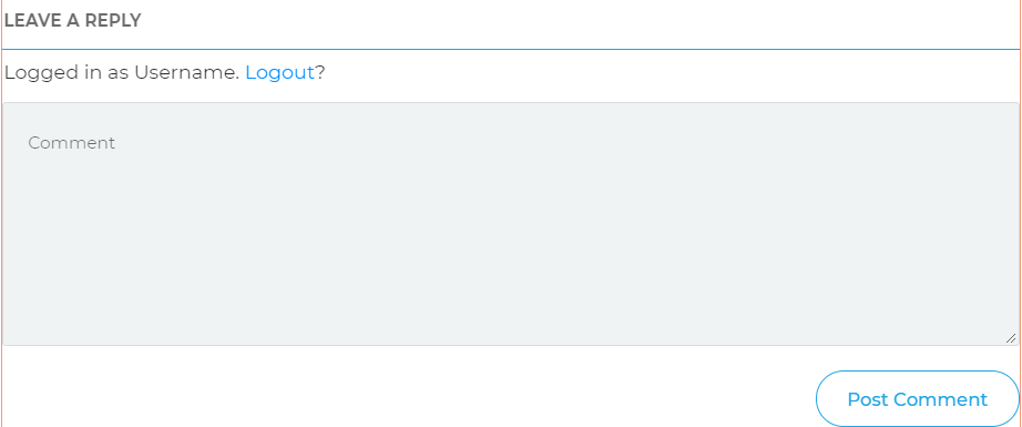
As you can see, there is only one field that you can edit the label or placeholder for, which is the “Comment” field:

In order to change a field’s label or placeholder, you can either identify the field in the left sidebar, and then use the options from there to edit them, or you can click on the respective field and use the “Comments Form Text” options.
For example, in the “Logged In User View” state, there is only one field that I have the option to edit, the “Comment” field.
I can look for the field in the left sidebar and, once I find it, click on the pencil icon:

A small pop-up will open, where I can directly change the placeholder from, and then click on “Apply”:

The placeholder will immediately change, as shown in the image below:

The other way in which you can proceed is to click directly on the field, in the editor. This will open the “Comments Form Text” option, with a few ways you can edit it in the left sidebar:
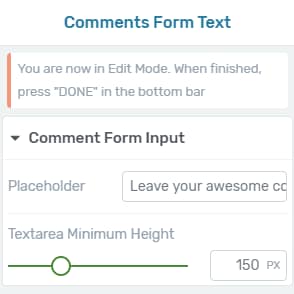
- Placeholder
This is where you can change the placeholder. Simply write it inside the field next to the option:

- Textarea Minimum Height
This option allows you to modify the height of the field. In order to do that, use the slider and drag it from side to side, or manually enter a numerical value in the field next to the slider:

These were the two ways in which you can edit a placeholder.
Visitor View
After you have finished editing the form in the “Logged In User View”, you can switch to the “Visitor View” and customize that state.
In order to switch from one to another, click on the field with the “Logged In User View” option, in the lower part of the editor:

A small drop-down will open. Click on the “Visitor View” option:

The comment form will change, and it will look the same as a visitor will see it when they want to leave a comment:
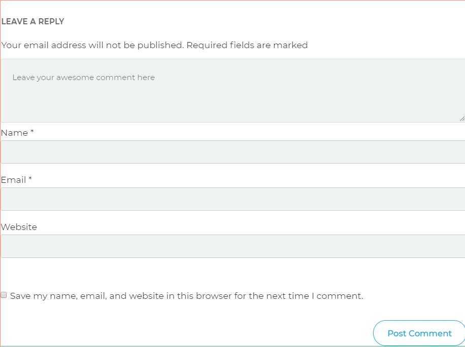
Again, you have two options here. You can either locate the fields visible of the “Visitor View” in the left sidebar, and click on the “Edit” icons to change the labels and the placeholders, or you can click on the fields individually and change them from there.
For some fields, you can only modify the placeholder, and for some, you can also modify the labels. I will use the “Name” field as an example. I will edit the field directly from the left sidebar, by clicking on the pencil icon:

Similar to the case presented here, in the “Logged In User View”, a small pop-up will open. I can enter a placeholder and, besides that, I can also include a label. After you do that, click on “Apply” to save them:

This field did not have a placeholder by default, and it looked like this:

After I changed the label and I entered a placeholder, the field looks like this:

Comments are Closed
Lastly, from the “Editing Comments Section” part of the editor, you can choose to edit the situation where the comments are closed. Click on the field to open the drop-down, and choose the last option from there:
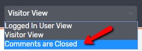
When the comments are closed, the visitor will see a message in a “Text” element form, like this:

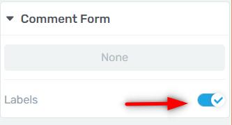
In the left sidebar, you will be able to decide whether you want the label to appear or not:
Then, if you click on the “Comments are closed.” text, you will be able to simply remove that text and write it on your own, and then customize the text using the “Text” element settings available in the left sidebar:
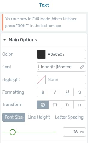
If you are not sure how to do that, make sure to check out this article about the “Text” element.
Before we finish with the “Edit Elements” section, there is one more option that you can use, which is the “Labels” one. You can remove the labels for the fields if you want. The option is activated by default, but you can remove the labels by clicking on the switch next to the option:

This is the way in which you can use the “Edit Elements” option. In order to go back to the “Comments Section” element options, click on the orange “Done” button:

Use the Advanced Options
After using the “Main Options”, you can further customize the “Comments Section” element by using the “Advanced” section from the left sidebar. Click on the down arrow or next to it in order to expand the section:

When you expand the option, another button will appear, called “Edit error messages”. Click on it if you want to modify the messages that appear when an error occurs:

A pop-up will open, where you can see and change all the available error situations that the user might encounter:
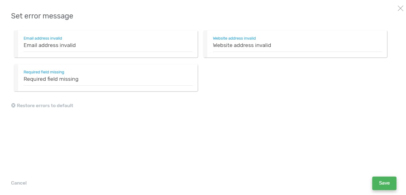
In order to modify a message, click on the field with the message, and simply delete it and write your own:

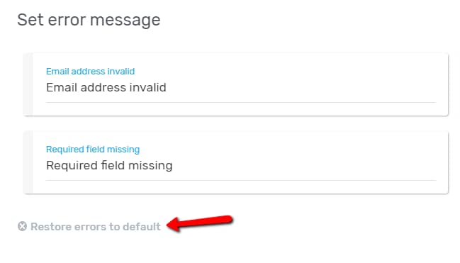
If you want to go back to the initial error messages, you can click on the “Restore errors to default” option:
When you finish editing the error messages, make sure to click on the green “Save” button:
This is how you can edit the error messages using the “Advanced” section. Besides all the options presented above, you can also use the “Layout & Position” and “Responsive” options to further customize the element. We do have separate articles for them in our Knowledge Base.
Important!
Something to keep in mind is that, by default, a new page will have the “Allow comments” option disabled.
This means that, if you apply a template that contains a “Comments Section” element on it, to a page, and you do not enable the “Allow comments” feature on that page, the visitors will not be able to leave comments to that page. If you want to find out how to enable or disable the “Allow Comments” feature, please see this article.
However, in the case of using a template on a post, things are different. By default, the posts will have the “Allow comments” feature enabled, so the “Comments Section” element will be visible after applying the template, without you having to take any further action.
If you want to find out more about various Thrive Theme Builder elements and features, you can find and check out the Thrive Theme Builder articles.