You can easily build columns on your website using the “Columns” element in Thrive Architect.
There are two ways of doing this:
1. The traditional drag & drop
To add the element, drag & drop the “Columns” element to the part of the page where you would like to place your columns.
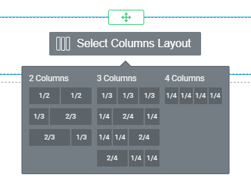
You will see that a window is displayed from where you can choose how many columns (a) you want and you can also select the proportions for the columns (b). All you have to do is click on the one you find most suitable:

In case you do not like the proportions of the columns, you can change them manually anytime by dragging the arrow associated with them to the left or right.
|
Note: If you want a higher number of columns than the already predefined one, you can do that by adding a new “Columns” element within the already existing one. So, for example, if you want to have five columns, you first have to select a four-column layout:  And then, drag and drop another “Columns” element on the left side or right side of the already existing one:  Now, go ahead and select the columns layout:  Lastly, remove the extra columns, until you reach the desired number:  |
Column options
The “Columns” element, just like every other element, comes with its specific options. These will be displayed in the sidebar once you’ve added columns to your page.
You can set the “Gutter Width”(1) and the “Minimum Height” (2) of the columns by dragging the slider under the options or entering a value manually in the fields next to them. You can also choose the “Vertical Position” (3) of the columns by clicking on one of them:

Going forward, there are some additional options that you can use to customize the design of your columns:

Activating the “Reverse column order” (4) switch button will basically switch the position of the column between them:

If you activate the “Wrap columns” (5) switch button, then the “Column breakpoint” slider will be triggered:

The column breakpoint is the minimum width a column will shrink before it will be stacked vertically. You can drag the slider from left to right to adjust how the columns will be displayed on different screen sizes.
Lastly, if you click on the “Reset column layout”(6), you will be able to choose between the different types of column variations available for the selected number of columns:

If, for example, the layout has two or three columns, then you will be shown the column options in order to choose the one that you need. If there are more than three columns, then these will be evenly distributed within the layout.
If you want to select just one column and edit it individually, you can do so from the same left sidebar :

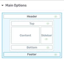
From the “Main Options” section you will be able to turn on the “Enable fixed width” option from the switch button:

You can then drag from left to right the slider underneath the “Width”, and adjust the columns to your liking.
If you have the “Enable fixed width” option active, the size of that column will be displayed in pixels, whilst if that option is turned off, the size will be displayed in percentages.
This option cannot be used on all your columns: at least one of your columns will have this option disabled automatically:

Let’s take an actual example in order to properly showcase this: I have added a set of three columns to my content, each of them containing the same image:

I will select the first column, and activate the “Enable fixed width” toggle:

As already mentioned, since this option is activated, I will be able to adjust the size of the columns in pixels, rather than percentages. Hence, I’ll change the width of this column, like so:

Now, regardless of the screen size on which I am viewing this, that one column that has the fixed-width enabled will keep its size, whilst the other two will change their proportions and occupy more or less, depending on the size of the screen.
You can also choose how you want to place your element within the column – in the upper part of the column, centered or in the lower part, by simply selecting (clicking on) the respective setting from the “Vertical position” option. You can also choose to have “No style” applied to it at all, which is enabled by default:

You can drag and place any type of elements in the columns, not necessarily only “Text” elements. You can insert elements like the “Button” element, the “Image” element, and so on.
Besides the “Main Options”, you can use some other general options (such as “Layout&Position”, “Animation&Action“, etc.). Make sure to take a look at the articles and tutorials from our Knowledge Base if you want to learn more about the general options.
2. Create columns automatically
This second way of building columns is sort of a ‘given’. If you take an element and place it next to another element (to the left or right), the column around them will be created automatically, just as shown in the images below:
-
Placing element next to another element:

-
Columns created:

Afterward, you can adjust the proportions of the columns just as mentioned above and you will also have the column options in the sidebar for the newly created columns.
You can place as many elements as you like next to each other, thus having many columns. However, it is strongly recommended not to over-use this feature, because it might lead to your page being too crowded.
Here you can find out how other elements in Thrive Architect work.
We hope this article was useful for you. If so, give us a smile below 🙂