This article will show you how to use the “Button” element and how to customize it using its options.
Add the element
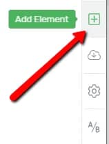
The first thing you need to do is to add the element to the page. To do that, proceed just like in the case of any Thrive Architect element. Go to the right sidebar and click on the plus sign:
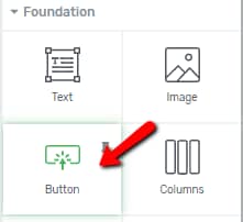
Then, look for the “Button” element or search for it in the search bar:
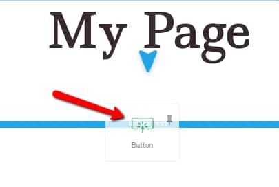
Next, you can drag and drop it anywhere you want it to be placed on your page:
After you have added the element to the page, you will notice its options appear in the left sidebar. You can customize the “Button” element as you please, by using its “Style Options”, “Main Options”, as well as the rest of the general options that it has.
Template Button
The first section of the left sidebar is the “Template Button” one. This is where you can choose the template of the button from. To do that, click on the “Template Button” field:

This will open a small pop-up. You will notice two tabs which you can browse through “Default Styles” and “Saved Styles”:

The “Default Styles” tab is where you will be able to find some pre-built button styles. If you are not editing a page where a Smart Landing Page has been applied, this tab will only have the “Thrive Templates” displayed:

If, however, you have applied a Smart Landing Page, you will also have the “Template Styles” section, inside the “Default Styles” tab:
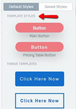
This section comes in very handy if you want to add more “Button” elements to a Smart Landing Page, and you want the new “Button” elements to match the existing ones from the page.
In the “Default Styles” tab, you can scroll down through all the styles and choose the one you like. After that, click on “Apply”:
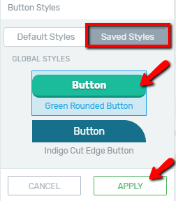
The other tab, called “Saved Styles”, is where you will find the button styles that you have saved using the “Global Style” feature. Just like in the case of the “Default Styles”, click on the style that you want to use in order to select it, and then click on “Apply”:
Here are some resources to help you understand how to use the “Global Styles” options:
This is how you can choose and apply a style for your button. You can change the style of a button anytime by repeating the same steps, using the “Style Options” section from the left sidebar.
Main Options
The next section of the left sidebar is the one where you can find the “Main Options”. You can use these to further customize the element:

Colors
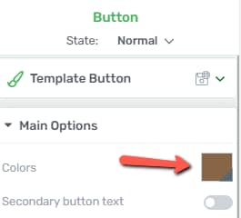
The first option from the “Main Options” section is the “Colors” option. If you want to change the color of the “Button” element, click on the color box next to the “Master Color” field:

This will open the color picker pop-up. In order to choose a color, you can either pick one by manually using the color picker, or you can enter a HEX/RGB code in the dedicated field:
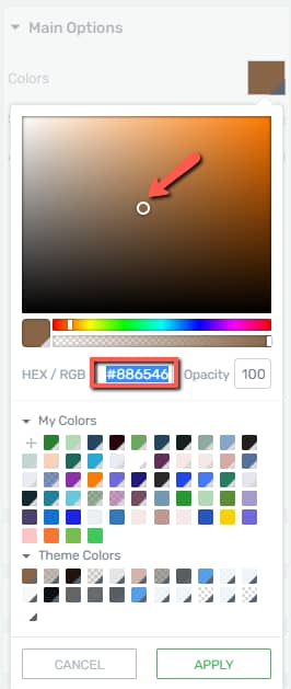
You can also choose one of the already existing colors from the “My Colors” and “Theme Colors” sections.
After you are done, don’t forget to click on the “Apply” button to make sure all your changes have been saved.
Secondary Button Text
This option is deactivated by default. To activate it, click on the switch next to the option:

Activating the option will add a second “Text” element inside the “Button” element, underneath the already existing one, like so:

Add Icon
The next option is the “Add Icon” one. It is also deactivated by default. Click on the switch next to it in order to activate it and add an icon to the button:

When you activate the option, you will notice another option will appear right below the “Add Icon” one, where you can choose on which side you want the icon to be placed (Left/ Right):

If you want to change the icon type, size or color, click on it:

This will open the “Icon” element options in the left sidebar. You can use these options to change the icon (with the first option from the “Main Options”) and then customize it as you wish, using the rest of the options of the “Icon” element from the sidebar:

To go back to the “Button” element options, either click on the element or click on “Button” in the breadcrumbs:

Size and Alignment
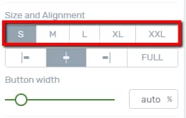
Next in the “Main Options” section comes the “Size and Alignment” option. Firstly, you can choose a size by selecting one of the available button sizes (S / M / L / XL / XXL). You can do that simply by clicking on the desired one:
Below the sizes, there are the alignment options. Click on the one that best fits your post or page (Align Left/ Align Center/ Align Right or Full Width):

Button Width
The next option is the “Button Width” one. If you want to modify the width, you can either drag the slider from side to side, or you can manually enter a value in the field next to the slider:

Button Link
After you’ve set the width of the element, you can go to the next option and make use of the last available option from the “Main Options” section, which is the “Button Link” one:

With the help of this option, you can add a link to the button, so when customers will click on the button, they will be taken to the target page/place you set up here. There are three types of links that you can use in order to do this:
Static Link
The first type is the static link:
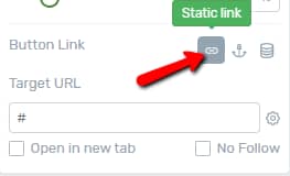
You can find an example of how to use the static link and the “Target URL” field in this article.
Jumplink
The next type of link that you can use is the “Jumplink”:

The steps in which you can add a jumplink to a “Button” element are described in this article.
Dynamic Link
Lastly, you can apply a dynamic link to the button:
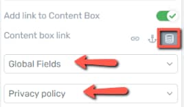
The steps in which you can do that are described in this article.
These were the ways in which you can use the “Main Options” to customize the “Button” element.
Furthermore, if you want to edit the text inside the “Button” element, simply click on it:

This will open the “Text” element options in the left sidebar. The ways in which you can customize it are also described in one of our Knowledge Base articles, you can find it here.
Besides the “Main Options” of the “Button” element, you can also use the other options, such as the “State”, or the general options to customize the button even further.
Hover State
The “State” option allows you to determine how does the button change when a user will hover over it. The option can be found on top of the “Button” options from the sidebar:

Click on “Normal” to open the sub-menu where you can choose the state from. You will have two states available for the button: Normal and Hover:
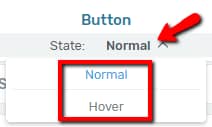
The “Normal” state is used from the moment you add the button on the page. This is the natural state of the button. However, if for example, you want the button to change its color every time a user hovers over it, you will have to set that up in the “Hover” state, so select the “Hover” state:
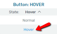
You will notice that the screen will get slightly darker, the button being highlighted and the options you can use in the “Hover” state will be in the left sidebar:
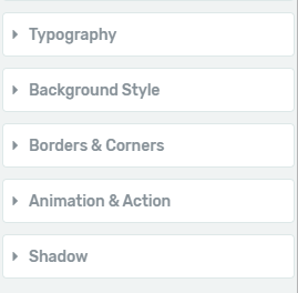
Since the “Button” element has templates with smart colors applied to it, you will not see the main “Color” option here. This is because the main color of the button is linked and you shouldn’t change it from here, since that would result in changing it in both states.
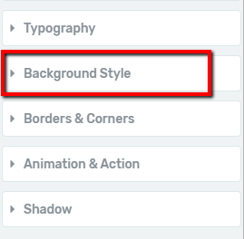
Nevertheless, you can still change the color in the “Hover” state, using the “Background Style” option. Click on it to open it:
Then, look for the background layer with the “Solid Color”, and click on the little box with the color from it:
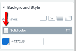
The color picker will open and you can select a different color and opacity for the “Solid Color”, which will also be used as the color on the “Hover” state:

Furthermore, you can also use the rest of the options available in the sidebar to change other aspects of the button in hover state, such as the font (from the “Typography” options), the “Border & Corners”, the “Shadow” color of the button etc.
Reset State
If you do not like the customization you have applied to the button in the “Hover” state, you can use the “Reset State” option to reset the “Hover” state of the button to match the “Normal” state:
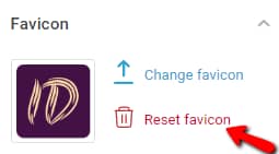
In order to do that, simply click on the “Reset State” option and then, confirm that resetting the state is indeed what you want to do:

When you have finished customizing the button in the “Hover” state, you can go back to the “Normal” state by choosing it from the submenu mentioned earlier:

Besides the “Style Options”, “Main Options”, or the state of the button, you can also use the rest of the “General Options” to further edit the element, such as the “Borders & Corners” option, “Layout & Position”, etc. We have separate articles for all of them, which can be found in our knowledge base.
These were the ways in which you can customize the “Button” element. I hope this article was useful to you. If that’s the case, make sure to reward our efforts by leaving a smile below. 🙂