When using the Thrive Theme Builder editor to customize a template, you can use various elements in order to build the website just as you wish.
This article will show you how to use the “Breadcrumbs” element and how to customize it, as well. This element comes in handy for the users so that they can navigate more easily through the posts from your website.
Add the “Breadcrumbs” element to your template
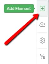
In order to use the “Breadcrumbs” element, you first have to insert it into the post or page you want it to be in. To do that, in the Thrive Theme Builder Editor, go to the right sidebar and click on the plus sign:

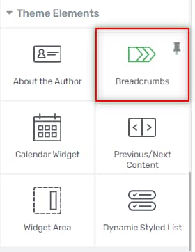
This will open a list with all the elements that you can use for customizing your page. Look for the “Breadcrumbs” element or search for it in the search bar:

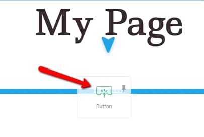
Once you find it, drag and drop it to place it anywhere you want on the page:

Now the element is added to the page and you can start using its options.
Use the “Breadcrumbs Options”
You will notice that, after the element has been added, some options appeared in the left sidebar, under the “Breadcrumbs Options” section:

Edit Breadcrumbs
This very first option allows you to edit the items inside the “Breadcrumbs” element. If you click on it, you will be taken into the “Edit Mode”. You can click on one of the items of the element, and the item’s options will appear on the left sidebar.
Edit the Breadcrumbs Path
If you click on one of the breadcrumbs path elements from the editor (except for the last one), you will be taken to the “Breadcrumbs Path” options, which will open on the left sidebar:

You can use these general options that appear here to edit the path elements.
If you are not sure about how you can use these options, such as the “Borders & Corners” one, or “Layout & Position”, we do have written articles for all of them in our Knowledge Base.
Keep in mind that you can make modifications to both the “Normal” as well as the “Hover” state of the “Breadcrumbs Path” elements.
You can change the state that you are editing by clicking on the down arrow next to “State: Normal” and choosing “Hover” from the small drop-down that opens:

The “Hover” state options will be available in the left sidebar, and you can use them to customize the “Hover” state as you please:

Then, you can go back to the normal state by clicking on “Normal” in the drop-down menu mentioned here.
Edit the Breadcrumbs Leaf
Just as you can edit and customize the “Breadcrumbs Path”, you can do the same to the “Breadcrumbs Leaf”, as well. The “Breadcrumbs Leaf” is the last item of the “Breadcrumbs” element:

Just like in the case of the “Breadcrumbs Path”, the options will appear on the left sidebar:

Enable truncate character
Besides the general options that are available for the “Breadcrumbs Path” as well and all for which we have separate articles, there is one more option, the “Enable truncate character” one. The option gives you the possibility to control the length of the “Breadcrumbs Leaf”.
It is disabled by default. If you want to activate it, click on the switch next to the option:

When you activate it, another option will appear, letting you choose the number of “Truncate characters”. In order to adjust the number of characters, either write the number inside the field or use the up/down arrows:

Then, you can also use customize the element in its “Hover” state. The process is the same as in the case of the “Breadcrumbs path”, described above.
Edit the breadcrumbs separator
Whilst editing the element in the “Edit Mode”, you can make modifications to the separator, as well. When you click on either one of the separators, its options will appear on the left sidebar:

You can find the “Separator Options” described below.
Once you finish customizing the element in the “Edit Mode”, you can click on “Done”:

This will take you back to the “Breadcrumbs Options”, and you can use the rest of the options to further customize the element.
Separator Type
The first option is the “Separator Type” one. You can change the way in which the breadcrumbs are separated, and there are three different ways in which you can separate them. In order to choose the type, click on one of the three types placed next to the option:

-
Character
If you choose the first option, you can separate the breadcrumbs using any character from the keyboard. Simply write the character that you want in the field next to “Character”:

-
Icon
If you want to choose this type of separator, click on the second option of the separator type:

Choose Icon
The “Choose Icon” option will appear. If you want to change the icon, click on the field next to the option:

This will open a pop-up with all of the available icons:

Scroll through the list until you find the one that best fits. In order to select it, simply click on it, and then click on the green “Select” button:

-
None
The third variant of separator is “None”, meaning that you can leave the breadcrumbs without any separator in between. If you want to choose this option, click on it:

After choosing the separator type, there are some options that apply to the “Character” and “Icon” types, here is how to use them:
Color
You can change the color of this element, as well. You can do that by clicking on the color box field next to the “Color” option:

When you click on it, a color picker pop-up will open. You can choose the color you want by using the color picker, or by manually enter a HEX / RGB code in the dedicated field:

You can also change its opacity, by adjusting the “Opacity” value from the pop-up:

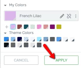
After you choose a color, click on the “Apply” button:

Size
You are also able to choose the size of the “Breadcrumbs” element. You can do that by using the “Size” option that comes after the “Color” one.

To adjust the size, drag the slider from side to side, or enter a numerical value in the field next to the slider:
Item Spacing
These were the ways in which you can customize how the breadcrumbs should be separated. The option that comes next is the “Item Spacing” one and it refers to the distance in between the elements inside the breadcrumbs.
You can modify the spacing either by dragging the slider from side to side, or by entering a numerical value in the field:

Alignment
Next comes the “Alignment” option, where you can choose if the “Breadcrumbs” element should be center/left/right-aligned, or you can use the “Space Between” option, which equally spreads the element inside the “Content Area” width.
In order to choose the suitable alignment, click on the field next to the option:

A small drop-down will open, with the options. Choose the one you best see fit by clicking on it from the drop-down menu:

Display categories in breadcrumbs
Note: Please keep in mind that the “Display categories in breadcrumbs” option is only available for post templates since only the posts of your website are divided into categories.
The next option of the “Breadcrumbs options” section is the “Display categories in breadcrumbs” one. Just as the info note says, when activated, this option shows the category in the breadcrumbs path.
It is not activated by default. If you want to activate it, simply click on the switch next to the option, and the categories will be added to the breadcrumb path:

Customize Labels
Lastly, you can also customize the labels of the element. This can come in handy if, for example, you want to translate this element into another language (you can find an example here). If you want to edit the labels, click on the down arrow next to this option, to expand it:

Then, for each of these labels, you can delete the default names and enter your own, in the fields next to them:

The labels will save and change immediately.
This is how you can easily use the “Breadcrumbs Options” section from the left sidebar.
You can use the rest of the options to customize the element, as well (e.g.: Background Style, Borders & Corners, Responsive, etc.). If you want to find out how you can use them, you can take a look at our knowledge base.
This concludes the article about how you can use and customize the “Breadcrumbs” element using Thrive Theme Builder. If you need more information about various Thrive Theme Builder elements and features, make sure to check out the dedicated section of our knowledge base.
I hope this article was useful for you. If that’s the case, make sure to reward our efforts with a smile below 🙂