The “Background Style” option is one of the various ways in which you can customize a Thrive Architect element. The option is available for most of the Thrive Architect elements.
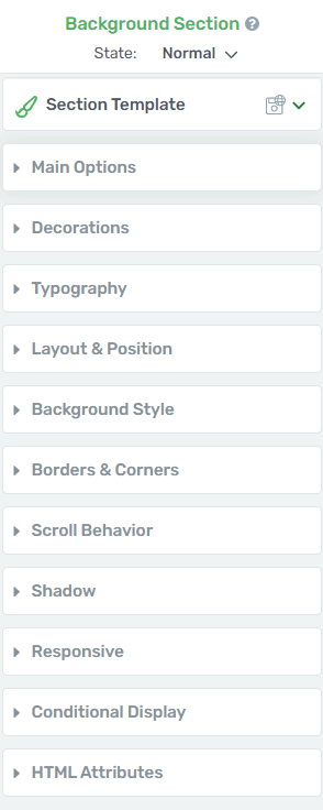
When you edit a page and select an element, you can find this option in the left sidebar, among the general options.
It allows you to add different types of layers to your “Background Section”. You can apply only one layer, or you can choose to build up different types of them.
As an example, I will use the “Background Style” option on a “Background Section” element.
The first thing you need to do is add the element to your page.
Just like in the case of every Thrive Architect element, in order to add it to your page, click on the “plus” sign from the right sidebar:

Then, select the element that you want and drag & drop it where you want it to be placed on your page.
In the left sidebar, you will notice the element options. You can customize it using the main options as well as the general options:

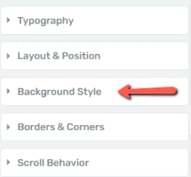
Look for the “Background Style” section and, once you have found it, click on it in order to open the options that it includes:

As you can see in the section that opened, with the help of the “Background Style” options you can add a “Solid color”, an “Image”, a “Gradient”, a “Pattern”, or even a video as the background of your element.
You can choose the layer types by clicking on the icons next to the “Add layer” option:

Here are all the layer types and how to use them:
Solid Color
The first type of layer available in this option is the “Solid Color” one. This will make your background one color, for which you can modify the opacity.
Click on the “Solid Color” icon in order to open it:

This will open a color picker pop-up:
You can choose the color of your background by manually picking a color using the color picker, or by entering a HEX/RGB code:

You can also choose one of the already existing colors from the “My Colors” and “Theme Colors” sections.
Furthermore, you can set the opacity of the color. The default opacity is set to 100. Enter a value in the box next to “Opacity” in order to change it:

After you are done, don’t forget to click on the “Apply” button to make sure all your changes have been saved.
Image
The second available layer type is the “Image” one, where you can upload your own image to use it as a background. Click on the “Image” icon to open the layer options:

Here, you will have to select between a “Static” and a “Dynamic” type of image:

Static
- Choose Image
Then, click on the “Choose image” section to add the image from your Media Library. Check out this article if you are not familiar with the image uploading process:

- Image Display
Once the image is added, you will be able to choose where to display it, using the “Image Display” drop-down, as well as the option next to it:

Default
If you click on the field below the “Image Display” option, a drop-down menu will open. The first option there is the “Default” one:

Choosing “Default” from the drop-down menu will keep the default size of your picture after inserting it inside the “Background Section”:

When you choose the “Default” option, this message will show on your image, allowing you to drag the image around to reposition it as you wish:

Cover
The next way in which you can display the image is by choosing “Cover” from the “Image Display” drop-down:

This option scales the image as large as possible, without stretching the image. If the proportions of the image differ from the element, the image will be cropped either horizontally or vertically so that there will be no empty space:

The image will have the maximum width, so you will not be able to move it from side to side. A message will show on top of the image, allowing you to move the image up or down to reposition it:

Contain
The next “Image Display” option is the “Contain” one. This will place the image and make it fit your “Background Section” heightwise:

To use it, go back to the drop-down menu and choose the third item from the list:

You will be able to move it around from side to side, just by hovering over the image and dragging it to the left or to the right:

Percentage
The last option you can choose from the drop-down menu is the “Percentage” one, which allows you to choose the exact percentage of the height and the width of the image. To select it, click on “Percentage” in the drop-down menu:

You will be able to customize the size of the image, which will look similar to this when you upload it:

The “Default” and “Percentage” options support several other features, which are available only when one of them is selected. Here’s how you can use them:
Repeat
Once you’ve picked a way in which your image should be displayed, you can also choose if you want the image to be repeated or not. You can do that by using the “Repeat” option:

If you click anywhere on the field, a drop-down menu will open:

Repeat Vertically
If you choose the “Repeat Vertically” option, your image will repeat in the empty vertical space of the “Background Section”, as shown below:

Repeat Horizontally
You also have the option to repeat the image horizontally, thus filling in the empty horizontal space of the “Background Section”:

Repeat Both
The last item from the option drop-down is the “Repeat Both” one. This will fill in both the empty horizontal and vertical space from the “Background Section”:

Note: As already mentioned, keep in mind that the “Repeat” option is only available for the “Default” and “Percentage” image display styles.
Width & Height
You can also adjust the “Width” and “Height” from these two sliders, or by manually entering a percentage value inside the boxes next to the sliders:

You are able to move the image around up-down or side to side as much as you need to.
- Positioning Square
Next to the “Image Display” option, there is a square that you can use in order to set the position of your image:

The square contains 9 dots. You can click on any of them in order to position your photo (in one of the corners/middle top/middle bottom, etc. of the “Background Section”).
For example, if I click on the upper right corner, the image will be placed as shown below:

- Static Background Image
After you’re done with the “Repeat” option, you have one more option in the “Image” section, which is the “Static Background Image” one, with a check box in front of it:

If you choose to make the image a static background then, the image itself will not move when visitors will scroll down on your page.
Only the content will be dynamic, whilst the background will be static. This is very similar to creating a parallax effect.
Dynamic
If you select “Dynamic”, then you will be able to add dynamic background images to your background section:

- Dynamic source
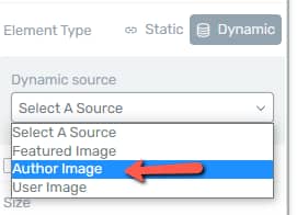
Open the source drop-down list to view the available sources:

Featured Image
The first option will allow you to display the featured image that you have set up for that page or post from your WordPress admin dashboard:

Next, go ahead and select the size of the featured image, from the following drop-down list:

The remaining options available here have the same ones described for the “Static” type of image.
Author Image
You can next select the “Author Image” as your source:

Once again, this is an image that you have to set in your WordPress admin dashboard, just as described in the dedicated section of this article.
After you set your author image, you can proceed with using the remaining options.
User Image
Selecting the “User Image” will automatically display the user image set in your Gravatar account:

After you select it, you can proceed with setting the “Image display” options, adjust the positioning, etc.
Custom field
Lastly, you can set a custom field as your dynamic source image:

What this means, is that you can display here any Advanced Custom Fields type image field type.
These articles from our knowledge base take you through all the necessary steps for using the Advanced Custom Fields plugin, so don’t hesitate to check it out if you consider using this “Custom fields” feature for your background style:
- How to Set Up Custom Fields Using the Advanced Custom Fields Plugin
- How to Use Fields Set Up with the Advanced Custom Fields Plugin in Thrive Architect
- How to Set Up the Specific Types of Advanced Custom Fields Needed for Thrive Architect Elements
Once you select the dynamic source, you will be promoted with another drop-down list, where you can go ahead and select the custom source:

Here you can view the full list of image sources that you have set up in your custom field group.
After you decide on the image custom field type you want to use, select it and it will automatically set as your background style image:

Next, you can go ahead and click on the “More Options” drop-down:

Here you can select what happens to the element to which you want to apply the background style if the advanced custom field image is not available:

You can choose to hide the element, which means that the element will not be displayed at all if the custom source is not available.
But you can also choose to display a default image instead:

If you click on the “Choose File” button, you will be taken to the Media Library, where you can select your default image:

Therefore, if the custom image source might not be available, you will have this alternate solution of displaying a default image instead.
These are all the ways in which you can customize the “Image” layer.
Gradient
The next available one is the “Gradient” layer. To choose it, click on the third icon next to the “Add layer” option:

All the options available for this layer will open in the left sidebar:

Orientation
The gradient that you add can be linear or radial. Open the drop-down menu next to the “Orientation” section by clicking on the field next to it:

Now, choose the preferred option (linear or radial):
Linear
Angle
If the effect is linear, you can also choose its angle. Do that either using the angle wheel next to the option or by manually entering a numerical value in the box next to the option:

Below the “Angle” option you can see a bar. This bar can be used to specify the percentage/the ratio of the gradient color, that you want to add as a layer for your “Background Section”. The percentage refers to the intensity with which the color will blend into another one (aka form the gradient).
In order to define this, simply hover over the part of the bar where you want the percentage to be (you will see a plus sign appear next to the cursor) and then click on it.
If you wish, you can also define more ratios by clicking on more parts of the bar:

You can then choose the gradient color, by using the color picker, saved colors or by manually entering a HEX/RGB code:

You can also set the opacity by entering a value in the dedicated field:

Don’t forget to click on “Apply” when you’re done:

Radial
The other orientation type which you can use for the “Gradient” option is the “Radial” one. To choose it, open the drop-down next to the “Orientation” option and click on “Radial”:

Besides the “Angle” option, which is not available in this case, you can customize the “Radial” orientation type using the same options that are available for the “Linear” gradient too, as explained above.
Pattern
Next in the “Add layer” list, you have the possibility to add a “Pattern” as a layer for your background.
Choose it by clicking on the “Pattern” icon next to the “Add layer” option:

This will open the “Select pattern” section. From here you can choose a pattern as the background:

You can also set its color, as well as opacity if you click on the field next to the “Color” option:

This will open the color pop-up, which you can use just like you would use any other color pop-up. When you’re done, click on “Apply”.
Background Effects
The last layer type you can add to the “Background Section” is the “Layer Effects” one.
If you want to choose it, click on the last icon next to the “Add layer” option:

You can choose different types of background effects. To choose a type, click on the field next to the “Type” option:

You can find more information about what each of these effects means in this article.
Choose a Color
The next part of the “Background Style” section is the one where you can choose a color as your background. If you want to do that, click on the field:

Video Background
The “Background Style” also lets you add a video as the background. First, activate the option by clicking on the toggle:

Next, in the following step, you will have to select the element type. If you have custom fields set up on your website, then you will also have the “Dynamic” option available, besides the “Static” one:

Depending on what you choose here, the source of the video will be different as well.
For the “Static” option, you will be able to open the “Source” drop-down list and simply select one of the available sources:

If you need to read more about how to upload a video from these sources, you can find information about it in this article.
However, if you opt for a “Dynamic” element type, then you can pick from a custom dynamic source:

This is similar to the “Image” layer type detailed earlier in this article. Furthermore, this article has a separate section that explains how to set up a video type of field so that you can further display it here as a dynamic source.
So after you select the source, a set of “More options” will appear in the left sidebar:

Expand this section and you will be able to select what happens in case the element is not available:

If you decide to hide the element, then this means that the element will not be displayed at all if the custom source is not available:

Alternatively, if you want, you can display a default video instead:

This video can be selected by clicking on the “Choose File” button and then simply uploading one from your Media Library:

These are the ways in which you can customize your “Background Section” element using the “Background Style” option.
As mentioned at the beginning of the article, this option is available for various Thrive Architect elements. Whichever element you decide to customize the background style for, the steps will be exactly the same as in the case of the “Background Section” one.
If you want to understand how other Thrive Architect elements work, make sure to check out our knowledge base.
I hope this article was useful for you. If that’s the case, make sure to reward our efforts with a smile below 🙂