The “Layout & Position” options let you customize the margins, padding, alignment of various elements that you might have on your page.
This article will explain the “Advanced” settings of the “Layout and Position” options.
Advanced Settings
First of all, it’s worth mentioning here that the “Advanced” settings might have different features, depending on the element you have chosen.
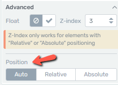
For some elements, such as the “Text” and “Image” ones, you will be able to adjust the “Position”:
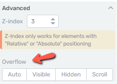
For others, such as the “Background Section” you will be able to use the “Overflow” option:
Whilst for some elements, such as the “Content Box” and “Columns”, you will have the possibility to use both:
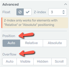
For this example, we will use the “Columns” element, in order to cover as many settings as possible.
Where to Find the Advanced Settings
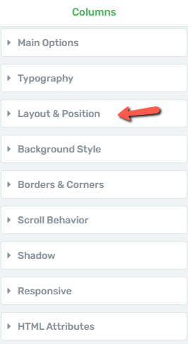
After the element has been added to the page, go ahead and click on the “Layout & Position” section of your left sidebar:
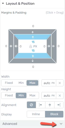
This will take you to the main section of the “Layout & Position” options, for which we have a dedicated article linked here. In order to access the “Advanced” settings, click on the downwards pointing arrow located at the bottom of the section:
How to Use the Advanced Settings
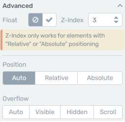
Now you can start using the “Advanced” settings, which consist of the following: “Float”, “Z-index”, “Position” and “Overflow”:
Float
This option allows you to position one element in relation to another one, which sits next to it.
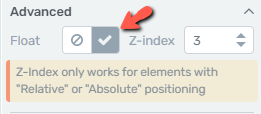
In order to activate it, you have to select the “checkmark” icon:
This will automatically enable the “Relative” option as well from where you can set the “Horizontal” and “Vertical” position of the element:
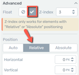
As soon as you enter the value or start dragging the arrows from the corresponding fields, you will see how the element changes its position on the page:

Z-index
The next option is “Z-index”. This option comes in handy when you have two or more elements stacked on top of each other, and you want to define which of them to be displayed in front:
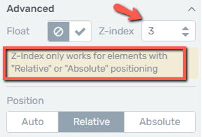
Note: The “Z-index” works only for elements that have “Relative” or “Absolute” positioning.
You can set an index value of “10” or higher for that particular element that you want in front of the others.
So, for the current example, I’ve added an “Image” element on top of the “Columns” one. Then, I’ve set the “Position” to “Absolute” on both, and the “Z-index” value to 10 for the “Columns” element, as I wanted to have that one in front of the “Image” element:

Position
The “Position” option can be used in order to position an element in relation to other elements available on the page.
-
Auto: this is the default state of the element; it’s the position of the element when you first add it to the page:

-
Relative: this option can be used to adjust the position of the element vertically and horizontally. Once you select it, the “Horizontal” and “Vertical” fields appear underneath it, with corresponding value boxes in which you can set the position:
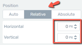
Adjust the values from the boxes either by dragging the arrows up and down or by inserting a numerical value:

-
Absolute: when you select this option, two additional sections will appear in the sidebar:

With this option you can set the position of the element to be a top right, top left or bottom right, bottom left position:

Just as in the case of the “Relative” option, you can further adjust the position of the element by dragging the arrows or entering a value in the corresponding fields.
Overflow
The last option available in this section is the “Overflow” one, from where you can decide what happens to content that is too big to fit into a particular area:

-
Auto: this option is set by default when you first add the element to the page:

-
Visible: when you enable this option, the content will render outside the element’s box:

-
Hidden: this means that only part of the content will be visible. Whatever is outside the element’s box will remain hidden:

-
Scroll: if you enable this option, then a “scroll” bar will appear allowing you to view all the content:

These are the ways in which you can use the “Advanced” settings of the “Layout & Position” section.
You can read more about how to use the rest of the Main Options sidebar sections in our knowledge base.
Hopefully, you found this article useful. If so, don’t hesitate to rate it with a smile below 🙂