The “Content Box” element can be very useful when creating your website with Thrive Architect because you can add more elements to it and it acts as a container for them. Here is how to use it in a few easy steps:
Add the Element to the Post/Page
The first thing you have to do is to add a “Content Box” to the page. In order to do that, click on the plus sign from the right sidebar, which will open the list of elements:
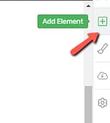
Look for the “Content Box” element and when you have found it, drag & drop it to the desired place on the page:

You will see that for the moment, the “Content Box” is a simple box. What makes it so useful though, is the fact that you can drag other elements and place them inside the box:

Add Content
Depending on what your goal is, you can add various elements inside the “Content box”. By default, a “Text” element is already added to the “Content Box”. You can simply click inside the box and start typing or paste the text you want to display in your content box.
Tip: In case you don’t need the default “Text” element, you can easily delete it using the little trash icon that appears when you click on the element:

Furthermore, you can add other types of elements (such as buttons, images, etc.) by simply dragging and dropping them into the “Content Box”. This way you can create the content that is the most suitable for your page.
After you have added the “Content Box” to the page, you can use its options from the left sidebar to customize it.
Note: Keep in mind that you can customize the “Content Box” before, as well as after, you have added content to it.
If you customize the “Content Box” after you have also added content to it, you will have to select it again, either from the breadcrumbs or by clicking on it directly in the editor, to see its left-sidebar options.
Choose the Template
From this section, you can choose one of the styles that are available for the “Content Boxes”. In order to see and select one of these, click on the field from the “Template ContentBox“ section here:

This will open the drop-down with the available styles. You can scroll down to see all of them, as they are displayed in two main categories: “Global Styles” and “Default Templates”:

The “Global Styles” set is comprised of all the previously created styles, which were saved as global. You can read more about how to use the “Global Style” feature in the article linked here.
The second set is the “Default Templates” one, and here, you can choose from a list of predefined templates.
Clicking on either one of these styles, allows you to see how it would look like directly in the editor on your “Content Box”.
Once you have found the style you want to apply to your “Content Box”, click on it to select it and then, click on the “Apply” button from the drop-down.
You can change the style of your “Content Box” anytime, by simply clicking on the field from the “Template Content Box” section again and taking the same steps as mentioned above for the first time when you select a style.
Furthermore, you can save the style of your “Content Box” as a global one anytime, by clicking on the “Save as Global Style” button:
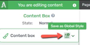
This will open a drop-down, where first, you will have to give a name for the Content Box Style and then, simply click on “Apply” to save it as a global style. This way, you will be able to re-use it again whenever you need it:

Here are some resources to help you understand how to use these options:
Use the Main Options
With the help of the “Main Options” you can adjust the width and the height of the “Content Box”, as well as add a link to it or change the “Vertical Position” of the elements that will be inside it.
Let’s go through each of them one by one.
Maximum Width
If you want to modify the width of the “Content Box” all you have to do is drag the slider under this option, or enter a value manually in the field next to the slider:

Minimum Height
Use the same type of slider if you want to modify the minimum height of the “Content Box”:

Add link to Content Box
If you want to add a link to the “Content Box” then, you will have to activate this option by clicking on the switch next to it. This will open a drop-down, where you can insert the desired link; or in case you want the “Content Box” to link to one of your pages, then, you can start typing to search through your pages:

Similar to the other linking options in Thrive Architect, you can also select the link to be opened in a new tab, and/or be no-follow.
Furthermore, you also have the possibility to add a jump link to the “Content Box”, meaning you can add a link that will jump to a different element on the same page.
You can do this by using the second option (anchor icon) from the “Add link to Content Box” section:

Adding a dynamic link to the “Content Box” can also be done easily, if you use the dynamic link option (third option) from the “Add link to Content Box” section:

Vertical Position
Just as its name says, the “Vertical Position” option allows you to choose the vertical positioning of the content, meaning the elements that are/will be in the “Content Box”.
You can do this by simply clicking on one of the desired vertical positionings from this section:

States
Last but not least, you have the possibility to define the aspect of the “Content Box” for various states. If you click on the “State” section from the upper part of the left sidebar, a drop-down will open and you will be able to access the “Hover” state as well:

This lets you customize your “Content Box” in a hover state. This state refers to how the “Content Box” will look like when the visitors of your website hover their mouse over it.
After you click on “Hover”, the available options of the element will change:

Using these options, you can make your “Content box” look different in the “Hover” state. For instance, you can add another type of background to it, or you can change the “Typography” options.
Use the Rest of the Options
Besides the already explained options, there are still several other features you can use in the left sidebar.
You can add decorations to your “Content Box”, change the background style, or apply borders and corners to your element.
Style scrollbar
Another thing you can do is to add a stylized scroll bar to your “Content Box” so that the user would be able to scroll through the content.
If you have a larger piece of text in your “Content Box”, and don’t want to display it in full, then you can use some of the options available in the “Layout & Position” section:
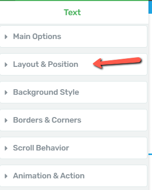
Here, make sure the “Height” is set to “Max”:

Add then set a lower value into the “Height” value field so that the text is overflowing:

Next, open the “Advanced” settings and select “Scroll” in the Overflow section:
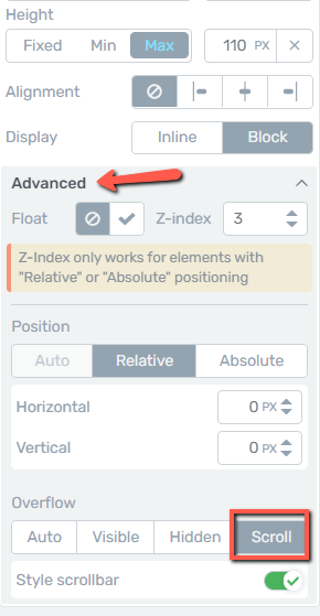
You will notice that a toggle appeared next to the scroll, which you can use to activate or deactivate the “Style scrollbar” feature:

Now, as simple as that, you have added a stylized scrollbar to your “Content Box”:

The ‘Conditional Display’ option
This feature allows you to take a block of content from any page, and create alternate versions for it:

You can then assign different display rules to each version, and decide what each visitor to that page will see, depending on what kind of permissions that person has:
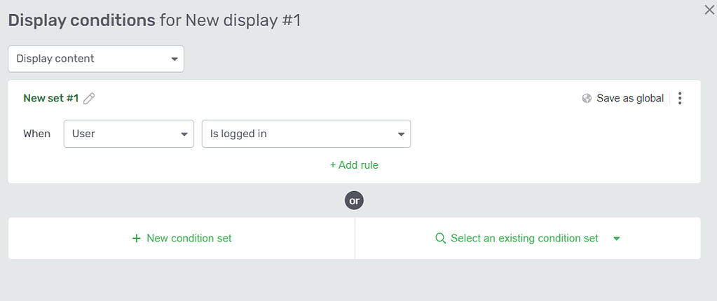
We have a separate article in our knowledge base that explains in depth how to use this feature:
After you have finished customizing the “Content Box”, save the work you have done, using the “Save Work” button, from the bottom-left part of the page:

Then, you can preview it, to see how it will look like for the visitors of your page. In order to do that, use the “Preview” option from the bottom-center part of the page:

This is how you can use and customize the “Content Box” element. You can check out the articles available in our knowledge base if you want to learn more about Thrive products.
Hopefully, this article was helpful to you.