The “Animation and Action” options are a set of features, created with the purpose of controlling what happens when someone clicks, scrolls, or hovers on elements.
There are various types of “Animation and Action” options, depending on what element you are adding them to.
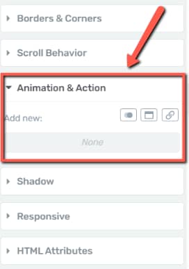
Access the element (in our case an image) and then, open the “Animation and Action” drop down to get started:
Animations
In order to add a CSS animation, click on the first icon from the “Add new” section:

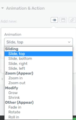
Then, you should click on the arrow to open the drop-down:

You will see that there are many animation types that make the element appear:
Thus, it makes sense for them to appear when they come into view.
However, as you can see in the image above, you also have the option of choosing the “Modify” animations (grow or shrink) which can have the “Mouse over element” trigger. This means that the animation will be displayed when the mouse has hovered over the element.
Let’s have a look at each animation from this list:
- Slide, top

- Slide, bottom

- Slide, right

- Slide, left

- Zoom in

- Zoom out

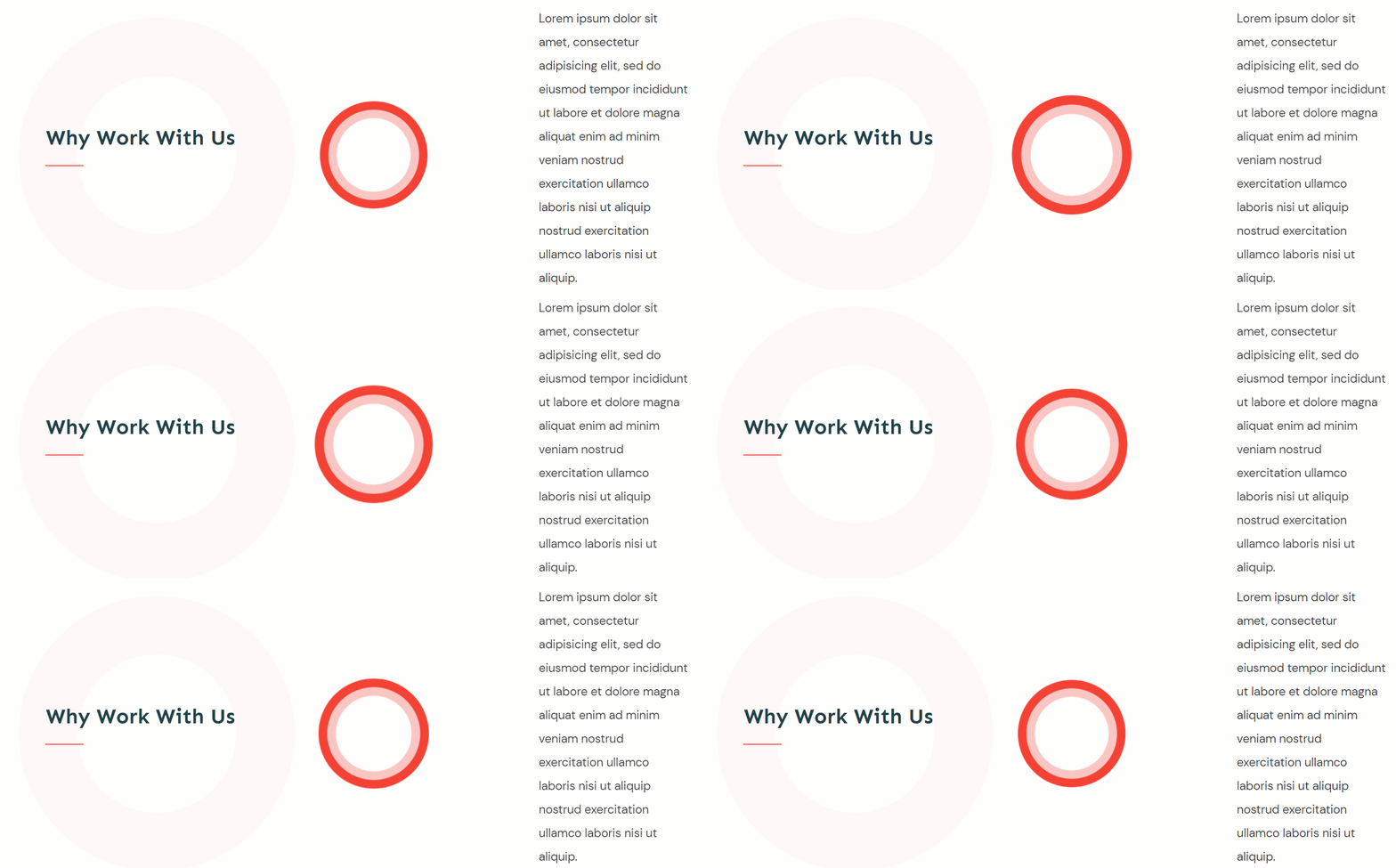
- Grow
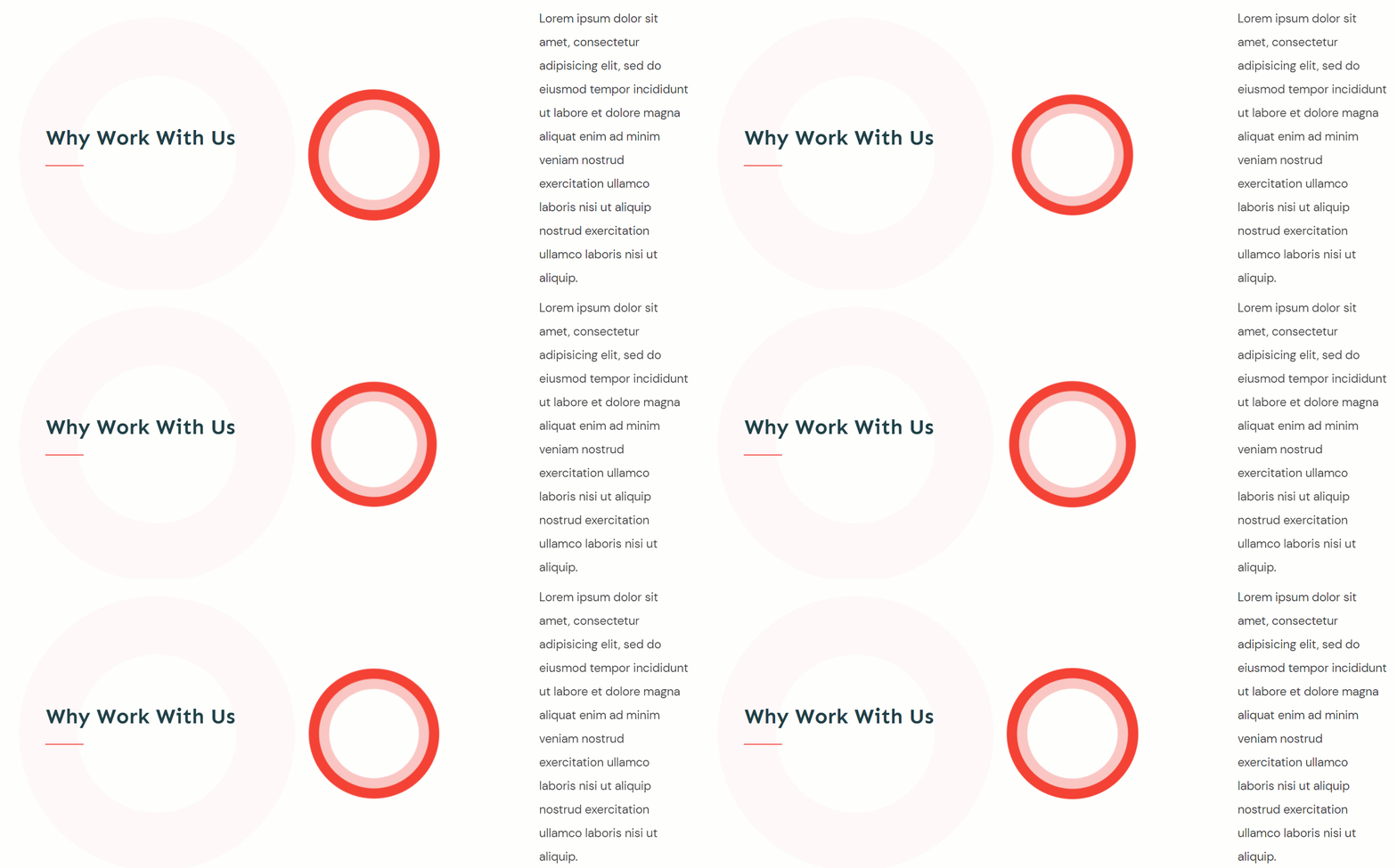
- Shrink
- Fade in
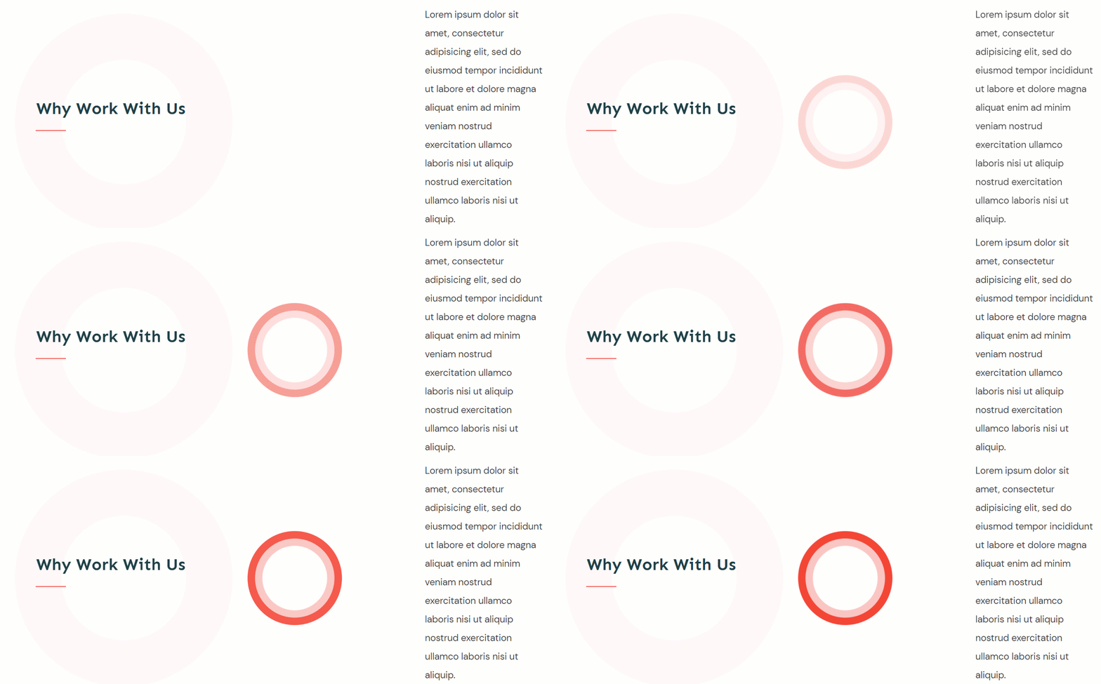
- Rotate
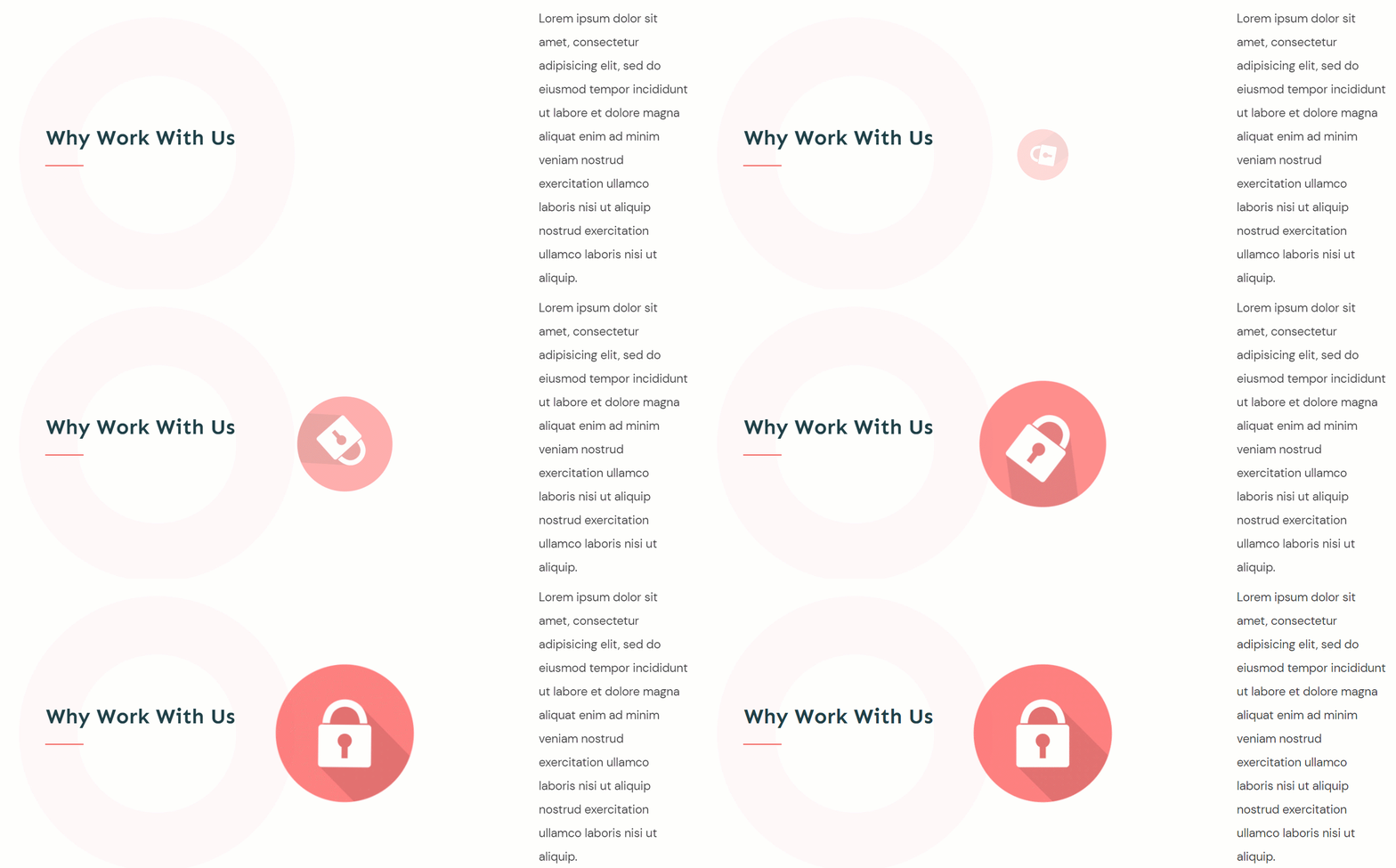
- Roll in
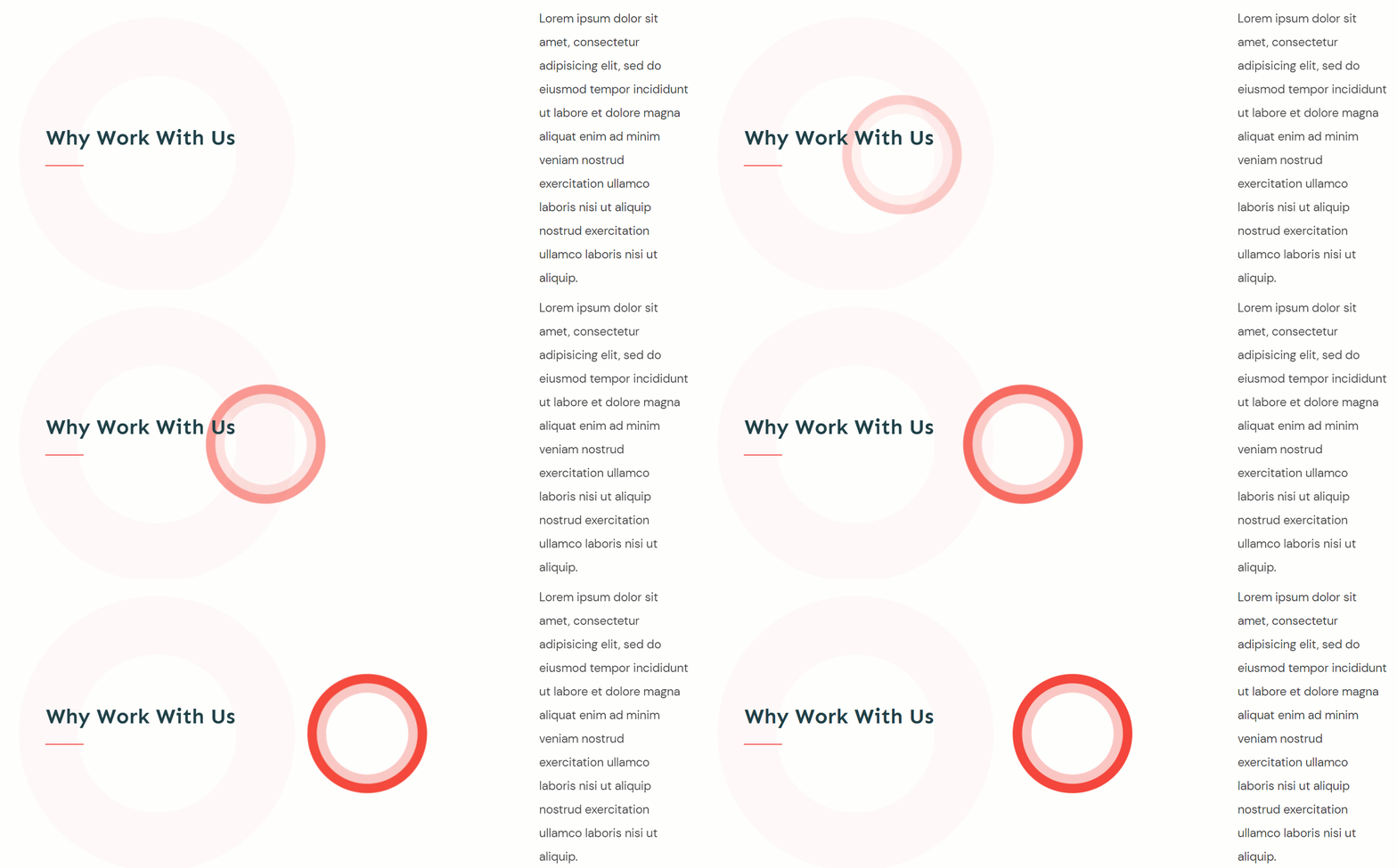
Looping and non-looping animations
Next, you will have to select whether or not you want your animation to be a looping one:
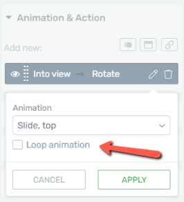
The difference between them is that non-looping animations animate only once; whereas every time a looping animation leaves the viewport, it resets and it animates again when it comes into view again.
After you have chosen the animation that best suits your needs, click on “Apply”.
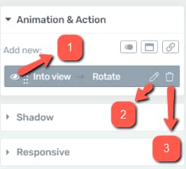
You can also manage your animations from here. You can preview them with the eye icon (a), edit them with the pencil/edit icon (b) or remove them by clicking on the trash icon (c):
Actions
The remaining two icons in the “Add new” section represent the action options:
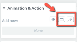
Pop-ups:
This option lets you apply a pop-up as an overlay to the element. First, you need to choose the “Trigger”, meaning when should the overlay appear: on click or when coming into the viewport.
Then, you can choose what the actual pop-up/overlay should open. You can select to open a Thrive Lightbox, Thrive Leads ThriveBox, an image, or a video (this has its own display options as well):

Thus, this is a feature that might replace separate plugins with the same overlaying functions.
|
Note: When choosing the “Open Image” option, make sure that the image you’re using has a title: 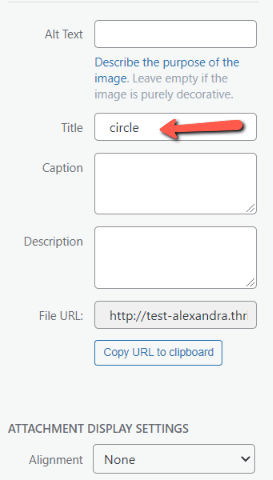 If you’re using an image that doesn’t have a title, you won’t be able to properly create the setup. |
Create hyperlinks:
Last but not least, you can apply links to elements from this section. What is even better, is that you can apply links to entire elements:
For example, feature boxes: after you link the feature box, if someone clicks on any part of it (the text, the icon, or the box itself) it will take them to the specified link.
You can also link entire pages if you want to make the entire area a clickable call to action link.
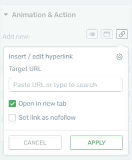
Just like in the case of an image, you just have to insert the hyperlink and choose whether or not to open in a new tab or be a no-follow one
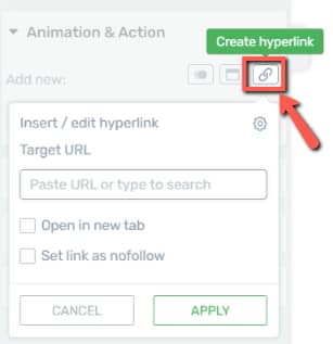
Note: The URL that you paste here can also be a URL that contains shortcodes. When you apply the link to the element, the shortcode will also be rendered, so when a visitor will click on the link, the shortcode will be executed as well.
Once you check the respective boxes, click on “Apply” and the link will be added to the element:
|
Note: The “Animation and Action” options have an additional feature when they are used on a Thrive Ultimatum campaign design. Open the design with Thrive Architect editor, and click on the “Animation and Action” section of your left sidebar:  Click on the “Custom integrations” option:  You will notice that you have the option of adding a “Close Ultimatum” action to the element:  After you click on “Apply”, the action will be added to the selected element:  This option too can be previewed (1), edited (2), and deleted (3), just as detailed earlier in the article:  |
|
Note: The “Animation & Action” section will also allow you to create tooltips on your website, using the “Display Tooltip” option. This can be found in the “Animation & Action” section while editing the “Hover” state of a “Content Box” element. We have created a separate article that goes through the entire process of creating and customizing tooltips for your website, so make sure to check it out, as well. |
Should you need more info on how various elements in Thrive Architect work, please follow this link.