When you insert a “Lead Generation” element into your post or page, and you connect your form to a service, you can add various types of custom fields to that form. The “Dropdown” type is one of them.
This article will explain how to set up a “Dropdown” type of custom field, and how to customize it, as well.
Set up a Dropdown Field
First of all, you have to connect your “Lead Generation” element to your desired services.
Click on the “Lead Generation” element, to select it, and go to the left sidebar menu to click on “Add Connection”:

Make sure to check out this list and click on any of the services that we support, to see a tutorial on how you can establish an API connection. Then, after setting up a connection, you will have to add a new form field.
As an example for this article, I have connected my “Lead Generation” element to Mailchimp.
In order to add a new field, in the “Form Fields” section of the left sidebar, click on “Add New”:
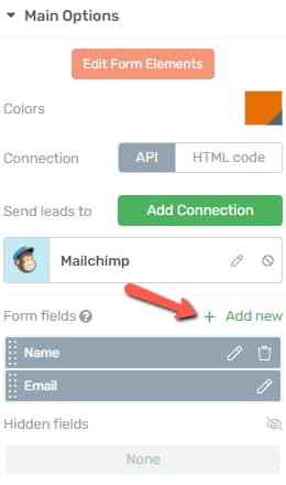
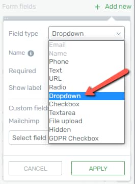
In the pop-up that opens, you will have to set up the new field. Click on the “Field Type” section:

This opens a list of the available types of custom fields. From here, choose “Dropdown”:
Then, continue setting up the field. You can choose a name for it, but this is optional, and the name will not be visible for the users:
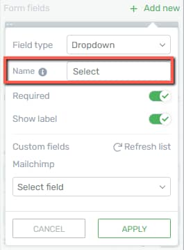
Providing a name here is just going to help you identify the “Dropdown” fields if you have used multiple ones.
Then, you will have to set whether this should be required or not, as well as if you want to show the label or not:
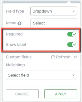
Then, you should set up the field mapping. Since I’m using Mailchimp as an example, I will have to click on the “Select field” section, to choose a field where the information should be sent to, in my Mailchimp account:

When finished, click on the “Apply” button:

The field has been added to your “Lead Generation” element.
Edit the Dropdown Field
After setting this field up, you can go ahead and use its options in order to customize it. For that, in the left sidebar, click on “Edit Form Elements”:

This will access the “Edit Mode” of the “Lead Generation” element. Then, click on the “Radio” field, and its options will appear in the left sidebar:

Here is how you can use the options from the left sidebar:
Grouped Styling
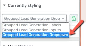
The “Grouped Styling” option and the ways you can use it are explained in more detail here. If you want to edit multiple “Dropdown” fields at a time, what you have to do is select the “Grouped Lead Generation Dropdown” option from the “Currently Styling” dropdown:
Main Options
Besides using the “Grouped Styling” feature, you can use the “Main Options” section to further customize the field. Here is how you can use these options:
Colors
This option allows you to change the color of the “Dropdown” field. If you want to change it, click on the color box:
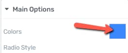
This will open the color picker pop up. Choose the color that you want, and click on “Apply”:

Dropdown Style
The next option is the “Dropdown Style” one. You can choose a style for this field, from a list of pre-designed ones. Click on this field to open the list with all the styles:
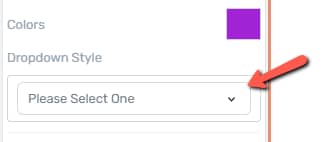
After you find the one you prefer, click on it to select it, and click on “Apply”:

Show Label
The option that comes next is the “Show Label” one. If you want the label of the field to be shown, above the field, activate the option by clicking on this switch:

Required
Then, if you want the “Dropdown” field to be required, activate the next option, by clicking on the switch next to it:

Rows when open
This option is where you can choose how many rows the drop-down should have. This does not represent the number of options of the field. You can have, for example, 5 options, and only 3 rows in the drop-down. When that happens, the users will be able to scroll down through the options.
To change the number of rows from the “Dropdown” custom field, use this slider, or enter the number of rows in the field next to it:

Include Placeholder
The next option is the one where you can choose whether you want to include a placeholder or not. If you do, then you will also have a field where you can write the placeholder into:

If you want to remove the placeholder, the default value will be the first option of the dropdown. To do that, deactivate the option by clicking on this switch:

Dropdown Icon
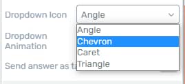
Then, you can change the icon of the field, and the way to do that is by clicking on the field next to the “Dropdown Icon” field:

A list with all of the icons will appear. To select one, click on it and it will be applied:
Dropdown Animation
The last option of this section is the “Dropdown Animation” one. You can choose an animation for when the drop-down opens. To choose one, click on this field, and a list with all of the available options will appear:

From the list of animations, click on the one that you want to use, to select it:

Manage Multiple Options
This last option will come in handy, for the situations where you want to quickly add multiple options to this field:

For this option, we have written a separate article, that you can check out here.
Besides these options, which allow you to customize the field, you can also customize the options inside the drop-down.
Edit the Dropdown Field Options
For that, in the editor, click on the option that you want to edit, and you can start customizing it using the left sidebar options:
To change the name of the options, all you have to do is remove the default “Option ..” text and write in your own:

Add and Remove Options
If you want to add a new option, hover over the existing ones, in the editor, and click on the blue plus sign:

If you want to remove one of the options, you can do that by selecting the option and clicking on the trash can icon from the top right corner:

Currently Styling
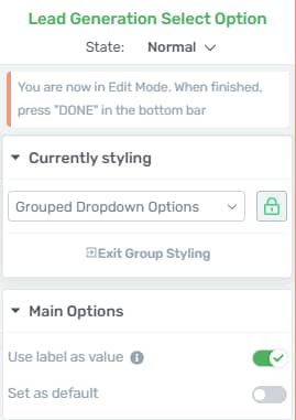
The “Grouped Styling” feature is applied here, as well, in case you want to modify all of these options of the “Dropdown” field, at the same time.
You can choose whether you want to customize all of the options at once, or just one selected option.
By default, the “Currently Styling” setting is set to allow you to customize all of the items at once, but you can click on this icon, and select the option that you want to separately edit:

This way, the modifications you make will only be applied to the selected option.
To exit the “Group Styling” feature, you can click on “Exit Group Styling”:

Main Options
Besides using the “Group Styling” feature, you have some more options that really let you customize the options of this field as you wish. They can be found under the “Main Options” section.
Use label as value
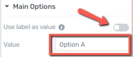
You can choose whether the label should be used as a value, or not. If you do not want that to be the case, uncheck this option, and a “Value” field will appear. Enter the desired value in that field:
Set as default
You can also set one of the options as a default. This means that the option will be already selected when the page loads:

State
If you want to customize different states, you can choose which one to edit by clicking on “State: Normal”, to open the drop-down with all of the states:

After choosing the state that you want to customize, select it from this list and use the left sidebar options.
Remove the Field
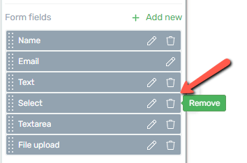
If you want to delete this “Dropdown” field, all you have to do is go back to the “Lead Generation” element options, and, in the form fields list, click on the trash can icon next to the field you want to remove:
As always, feel free to use all of the other general options for even more in-depth customization of this field. For all of the other options, you will be able to find articles in our knowledge base.
Make sure you also check out this article, to see what other types of custom fields can be added to this element.