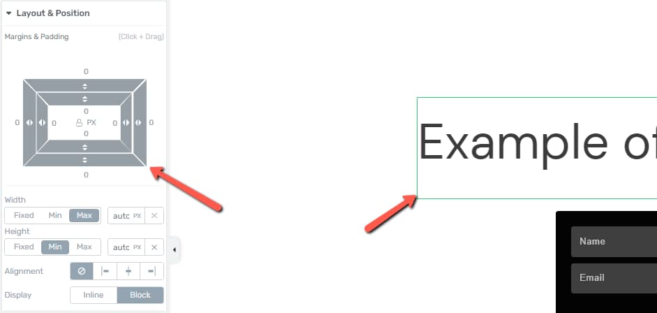
When you add a text element to your content, you may see extra space below, that doesn’t show in the Layout & Position options.
Here’s an example of what this can look like on the heading. Note the extra space, indicated by the green frame around the heading:

The Fix
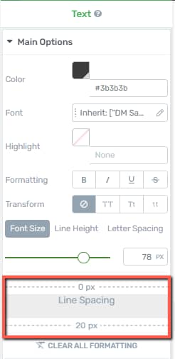
To remove or change this spacing, you simply have to modify the “Line Spacing”. The option can be found under the “Main Options” section, in the left sidebar:

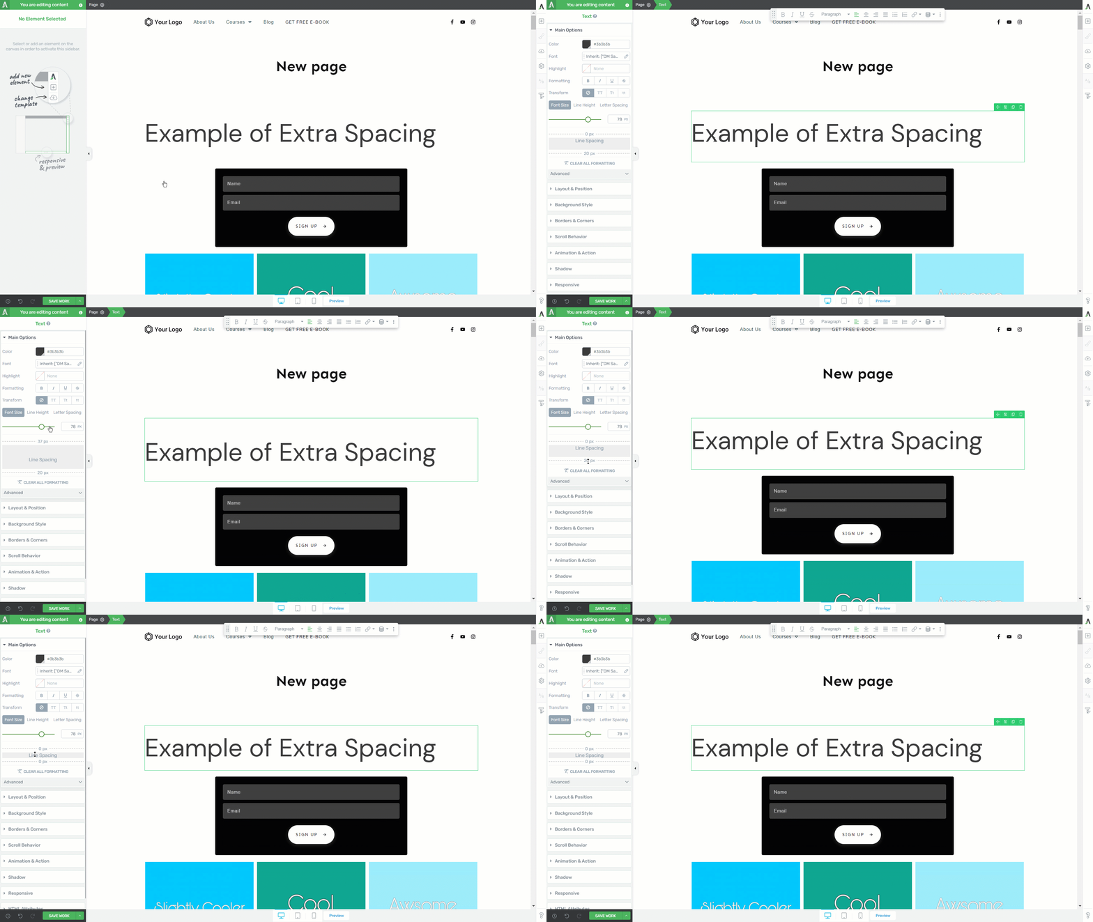
Simply grab the upper/lower dotted line and drag it up or down, to adjust the line spacing. Here’s a quick animation to walk you through the process:

Why this Happens
Here are the technical reasons for this “phantom space” below text: when this happens, it simply means that your theme is applying a bottom margin to the text. Text elements such as paragraphs and headings are default elements.
Thrive Architect can’t apply a unique style to these without causing problems, so the theme’s style rules about how much space should be applied take effect.
In most cases, this is fine. For example, if you’re writing a blog post using Thrive Architect, it simply means that the spacing around headings and paragraphs will be exactly as expected: exactly as they would be if the content was written in the default editor.
We can override this default theme setting by using a container or parent element. Container elements such as the “Background Section”, “Content Box”, and “Columns” can have typography options applied to them, which affect all the text content inside them.
This works because the theme will have a rule for how much space is below the text, but Thrive Architect can override it with a rule for how much space is below the text inside this container. Because it’s a more specific rule, it gets applied instead of the theme style.