Do you want to make it easier for your readers to skip to the article sections they’re most interested in? The Table of Contents element of Thrive Architect makes it easier for you.
In this article, we’ll show you how you can add the Table of Contents element in a post, and customize it to your needs.
- Adding the Table of Contents Element to a Post
- Styling the Table of Contents
- Styling the Headings Displayed in the Table of Contents
Adding the Table of Contents Element to a Post
If you’d like to see the Table of Contents element in action, we recommend you put together all of your content for the post, including all headings. Then, after this is all setup, add the Table of Contents.
After you’ve set up the post, click on the plus icon seen in the right-side panel. Then, start typing the element name “Table of Contents” in the search bar seen in the menu that appears.

When you start typing the element name, you’ll see matching elements listed below in the menu. Once you find the Table of Contents element listed, drag and drop it into the exact location you’d like it to appear in the post.

Once you drag and drop the element in your desired location, a popup will appear. This popup lets you select a template for the Table of Contents. Each of these templates includes a different color combination, layout, etc.

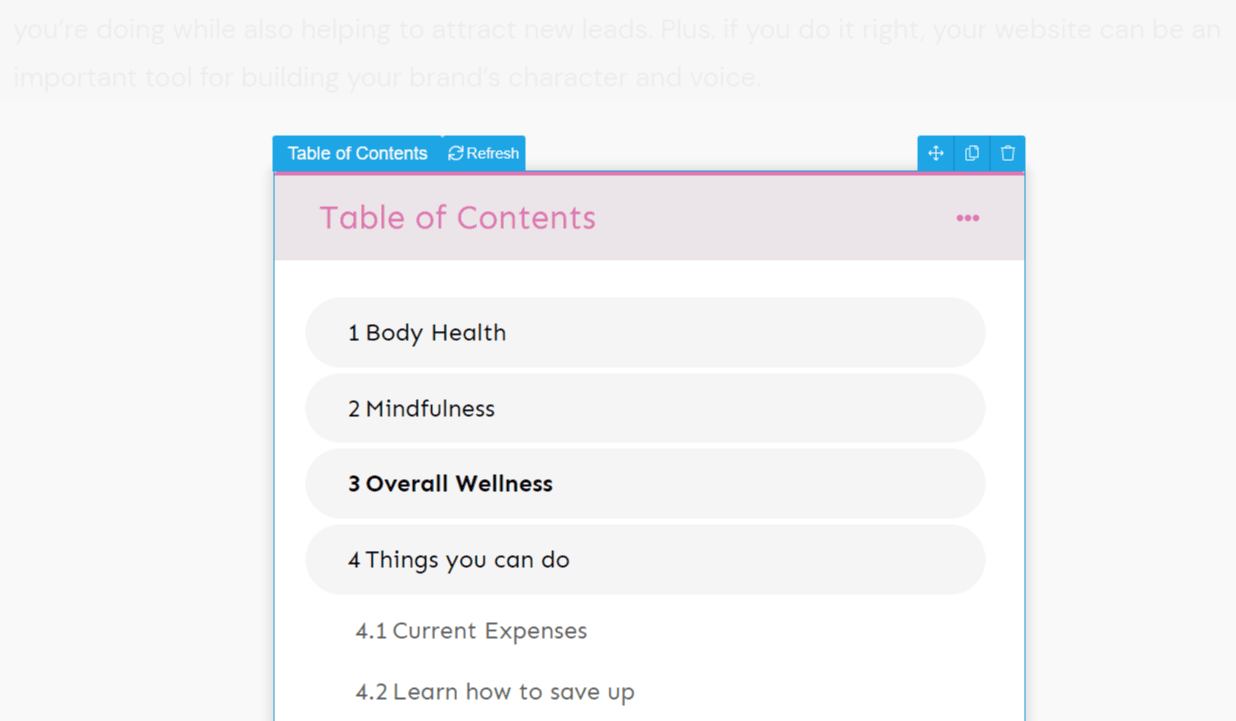
When you select the template by clicking on it, the popup closes and you’ll see the Table of Contents added to the post.
Styling the Table of Contents
When you click on the Table of Contents in the post editor, you’ll see the editing and styling options appear in the left-side panel. From here, you’ll be able to customize the appearance of your Table of Contents.
You’ll find multiple options like the Main Options, Layout & Position, Background, Scroll Behavior, and more.

If you want to change the template, you can click on the first tab in the left-side panel that has the current template name displayed.
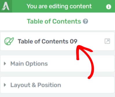
The Main Options allow you to select the color you’d like to use in the table, the heading tags you’d want to include in the table, the number of columns you want the headings to be displayed, and much more.

- The Colors option allows you to select a color theme for the table. You’ll see it reflected in the title, the border, and the background color.
- The Headings section lets you select the headings you want to display in the table. H1 is the largest and H6 is the smallest.
- Under Columns, you can select the number of columns you want the contents/headings to be displayed. This is useful when you have a long list of headings.
- The Distribute evenly option allows you to distribute the list of headings in the number of columns.
- The Highlight option lets you decide how you’d like to highlight the headings in the table. You can choose to turn that off, highlight the headings while the user scrolls the page, and highlight the current heading or section.
- The Indent size will help you determine the left margin shown before sub-headings.
- The List type setting allows you to choose whether you’d like to display a numbered list or one with icons. You can also decide whether you want all the headings to be accompanied by numbers or icons or just the main ones.
- The next option will allow you to Disable smooth scroll animation. This is useful on pages that have lazy load enabled on them.
- You can also allow the table to appear as a collapsed list of contents.
- You also get a setting to set the default state of the table to Collapsed or Expanded.
- The Dropdown Animation setting allows you to decide whether you want a collapsed table to expand with a slide or fade animation.
- The Animation speed setting allows you to select the speed of the above animation you select.
- You can use the Text size setting to decide the size of the text used to display headings within the table.
- The Line Spacing setting allows you to manage the spacing between two headings in the table.
The Layout & Position section allows you to adjust the width of the table, set the alignment, and manage the display along with the margins and padding.

- The Margins and Padding section here lets you determine the margin and padding on the inside and outside of the table border.
- The Width setting lets you select a width for the table on the whole. You can also select to set it to minimum, maximum, or auto-adjust.
- The Alignment option lets you decide whether you want the table to appear on the left, right, or center of the page.
- You can decide whether you want the table to be displayed inline or as a block using the Display setting.
- You also get more Advanced settings: Float and Z-Index. You can choose to keep the table floating while the user scrolls the page. Z-Index only works for elements with “Relative” or “Absolute” positioning.
The Position option lets you decide whether you want the position of the table to be set to Auto, Relative, or Absolute with their respective options. Relative allows you to display the table inline on the page, while Absolute helps you select the position you want to show the table in the viewport.
The Background Style section allows you to decide whether you want to add a background to the table and choose whether you want it to be a solid color, a gradient, a pattern, or an image.
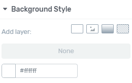
The Add layer setting is accompanied by 4 boxes. The first one allows you to add a solid background color, the second lets you select a background image, the third helps you set a gradient background, and the fourth lets you select a pattern as a background.
The Borders and Corners section allows you to select the border style, width, and color for your table. You can also select whether you’d like to have rounded corners.
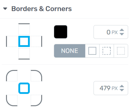
- The first border figure allows you to choose the sides where you’d like to apply the border.
- You can click on the colored box to set a color for the table borders.
- You can also select the border width and style with the respective settings.
- The next boxed figure will help you set rounded borders for your table.
Under Scroll Behavior, you can decide whether you want the table to remain Static, i.e. stay where it is, Sticky i.e. stick around the viewport when you scroll through the post, or Parallax.

- The Static option will keep the table as it is on the page even when the reader scrolls through it.
- The Sticky option will stick the table to the viewport so that the reader sees it even when he scrolls through the page.
- The Parallax option lets you add effects to the table while the reader scrolls the page. You can read this document to know more about the Parallax effects.
The Shadow section allows you to add shows inside the table border, outside, or to the text in the table.

- The three boxes help you add shadows on the internal side of the table border, the external side of the table border, and the table title text.
- Each of these options will let you select the shadow color, angle, opacity, distance from the border, blur, and spread.
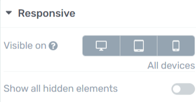
The Responsive section lets you decide which devices you’d like to display the table on. This option allows you to select between a desktop, a tablet, and a mobile device.
Finally, you have the HTML Attributes section where you can add a CSS class name or an ID to the table.

You can read more about HTML Attributes in this document.
Styling the Headings Displayed in the Table of Contents
There may be times when you feel like editing how each heading level in the table looks. This can be done using the Edit Table of Contents option.
To begin editing, click on the Table in the post editor. This will show up all the attributes with respect to the Table of Contents appearing in a left-side panel.
Since you’d like to edit the headings, click on the Edit Table of Contents button seen in the left-side panel.

After you click on the button, the edit mode is turned on and you’ll see the editor bordered with an orange line.
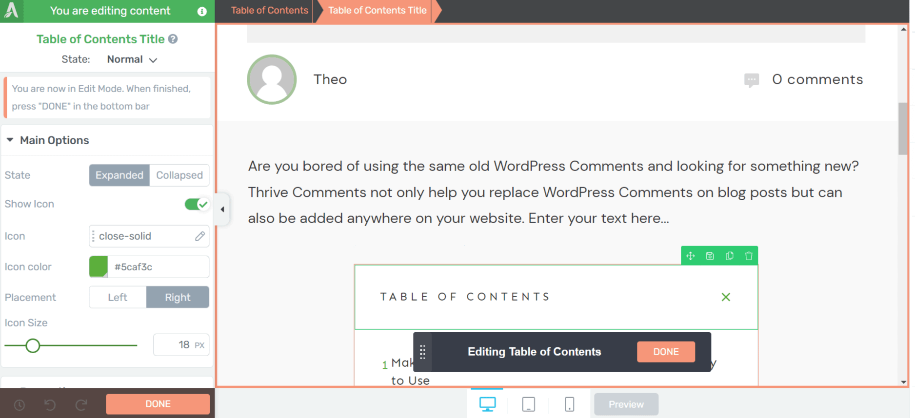
To start editing, click on any heading level that you want to edit. This will open the editing options in the left-side panel.

In the edit mode, you can start by selecting a state. It can be either Normal, Hover, or Highlight.

- The Normal state means how a Heading will look normally within the table of contents.
- The Hover state allows you to edit how the heading will look when a user hovers over it.
- The Highlight state indicates to the user where they are on the page in relation to the table of contents headings. This can be practically seen when you have the Sticky Scroll behavior enabled for the table.
Next, you can choose a group of headings you want to edit together. This means that changes made to one H1 heading will be applied to the others that fall into that group. You can click on the drop-down and click on each available group to see the headings that belong to a group.

These group heading options mean:
- Grouped Heading Level 1: Group of larger or parent headings in the table. This option covers the main text portion in the heading.
- Grouped Heading Level 2: Group of smaller or child headings on the table. This option covers the main text portion in the heading.
- Grouped Number Level 1: This covers the group of numbers given to the main or larger headings in the table.
- Grouped Number Level 2: This covers the group of numbers given to the sub-headings or smaller headings in the table.
There may be more grouped heading levels if you have more sub-headings added on the page. Similarly, the Grouped Numbers will be replaced by Grouped Icons if you use icons instead of numbers to be accompanied by the headings in the table.
If you don’t want to group the headings together, you can also click on the Exit Group Styling link under the drop-down.

After you are done selecting what you want to edit, you can click on each of the sections like Main Options, Layout & Position, Background Style, Borders & Corners, and Shadow to go ahead with the settings in them.

The Main Options have settings like font style, color, sentence form, alignment, formatting, font size, line height, and letter spacing.

- The Font option allows you to inherit the font for the headings from the theme or set a new one.
- The Colors option allows you to select a color for the selected headings.
- The Transform option helps you select the form you’d like to display a heading in. It has different capitalization forms to select from.
- Alignment lets you select an alignment of the heading within the table.
- The Formatting option allows you to format the headings as bold, italic, underlined, or strike-through.
- Similarly, you can set the Font size, Line Height, and Letter Spacing of the headings.
The Layout & Position settings allow you to set the margins and padding for each selected heading or group of headings. You can do that by clicking and dragging the lines in the section.
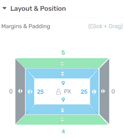
The Margins and Padding section here lets you determine the margin and padding on the inside and outside of the headings in the table of contents.
The Background Style lets you decide how you’d like the background to be. You can choose to keep it blank or add a solid color, a gradient, an image, or a pattern.
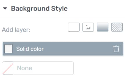
The Add layer setting is accompanied by 4 boxes. The first one allows you to add a solid background color, the second lets you select a background image, the third helps you set a gradient background, and the fourth lets you select a pattern as a background.
Under the Borders and Corners, you can choose to add a border by styling it with a pattern, color, and width. This section also allows you to manage the corners for each selected heading or group of headings. So, if you want to add those rounded corners to the headings, you know where to set that.

- The first border figure allows you to choose the sides where you’d like to apply the border.
- You can click on the colored box to set a color for the heading borders.
- You can also select the border width and style with the settings.
- The next boxed figure will help you set rounded borders for the selected headings.
The Shadows section lets you add shadows to each of the selected headings or groups of headings. It allows you to add shadows to the entire border you added to a heading or only the text.

- The two boxes help you add shadows on the external side of the table border, and the table title text.
- Each of these options will let you select the shadow color, angle, opacity, distance from the border, blur, and spread.
After you are done editing the heading styles, click on the orange Done button seen in the bottom left corner of the screen or on the floating panel.

We’ve just seen how you can add a Table of Contents to a post using Thrive Architect. This element makes it easy for readers to jump to particular sections of a post.
Next, if you’d like to add links to other text (outside of the Table of Contents) to let readers jump to other parts of the page/post, you can use JumpLinks. Read our article about adding Hyperlinks using Thrive Architect.