Important!
The “Text Shadow” option, previously found in the Text options, is now found within the “Shadow” options.
The “Shadow” option allows you to add a shadow to various elements from Thrive Architect, including the “Text” element. This article will explain how you can use it.
When you add an element, no matter which one, its options will appear in the left sidebar. This is where you will also be able to find the “Shadow” option.
To use the feature, you simply have to select the element you want to apply the shadow to, and then click on the “Shadow” section from the left sidebar:

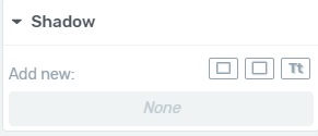
When you click on the section, its options will appear:

You can find each of these options described below. I will use a “Button” element as an example.
Inner Shadow
The first shadow type that you can use on an element is the “Inner Shadow” one.
Here is an example of the “Button” element with and without this type of shadow applied:


Click on the option if you want to use it:

Then, a small pop-up will open, with the options for this shadow type:

Here is how you can use each of these:
-
Color
You can change the color of the “Inner Shadow”. For that, click on the color box next to the option and a color picker will show up, allowing you to choose a certain color:

The color picker popup will open. Here, you can use the color picker manually, and choose a color, or you can enter a HEX/RGB code in the dedicated field:

Another thing that you can do from this pop-up is to change the opacity of the shadow. Do that by using the opacity slider, or by entering a value in the “Opacity” field:

Moreover, you can also choose from one of your previously saved colors, using the “My colors” section:

When you’re done choosing the color, click on “Apply”:

This will take you back to the pop-up with the options.
-
Angle
The next option is the “Angle” one. You can use the round dial or enter an exact value in degrees, to set up how the shadow will be positioned:

-
Opacity
Moving forward, you can use the “Opacity” option to quickly change the opacity of the shadow. This is the same option as the one you have previously set from the color picker pop-up, so the “Opacity” field will have the same value as that one.
To modify the opacity, you can either use the slider and drag it from side to side, or you can enter a value in the field next to the option:

-
Distance
Using this option, you can choose how much shadow you want to apply to the element:

Again, use the option by dragging the slider from side to side, or by entering a numerical value in the field next to it, as shown above.
-
Blur
You are also able to determine the blur level for the text-shadow:

-
Spread
Lastly, choose the “Spread” option to decide the radius of the shadow:

When you’re done using all of these, click on “Apply” to save the modifications of the “Inner Shadow”:

Drop Shadow
The next type of shadow is the “Drop Shadow”. Here is an example of a “Button” element with and without this type of shadow applied to it:


Click on this type of shadow if you want to apply it to an element:

This will open the pop-up with the options for this type of shadow. As you can see, these are the same options just like the ones in the case of choosing the “Inner Shadow”:

Since the options are the same, you can use them just as described above.
Text Shadow
Lastly, you can use the “Text Shadow” type, which, naturally, will be applied to the text inside the element. Here is how the “Button” element looks like with and without a “Text Shadow”:


If you want to add a shadow to the text, click on this option:

Again, the options available for this type of shadow will be the same ones just as the ones described above, with the exception the “Spread” option is not available here:

The way to use each of these options is just as described in the case of choosing an “Inner Shadow”, here.
Note: You can find the “Text Shadow” options in one more place. When you select a “Text” element (whether it is a stand-alone one, or it is incorporated in another element), you will find the options for the “Text” element in the left sidebar.
You will notice the “Main Options” section, as well as a “Shadow” section:

If you click on this section, you will see that only the “Text Shadow” option is available, and you can use it just as explained in this article:

A fun thing about the “Shadow” option is that you can stack up the shadow types, and add as many as you want, to the same element:

This is possible because, after you add a shadow, customize it using its options, and click on “Apply”, it will be added to the list shown in the image above.
If you ever want to remove any of these, you can simply click on the trash can icon next to the shadow that you want to be removed, and it will be deleted:

These were the ways in which you can add shadows to various elements, and customize them as you wish.
If you need more information about Thrive Architect and its features, please take a look at our knowledge base.
I hope you enjoyed this article and found it useful! Don’t forget to rate it with a smile below:)