When building your website with Thrive Architect, you have the possibility to use the “Call to Action” element. With the help of this element, you can encourage a user to take an action (subscribe, make a purchase, etc.) on your website.
For instance, on a sales page, the “Call to Action” element can be used to drive visitors to your checkout page and purchase your products.
Here is a step-by-step guide In order to show you how to use the “Call to Action” element:
Add the Element to the Post/Page
Just like in the case of the other Thrive Architect elements, here as well, the first step you need to take is to add the “Call to Action” element to the page.
While you are editing the page with Thrive Architect, click on the plus sign from the right sidebar:

This will open the list of elements. Look for the “Call to Action” element and once you have found it, drag and drop it to the desired place on the page:

After the element has been dropped on the page, a pop-up window will open with the list of the available “Call to Action” templates that you can use:

Scroll down to check out all the available templates and when you have found the one you want to use, click on it to select it. The template will automatically be applied to the element.
Doing this will apply the template to your element and add it to the page.
Next, you can use all the options of the “Call to Action” element, that appeared in the left sidebar, in order to customize your “Call to Action” as follows:
Choose the Template
The first section of the left sidebar options is the template library. You can use it if you want to change the template that is currently applied to the element:

Then, the same pop-up window will open that you have used to select the template in the first place:

Click on the other template that you want to use, from available templates and then, click on the “Replace Template” button:

This way the new “Call to Action” template that you have selected will be applied to your element.
Note: Before changing the template, please consider that this might also affect the content of your “Call to Action” element. Whenever you change a template, all the content, as well as customization, that you have added to the element will be lost.
This is why it is important and we recommend that you select a suitable template for your “Call to Action”, before adding the actual content to it.
Use the Main Options
The next set of options that you can use to customize the “Call to Action” are its set of “Main Options” from the left sidebar:

Colors
Click on the color box next to the “Colors” field if you want to change the color of the “Call to Action” button:

This will open the color picker, which you can use for selecting a color from the color box, or you can just insert a HEX/RGB code in the corresponding field:

You can also choose one of the already existing colors from the “My Colors” and “Theme Colors” sections.
After you are done, don’t forget to click on the “Apply” button to make sure all your changes have been saved.
Maximum Width
With the help of this option, you can adjust the width of the “Call to Action” element. All you need to do is to either drag the slider from this section or enter a value manually in the field next to it:

Minimum Height
You can use this option if you want to change the height of the “Call to Action” element. Just as in the case of the width, here as well, you have to either drag the slider from the “Minimum Height” section or enter a value manually in the field next to it, in order to modify the height of the element:

Add link to Content Box
If you want to add a link to your element, then you can do so by activating this toggle:

This will open up another set of options, which you can use just like you would do with any other element to which you would add a link:

First off, you can decide what type of link you would like to apply. You can choose between a “static”, “jumplink” or “dynamic” link:

In the case of the “Static link”, you can simply paste the URL and search for a page already exiting on your website in the field below it:

You can find an example of how to use the static link and the “Target URL” field in this article.
If you select “Jumplink”, then you’ll also have to configure your “target” and whether you want to apply an animation to it or not:

An example of how to use this feature is described in this article, detailing the steps for adding a jumplink to a “Button” element.
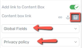
Lastly, the “Dynamic link” can be used as per the steps described here:

Vertical Position
The “Vertical Position” option lets you choose the vertical position of the content inside the “Call to Action” element. You can choose to place the content on the top, in the middle, or on the bottom of the “Call to Action” element. By default the top position is selected:

To select another position just click on it and you will see how the position of the content changes in the “Call to Action” element.
Use the Rest of the Options
Besides the “Main Options” of the “Call to Action” element, you can also use the more general options to further customize the element. You can see these general options under the “Main Options” when the element is selected:

If you need detailed information on how to use these general options, check out our knowledge base, because we have separate tutorials about each of them.
Customize the Content of the Call to Action Element
After customizing the way the “Call to Action” element looks, it is also important to customize the content that can be found in it. When you have added the element to the page and chosen a template for it, the respective template came with general texts, images, buttons, etc.
You will have to change all such default/general content by replacing them with your own texts, images, buttons, etc. This is needed to make the “Call to Action” unique and specific to your page. In order to change the default content, click on the element you want to change.
This way its specific options will appear in the left sidebar. Then, use the options of the respective element to customize the part of the content it represents.
-
For example, if you want to change the text of a button, simply click on it, delete it directly from the editor and then write your own button text. In the case of buttons, it is also important to use the “Button Link” option, which appears when you select the button from the “Call to Action” element. With this, you can link the button to a different page, where you want the users to be redirected after they click on the button.
-
Another example would be changing a default image. In order to do that, you will have to use the “Replace Image” option, from the sidebar, to change it with your own image.
Keep in mind that doing this for every element with general content, inside the “Call to Action”, is essential, so that they represent your own business/services.
Use the Rest of the Options
Naturally, you are also welcome to use the other options that can be found in the left sidebar:

If you want to know how to use the rest of the options from the left sidebar, make sure to take a look at the articles and tutorials from our knowledge base.
After you have finished customizing every part of your element, you can save the page and preview it, to see how the “Call to Action” element will look for the visitors of your page.
Hopefully, this article was useful for you. If so, please give it a smile below 🙂